The Definitive Guide To Styling Links With CSS
So without links, we’d be lost. We look for them on the page when we want to venture further. Sure, we pause to read a bit, but inevitably we end up clicking a link of some sort.
Further Reading on SmashingMag:
- Designing “Read More” And “Continue Reading” Links
- Why Your Links Should Never Say “Click Here”
- Should Links Open In New Windows?
- A Short Story About “Back To Top” Links
Styling Links
When you style links, remember that users don’t read; they scan. You’ve heard that before, and it’s true. So, make sure your links are obvious. They should also indicate where they will take the user.
Let’s start by looking at CSS selectors and pseudo-classes:
a:link { }Unvisited link.a:visited { }Visited links.a:hover { }The user mouses over a link.a:focus { }The user clicks on a link.a:active { }The user has clicked a link.

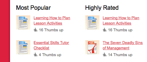
The TLC uses not only plaint text links, but also icons to communicate the corresponding file types.
Ensure Contrast
Links should stand out not only from the background but from the surrounding text. If the font color is black and the link color is black, you have a problem. Make your links stand out by using one or more than one of the following techniques.
text-decoration: underline;Underline.font-weight: bold;Bold.font-size: 1.4em;Enlarge.color: #ed490a;Color.background-color: #c0c0c0;Background.border-bottom: 2px solid #a959c3;Border.
If you decide to make links blue, then make sure no other text (including headings) is blue, because users will expect it to be a link, too.
Also, don’t underline text that isn’t linked because users expect underlined text to be a link. And keep in mind users with poor sight. Red won’t stand out to someone who is color blind, so consider underlining or bolding links, in addition to changing the color.


A helpful technique that I always use is to slightly blur the focus. Links with good contrast should still stand out when you look at the page.
Don’t Forget About Visited Links
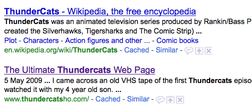
Visited links are often overlooked, but they are very helpful, especially on larger websites. Knowing where they’ve been before is helpful for users, whether because they want to avoid pages they’ve visited or to make a point of visiting them again.
Give visited links a darker shade of color, so that they stand out but aren’t as obvious as unvisited links.


Use the Title Attribute
The title attribute is usually overlooked, but it’s a convenient way to add descriptions to your links and can be especially useful for those who rely on screen readers.
<a href="example.com" title="This is an example link">Example</a>Use Button Styles
To make really important links stand out—say, a call to action or a “More info” link at the bottom—use a button style. And you can reuse the style again and again without having to edit any graphics.


For more information, check out “Super-Awesome Buttons With CSS3 and RGBA” and “Call to Action Buttons.”
Hover State
Offering feedback to users that they’re hovering over a link is good practice. The best way to do this is to change the background color, change the text color or remove the underline.
a:hover { text-decoration:none;
text-shadow: 0 0 2px #999;
}

The mouse pointer usually turns from an arrow into a hand when the user hovers over a link. But this functionality is sometimes lost; for example, in IE when the link contains a span element, or on “Submit” buttons. Fix this by adding the cursor type via CSS.
a:hover span { cursor: pointer }Active State
Provide visual feedback to the user to indicate that they have clicked a link, so that they know to wait. One nice effect is to move the link down one or two pixels, which gives the link the appearance of being pressed.
a:active { padding-top: 2px; }

Apply Padding
Here is a good usability tip. Add padding to your links. This way, the user doesn’t have to hover over the exact point of the text. Instead, they can hover in proximity and still be able to click. This works well for navigation links.
a { padding: 5px; }
Use Icons for File Types
If your links point to files in various formats, inform the user of as much using icons. This prepares them for the file type they are about to open, whether it’s PDF or JPEG, for example.

For some great resources, check out Fam Fam Fam Silk Icons.
Use Icons for Recognition
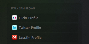
Just as you would use icons for file types, use icons to identify where links go or what they do. This user can more quickly absorb a visual icon than text.


Make Anchor Text Descriptive
Use meaningful text, not “Click here.” The problem with the latter is that it forces the user to read around the link to understand why they should “Click here.” Anchor text such as “See Britney on a beach” speaks for itself. It’s also more SEO-friendly.

Link Your Logo
Always link your logo to the home page. Most users expect this convention across the Web. That said, don’t assume that users know this. Regular surfers expect it, but a number of users still look for the “Home” link.
<h1><a href="/" title="Homepage">Site name</a></h1>h1 a {
background: url(images/logo.gif) no-repeat top left;
display: block;
text-indent: -9999px;
width: 200px;
height: 60px;
}Don’t Open New Windows
Just don’t do it. Let the user decide when and where to open a new tab or window. Users expect links to open in the same window. If you really must do it, at least add an icon to show that this will happen. There are exceptions; for example, it you don’t want to break the flow of a check-out process.
Micro-Formats
As the Web becomes more semantic, consider incorporating microformats into your link structures, to help machines understand how a link fits into a page and its relationship to other pages. For example, the following…
<a href="https://myfriend.example.com" rel="friend met">My Friend</a>tells search bots that this text links to a friend who I’ve met, which is useful for discovering connections between links. You can also read more about microformats.
Further Reading
- Padded Link Targets for Better Mousing, 37 Signals
- Top Ten Mistakes in Web Design, Useit
- Guidelines for Visualizing Links, Useit
- Styling Text Links, Andy Rutledge
- Showing Hyperlink Cues With CSS
- Don’t Lose Your Focus


 Get a Free Trial
 Register for free today!
 Try if for free!
 JavaScript Form Builder — Create JSON-driven forms without coding.

