Free Zocial Button Set: Social CSS3 Buttons
The idea behind this project was to produce a consistent set of buttons that could be used for the range of social actions frequently taken in Web applications. These actions are often important goals for users, such as connecting third-party accounts or sharing content to third-party platforms, so their appearance has to be attractive and clear.
The standard buttons provided by third parties (such as Facebook, Twitter and SoundCloud) vary in size, style and interactivity. A consistent button set could reduce a lot of that visual noise and inconsistency. Furthermore, having it in CSS format means that changing the text for certain actions would be a breeze for developers, and it also allows administrators of non-English websites to translate labels into their native languages.
The button set was designed from the beginning to require no extra markup, and the elements used are entirely the choice of the (semantically considerate) designer. All buttons are fully scalable and customizable, and they degrade gracefully on older browsers, although the aesthetics in IE 6 and 7 are admittedly inferior to image-based alternatives.
No raster images or sprites were used. Instead, vector icons were inserted using a custom font file, an @font-face rule and pseudo elements. For more information, John Hicks has an informative write-up on this technique.
Download The Button Set For Free
This button set is free to use and extend, personally or commercially. No attribution is required.
- Preview
- Demo
- Download the package (ZIP, 147 KB)
- GitHub repository (handwritten CSS)
- Sass framework (six buttons) (by @adamstac)
Features
- 100%-vector CSS3 buttons
- @font-face icons and custom font files
- 72 services supported
- Button and icon versions supported
- Em sizing for full scalability
- Generic primary and secondary action buttons for consistency
- Graceful degradation on older browsers
Preview
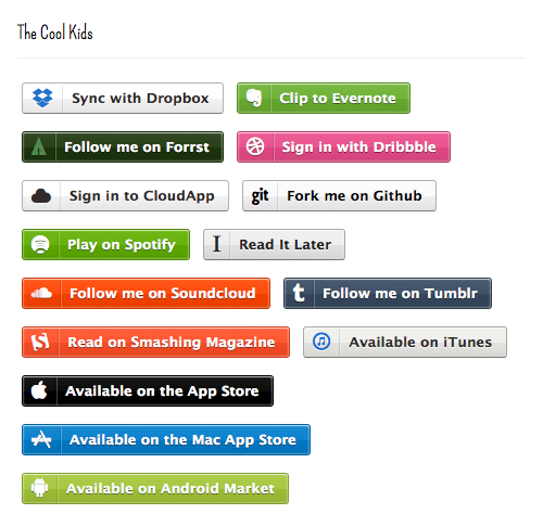
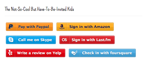
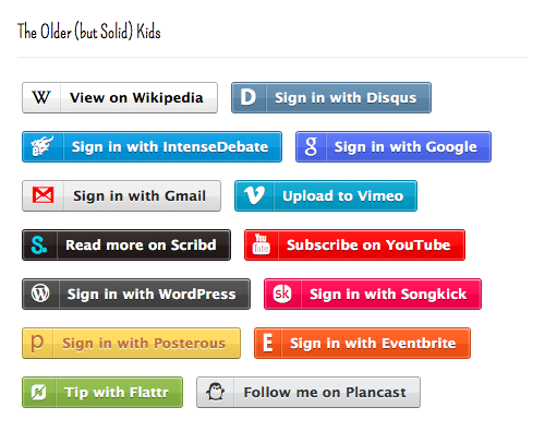
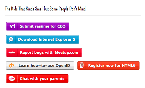
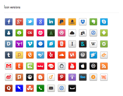
Screenshots of each set are below. Or view a live demo.
Usage
The button set was designed with simplicity and semantics in mind. No unnecessary or extra markup is required, and button types are called through class names. Call the zocial.css file on your page (make sure the font files and the zocial.css file are in the same directory). Buttons can be displayed with the following markup:
<button class="zocial facebook">Sign in with Facebook</button>The parent element is agnostic, so you may use <a>, <div> or <button>.
To choose buttons from the set, include the appropriate class name for the service, such as .dropbox, .linkedin or .twitter.
Icon versions can be displayed by including an extra .iconclass, as follows:
<a class="zocial quora icon">Follow me on Quora</a>More code samples are available on the Zocial page.
Further Reading on SmashingMag:
- Are You Giving Your Users Positive Feedback?
- How Content Creators Benefit From The New SEO
- Why Should Web Design Be A Profession?
- The Organic Ambigram


 Start with a free demo —
 Click here to kickstart your project for free in a matter of minutes.
 Check the frontend report!
 Take a break with a 3D game built on Netlify!
