Combining UX Design And Psychology To Change User Behaviour
Have you ever wondered why your users do not interact with your product the way you hope? Persuading people to perform a particular action, like signing up or buying a product, is a challenge in most industries, especially when you want that action to be performed repeatedly.
As UX practitioners, we try to create the best conditions for users to complete their tasks, and yet even the most usable interface is sometimes not enough to engage users. Why is that?
To understand the reasons behind what drives users to certain behaviours, we need to look at the psychology that underlies the process of initiating and performing a behaviour. Only when we understand the broader mechanisms that guide actions will we be able to create usable interfaces and conduct user-specific research.
In this article, we’ll explain from a psychological perspective what drives behaviour, and we’ll share three tips on how you can use these insights along with UX best practices to change your users’ behaviour.
What Motivates Behaviour Change?
Let’s say you want to create a website or app to help people exercise more, but you are not sure how to motivate users.
In psychology, we distinguish between extrinsic and intrinsic motivation. This means that someone can be driven to do something either by external factors, like the prospect of receiving a reward, such as money, or by internal factors, like the enjoyment derived from doing an activity.
A website or app that encourages people to exercise more might offer a reward whenever a user exercises, thus creating extrinsic motivation for the person to show that behaviour. The Pact app runs with this idea by allowing users to earn money by reaching their health goals.
Research has shown that this approach works well for people who do not enjoy the behaviour (for example, people who don’t enjoy exercising). However, for people who do enjoy the behaviour but would like to improve on it or are not doing it for another reason, giving a reward could actually have a negative effect.
Rewarding someone for an activity they already inherently enjoy might lead to a short–term increase in this behaviour, but as soon as the reward is taken away, the activity is often pursued less than before the reward was given. This phenomenon is called the “over-justification effect”, because the existing reason for a person to do something, such as enjoyment of exercise, is suddenly joined by another reason, the external reward.
Because rewards are a powerful way to get people to change behaviour in the short term, including them is tempting. The website Freeletics, which promotes high–intensity workouts to increase fitness levels, has a popular workaround for the problem of over–justification. The workouts require a basic level of fitness to be completed; therefore, we can assume that users already get some enjoyment out of exercising (otherwise, they probably wouldn’t have achieved a basic level of fitness).
The website still uses extrinsic rewards in the form of stars for completing workouts, but users receive a star only if they perform all exercises in a workout by exactly following a predefined series of actions. So, the reward in this case is linked to performance; the user has to not merely perform the activity but do it well in order to receive the reward. This type of reward has been shown to be very effective and not as prone to the over-justification effect.
Combining Motivation With Ability And Triggers
Unfortunately, motivation is not always enough to initiate a behaviour. You might be highly motivated to go for a bike ride, but you will never convert this motivation into action if you do not have access to a bike.
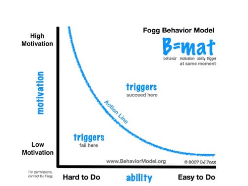
A useful framework for looking at what enables behaviour is BJ Fogg’s behaviour model. The model states that, for a specific behaviour to occur, three elements have to be present at the same time: motivation, ability and triggers. The model assumes that a behaviour is most likely to happen when a person feels sufficiently motivated, is able to perform the behaviour (for example, they want to go for a ride and they have access to a bike) and is reminded to perform it by a trigger.
A trigger can take various forms, such as a notification that reminds the person to go for a bike ride or a visual cue, like a bike helmet lying around. The model, as shown in the graph below, stipulates that triggers work effectively only if the person’s levels of motivation and ability are sufficiently high. Simply reminding someone to go for a bike ride, even if they know how to bike ride and have access to a bike (i.e. their ability is high), will not be effective if it is pouring rain outside and the person has no or very little motivation to do it.

Tips On Changing User Behaviour
While this sounds like a compelling model for a website or app, simply ensuring that the three components are present might not be enough to create a persuasive interface that encourages behaviour change. As we have seen, a user can be motivated in several ways, and what motivates one group (for example, earning money for working out) could have a detrimental effect on another group.
Similarly, ability level likely varies between users, and some might prefer certain triggers to others. To design a successful product, you will need to tailor the three components of the model to your users and thoroughly understand your target audience. The following three tips describe how you can achieve this.
Map Your Users’ Motivations
A psychologist, like any health professional, will always learn about their client before giving any advice. Similarly, if we want to provide a solution for users to change their behaviour, we first have to understand where they are coming from and what motivates them to change their behaviour. This goes beyond asking about simple demographics like age, area code and gender. Why do they want to change their behaviour now and not tomorrow? What have they tried before, and what has worked for them? Are they motivated by extrinsic or intrinsic factors? Only by gaining a deeper understanding of our users and how they will interact with our product will we be able to create an interface that is usable and delivers value.
Customer experience maps, personas and user journeys are useful tools for capturing these insights, and they serve as a great reference throughout the UX and design process. While these maps can help you to identify the motivational component in Fogg’s model, they could also give you hints about your users’ ability levels and effective triggers.
Assess Ability And Lower Barriers
Before launching or revamping a product, answer the following questions. Where will your users most likely be when they use your product? What tasks will they most commonly perform? What mistakes or frustrations might they encounter? How do they feel about their capacity and skills? The answers to these questions will point to the requirements that your interface and product will have to meet.
The best method of gathering this information is contextual inquiry. Here, you would accompany some of your prospective users as they interact with your product (or prototype) in the location where they would naturally use it. So, for the fitness app, you would seek out those runners and join a few of them on their run (good luck taking notes!).
You might think this is a waste of resources and could just as easily be achieved by talking to users after they have used the product; however, as research shows, memories can be tainted and users might not be as open and frank with you as you would hope. A lot of biases can affect the findings of an interview that depends on remembering specific details, and they can easily be avoided through observation.
With the information gathered from observation, you should now have a better idea of your users’ ability to interact with the interface. You should also be able to ensure that tools for the most common tasks are easily accessible to them. And you may have observed users make some errors while interacting with the product.
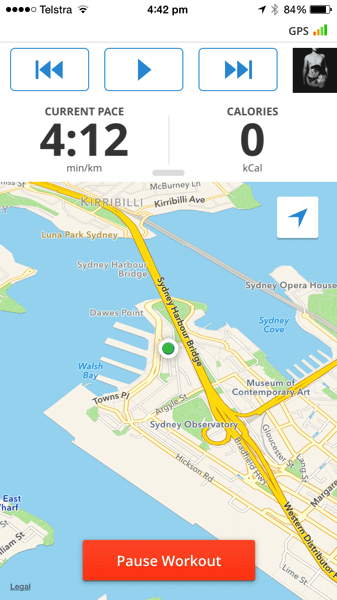
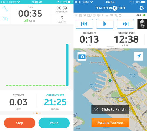
When designing an app to track a run, you might find that users want to be able to pause their workout at a red traffic light and then quickly resume once the light changes. Some apps offer a pause and stop button, like Runkeeper. However, as the user starts running again, they might accidentally tap on stop instead of pause, which could lose the data from the run or require them to cancel the command, leading to frustration. The app Map My Run solves this design challenge by providing only a pause button and requiring users to swipe to indicate completion. Swiping generally requires more effort than tapping and is less likely to happen accidentally. Find out what errors might occur when users interact with your interface, and help them prevent or recover from them.


Identify Triggers
Understanding what motivates your users and how you can adapt your product to their level of ability are two important steps, but how do you convert their good intentions into tangible outcomes and trigger certain behaviour? Thanks to mobile technology, sending notifications at precise times and even locations to direct the user’s attention to your product has become easier than ever. However, with the sheer amount of notifications that users are exposed to, you must use this power wisely to prevent the user from perceiving them as intrusive and possibly turning them off.
Fogg’s behaviour model shows that triggers are most effective when the user’s levels of motivation and ability are sufficiently high. This means that timing is crucial; a notification about your daily exercise routine while you are on your way to work will probably not make you turn the car around, but rather will more likely be perceived as annoying.
The research methods discussed above will give you indicators on when users are likely to engage with your product and where. In addition, usage statistics expand this picture. You may find, if the intended behaviour is to increase time spent exercising, that the majority of users want to exercise before work. Maybe the notifications could be linked to the user’s alarm, and a motivating message could be sent on the day the user plans to work out.
As we’ve seen, users are motivated by different things at different times. Rather than flooding them with triggers, give them control over (and options for) what types of triggers to receive. Some users might want an image they can print and pin in their home, while others might prefer a short message reminding them of their goal. Work with your users to find motivating triggers; after all, you share the same goal: behaviour change.
Conclusion
These are only a few tips and examples of how UX and psychology can be combined to encourage behaviour change. It is not a shopping list for success. Some great websites and apps that are designed to encourage behaviour change already show elements of what we’ve discussed. Having a formal model such as Fogg’s can help you structure research and design processes to ensure that the user’s needs are considered. How are you helping users change their behaviour? Let us know in the comments below!
Further Reading
- “Redefining Hick’s Law,” Jason Gross
- “Advanced Navigation With Two Independent Columns,” Vitaly Friedman
- “Takeaways From Mobile Web Behaviour,” Richard Howe
- “Infinite Scroll: Let’s Get To The Bottom Of This,” Yogev Ahuvia


 Take a break with a 3D game built on Netlify!

 Click here to kickstart your project for free in a matter of minutes.

 Start with a free demo —

