How To Make And Maintain Atomic Design Systems With Pattern Lab 2
The benefits of UI design systems are now well known. They lead to more cohesive, consistent user experiences. They speed up your team’s workflow, allowing you to launch more stuff while saving huge amounts of time and money in the process. They establish a common vocabulary between disciplines, resulting in a more collaborative and constructive workflow.
They make browser, device, performance, and accessibility testing easier. And they serve as a solid foundation to build upon over time, helping your organization to more easily adapt to the ever-shifting web landscape.
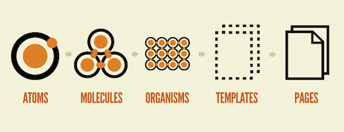
In order to create these systems, we have to establish a Pattern Library in Markdown. We need to break our interfaces down into smaller parts, but we simultaneously need to ensure those parts come together to form a beautiful and functional whole. “Atomic design” is a helpful mental model that helps us do just that, and Pattern Lab is a suite of tools that helps bring these atomic design systems to life.
Further Reading on SmashingMag:
- Taking Pattern Libraries To The Next Level
- Smart Responsive Design Patterns
- An In-Depth Overview Of Living Style Guide Tools
- Meet Inclusive Front-End Design Patterns
After over two years of hard work, we’re happy to announce Pattern Lab 2! Totally reimagined, Pattern Lab 2 is an open-source suite of tools to help you and your team create and maintain thoughtful UI design systems. At its core, it’s a static site generator that stitches together patterns and allows you to design with dynamic data.
A few highlights of the new version include:
- A totally restructured core that supports more languages, templating engines, and data formats
- Supporting Markdown for pattern documentation
- Adding YAML support as well as JSON for managing dynamic data
- Plugins to extend and enhance Pattern Lab’s functionality
- A themable, extendable, redesigned frontend UI
But more than anything, Pattern Lab 2 has been designed and built so your team can effectively use it during every phase of your design system process, from the very beginning all the way through to its long-term maintenance.
Pattern Lab At Project Start
Your team has been tasked with making a new application and underlying design system. Once upon a time, your teams’ UX designers might have holed up in a room to define the product by way of monolithic, heavily-annotated wireframes. Once approved, they’d get passed off to visual designers who would then apply color, typography, and texture to bring the wireframes to life. After homepage_v9_final_forReview_jimEdits_05-12__FINAL.psd finally gets approved, the designs are sent off to the frontend developers, who quickly burst into tears since the designs contain a slew of unrealistic layouts, improbable user content (every username is only 4 characters—how convenient!), and a potpourri of font faces and incongruent design patterns.
The throw-over-the-wall design process is dead and gone. Collaboration, iteration, and quick development are essential for tackling this ever-shifting, diverse web landscape. We need to get into the browser as soon as possible and test designs under real-world variables like responsiveness, performance, ergonomics, and motion. That’s why it’s critical to treat front-end development as a core part of the design process, and why it’s so crucial to get designers and frontend developers working closely together. At the end of the day, we’re all working on the same UI.
Setting up an instance of Pattern Lab on Day 1 of your project can create a shared workshop — or laboratory, if you will — equipped with design and development tools, a watercooler, a whiteboard, and a microscope. It provides a place for each discipline to contribute their perspective to the living, breathing design system. In a real sense, Pattern Lab can serve as the hub of your design system project, minimizing the need to create overly verbose wireframes, red-lined static comps, and other clunky static artifacts.
Sounds great, right? Let’s walk through how you can spin up Pattern Lab on Day 1 of your project.
Pattern Lab 2 comes in both PHP and Node flavors. Teams, choose your adventure! Some projects yield a clear tech-stack choice. Others come down to team skillset or environmental precedence. Whichever the platform, Pattern Lab 2 is poised to help you and your team collaborate on building your new application and design system. Whatever your platform choice, know that with either version Pattern Lab will produce nearly identical results — much like cars of different makes and models all bring you to the same destination.
Installing Pattern Lab
Once the appropriate prerequisites are installed, you’ll be ready to install Pattern Lab. Let’s take a look at how to install Pattern Lab Node, but keep in mind that PHP instructions are also available and are similar.
From your terminal window, navigate to a directory you’d like to install Pattern Lab into. Then type the following commands:
git clone https://github.com/pattern-lab/edition-node-gulp.gitnpm install- Once complete,
gulp patternlab:serve
Running npm install will pull down the latest dependencies, and gulp patternlab:serve will generate and self-host Pattern Lab, opening the frontend in your default browser. And if you don’t wish to clone the git repository directly, you could alternatively download the latest release and then perform steps 2 and 3.
With Pattern Lab up and running, your team now has a hub for which to design, develop, and review your soon-to-be-established design system.
Pattern Lab’s Filesystem
Pattern Lab compiles everything found in your project’s /source folder into static HTML files that live in the /public folder. This output can then be displayed or consumed individually or inside the style guide frontend. Let’s take a look at Pattern Lab’s filesystem and what lives inside of source/:
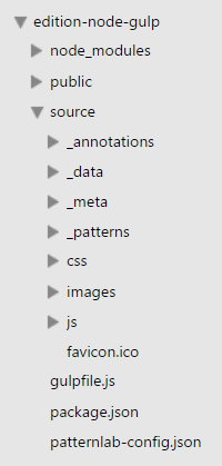
_annotations/- where your team can define living annotations to bolster your UI documentation_data/- where the global data used to render your patterns resides._meta/- where the<head>and foot (which bookend all of your patterns) information resides._patterns/- where your patterns, pattern documentation, and pattern-specific data reside.- css - where your stylesheets can reside
- images - where your images can reside
- js - where your javascript can reside
It’s worth stressing that Pattern Lab doesn’t force any frontend conventions or production dependencies onto you. How you decide to structure your folders and which technologies you choose is totally up to you. If you want to call your folder /stylesheets instead of /css go for it! Want to use Sass? Nice! Love jQuery? Great! Hate it? That’s fine too! Pattern Lab simply exists to stitch your patterns together and gets out of the way of any frontend decisions you make. You can even configure how your assets are managed as they travel from from source/ to public/.
Choose Your Own Adventure: Naming Conventions and Configuration
Atomic design is a helpful mental model to think about constructing UI design systems, but it’s certainly not rigid dogma. It’s important to choose a nomenclature that helps your team speak the same language and do great work together.
Pattern Lab’s naming conventions, like most aspects of the software, are entirely configurable. While Pattern Lab patterns/ folder defaults to “atoms”,”molecules”, “organisms”, “templates”, and “pages, you’re free to modify, remove, or add to your heart’s desire. For instance, if we were to recreate GE’s Predix design system’s taxonomy — which consists of Principles, Basics, Components, Templates, Features, and Applications — we would structure Pattern Lab’s /source/_patterns/ directory to be as follows:
    /00-Principles/

    /01-Basics/

    /02-Components/

    /03-Templates/

    /04-Features/

    /05-Applications/
Pattern Lab is designed to conform to your workflow, not the other way around.
Establishing Design Direction
Even during the first days or hours of a project, everyone has something to contribute to your Pattern Lab. This is a time for exploring, figuring things out, and creating alignment. Each role conducts different activities, but their output and input is linked. Each is inflating a separate tire of the vehicle that will get you all to your destination.
Defining lo-fidelity IA in Pattern Lab
Early UX design work involves determining the application’s information architecture. Rather than immediately reaching for high-fidelity wireframe tools that tend to prematurely define layouts and technical functionality, it’s better to create lo-fi sketches that establish what goes on a particular screen and in what general order. This work can take the form of napkin sketches, bulleted lists, or spreadsheets. Since Pattern Lab supports basic markup, it’s possible to quickly translate these content reference diagrams into the browser right away. For the Pittsburgh Food Bank redesign, we stubbed out the each template using this approach.
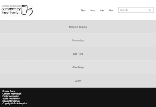
So the homepage template code, found in /source/_patterns/templates/homepage.mustache looks like this:
{{> organisms-header }}

<div class="fpo">Mission Statement</div>

<div class="fpo">Campaign</div>

<div class="fpo">Get Help</div>

<div class="fpo">Give Help</div>

<div class="fpo">Learn</div>

{{> organisms-footer }}
We’re including a header and footer pattern, and then simply stubbing out the content we’re anticipating to include on this page.
Capturing Visual Design Decisions
Early visual design work involves exploring typography, color palettes, and other aspects of the visual brand. Historically, designers might leap into creating high-fidelity, desktop-centric Photoshop mockups, designers now have helpful tools like style tiles, Typecast and element collages to establish visual design direction without resorting to premature, high-fidelity comps.
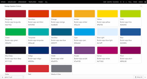
As decisions get made around color palettes and font pairings, Pattern Lab can capture the results of those design decisions, ensuring the design and development team aren’t unintentionally generating 50 shades of gray.
Becoming a Frontend Prep Chef in Pattern Lab
And then there’s frontend code. In these early stages of a project, frontend developers may be tempted to sit tight and wait for designers to come up with a direction before diving into code. But this type of thinking keeps designers and developers out of sync with each other and prevents true collaboration from happening.
Like prep chefs at a restaurant, developers have a huge opportunity to get to work prepping the patterns and code that will ultimately become the final design system. In the early days of the project, developers can begin stubbing out patterns and and importing assets into Pattern Lab, getting things set up early so designers and developers can spend more time actually working together to design and build the UI.
Color palettes, real copy, and layout have yet to be established, but that shouldn’t stop developers from scaffolding the structures that support the content wireframes. Take a hero pattern, for example:
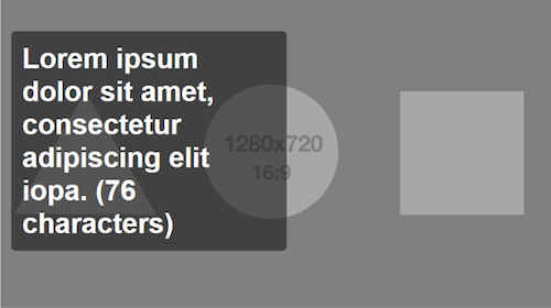
This pattern includes other patterns, which is a powerful way to consume smaller interface elements into ever-larger structures. Here’s the markup for block-hero.mustache:
<a href="{{ url }}" class="c-block-hero">
    {{> atoms-hero-img }}

    <h2 class="c-block-hero__headline">{{ headline.medium }}</h2>

</a><!-- end c-block--hero-->
The double curly bracket code ({{}}) is Mustache templating code, which allows us to define dynamic content and include patterns inside one another. For example, the code {{> atoms-hero-img }} tells Pattern Lab to look for an atom called “hero-img” and include it in the pattern. The hero unit itself can then be included in more complex patterns using the same include convention using the following: {{> molecules-hero }}.
This Russian nesting doll approach to including patterns allows your codebase to stay nice and DRY, meaning that if you make an edit to any particular pattern, anywhere that pattern is included will be updated automatically. This keep your designs and codebase in sync and consistent. And on top of all that, this continual build up of patterns can yield near-complete interfaces in short order!
Rolling Up Our Sleeves
The information architecture has started to take shape, the initial aesthetic direction has been established, and nascent patterns have been stubbed out in Pattern Lab. Now the team can now collectively dive into building out the interface design system in earnest. Let’s discuss how to use Pattern Lab to turn a vague sense of direction into a beautiful, functional, thoughtful, and complete design system.
Designing with Dynamic Data
One important concept of atomic design is the differences between templates and pages. Templates define the underlying content structure of a UI, while pages are specific instances of those templates that replace that content structure with real representative content. Both are necessary to document content parameters while also showing the design patterns in action and populated with real content.
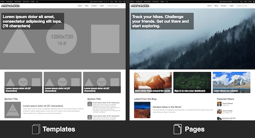
One of the most powerful Pattern Lab features is the ability to swap in different representative content into your UI patterns to ensure they can handle the dynamic nature of your content. What if your user doesn’t upload a profile picture? What if the user has 13 items in their shopping cart versus 2 items? What if one of those products has 14 potential variations? What if the blog post title contains 400 characters? Return user? First-time user? What if the article has no comments? Or what about when it has seven layers of nested comments? What if we need to display an urgent message on the dashboard when their account is hacked? Pattern Lab allows you to manipulate data to express any number of various UI states and variants of any template.
Page-Specific Data
Initial data in Pattern Lab is stored in a file called /source/_data/data.json, which contains the data that patterns will initially consume to be displayed in the style guide and template views. Your default data.json may look something like this:
{
   "headline" : {
        "short" : "Lorem ipsum dolor sit (37 characters)",
        "medium" : "Lorem ipsum dolor sit amet, consectetur adipiscing elit iopa. (76 characters)"
    },
    "url": "#",
    "imgHero" : {
        "src": "../../images/fpo_hero-opt.png",
        "alt": "Hero Image"
    },
    "imgLandscape" : {
        "src": "../../images/fpo_16x9-opt.png",
        "alt": "Landscape Image"
    },
    "mediaList": []
}
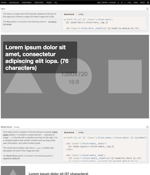
You can reference these pieces of data in your patterns (i.e. including {{ headline.short }} in a pattern) to achieve results like this:
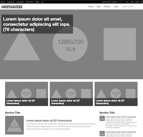
data.json. (Large preview)At the page level, we want to replace those grayscale images and lorem ipsum placeholder text with real content. To accomplish this, we’ll make a new file right next to /source/_patterns/pages/homepage.mustache called homepage.json, where we can override the initial data defined in `data.json. That might look something like this:
"imgHero" : {
      "src": "../../images/sample/hero-forest.jpg",
      "alt": "Forest"
    },
    "headline" : {
        "medium" : "Track your hikes. Challenge your friends. Get out there and start exploring."
    },
    "toutList" : [
      {
        "url": "link.pages-blog-detail",
        "headline": {
            "short" : "Best winter hikes around the world"
        },
        "imgLandscape" : {
          "src": "../../images/sample/tout-winter-hiker.jpg",
            "alt": "Hiker with back pack walking in snow"
        }
      },
      {
        "url": "link.pages-login",
        "headline": {
            "short" : "Sign in to view your dashboard"
        },
        "imgLandscape" : {
          "src": "../../images/sample/tout-leaves.jpg",
            "alt": "Green Leaves"
        }
      },
      {
        "url" : "link.pages-about",
        "headline": {
            "short" : "Learn about our mission"
        },
        "imgLandscape" : {
          "src": "../../images/sample/tout-mountains.jpg",
            "alt": "Mountain"
        }
      }
    ]
This results in a UI that looks like this:
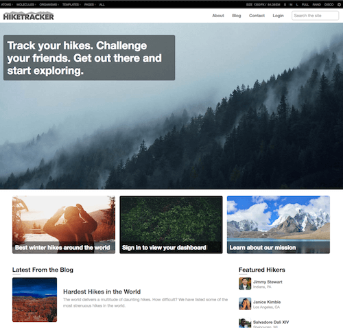
homepage.json and overrides the default data defined in data.json to render a UI that would be similar to what users would interact with. This stage is obviously important as it’s what the end user will likely see, but it also is critical for testing the resiliency of the underlying patterns that make up the UI. (Large preview)Pseudo-Patterns
Our design systems need to be flexible and adapt to the reality of the content that lives in our applications. We need to concurrently account for the best-case situations, the worst, and everything in between.
Expressing these UI variations in static design tools is an exercise in tediousness and redundancy, which may explain why they’re rarely designed. But Pattern Lab’s pseudo-pattern feature allows us to articulate (sometimes wildly) different scenarios with just a few changes to our data.
Let’s say we’re making a hike-tracking app whose dashboard displays a list of hiking statistics: elevation climbed, number of trails hiked, steps taken, and so on. For an active user who has been consistently inputting content into the app, the UI might look something like this:
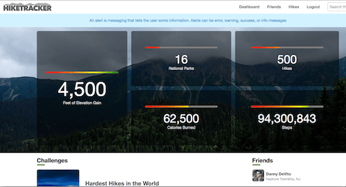
In /source/_patterns/pages/dashboard.json, our data would look something like this:
{
  "blockFeature":{
    "number":"4,500",
    "headline":{
      "short":"Feet of Elevation Gain"
    },
    "progress":{
      "max":"100",
      "progressValue":"100",
      "label":"Progress: 100%"
    }
  },
  "tileList":[
    {
      "number":"16",
      "headline":{
        "short":"National Parks"
      },
      "progress":{
        "max":"100",
        "progressValue":"20",
        "label":"Progress: 20%"
      }
    },
    {
      "number":"500",
      "headline":{
        "short":"Hikes"
      },
      "progress":{
        "max":"100",
        "progressValue":"40",
        "label":"Progress: 40%"
      }
    },
    {
      "number":"62,500",
      "headline":{
        "short":"Calories Burned"
      },
      "progress":{
        "max":"100",
        "progressValue":"60",
        "label":"Progress: 60%"
      }
    },
    {
      "number":"94,300,843",
      "headline":{
        "short":"Steps"
      },
      "progress":{
        "max":"100",
        "progressValue":"80",
        "label":"Progress: 80%"
      }
    }
  ],
  ...
}
With this data, Pattern Lab is able to populate the UI with this user’s wealth of generated content.
However, this scenario may not be all that common. For every ambitious user who takes the time to populate every field and connect every available application, there are likely to be dozens of casual users who don’t fill in every blank and take advantage of all the app’s features. For that matter, at one point in every user’s journey, they are entirely new to the interface! Let’s articulate these important variations using Pattern Lab’s pseudo-pattern feature.
In our /source/_patterns/pages/ directory, we can create a new pseudo-pattern called dashboard~new-user.json. This will create another instance of the page that inherits all the data from dashboard.json, but also allows us to further modify or extend the data. In the case of dashboard~new-user.json, we can override bits of a data to demonstrate what a new user experience might look like:
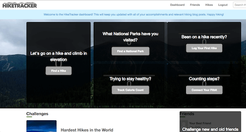
And here’s the data we’re adding to the file to accomplish this UI:
{
  "blockFeature":{
    "styleModifier":"featured",
    "number":"0",
    "headline":{
      "short":"Feet of Elevation Gain"
    },
    "progress":{
      "max":"100",
      "progressValue":"0",
      "label":"Progress: 0%"
    },
    "overlay":{
      "overlayMessage":"Let's go on a hike and climb in elevation",
      "overlayAction":"Find a Hike"
    }
  },
  "tileList":[
    {
      "number":"0",
      "headline":{
        "short":"National Parks"
      },
      "progress":{
        "max":"100",
        "progressValue":"0",
        "label":"Progress: 0%"
      },
      "overlay":{
        "overlayMessage":"What National Parks have you visited?",
        "overlayAction":"Find a National Park"
      }
    },
    {
      "number":"0",
      "headline":{
        "short":"Hikes"
      },
      "progress":{
        "max":"100",
        "progressValue":"0",
        "label":"Progress: 0%"
      },
      "overlay":{
        "overlayMessage":"Been on a hike recently?",
        "overlayAction":"Log Your First Hike"
      }
    },
    {
      "number":"0",
      "headline":{
        "short":"Calories Burned"
      },
      "progress":{
        "max":"100",
        "progressValue":"0",
        "label":"Progress: 0%"
      },
      "overlay":{
        "overlayMessage":"Trying to stay healthy?",
        "overlayAction":"Track Calorie Count"
      }
    },
    {
      "number":"0",
      "headline":{
        "short":"Steps"
      },
      "progress":{
        "max":"100",
        "progressValue":"0",
        "label":"Progress: 0%"
      },
      "overlay":{
        "overlayMessage":"Counting steps?",
        "overlayAction":"Connect Your Fitbit"
      }
    }
  ]
}
By overriding some of the values in dashboard.json we’re able to modify the content and turn on/off particular patterns.
In another instance, we may need to demonstrate what the UI looks like when there’s a security issue or some other problem with the user’s account. We can create the dashboard~hacked.json pseudo-pattern to create the following UI:
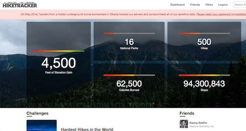
Most of the data from dashboard.json will stay the same, but we’ll add the following to create the error message:
{
    "alert" : {
        "alertClass" : "error",
        "alertText" : "On May 22nd, hackers from a hidden underground tunnel somewhere in Siberia hacked our servers and compromised all of our sensitive data. <a href='#'> Please reset your password immediately!</a>"
    }
}
Pattern Parameters
There are times when using Pattern Lab that warrant full pseudo-patterns, as illustrated above. But sometimes you may need to tweak or override only a single data value within a pattern, leaving the rest to be handled by the other dynamic display patterns. For these instances, pattern parameters are your tool of choice. Pattern parameters are a simple mechanism for replacing variables in an included pattern. They are limited to replacing variables in the included pattern and only the included pattern. Consider this excerpt of the detail template:
...
<div class="l-sidebar">

    {{# latestPosts }}

    {{> organisms-section-media-list }}

    {{/ latestPosts}}

    {{# featuredPeople }}

    {{> organisms-section-media-list }}

    {{/ featuredPeople}}

</div><!--end .l-sidebar-->

...
which is includes the section media list pattern.
<section class="c-section">
    {{# sectionTitle}}
    <h2 class="c-section__title">{{ sectionTitle }}</h2>
    {{/ sectionTitle }}

    {{> organisms-media-list }}

{{# textButton }}
    {{> atoms-text-button }}
    {{/ textButton }}

{{# overlay }}
    {{> molecules-overlay }}
    {{/ overlay}}
</section><!--end section-->
As we’ve learned, {{sectionTitle}} for both the latestPosts and featuredPeople data blocks will populate from any companion .json present, with /source/_data/data.json as the global fallback. We are including a single pattern multiple times, however, and may want to quickly supply unique data to each pattern without having to create these keys in our .json. We can change the included section media lists to the following:
...

<div class="l-sidebar">

    {{# latestPosts }}

    {{> organisms-section-media-list(sectionTitle: "The latest from the moleskine") }}

    {{/ latestPosts}}

    {{# featuredPeople }}

    {{> organisms-section-media-list(sectionTitle: "Staff Hikers") }}

    {{/ featuredPeople}}

</div><!--end .l-sidebar-->

...
These two organisms will now use the sectionTitle variable defined here when rendering. Pattern parameters are powerful, but are only supported by the PHP and Node Mustache PatternEngines. Other template languages provide better solutions to this problem. Check out the docs to read the full skinny on parameters parameters.
styleModifiers
Often you’ll find yourself wishing to display stylistic variants of the same pattern, such as colored social media buttons or component states. An extension to the shorthand include syntax, styleModifiers supply additional classes to a pattern. Provided you construct a pattern block-media with {{ styleModifier}} within the class attribute:
<a href="{{ url }}" class="c-block-media c-block-media--{{ styleModifier }}">

    <div class="c-block-media__media">

        {{> atoms-square:c-block-media__img }}

    </div>

    <div class="c-block-media__body">

        <h2 class="c-block-media__headline">{{ headline.short }}</h2>

        <p class="c-block-media__excerpt">{{ excerpt.medium }}</p>

    </div><!-- end c-block-media__body -->

</a><!-- end c-block-media -->
Including this pattern with a colon after the name sets the styleModifier:
{{> molecules-block-media:fullBleed }}
would yield an anchor tag like this:
<a href="path/to/url" class="c-block-media c-block-media--fullBleed">
styleModifiers can be combined to supply multiple classes, using pipe (|) as a delimiter.
{{> molecules-block-media:fullBleed|is-lazyLoaded }}
Between pseudo-patterns, pattern parameters, and styleModifiers, Pattern Lab makes it easier to demonstrate sometimes wildly different UI variations while keeping the underlying codebase DRY in the process.
Iterating in Style
A key element of a pattern-based workflow is embracing iteration and recognizing that patterns and the design will continue to evolve. The parts will shape the whole, the whole will shape the parts, and the interconnected system of components will emerge as a result of this process.
Another natural consequence of this process is that the point of production shifts from the hands of UX and visual designers into the hands of frontend developers much earlier. Rather than burning a lot of precious time creating a slew of high-fidelity comps and detailed wireframes, design work can move from static documents into browser where your team can sooner address the realities of the web.
With Pattern Lab as the watering hole for the whole team, designers can better understand how decisions made in one area affect other areas.
Viewport testing with ish.
It’s important for our components, as well as our pages, to be flexible across the entire resolution spectrum. Baking a viewport resizing tool like ish. into a pattern library ensures each element looks and functions beautifully at any screen size. Taking the time to craft fully flexible patterns will better prepare us for a future when element queries and web components have fully matured (we can’t wait!).

By having these viewport tools baked right into the frontend environment, designers and developers can huddle around Pattern Lab to determine where to insert breakpoints into the design. Moreover, clients, QA, and other colleagues can pinpoint specific areas where the UI falls apart for whatever reason.
Ready To Launch
The project is coming together nicely, but before it can be launched into the world things need to be tightened up, cross-browser/device tested, and properly documented. Let’s talk about how Pattern Lab can help get your design system code and documentation ready for prime time!
Approachable Pattern Documentation
Some patterns may present themselves as self-documenting, but a pattern often requires some context or additional information to make things crystal clear. Things like definitions. usage guidelines, considerations, resources, and example images can and should find their way into pattern documentation. Pattern Lab 2’s documentation uses Markdown with YAML front matter to create this documentation. The markdown file accompanies the pattern (for example, media-object.md must sit right beside media-object.mustache), and can be formatted like this:
---
title: Utility Colors
---
The utility color palette defines colors that are used to convey meaning such as success, error, warning, and information to the user. These colors should be used for things like alert messages, form validation, tooltips, and other kinds of messaging.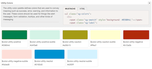
Markdown documentation means that IAs, visual designers, content strategists, business folks, etc can more easily contribute to living documentation. Product owners could even stub in functionality notes for new patterns before the pattern is even created. Improvements are planned to make pattern documentation more powerful, further making Pattern Lab an evergreen space for your team.
Lineage for Easier QA
When looking at various patterns in a library, the lack of context can make it difficult to discern where they actually get used. Defining and describing pattern characteristics is one thing, but there’s an opportunity to provide additional contextual information about your UI patterns.
Thanks to the Russian nesting doll nature of Pattern Lab, it can display what patterns make up any given component, and also show where that pattern is consumed in the design system.
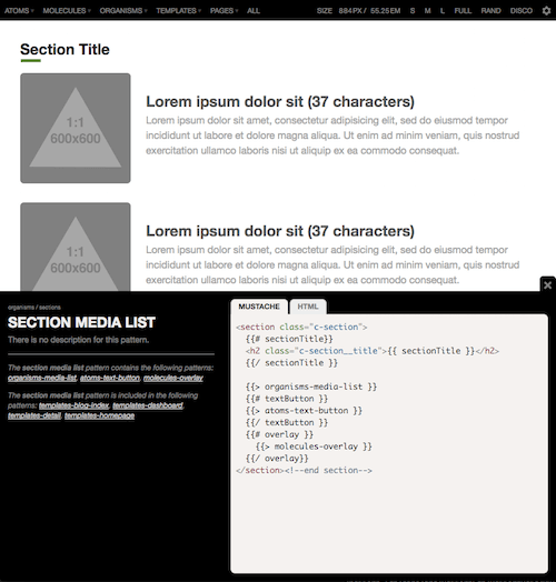
Thanks to this feature, designers and developers have contextual information that comes in handy when QAing and/or making changes to the design system. If we wanted to make changes to a particular pattern, like doubling the size of the image or adding an additional text element, we’d immediately know which patterns and templates would need re-tested and QA’d to ensure nothing breaks with the changes. The lineage feature also helps point out unused or underutilized patterns so that teams can weed them out of the pattern library.
Showing Progress with Pattern States
Taking the concept of pattern lineage a step further, you and your team can keep track of each pattern’s progress and how it affects the whole system. Pattern Lab’s pattern state feature can track progress of a pattern from development, through review, to completion. With pattern states, you’ll always be able to answer “Are all the patterns that comprise this template complete?”
To give your pattern a state, you add a state to the frontmatter in that pattern’s documentation file. For instance:
---
title: Block Media
state: inreview
---
The media block consists of...
Applying this status will present the pattern state in a couple places across Pattern Lab.
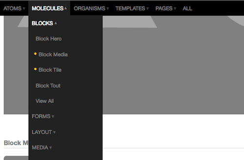
It’s important to note that the state of a pattern can be influenced by the patterns it contains. Flagging a pattern like {{> molecule-media-block }} as inreview will cause a ripple effect anywhere that pattern is included. This helps identify bottlenecks that need addressed in order to bring your design system home.
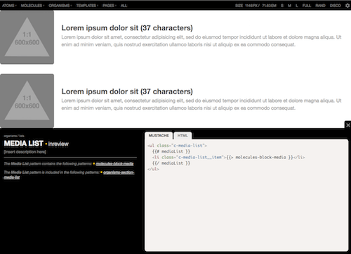
media-block pattern is flagged as incomplete, then any pattern that includes it will also be flagged as incomplete. (Large preview)You can create your own pattern states that match your team’s workflow. These methods of understanding the state of your patterns can help larger teams keep track of the airplane as it’s being built and flown at the same time.
Maintaining An Effective Design System
"The biggest existential threat to any system is neglect." – Alex Schleifer, Airbnb
There is a very real risk that despite your team’s best intentions, your carefully-crafted design system and pattern library will slip into oblivion. “Never!” you exclaim, but unfortunately design system efforts fall into a state of disrepair for a number of reasons:
- The level of effort required to keep pattern code up to speed with applications’ code bases is too high
- The pattern library is thought of as mere documentation rather than as housing a living, breathing system.
- The team fails to make the design system a key part of their workflow, and instead lets their process devolve into a series of hotfixes and ad hoc changes.
- One discipline serves as gatekeepers to the pattern library, preventing it from becoming a helpful resource for every discipline
- The pattern library isn’t visible or attractive
- Many other factors (lack of funding, technology mismatches, lack of governance model, and more)
As Nathan Curtis rightly says, making a design system isn’t just another project, but rather a product meant to serve your organization’s sites and apps. To create a system that serves your organization for years to come, your UI design system needs to be properly maintained, serve as an essential resource for the organization to keep coming back to, and continue to be a core part of your team’s design and development workflow.
Pattern Lab has always been an effective tool for creating UI design systems, but has historically lacked in the maintenance department. Thankfully, that’s all changed with Pattern Lab 2. The new version has many features that helps you successfully document and maintain your pattern libraries while continuing to serve as a key tool in your pattern-driven design and development process.
Seeking the Holy Grail
It’s critical to reduce the amount of effort and friction required to keep both your pattern library and production environments up to date. The Holy Grail of design systems is an environment where changes to patterns in a design system are automatically updated in both the pattern library and production environments.
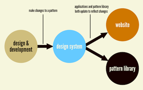
The Holy Grail is often accomplished by using a frontend templating language to serve as the bridge between your pattern library and production environments. Pattern Lab 2’s architecture now makes it possible to choose the templating engine that’s right for your particular environment. As a result, you’re able to get closer to achieving the Holy Grail. For instance, the team at Phase2 Technology have successfully integrated Pattern Lab 2 into their Drupal builds so that their clients’ pattern libraries and production builds are always in step with one another.
“By using the same templating engine, along with the help of the Component Libraries Drupal Module, the tool gives Drupal the ability to directly include, extend, and embed the Twig templates that Pattern Lab uses for its components without any template duplication at all!”– Evan Lovely, Phase2 Technology
Currently Pattern Lab 2 supports the popular Mustache and Twig templating engines, but the decoupled nature of Pattern Lab 2’s editions (more on these in a bit) means that you can power Pattern Lab using the templating engine of your choice.
A Helpful Resource
Your pattern library and accompanying style guide should be something that your team comes back to reference again and again. While it may not make sense to immediately surface code snippets and pattern usage information during the initial design and development process, design system users will find themselves reaching for these things as they apply the design system to actual applications. Pattern Lab 2 now has more advanced config options that let you switch on pattern info by default to become a more helpful documentation and reference tool.
In order for your design system to thrive across your entire organization, it should be approachable and attractive. Pattern Lab 2 allows you to create your own custom front page for the component library, and also skin Pattern Lab’s (intentionally bare bones) default UI to better serve your brand.
Doing It All Again
There are some teams that need only to set up and maintain a single design system, but many of us work on multiple projects for multiple clients. Wouldn’t it be great to start new design system projects from a setup that’s tuned to your workflow and tool choices?
Pattern Lab 2 has been re-architected to achieve just that. No longer is Pattern Lab a standalone tool, but rather it’s an ecosystem built atop a core library. These changes will also make it easier for the Pattern Lab team to push out new features.
Pattern Lab Editions
Editions let teams and agencies bundle all the things that support their unique workflows with Pattern Lab. An Edition can become the starting point for all of your projects while teams share and update functionality. The Node version of Pattern Lab uses npm to pull in separate components, while PHP version uses Composer to help you kick off your projects in a simple and standardized way.
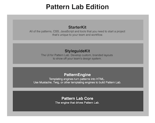
Pattern Lab Core
Core is the guts of Pattern Lab and enables all of the other features. Because Core is standalone a team can update and stay current with the latest Pattern Lab features without disrupting the rest of their project.
StarterKits
Have a trusty set of boilerplate code that you start every project with? Perhaps a common set of basic patterns, Sass mix-ins, and JavaScript libraries that are your go-to tools? A StarterKit is perfect for bundling these assets together into a boilerplate that makes sure each project starts off on the right foot.
Several starterkits alreadyexist to kick your project off, whether you’re looking for a blank start, begin with a demo that showcases Pattern Lab’s features, or start with a popular framework like Bootstrap, Foundation, or Material Design. And you can roll your own, which can be fully version-controlled so your team’s StarterKit can evolve along with your tools.
Importing a starterkit is only a few keystrokes away after installation. Eventually this feature will be built into a post-install phase like it is for Pattern Lab PHP via composer.
StyleguideKits
StyleguideKits are the front-end of Pattern Lab. We call this “The Viewer.” StyleguideKits allow agencies and organizations to develop custom, branded Pattern Lab UIs to show off their patterns.
PatternEngines
PatternEngines are the templating engines that are responsible for parsing patterns and turning them into HTML. PatternEngines give Pattern Lab Core the flexibility to render many different types of template languages. Current PatternEngines include Mustache and Twig, with others like Handlebars and Underscore in development. And there’s no stopping you from adding another templating engine to Pattern Lab.
Plugins
Plugins allow developers to extend Pattern Lab Core and other parts of the ecosystem. For example, the PHP version of Pattern Lab has a number of plugins like Browser Auto-Reload, Data Inheritance, and Faker. Pattern Lab’s architecture allows developers to modify data at different stages, add their own commands or pattern rules, or change the front-end to modify and extend Pattern Lab’s capabilities
Watch My Talk
Give Pattern Lab 2 A Try, And Get Involved
Creating pattern-driven user interfaces and sophisticated design systems is more important than ever. Pattern Lab 2 is well equipped to create and maintain atomic design systems, and can serve as a hub for your design system through every step of your team’s workflow.
If your team decides to download Pattern Lab 2 and give it a try, we’d love to hear from you! Join the conversation by asking questions on Gitter, open issues if you’re struggling with something, and help propose & discuss new features.
And if you make cool things with Pattern Lab 2, please share your insights! Styleguides.io has over 150+ examples of pattern libraries, so add your Pattern Lab to the mix. The beauty of the web and open source projects is that the entire community can learn from your experience and build upon that knowledge.
We’re excited to see what great things you create!
 (vf, il)


 Get a Free Trial
 Try if for free!

 JavaScript Form Builder — Create JSON-driven forms without coding.

