Figma Vs Sketch: The Showdown
The past year has seen quite a rise in UI design tools. While existing applications, such as Affinity Designer, Gravit and Sketch, have improved drastically, some new players have entered the field, such as Adobe XD (short for Adobe Experience Design) and Figma.
For me, the latter is the most remarkable. Due to its similarity to Sketch, Figma was easy for me to grasp right from the start, but it also has some unique features to differentiate it from its competitor, such as easy file-sharing, vector networks, “constraints” (for responsive design) and real-time collaboration.
In this article, I’d like to compare both apps in detail and highlight where each of them shines.
Platform
The greatest weakness of Sketch has always been its lock-in to the Apple ecosystem. You need a Mac not only to design with it but also to open and inspect files. If you are on Windows or Linux, you’re out of luck. (Technically, you could get Sketch running on Windows, as Martijn Schoenmaker and Oscar Oto Mir describe, but it might not be worth the hassle for some.) That’s why, over time, a few paid services have emerged that enable you to provide teammates with specifications of Sketch files, but that’s still an unfortunate extra step.
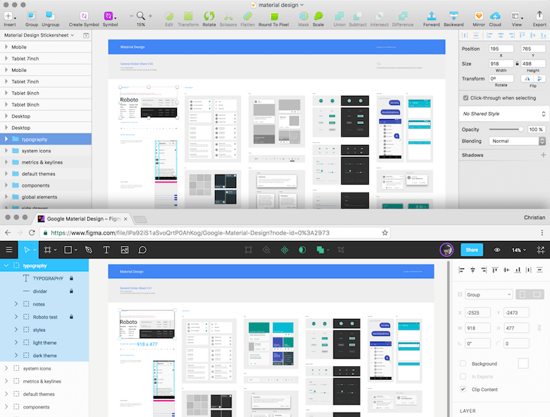
That’s probably one of the reasons why Figma took a different route right from the start: It can be used right in your web browser, on basically any device in the world. No installation whatsoever needed: Just open Chrome (or Firefox), set up an account and start designing. While I’ve been hesitant with browser-based tools before, Figma blew my doubts away in a single stroke. It’s as performant as Sketch (if not more), even with a multitude of elements on the canvas.
Even standalone desktop apps of Figma for Windows and Mac are available, but basically, they are no more than wrappers of the browser version. While they give you better support for keyboard shortcuts, they don’t save you from having to be online all the time.
Winner: Figma
Why: It is platform-independent.
Usability (Features And User Interface)
Basically, Figma can be best described as an in-browser version of Sketch. It offers mostly the same features, the interface looks similar, and even the keyboard shortcuts are mostly taken from its competitor. If you knew Sketch already, you could have easily found your way around Figma when it was released at the beginning of 2016.
Figma has improved on many aspects since then, and has even surpassed Sketch in parts, but some features are still missing, such as plugins, integration with third-party tools and the ability to use real data (with the help of the Craft plugin). Nevertheless, at the pace Figma is improving, it may be just a matter of time before it’s on par with Sketch.
Winner: A draw
Why: At the moment, they don’t differentiate enough. But still, Sketch is more mature, offers more odds and ends to make you more productive.
Pricing
Sketch initially started with a one-time fee of around $99 USD for each new major version. But having finally realized that this business model is not sustainable, Bohemian Coding has recently changed its pricing to a kind of subscription-based model: For $99 USD, you get one year of free updates. After that, you can keep using the app as is or invest the same amount of money to get another year of updates.
This price increase might seem inappropriate at first, but what’s $99 for your main tool as a designer? Right, not much, and still cheaper than Adobe’s Creative Cloud subscription price. (Also, note that when you stop paying for your Creative Cloud subscription, you cannot keep using any of the Adobe CC apps, whereas your existing version of Sketch will continue running with no problems at all.)
For the time being, Figma is still free to use for everybody, but that might change later this year. I’d bet that it will also be subscription-based, with a monthly fee of around $10 to $15 USD (don’t hold me to that, though). One thing’s for sure: Figma will always be free for students (similar to how Sketch offers a reasonable discount to students and teachers).
Winner: A draw
Why: No word yet on the pricing of Figma.
Collaboration Features
The main differentiator of Figma is probably the real-time collaboration feature, called “multiplayer.” It allows a user not only to edit a file at the same time as others but also to watch somebody else fiddle around in a design and communicate changes with the built-in commenting system. For one, this simultaneous editing is great for presentations and remote teams, but it also ensures that everyone involved sees the same state, and it prevents unintended overwrites.
Sketch doesn’t offer anything like that (not even with the help of plugins), and it’s probably the better for it. Designers are skeptical of this feature, and rightly so, because it can lead to the dreaded “design by committee” and to a mentality of “Make this button bigger. No, wait! I’ll just do it by myself!” Of course, I’m exaggerating a bit here. This feature can be somewhat valuable, but it has risks if you don’t set certain rules up front.
Winner: Figma
Why: Allows multiple people to work on the same file at the same time.
File Sharing And Spec’ing
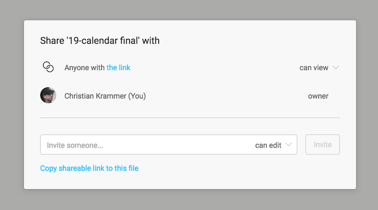
Somewhat related to real-time collaboration is the sharing of design files. Because everything in Figma happens in the browser, every file naturally has a URL that you can send to your peers and bosses (in view-only mode, too). Another huge advantage of this browser-based approach is that everybody, developers foremost, can open a design and inspect it right away, with no third-party tool needed.
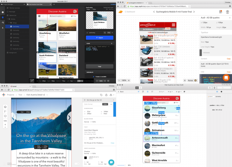
That’s exactly what you need in Sketch in order to offer teammates all of the necessary information on a file, such as font sizes, colors, dimensions, assets and so on. However, as mentioned, to help you here, you’ll need paid tools such as Zeplin, Sympli, InVision’s Inspect, Avocode or Markly. To be fair, the first three are free for a single project, but that might not be enough when you’re working on more complex stuff.
If you need more or don’t want to invest money in such (admittedly basic) functionality, there are also the free plugins Marketch and Sketch Measure. Many paid apps also allow you to add comments and create style guides automatically.
Alternatively, you could even import your Sketch files into Figma and inspect them there, because Figma supports the Sketch file format.
If you just need to let your teammates have a look at a design, then the built-in Sketch Cloud does exactly that. To view a design on your iOS device, you have Sketch Mirror and Figma Mirror; for an Android device, you can use Mira and Crystal. Figma doesn’t offer an Android-based app, but opening www.figma.com/mobile-app on the device after selecting a frame or component (on your desktop computer) will give you a kind of preview.
Winner: Figma
Why: Files are easily shareable, right in the browser, without the need for a third-party tool.
Organizing Files
Thanks to the organizational capabilities that Sketch gives with its pages, you can design an entire app or website in a single file, and switch between its pages quickly. Figma is left behind here: It doesn’t provide pages, but you can at least combine files into a project.
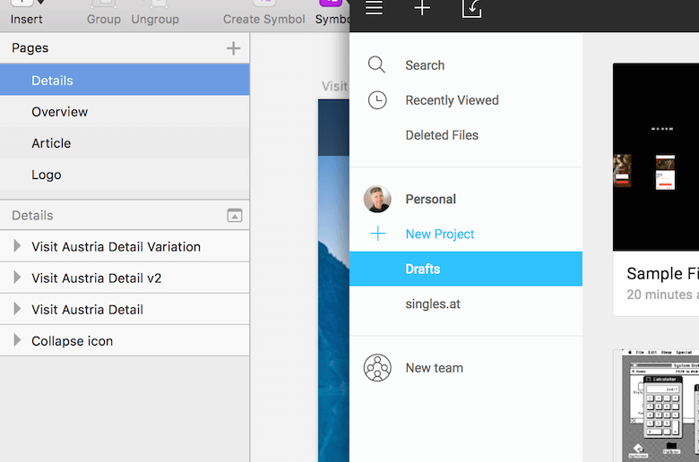
Another important concept of Sketch — artboards — has been taken on as well, but in an enhanced form. In Figma, you can apply fills, borders and effects to artboards, and they can also be nested and be easily created from groups. For one, this allows for containers of elements that are bigger than their combined bounds, which can be helpful for the “constraints” functionality. Furthermore, each artboard can have its own nested layout grid, which helps with responsive design.
It’s worth mentioning that Sketch also allows you to nest artboards, but the implementation is not nearly as powerful as Figma’s.
Winner: A draw
Why: Sketch has pages, but Figma’s artboards (frames) are more powerful.
Responsive Design
A feature that Figma introduced (and that Sketch followed with months later) is responsive design, or the ability to set how elements respond to different artboard or device sizes. There have been plugins that offer such functionality in Sketch, but they’ve always felt a bit clunky. Only the native “group resizing” feature has been easy to use, competing with Figma’s “constraints” feature.
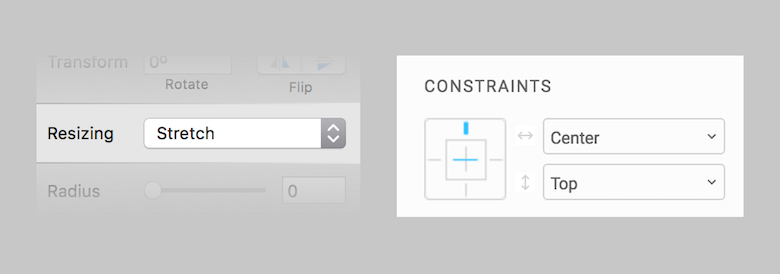
They do basically the same thing but are very different in execution. In Sketch, you just have a dropdown menu with four options, and it can be a bit hard to imagine what they do. Figma offers a more visual way to define these properties; for example, to pin an element to the edge of an artboard or to let it resize proportionally.
A huge advantage of Figma is that these constraints work in combination with layout grids. Elements can be pinned to certain columns (or rows), for example, or take on their relative width. Furthermore, you are able to change these settings independently for each axis, and they work not only for groups but also for artboards. None of that is possible in Sketch.
Winner: Figma
Why: Its constraints functionality is far more advanced and offers more options.
Vector Manipulation
One major feature of Figma when it was released was “vector networks.” No longer is a vector just a sequence of connected points (nodes). Now, you can easily branch off from any node with a new line. Creating an arrow, for example, is as easy as pie.

But there’s much more to it. Parts of a vector can be easily filled (or removed) with the Paint Bucket tool. You can move entire segments (or bend them) with the help of the Bend tool. And copying lines (as well as points) from one vector to another is a snap.
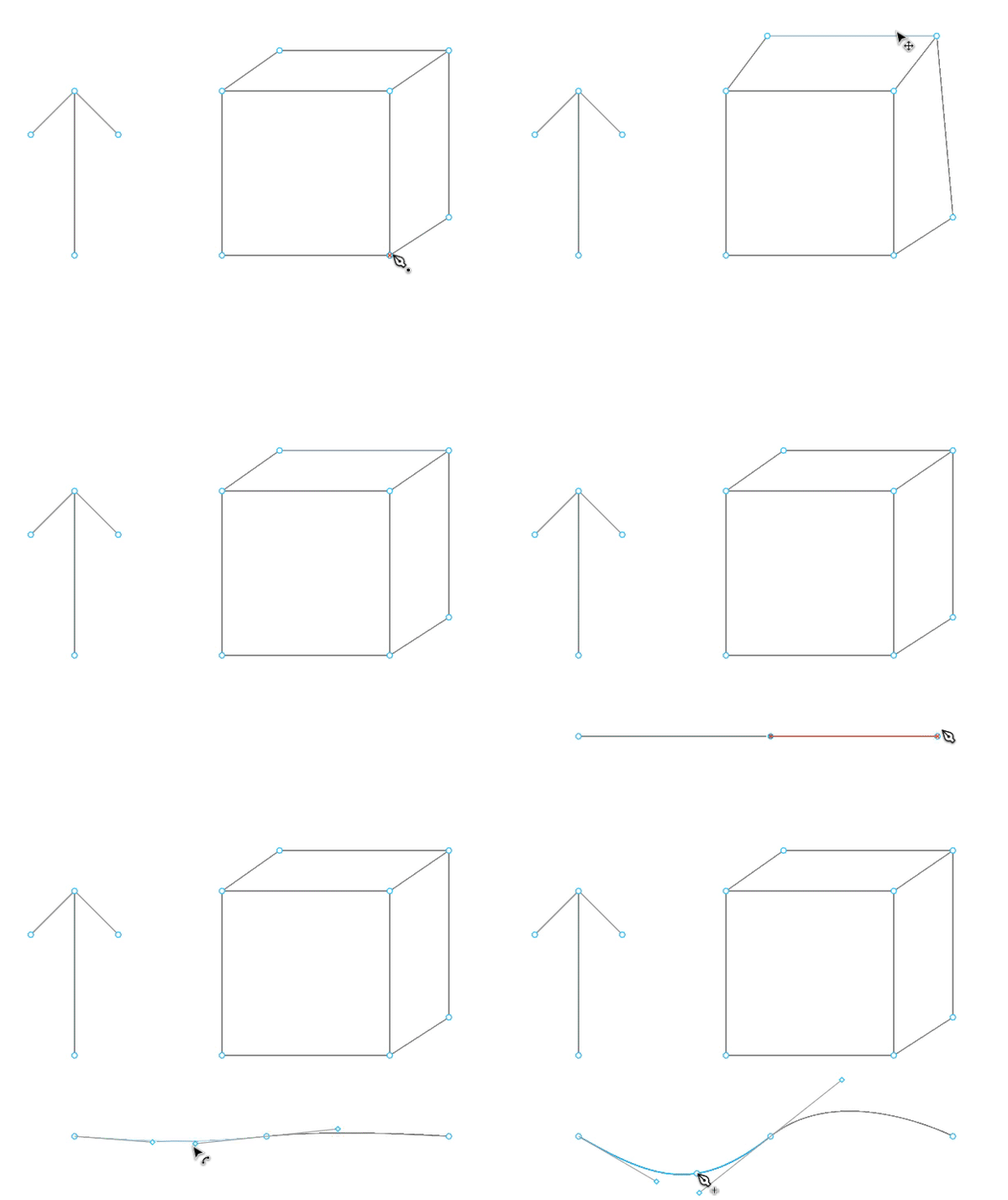
This feature alone sets Figma apart from Sketch in a very special way and makes it so much more suitable for icon design. Compared to it, the tools available in Sketch feel almost archaic. While Sketch might have everything you’ll ever need to create and manipulate vector objects, as soon as more complex vector operations are involved, it can get a bit too tricky.

While most of the time you’ll need to use Boolean operations to create certain types of shapes in Sketch, much of that can be achieved more easily with vector networks in Figma. The fact that in Sketch it’s often hard to join two vector objects or even flatten a shape after a Boolean operation has been applied makes things even worse — the app certainly has a lot of ground to cover in this regard.
Winner: Figma
Why: Vector networks give a whole new dimension to vector manipulation, something still unmatched in Sketch.
Supported File Types
Whenever a new application appears, you often face the problem of having to redo everything if you want to migrate a project. Not so in Figma: It can open Sketch files in an impressively accurate way, which gives it an immediate advantage.
Unfortunately, it doesn’t work in the other direction. Once you start designing in Figma, you are bound to it. It can’t export back to Sketch, nor is it capable of creating PDF files (or importing them). There is an option to export to SVG, but that’s not the ideal format in which to exchange complex files between design applications.
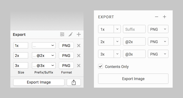
Another limiting factor is that you can’t set the quality level when exporting JPG images in Figma, so you might need a separate application to optimize images. The latest version of Sketch improves the exporting options even further. It allows you to set both a prefix and a suffix for file names now, as well as provides exporting presets, which makes exporting for Android much easier.
Let’s look at the export file formats that each application supports.
Sketch:
- PNG
- JPG
- TIFF
- WebP
- EPS
- SVG
Figma:
- PNG
- JPG
- SVG
Winner: Sketch
Why: More file formats, and better saving and exporting options.
Accessibility
Though Figma shares many keyboard shortcuts with Sketch, it doesn’t have the same level of accessibility. In Sketch, almost everything can be achieved with a key press. And if you are not satisfied with a certain shortcut combination, you can set your own in the system’s preferences (which largely goes for shortcut commands not assigned by default).
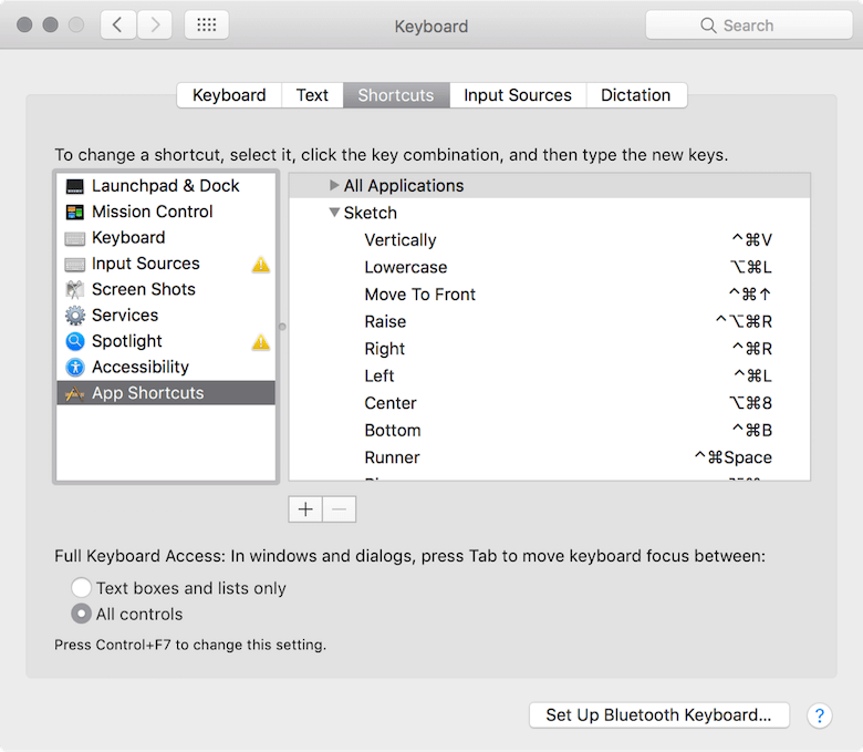
Because Figma lives in the browser, none of that is possible. While the desktop app makes up for it, certain functions simply can’t be assigned to the keyboard due to a lack of certain menu bar commands.
Winner: Sketch
Why: Almost all features in the application are accessible with keyboard shortcuts, and they can be customized.
Symbols (Components)
An important feature has only just been introduced to Figma: symbols, or, as they are called there, components. Components allow you to combine several elements into a single compound object that can be easily reused in the form of “instances.” As soon as the master component is changed, all instances inherit the change. (However, certain properties can still be modified individually, allowing for variations of the same component.)
Lately, it’s even possible to create a library of components in Figma, that can be shared across files and with multiple users — a huge step towards a robust design system.
In Sketch, the modifications of individual instances are handled in the form of overrides in the Inspector panel, allowing you to change text values, image fills and nested symbols separately for each instance. Figma lets you update the properties of an element directly on the canvas, including the fill, border and effects (shadows, blurs).
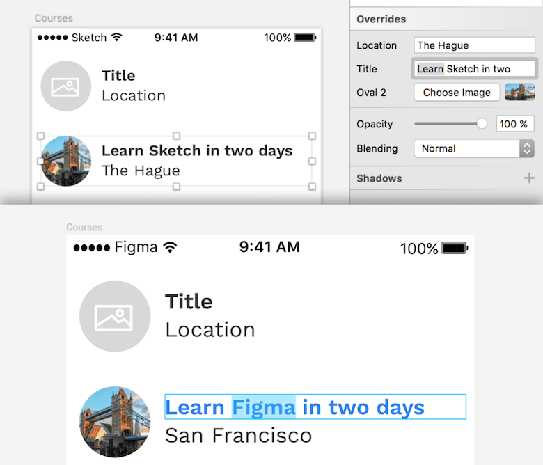
The true strength of symbols (and components) becomes evident with responsive design. In both apps, you can define how elements within a symbol react when their parent is resized, making it possible to use symbols in different places or screen sizes.
An area where Figma is still behind is layer and text styles. You can’t save the styling of shapes or text layers and sync it with other elements. What you can do, however, is copy and paste the styling from one element to another.
Winner: A draw
Why: The implementations are quite comparable, but Figma has a slight advantage with its shareable components.
Plugins
Sketch is undeniably great and capable out of the box, but what makes it really awesome are the third-party plugins, which either enhance Sketch or make up for missing features. You can use them to rename multiple layers at once, create dynamic buttons, save and load color palettes, easily insert images from Unsplash, enable Git functionality and create animations right in Sketch, just to name a few. A full list of plugins can be found in the official directory and on GitHub.
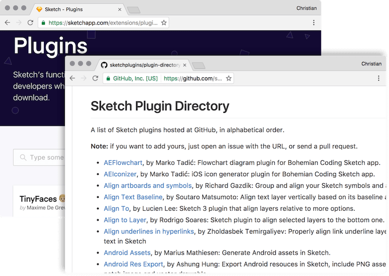
Then there’s Figma, which has none of that up until now. To be fair, Sketch probably didn’t offer many of these helpers early on in its development, and I’d bet that a plugin ecosystem will be introduced to Figma in the future.
A word of caution: While plugins give Sketch a huge advantage, they can be somewhat of a pitfall, too. They tend to break with each new release, and the Sketch team needs to be very cautious to avoid alienating developers in the future.
Winner: Sketch
Why: It’s simple: Figma doesn’t have plugins at all.
Prototyping
Unlike Adobe XD, neither Sketch nor Figma has any native prototyping capabilities. There are no plans for the latter so far, but Sketch has the Craft plugin, which brings at least basic prototyping functionality. Furthermore, Sketch’s popularity has led to broad integration with other prototyping tools: InVision, Marvel, Proto.io, Flinto, and Framer, to name a few. The idea with these is that you can easily import a design and sync up the apps.
The only application that works with Figma so far is Framer. It’s hard to say what support for similar tools will look like in the future, but it may well be that such interfaces are already in the works.
Winner: Sketch
Why: Though the Craft plugin doesn’t provide persuasive prototyping capabilities, Sketch is well integrated with many prototyping services.
Working With Real Data
Among the countless plugins that Sketch offers, you will also find some so-called “content generators.” For one, they let you fill a design with dummy content. But what’s even more interesting is that these little helpers enable you to pull in real data from various sources, or even insert content in the form of JSON files. This allows you to make more informed decisions and account for edge cases early in the design process.
By far, the best in this category is the Craft plugin from InVision. As soon as you use it to populate an element with content, you can easily duplicate and vary it in a single step. Craft also allows you to save design assets and share them with your team, or to create a style guide automatically. For an in-depth look at the Craft plugin, have a look at my recent article “Designing With Real Data In Sketch Using The Craft Plugin.”
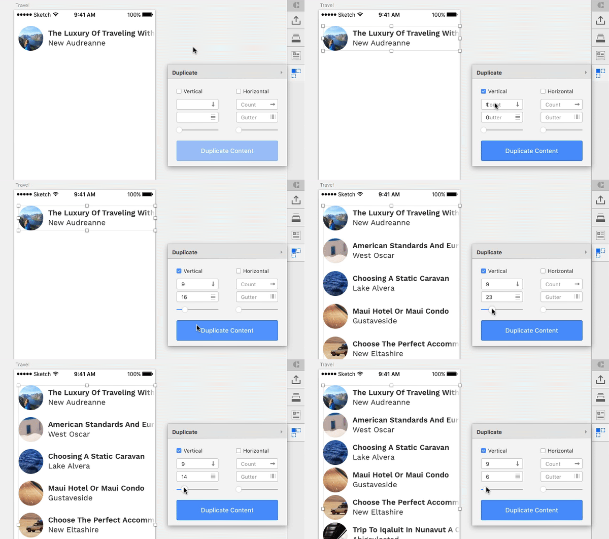
Though not as sophisticated as Craft, a few more plugins with similar functionality exist: Sketch Data Populator, Content Generator and Day Player.
Figma doesn’t offer such functionality yet, but I think it’s just a matter of time. It will be interesting to see which approach it takes: integrating it in the app, as Adobe XD teased some time ago, or relying on a plugin system.
Winner: Sketch
Why: Compensating for a lack of native functionality, various plugins allow you to use real data in Sketch easily.
Versioning
One thing I constantly do is undo my changes one by one with Command + Z to see what an earlier version of a design looks like — either to have a point of reference or to duplicate as a base for a new iteration. You might suppose that Figma is at a dead end here because of the browser’s limited resources, but in reality it is in no way inferior to Sketch.
Both apps save automatically, with the ability to browse and restore old versions. Sketch’s implementation, however, is far from ideal, and I don’t even know where to start. It’s laggy; you need to restore a version before you can actually inspect it; and it can lead to wasted space on the hard drive. (If you encounter this problem, Thomas Degry’s article “How Sketch Took Over 200GB of Our MacBooks” might help.) To cap it off, things can get screwed up pretty quickly when multiple people are working on the same file in the cloud (via Dropbox, etc.).
Figma lets you restore previous versions instantaneously, which is especially useful if multiple people are editing the same file, helping you to isolate the changes of each person. You can then jump back to a previous state or duplicate the version as the starting point for a new idea.
Winner: Figma
Why: Sketch’s versioning is so imperfect that the winner is obvious.
Text Features
As in other regards, the handling of text is quite similar in both applications, but some differences are worth mentioning. By default, Figma just gives you Google Fonts to choose from, but with a simple installer, you can access system fonts, too.
Something I constantly miss in Sketch is the ability to change the border position of text layers; “center” is the only option here. Figma also offers “inside” and “outside,” like it does for the shape layers.
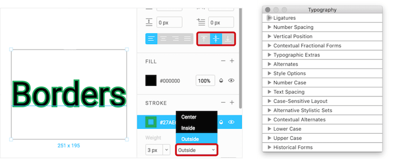
Furthermore, Figma lets you set the vertical alignment of text, allowing for easy vertical centering inside the frame. In contrast, Sketch has more typography options and enables you to apply OpenType features such as small caps, old-style figures, stylistic alternatives and ligatures (if a font supports them).
Winner: A draw
Why: Both applications have their distinct advantages. Sketch might be ahead a bit, due to its advanced typography options, but not enough to win outright.
Useful Resources And Further Reading
Sketch has been on the market now for over six years, which has allowed the community to accumulate a huge number of useful resources (articles, tutorials, blog posts, etc.). And due to the similarities between the two apps, some Sketch concepts can be applied to Figma, which makes some resources suitable for both applications. I’ll mention only a few here:
- SketchTips My very own project, where I regularly publish articles about Sketch.
- Documentation, Sketch
- Sketch Facebook group
- Sketch App Sources
- Design + Sketch, Medium
- Sketch Talk
- Sketch Hunt
- Sketch App Rocks
- Figma help (documentation)
- Figma Facebook group
- Figma: Daily Curated Collection of Articles and Resources, Heydon Pickering
Conclusion
Let’s quickly recap each app’s strengths.
Where Sketch Shines
- Keyboard accessibility is better supported.
- Plugins and a plugin ecosystem exist.
- Third-party tools and services can be integrated.
- File types and exporting options are richer.
- A complex project can be contained in a single file (with pages).
- Real data can be easily used in Sketch.
- The app is more mature.
Where Figma Shines
- Being browser-based, it’s usable from anywhere in the world, on any platform.
- Collaboration in real time.
- File sharing is easy.
- Vector manipulation is excellent (via vector networks).
- Responsive design options are better (via constraints).
- A library of components can be created and shared with your team members.
- Artboards are more powerful.
The Future
The discontinuation of Adobe Fireworks in 2013 left a huge gap in the world of UI design tools — a gap that Sketch gladly filled almost immediately. Sketch became so successful that it closed in on its main competitor, Photoshop, over time and even topped it last year as the tool of choice among user interface designers.
Sketch would probably be even more successful if there was a Windows version, though, a problem with other tools, too. So, Affinity Designer and Adobe XD (two new competitors that started as Mac-only apps) quickly stretched out to support Windows as well. There is also Gravit Designer, which works in the browser and which now also exists as a desktop app (for Windows, Mac and Linux); but like Affinity Designer and Adobe XD, it’s hard for it to compete with Sketch, which is probably the most mature tool of them all at the moment.
And now we have Figma: Not only is its feature set similar to Sketch’s, but it supports multiple platforms because the only thing you needed to run it is a modern browser. Moreover, Figma allows you to open Sketch files, which means you can basically continue in Figma where you’ve left off in Sketch, without much effort. (Figma requires you to be signed in and online to use it, though, a serious limitation in some cases.)
But as different as all of these tools are, they all have one thing in common: They want a slice of the pie, and so they are challenging Sketch in every possible way. But the Sketch team isn’t resting on its laurels. It is constantly improving the application and pushing new updates often, with the goal of making it the best possible UI design tool out there. So far, they are succeeding, but the pressure is growing.
Further Reading
- Using Sketch For Responsive Web Design (A Case Study)
- Designing A Responsive Music Player In Sketch
- Exploring Repeat Grid In Adobe XD
- Designing With Real Data In Sketch Using The Craft Plugin


 Get a Free Trial
 JavaScript Form Builder — Create JSON-driven forms without coding.
 Register for free today!
 Try if for free!


