Designing The Invisible: 3 Things I Learned Designing For Voice
The current iteration of voice-controlled digital assistants are still struggling to integrate as seamlessly as the big three voice players of Amazon, Google and Apple would hope. A 2017 report by Voicelabs states there’s only a 3 percent chance a user will be active in the second week after downloading a voice application and 62 percent of Alexa’s skills are still to get any kind of rating on its store (as of September 2017).
As designers, we have a real opportunity to provide valuable meaning to these assistants but we’re still trying to work out where the technology can add real benefits to the user. For many, embarking on a voice UI (VUI) project can be a bit like entering the Unknown. There are few success stories for designers or engineers to be inspired by, especially within contexts that illustrate how this nascent technology could help people thrive in new ways.
Experimenting With speechSynthesis
The Web Speech API gives you the ability to voice-enable your website in two directions: listening to your users via the SpeechRecognition interface and talking back to them via the speechSynthesis interface. All of this is done via a JavaScript API, making it easy to test for support. Read a related article →
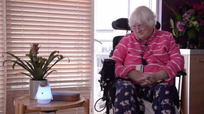
As part of BBC2’s Big Life Fix docuseries where teams of inventors create new and life-changing solutions for people in need, I had the opportunity to test and build a voice-controlled assistant for a woman called Susan. Susan has been living with a progressive form of Multiple Sclerosis for over 20 years and is now unable to complete everyday tasks for herself easily. With full-time carers, she relies on others to wash and dress her and has no ability to even change the channel on the TV without help.
While voice technology seemed like it would provide the smoothest pathway to overcoming Susan’s physical difficulties, Susan has never used a smartphone, so propelling her straight into an interaction with a voice assistant was never going to be easy — we had to think cleverly to help her learn to communicate with an incredibly alien technology.
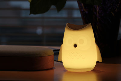
The result for Susan is a highly customized voice-controlled assistant that now empowers her to complete everyday tasks with the freedom that others take for granted — from making a phone call to family, to listening to music. Built as an enhanced version of Amazon Alexa technology on their Echo Dot device, Susan’s voice assistant also involved physical customization as we 3D printed a casing in the shape of her favorite animal, an owl.
As we rapidly experimented and iterated on a solution for Susan, my team and I uncovered dozens of intricacies that come with designing for voice in a more inclusive and accessible way. Although it was a unique project, there were three key takeaways that are applicable to any VUI project.
1. Make It Personal
The tech works. It’s not just a matter of sitting back and waiting for computing power to increase in line with user expectation. We found the voice detection, recognition, and synthesis of each of the devices far more powerful than we anticipated. And it’s not as though there’s a lack of choice. There are over 30,000 Alexa skills on Amazon with an average of 50 new ones being published daily. Skills are specific capabilities that enable designers and developers to create a more personalized voice experience when using devices like the Amazon Echo Dot. They operate much like an app within the App store on your smartphone, allowing you to customize your voice assistant the way you please.
However, there currently is a big barrier to access. Skills must be added via the app rather than the device, often negating the benefits of a VUI and breaking the conversational flow (not to mention excluding those who can’t/won’t use a smartphone). This makes the process feel clumsy and disjointed at best, completely isolating at worst. Even once a skill is installed, no skill visibility and a restricted time frame for interaction result in a lack of confidence and anxiety; can it do what I want? How do I talk to it? Has it heard me? So, how do you build that connection and trust?
For Susan, it meant stripping away the unnecessary and presenting a curated selection of core functionality. By personalizing the content to the unique behaviors and requirements, we presented much-needed clarity and a more meaningful experience. Susan wanted to perform key tasks: answer the phone, make a call, change the TV channel, play music, and so on. By getting to understand her and her needs, we created an assistant that always felt relevant and useful. This was quite a manual process, but there is a huge opportunity for machine learning and AI here. If every voice assistant could offer an element of personalization, it could make the experience feel more relevant for everyone.
As we were designing for one individual, we could easily tailor the physical elements of the product for Susan. This meant designing — then 3D printing — a light diffuser in the shape of an owl (her favorite animal and something with a significant meaning to her). The owl acted as a visual manifestation of the technology and gave her something to talk to and project towards. It was her guide that gave her access to those skills she wanted, such as listening to music. As it was personal to her, it made the potentially alien, intimidating technology feel much more approachable and familiar.

Although a fully custom 3D printed housing isn’t an option for every VUI project, there is an opportunity to create a more relevant device for people to communicate with, especially if their needs or usage of home assistants is quite specific. For example, you might talk to a voice-enabled light about your home lighting and a fridge about your groceries.
2. Think About Audio Affordances
Currently, the user does all the heavy lifting. With an obscured mental model and no hand-holding from the tech, we’re forced to imagine our desired endpoint and work backwards through the necessary commands. The simplest tasks aside (set a timer for 5 minutes, play Abba on Spotify, etc.), that’s incredibly hard to do, especially if you suffer from ‘foggy moments’ something that Susan explained to us — difficulty in finding the right words.
When Apple famously used skeuomorphic visual elements for their early iPhone apps, the user gained valuable, familiar reference points which afforded its use and method of interaction. Only once the mental model became more established did they have the freedom to move away from this literal representation, into their current flat UI.
When designing our VUI, we decided to lean on the well-established menu system seen throughout digital and web navigation. It’s a familiar tool which demands less cognitive processing from the user and allowed us to incorporate methods of way-finding that didn’t result in starting from the beginning if things went wrong.
As an example, Susan found verbalizing what she wanted, in the time frame offered by current digital assistants, a stressful and often unpleasant experience; often compounded by an error message from the device at the end of it. Rather than expecting her to give an explicit command such as “Alexa, play Abba from my Spotify playlist,” we decided to create a guided menu tool that could help her start slowly and get incrementally more specific about what she wanted Alexa to do.
Susan’s owl now prompts her with a curated list of options such as, “Play Music” or “Watch Something.” If she chooses music, it gets more specific as she progresses through each decision gate, to uncover the genre she feels like listening to; in the case of Abba, she would select “60s music.” This enables Susan to navigate to her desired outcome much more easily, and at a pace that suits her. All the while, the owl was glowing and responding to her voice, letting her know she was being heard and understood.

3. There’s More To VUIs Than Voice
The non-lexical components of verbal communication impart a great deal of meaning to a conversation. Some can be replicated by the synthesized voice (intonation, pitch, and speed of speaking, hesitation noises, to name a few), but many can’t (such as gesture and facial expression). The tangible elements of the product need to replace these traditional, visual cues for the interaction for it to feel even slightly natural. But there’s more to it than that.
Firstly, when someone interacts with a product designed to replicate human behaviors, the visual components are interpreted by the user’s preconceived notions of the world (both inherent and learned) and affect their emotional responses. If something looks imposing and cold, you’re much less likely to initiate a conversation than with something that looks cute and cuddly.
In our case, as the technology was so foreign to the user, we needed to make it feel as familiar and inviting as possible — an owl. In doing so, we hoped to remove the feelings of anxiety and frustration we had experienced with other products. We also amplified the visual side of it — there is one color for an idle state — a gentle glow, almost like breathing, but when Susan says the wake words the light changes to awake and listening.
You can go further. Apple, for example, has a full-color display on their Homepod which affords a higher level of nuance to their interaction and visualization. Adding a visual experience might sound counterintuitive, but visualizations can be very helpful for the user.
Conclusion
Although applied to an individual use-case, these top-level learnings can help any project hoping to utilize the inherent benefits voice affords. Personalizing the content (where possible) provides much-needed clarity and a logical, relatable navigation system reduces cognitive load. Finally, don’t underestimate the importance of the visual components; when done well, they not only deliver fundamental conversation cues, they set the tone for the whole interaction.
For those looking to experiment with voice, Amazon now showcases tens of thousands of skills from companies like Starbucks and Uber, as well as those created by other innovative designers and developers. The Alexa Skills Kit (ASK) is a collection of self-service APIs, tools, documentation, and code samples that make it easy for you to add skills to Alexa, and start creating your own solutions. Wondering if voice even makes sense? Here’s some considerations before you get started.
Further Reading
- A Web Designer’s Accessibility Advocacy Toolkit
- When Words Cannot Describe: Designing For AI Beyond Conversational Interfaces
- Precise Timing With Web Animations API
- How To Enable Collaboration In A Multiparty Setting


 Check the frontend report!

 Click here to kickstart your project for free in a matter of minutes.
 Start with a free demo —


