Dark Patterns And Other Design No-Nos For Mobile
When it comes to making money, some companies will do whatever it takes to get people inside their establishment. But does that kind of business tactic even work?
In my opinion, if you have to lie or trick your consumers into a sale, well then, that won’t obviously work! You might be able to attract a good amount of foot traffic (and even make some sales from the deceitful strategy), but let’s look at the big picture. If traffic levels won’t sustain and you’re handling more refunds than sales, the approach was a total failure. I’d suspect that to happen with a lot of people who attempt to use trickery to boost business both in the real world and digital space.
That’s why, today, I’m dedicating this post to dark patterns. We’re going to talk about what a dark pattern is, look at some well-known examples and then talk about why they’re always a bad idea — even if your client tries to convince you otherwise.
Designing Friction For A Better User Experience
In experience design, friction is usually the opposite of being intuitive or effortless. However, that doesn’t mean that it’s always bad for the users. Read related article →
What Are Dark Patterns?
The phrase was coined by Harry Brignull, a UX research specialist. According to Brignull:
“Dark Patterns are tricks used in websites and apps that make you buy or sign up for things that you didn't mean to.”
He has since developed a website dedicated to the worst of the worst Dark Patterns:
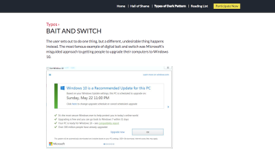
As you can see here, Brignull has defined one of the types of dark patterns used on the web. This specific example comes from Microsoft’s usage of a bait-and-switch pop-up that doesn’t behave as it should. I’m going to explain why this was such a huge problem for Microsoft’s users down below.
How Are Dark Patterns Used In Web Design?
In total, Brignull classifies dark patterns into 12 categories. I’m going to include each of them — as well as some of my own — in the following guide:
1. Bait And Switch
This happens when a user assumes that a specific reaction will take place upon engagement with a website. Typically, this is based on expectations set by the rest of the web. In the case of a bait-and-switch, however, an undesired response is the result.
Microsoft used this tactic a couple years back when it was trying to get users to make the recommended update to Windows 10. (That’s the image above from Brignull’s website.) Users claimed that, when X’ing out of the pop-up, their systems automatically updated without consent. The “X” should have indicated that the user did not want to proceed, but it did the opposite.
Now, here’s the thing. Software does need to be updated in order to keep systems running quickly and securely. However, if you’re tricking users into initiating an update they don’t want or aren’t prepared for, you could face serious consequences if it goes wrong. For instance, this woman won $10,000 as a result of the damage the Windows update caused her system.
These kinds of dark patterns don’t always lead to destructive consequences though. Sometimes they’re just really disruptive to the user experience.
For example, I was looking at the join.me website as I researched solutions for screen sharing with my clients. While looking over the pricing options, the contact widget from the bottom of the screen opened into this pop-up:

I wasn’t in need of assistance at the time, so I clicked the “X” in the right corner of the pop-up. However, upon doing so, this is what I saw:

I was surprised to see this page as I most definitely had not asked to “Start Chat”. Then, once I realized what this full-page pop-up was attempting to do, I immediately wanted to exit out. But the way to do that is in the top-left corner, which threw me for a bit of a loop as the “X” from the original pop-up was in the top-right.
The entire experience with the live chat probably consumed no more than five seconds of my time, but it still was a jarring one. I tried to take an action that said, “No, thank you,” but I was forced to engage. It’s like being in a restaurant and having the server bring you a dessert menu or tray even though you explicitly told them you weren’t interested.
If you want to annoy your visitors and prove to them that you’re not listening, use this dark pattern.
Recommended reading: Are Mobile Pop-Ups Dying? Are They Even Worth Saving?
2. Confirmshaming
Confirmshaming was pretty popular in pop-ups about a year or two ago. Users would see the pop-up and have two options:
- The positive option would encourage them to move towards conversion;
- The negative option would shame them for making a seemingly bad choice by not doing so.
There are still a number of websites that you’ll see do this, though there’s far fewer of them these days what with many designers steering clear of pop-ups on mobile.
Social Media Examiner still uses this double-CTA pop-up on its mobile site though:

Personally, I don’t think the shaming in this pop-up is that bad compared to others I’ve seen. You know the ones I’m talking about. The positive CTA says something like, “Yes, I want to double my revenue this year!” The other says something like, “No, I want my business to crash and burn!”
The intention in using confirmshaming CTAs is to use the consumers’ fears to talk some sense into them. But is that really what’s happening here? While I’m sure this strategy does work on some users, I don’t know if most people would fall for it.
My suggestion here would be to stay away from shaming visitors altogether. If you want to use the double-CTA method, however, opt for something like ghost buttons. This strategy aims to give you the same outcome: get visitors to click through and/or convert. However, it does it with subtle design persuasion. In other words:
- This button that’s big and colorful is deserving of your attention;
- This button that’s devoid of life is here (if you want it) but we’re happy if you want to ignore it altogether, too.
3. Disguised Ads
Generally, it’s pretty clear when an ad — even a native one placed mid-content — is there for promotional purposes. However, when an ad cannot clearly be distinguished as such, this can be an issue for visitors.
If you follow what happens in the world of influencer marketing on social media, you might recognize this problem with deception from Instagram. Basically, here’s what was (and still is) happening:
- Users who promote products or content as a form of advertisement or sponsorship are supposed to explicitly declare the promotion as such. That’s because they’re getting paid for their efforts and it’s not a genuine recommendation on their part.
- When influencers fail to announce that such endorsements are paid placements from brands, users may be deceived into buying something because they believed it to be a valid recommendation. And that’s a major problem.
According to the FTC:
“If there is a ‘material connection’ between an endorser and an advertiser — in other words, a connection that might affect the weight or credibility that consumers give the endorsement — that connection should be clearly and conspicuously disclosed, unless it is already clear from the context of the communication.”
The same should hold true when it comes to on-site advertisements, but there’s been no real regulation of this thus far. That said, we do recognize certain disguised advertisements for what they are: dark patterns.
One example I want to share comes from Travel & Leisure:
As I was reading an article about the best places to experience changing autumn colors in the United States, I became quite enraptured by the images included.

As I skimmed further down, I encountered this image — or what I thought was an image.

Once the page fully loaded (which took more than a few seconds), I realized this was a video. At this point, a couple of thoughts ran through my mind:
- Did I scroll too far? Were the rest of the fall foliage trip recommendations in a slider above?
- Why is a Bermuda summer vacation included on a list about fall foliage?
I decided to keep scrolling through the identically-formatted text for Bermuda to see what came next, and then I noticed a note beneath it that read “From Bermuda Tourism Authority”:

Once I got past the native video ad that looked exactly like the rest of the page, I was able to read the rest of the post. But it left a bad taste in my mouth.
I had set out to see some cool imagery and pick up some tips for fall travel, but was tricked. Albeit, the dark pattern only got me temporarily, but it still disrupted the experience and made me wonder what other deceptions would abound. What if all the ideas in this post or anywhere on the site solely came from sponsors and not from actual trips worth taking?
If you leave your visitors wondering whether or not they can trust your website, then you’ve gone down a bad path, m’friends.
4. Forced Continuity
This type of dark pattern occurs when someone signs up for a “free” trial, but is required to share credit card information during the intake process. Then, when the trial period ends, their credit card is charged without warning.
For users that don’t pay attention to these kinds of things and assume that brands won’t take advantage of them, this form of deception will definitely not go over well. In addition to losing the trust and business of these users, your business could be penalized if a credit card company or local business bureau gets involved.
Although this kind of dark pattern usually doesn’t have anything to do with design, it’s still one worth knowing about as a designer. That’s because you can use various design strategies and layouts to point potential customers to those revealing details about automated payments and what-not.
I’m going to use join.me once again for my next example.

On join.me’s pricing page, you’ll encounter three plans — each with an associated cost. It’s actually not until you locate the much smaller and non-highlighted CTA that you can explore more about what comes with each plan:

For users that discover this CTA, they’ll be able to explore the features of each plan within this detailed pop-up:

I was quite happy to discover that join.me has a free plan. However, in order to gain access to it, you have to sign up for the PRO plan. This is what’s included in the trial:

Once you’ve submitted your user and purchase details, you’re then granted access to a free, 14-day trial. If you choose not to proceed with PRO, only then can you gain access to the free plan that join.me doesn’t readily advertise.
Now, this example deviates slightly from the above-mentioned point. Or at least I hope it does. Since I haven’t purchased a trial of join.me, I can’t tell you if this site auto-charges after the trial without warning. That said, the way in which the free plan is mentioned and the way in which users are able to get it, leads me to believe that it’ll be difficult to cancel the PRO plan before the trial ends.
5. Friend Spam
Logging into websites and apps with social media accounts or Google is a common thing nowadays. Nevertheless, the companies that are using your list of friends to spam your contacts, however, is (hopefully) not.
That said, one major brand was found guilty of this and is now having to pay $13 million as a result: LinkedIn.
It appears that LinkedIn used its users’ contact lists for personal gain. Basically, it offered an “add connection” feature on its website in the early 2010s. This enabled users to quickly connect with people they knew or, rather, to send them a message and ask them to connect on LinkedIn.
While the service seems fair enough (after all, it can be difficult to track down previous acquaintances and workers on your own), LinkedIn still took it too far.
What should have been a simple email that said, “Hey, so-and-so wants to connect with you on LinkedIn,” turned into a number of follow-up emails to those contacts. The unwarranted harassment wasn’t necessarily the problem. The biggest problem was that LinkedIn crafted these emails in a way that made it seem as though it was coming directly from the known acquaintance.
This just goes to show you that it doesn’t matter how popular or well-revered your platform is. If you abuse your users’ trust for your own personal gain, there’s going to be a major backlash. A $13 million lawsuit is definitely a severe consequence, but even just the loss of customers should be enough to deter you from this dark pattern.
6. Hidden Costs
This one is self-explanatory. You do some shopping online, you’re satisfied with the items you’ve added to your cart, and so you decide to finally go to checkout where you discover costs you were unaware of.
While you might not believe this is a matter that you as a designer have a hand in, I’d urge you to take a look at this dark pattern example from Southwest Airlines:

As I looked for a roundtrip flight between Albany, NY and Atlanta, GA, I was presented with various pricing options. Time of day, number of layovers and so on affected how much I would have to pay on each leg of my journey. That’s to be expected.
However, what I hadn’t expected was that the total price displayed before checkout would be off from what I thought it to be. As you can see here, this final page doesn’t even show the prices of the individual legs of the trip anymore. It just shows the total cost and then asks me to continue on.
That’s when I realized there were tiny “Includes taxes and fees” and “Show fare breakdown” messages beneath the Total line. When I expanded them, I encountered this:
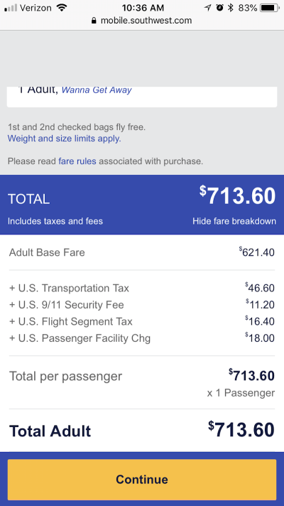
When it comes to travel and hospitality, it’s normal to expect charges for things like carry-on bags, resort fees, and so on. Still, this wasn’t what I expected to show up and there was no real mention of it made as I selected my flights earlier on. What’s worse, many of these charges aren’t even explained.
Now, there are some travel sites that handle this sort of thing in a reputable manner. However, I assume that many of them prefer to go the Southwest Airlines route of manipulating design and typography in a way that keeps extra charges hidden from plain view.
Recommended reading: How Mobile Web Design Affects Local Search (And What To Do About It)
7. Misdirection
Misdirection on a website is really no different than a magician’s trick. The website draws your attention to one thing while doing something deceitful somewhere else.
A good example of this is subscription forms for online publications. You usually see this when a magazine belongs to a much larger brand. Other magazines from the publisher are then promoted during the sign-up process. And it’s typically nothing more than a pre-checked checkbox at the bottom of the form that asks if you also want to subscribe to their newsletters or subscriptions.
For example, here is the Eater newsletter subscription form:
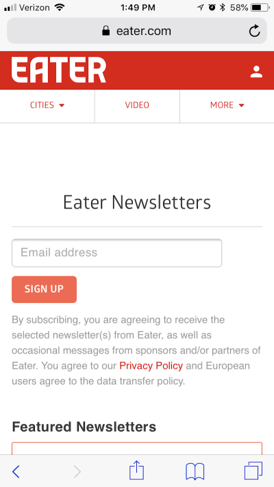
It’s not all that strange that the form sits at the top of the page. Or, at least, it wouldn’t be if it were the only subscription offered.
But as you scroll down, you can see that the Today newsletter is automatically checked:

That would be okay, except that I was on the Eater Philly website. I didn’t want generic Eater news. I wanted news related specifically to the area of the U.S. that I live in. I also don’t know if I was too crazy about a daily newsletter.
If I were to scroll down even further on the page, I’d discover more newsletter options:

Thankfully, none of these were checked on my behalf, but it’s still strange that all these options are placed below the form, including the city selection:

By “hiding” checkboxes and pre-selecting one for your users, you’re putting them in a position to receive messages that they’re not likely to be happy to receive. When they unsubscribe from those emails and state the reason such as “I never signed up for these communications.” That’s no good.
8. Price Comparison Prevention
For many users, mobile websites are visited for the purposes of doing research. Having access to multiple devices to simultaneously search with or having one device to take on the go to complement the on-site shopping experience, is a benefit many shoppers greatly enjoy.
However, if you prevent users from being able to easily compare prices within your website, it’s probably because you’re hiding something.
With the Southwest Airlines example I mentioned above, the website prevented me from tracking the individual prices of each leg of my trip. That was a pain since it required me to write them down somewhere so I could make sure I wasn’t exceeding my budget in the end.
Then, there’s this airline that just won’t reveal prices at all: British Airways.
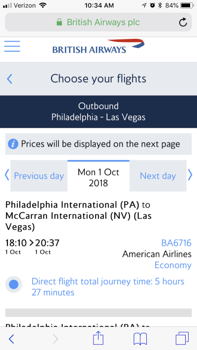
As you can see here, you can skim through flight times and stopover options on British Airways. While you can compare the times and number of stops against one another, prices aren’t actually revealed until you select a trip.
This makes the experience of booking a flight through British Airways incredibly annoying — to say the least. While prices can be compared, it requires a number of back-and-forths to gather that information. And, chances are good that if you hit the browser “Back” button, it’ll reset the data and you’ll have to re-enter all your trip information from the beginning.
While it’s nice that the designers of this mobile site inform visitors that prices aren’t revealed at this stage, the call to do so is a bad choice on British Airways’ part.
9. Privacy Zuckering
Here’s the basic premise of this dark pattern: When a design or piece of content does not make it clear that the sharing of data is optional or doesn’t present an easy way out of it, this would be a case of Zuckering.
I’m sure Mark Zuckerberg wouldn’t be too happy to know that Brignull named this one after him, but Facebook is known for luring users into giving more information than they have to — which is why this one is aptly named.
One example of this I run into often doesn’t actually occur on Facebook. Instead, it’s one I encounter on BuzzFeed when I’m taking a break from writing. Here’s what happens:
My brain starts to hurt and I find myself needing a quick distraction. I go to the living room, sit on my couch and pull out my phone. I immediately go to BuzzFeed’s quiz section. They’re entertaining and I know I can get through them quickly. Like this one about movies:
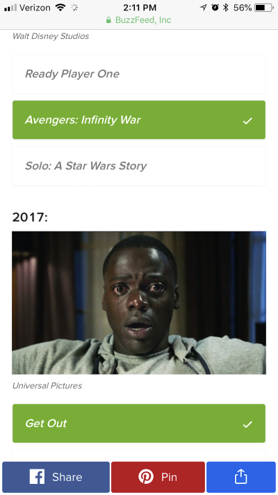
I start the quiz and quickly get into a groove of reading the question, looking at the entertaining graphics and choosing my answer. It’s a great mind-numbing activity that helps me reset.
Until this happens:
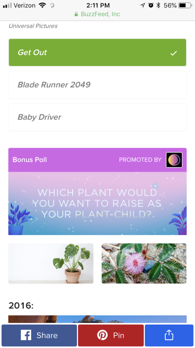
This is an unrelated question that BuzzFeed has snuck into my quiz. It usually occurs two or three paces down the page. This example happens to be completely unrelated to the quiz I was taking, so I was able to spot it right away. But sometimes they do a very good job of blending the topics so that I’m fooled into providing them with a revealing answer.
When your design incorporates additional interactive elements that don’t actually need to be engaged with, you should let users know that’s the case. Not only is it a waste of time — especially for mobile users — but it distracts from the rest of the experience.
10. Roach Motel
The trademarked product “Roach Motel” from Black Flag is one that lures cockroaches and other pests into a sticky situation that is then very difficult to get out of. This is exactly what some websites do.
In some instances, a roach motel occurs when a website or app makes it incredibly difficult to delete an account or unsubscribe from a list. You’ll most commonly see this with free trials of SaaS products.
In other cases, it might be a landing page a visitor has fallen into, but is unable to back out of using the website’s navigation (since it’s gone). Instead, users have to rely on the browser’s Back button, which can be a pain if it resets any work that had been inputted prior to that landing page.
Then, there are roach motels like the Wells Fargo Center website:

The first page of the ticket purchase form is fine. You indicate what price range you want your tickets to fall within and then you choose how many you need. Seems pretty straightforward.
What’s odd, though, is that it now says “Add to Cart.” It’s my assumption that I’ll be able to choose my specific seats at that point.

What happens instead is that the Wells Fargo Center automatically chooses my tickets and adds them to the cart. I had no say in which seats I wanted. Instead, the most expensive tickets for $1,250 were added to my cart.
At this point, I decide that I want to back out and try to find better seats. When I click on “change seats”, it takes me back to the original page where I get to make only vague choices about where I want to sit and how much I want to pay. The trash icon below does the same thing except that it completely clears out the tickets in my cart. Either way, I’m left feeling helpless as I have no control over the experience.
In a last ditch effort, I thought I’d move on to the next step to see if I had any more control there. I clicked on “cost details”, saw the associated charges and upgrades (which I hadn’t expected) and realized I could only “Checkout” at that point:
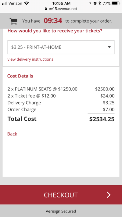
I eventually decided not to buy these tickets because I had no control over the process and because of how stuck I felt once I got deep inside it.
As you design journeys for your own users, don’t do this to them. Give them an easy way to reverse their tracks and to back out of a process if they’re unhappy with it. And, if it can be helped, give them more control over the choices and customizations they make. It’s hard enough to convert mobile users, don’t turn them off from your mobile website altogether because of this.
11. Sneak Into Basket
There are typically two ways users will find an unexpected item in their shopping cart. The first is by the website automatically adding it on. The second is by the website tricking the user into adding it themselves by placing a checkbox or other add-on option in a spot where something else should be.
Case in point: the Central Park Zoo.

The form to purchase tickets is pretty basic. Simply choose the tickets for the people that will be visiting the zoo.
You make your selections and scroll down to make the purchase.
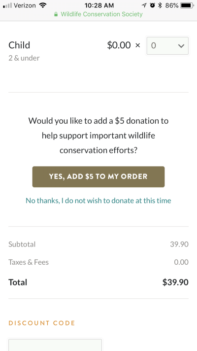
For mobile users that are in a hurry, they might not even think to read the button that appears. It’s big, bold and appears directly beneath the form. Why not click it?
However, upon closer inspection, you’ll see that “Yes, Add $5 to My Order” is what this CTA button calls for. Now, someone reading that quickly might read that as “Yes, Add to My Order” thinking it’s referring to the tickets.
It’s not until the mobile user makes one more swipe on their phone that they see the actual checkout button:

As users, we are trained to understand how common web elements act. A contact form follows a simple formula:
- Fill out the pertinent details.
- Click the button to complete the purchase.
It’s an easy 1-2 punch to execute as a web designer. However, when you throw something in your users’ pathway that resembles a button, you’re very likely to trip them up in the process. Or you’ll find a lot of angry visitors who unknowingly added and paid extra money because of the confusing way the form was designed.
12. Trick Questions
This one happens a lot with things like exit-intent pop-ups. By using language that is confusing or incorrectly written (like a double negative), the site is able to keep visitors put until they realize their mistake in understanding the question.
Tricky messaging can also be used to drive up costs. Here is what I experienced when trying to order flowers from 1-800-Flowers:

I was pretty happy with this floral arrangement and thought the large would be nice for my friend’s table. As I scrolled down, I saw this checkbox for “FREE Shipping.” I didn’t bother to click on the “i” icon since I figured, “What more do I need to know about free shipping and no service charges? Sounds like a good deal to me.”
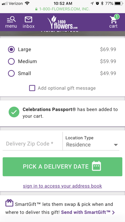
After clicking the box, this message about the Celebrations Passport appeared, but I didn’t bother to pay attention to it. Once the box was checked, I quickly moved on to enter my zip code; I wanted those flowers delivered ASAP.

As I continued to select a delivery date, this upsell screen appeared on my phone. I considered it briefly and decided I don’t need any of these add-ons. I couldn’t find an “X” button, so I clicked “Continue” and hoped that none of these items had been added to my purchase.

I finally arrived at my shopping cart and discovered that ‘12 Months of Passport’ had also been added to my cart. Thankfully, I screenshotted the process for the purpose of this article. Otherwise, I would’ve had no idea where the add-on came from. Granted, it ended up here because I didn’t read the details closely.
That said, when you lead with something like “FREE shipping”, how many customers do you think will take time to read any further? We all understand what that phrase means in most contexts. By not clearly stating that this was a 1-800-Flowers upgrade, many users are likely to select that box and end up with an unintended item at checkout.
In addition to Brignull’s list, I want to add a couple more dark patterns that I find especially perturbing on the mobile web and in mobile apps.
Recommended reading: What You Need To Know To Increase Mobile Checkout Conversions
13. Unnecessarily Deep Navigation
This reference to navigation doesn’t really pertain to the hamburger menu mobile visitors use on websites. Instead, I’m referring more to those websites that have blog posts and quizzes that span multiple pages.
In some cases, I’m sure this is done for the purposes of keeping load times on individual pages fast. However, a properly optimized server and a website with a solid caching mechanism shouldn’t have those sorts of problems, even with a page loaded with images. My guess? These websites create multiple pages for a single post for the purposes of superficially bolstering the number of page views they get.
A good example of this comes from MagiQuiz:
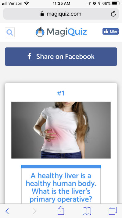
The image above shows what a typical quiz looks like from the MagiQuiz website. Engaging imagery, question and answers to choose from.
However, the image below is what the typical quiz interface looks like when you actually scroll through it. It’s littered with advertisements, distractingly breaking up the experience of the quiz on the page:

As if those in-line ads weren’t enough, users finally get to the bottom of the page to find this:

It’s not actually the bottom of the quiz at all. All of that scrolling and skipping past unrelated ads made the quiz take so long, and now there’s still more to do in order to reach the payoff. That sucks — if you ask me!
Unfortunately, quiz sites such as MagiQuiz aren’t the only ones that do this. Major publishers like Forbes are guilty of this as well, breaking up otherwise short stories (no more than 800 or 1,000 words) into multiple pages. If this were a way to conserve server bandwidth, that would make sense, but I’m guessing this dark pattern is used for mainly selfish reasons.
14. Made-You-Look Notifications
One final dark pattern I want to call out is the made-you-look notification. I usually see this sort of thing on mobile apps that claim that I have activity or communications to look at. Since I’m already active on those apps, it’s usually not a big deal to open them and see what all the fuss is about. Sure, it’s annoying to discover the notification was just to remind me to respond to someone, but it’s not a problem if I was going to be in there anyway.
Mobile websites, on the other hand, shouldn’t be making use of this dark pattern. If there’s no history of engagement, then visitors’ attention should not be drawn to something that won’t improve the experience.
1-800-Flowers, again, is guilty of using this particular dark pattern:

See how my inbox has a green number “1” hovering over it? It looks just like email reminders you’d get from Gmail or Outlook, right?
Here’s the problem with this: Before today, I’d never been to the 1-800-Flowers website nor do I have an account with them. Yet, my eye was drawn to that message sitting in my inbox. It’s just a gut reaction I have. When I see that someone has messaged me, it’s usually from a client that I want to get back to ASAP. It’s that sense of urgency that compels me to instantly click to find out what action is needed.
And, so, this is what I did:

I knew the message that appeared wouldn’t be of relevance to me even before I clicked it, but I needed to see what it said.
As you can imagine, I wasn’t too happy to see an unhelpful promotion like this waiting for me. It’s not even like 1-800-Flowers went to the trouble of promoting flowers for an upcoming occasion (like homecoming events or the approaching holiday season). They just wanted to distract me from what I set out to do in the first place.
Honestly, I’m not sure what 1-800-Flowers (and other brands that do this) hoped to gain from this dark pattern. When people come to a flower delivery site, they typically know what they’re there for. Let them take the user journey you’ve already so carefully planned it out for them and leave those urgent notifications for websites or apps that can share personalized content and messages with their users.
Wrapping Up
Okay, so what have we learned here? To begin with, dark patterns are a way to use design and content to trick users into taking an unintended action. Still, are they effective?
In all honesty, I’m going to guess that — initially — dark patterns work on many visitors. For companies that are only concerned with the superficial success of a website (i.e. visits, page views, and sales), then that may be a good thing.
For companies that understand that short-term gains in these areas can easily be outweighed by losses from refunds, low customer retention rates and lawsuits, dark patterns will ultimately prove not to be worth it.
Deceitful design tactics won’t get you anywhere good with your visitors. Not only does this deception hurt your ability to gain customer loyalty, but it hurts the overall user experience online.
Think about it: enough users get burned by a certain type of website (say, a SaaS tool that makes it difficult to cancel). So, now they comb through every field in the sign-up or check-out process because they’re nervous about being overcharged or sucked into a bad deal. Or they spend so much time digging through your site trying to find some hint that gives the jig away. At the end of the day, users just give up or avoid making those kinds of purchases online altogether.
The user experience should be fast and easy and take visitors on a straight and narrow path to conversion — not make them second-guess their decision to be there in the first place.
Further Reading
- 55 Free High Quality Icon Sets
- The Ultimate Guide To Cloning In Photoshop
- Hand-Sketching: Things You Didn’t Know Your Doodles Could Accomplish
- Switching From Adobe Fireworks To Sketch: Ten Tips And Tricks


 Start with a free demo —
 Take a break with a 3D game built on Netlify!
 Check the frontend report!
 Click here to kickstart your project for free in a matter of minutes.

