How To Create A Compelling Landing Page
If you want more leads or increased sales, you need compelling landing pages. According to Hubspot, those companies with over 30 landing pages, will generate seven times more leads than those with fewer than 10.
A landing page is a standalone webpage created to support a specific marketing campaign or targeting a particular search term. They are where users “land” when they click a link in search results, email or an ad.
Typically they encourage users to complete a specific call to action such as making a purchase, subscribing to a newsletter or getting in touch.
So how do we create landing pages that encourage users to act, without resorting to manipulative techniques or dark patterns? The answer lies in a combination of a clear focus, compelling copy, considered design and relentless testing.
It is tempting to leap straight into creating your landing page. However, before we begin, we must have a clear focus, and that starts with defining our value proposition.
Define Your Value Proposition
When a user arrives on your landing page, you have less than eight seconds to grab their attention. That means the first step in creating any compelling landing page is to understand what it is that the page will offer and how you can express that compellingly and concisely. That is typically known as a value proposition.
Start by writing a single sentence that communicates what it is you are offering to the user. This sentence should consist of two parts; what problem you are solving or benefit you provide, and how you achieve that.
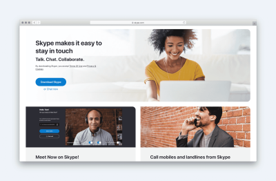
For example, Skype’s value proposition is:
“Skype makes it easy to stay in touch. Talk. Chat. Collaborate.”
The first part outlines what benefit it provides, while the second explains how it delivers.
However, be careful. It is easy for your value proposition to become meaningless. For example, talking about “best-in-class” or “friendly and approachable” is the kind of thing any company could, and does, say.
To avoid becoming too generic, ask yourself whether the opposite of what you have written would still be a valid option. For example, if your value statement reads:
“We offer high-quality products at an affordable price.”
The opposite would be ridiculous:
“We offer terrible quality products at an astronomic markup.”
So effectively, your value statement is stating the obvious!
However, by contrast, if you wrote:
“We offer handcrafted products for a discerning buyer.”
The opposite would be equally valid:
“We offer factory-produced products for the mass market.”
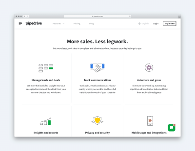
Not that your value proposition isn’t just limited to this one sentence. Make a list of all the benefits you provide to customers and then any features of your offering that allow you to deliver those benefits.
With that done, you can turn your attention to your calls to action.
Identify Your Calls To Action
Every landing page needs obvious calls to action. That means you need to ask yourself, what is it you want users to do?
To keep your landing page focused and improve your chance of users acting, resist the urge to add too many calls to action. Asking people to follow you on social media, for example, is just going to distract them from completing your primary call to action.
That said, it is often wise to have a secondary call to action. If you have done your job right, your landing page will have convinced many users to take action. Nevertheless, others will not be ready.
Instead of just giving up on these users, it is often worth offering them a secondary call to action, that requires less of a commitment.
For example, if your primary call to action is to get in touch or make a purchase, your secondary call to action could ask people to signup for a newsletter.
To avoid this secondary call to action distracting, ensure it is not too prominent. That might mean showing it lower on the page or even as an exit-intent overlay. That said, be careful. Some audiences react extremely negatively to popups. They should, therefore, be used sparingly.
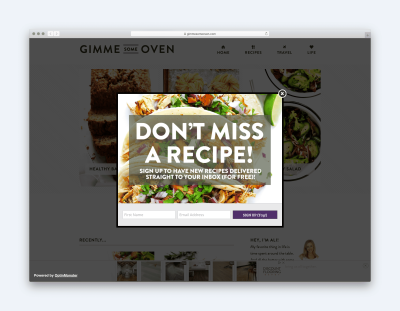
Finally, consider ways of incentivising people to complete the call to action. Perhaps you could offer a free ebook if people subscribe to your mailing list or a discount if they buy via your landing page. Sometimes, something this small can be a nudge that encourages people to take action now rather than put it off to another day.
Of course, a gift is not going to make any difference if other elements put people off. To address that you need to understand what the issues are and find a way to deal with them. That is known as objection handling.
Understand User Objections
What are the reasons that might stop somebody acting on your landing page? Is there a delivery charge or might they be worried about privacy? Do you seem expensive compared to the competition?
If you cannot easily write a list of objections that users might have then you need to do some user research to find out.
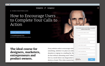
Don’t worry that it will be time consuming or expensive. A one-question survey on your landing page is all you need. If people go to leave your site without acting, you can ask them a single question:
“If you decided not to act today, it would be useful to know why.”
You can then show them a list of possible options for them to choose between or they can add their own.
Once you understand the reasons why people are not acting, you can then start to address them.
Ideally, that means eradicating the obstacle, such as offering free delivery or money-back guarantee. But failing that, you need to reassure people the best you can in your landing page copy. It is always better to address an objection than it is to ignore it.
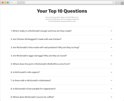
For example, McDonald’s knows that many people claim their chicken comes from the less favorable parts of a bird. Instead of ignoring these concerns, they address them directly on their site.
There is, however, one more consideration to take into account when dealing with user’s concerns. You need to make sure you address them at the right time and in the right way.
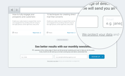
An excellent example of this is privacy and security. People don’t worry about these things when reading a privacy policy. They worry about it as they are about to submit their email address. That is why it is so important to address data protection and privacy while users are completing a form. Users are not going to search your site for the answers; they will simply assume the worst.
With our offering laid out and objections addressed, we have done the hard work of appealing to people’s logical minds. Now it is time to give them that positive feeling.
Shape Your Personality
Much of our decision to act happens on a subconscious level. In fact, according to research published in the journal Behaviour and Information Technology, people form an initial impression about a site in 50 milliseconds. They go on to say that due to the halo effect these initial impressions last.
In other words, the branding and aesthetics of a site shape our impressions of the actual offering, despite there being no causal relationship between the two.
So what does all of this mean in practical terms? For a start, it goes to show how much aesthetics matter. However, more importantly, it means we need a clear picture of what first impressions we wish to convey and then be confident that our design does precisely that.
Decide On What You Want To Convey
A good starting point is to create a shortlist of words that convey the impressions you want users to have upon seeing your site.
There will be some words that will be universal. For example, you will probably want your landing page to convey “trustworthiness.” However, many of the terms will depend on your audience and offering.
Once you have your list of words and the designer has produced a design that they hope convey those words, the next step is to test.
Testing Your Design Aesthetics
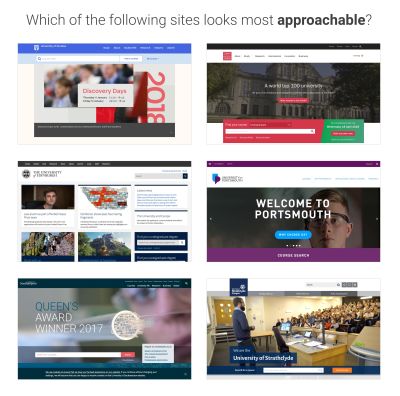
If the designer has produced multiple approaches, then a simple preference test works well. For example, you can ask the user which of your designs do they consider to be more “approachable.”
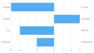
When there is only one design, you can run a semantic differential survey, in which you ask users to rate a website against your keywords. For example, is a design more “approachable” or “unapproachable?”
Of course, aesthetics is not the only consideration when it comes to design. You also need to make sure your visual hierarchy is right too.
Create Your Visual Hierarchy
Establishing a strong visual hierarchy for your landing page will ensure that users see the right information at the right time and won’t be distracted by irrelevant or secondary content.
Answer The Right Questions At The Right Time
The first step is to ensure you are presenting the right information to the user are the right point on the page. To do that you need to understand the thought process that goes through people’s minds as they view your landing page.
Of course, we cannot be sure of that, as everybody is different. Even usability testing can only give us an indication. However, we can make an educated generalization.
Typically, a user subconsciously asks a series of questions when viewing a landing page. These are, in order:
- What is this page offering? (Value Proposition)
- How will that help me? (Benefits)
- How does the offering work? (Features)
- Why should I trust this page? (Social Proof)
- What should I do next? (Call to Action)
It is, therefore, essential that any visual hierarchy for a page reflects the order a user asks these questions, at least to some degree.
For example, a typical landing page hierarchy might look something like this:
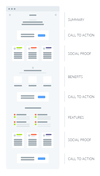
Getting the flow of your content on the page right is only half of the battle when it comes to creating a strong visual hierarchy. The second challenge is ensuring that users see the most critical screen elements.
We can draw attention to essential screen elements in a variety of ways, including, but not limited to:
- Positioning
- Colour
- Size
- Imagery
- Animation
- Negative space
However, probably the most effective technique is to minimize other distractions on a page.
Simplify Your Interface
To achieve this, consider adopting a three-step approach, where you systematically review every element on your landing page from the logo to the privacy policy link.
For each element, you will ask three questions in turn.
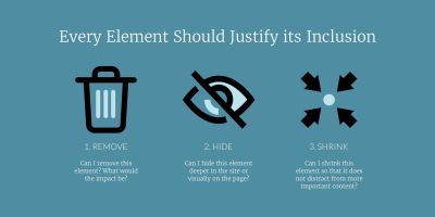
Start by asking could I remove this element? If I removed it, what would the consequences be? Would those consequences be more damaging than the increase in cognitive load that additional screen elements create? If not, you are better removing it.
If you feel that the content is too valuable to the user or aids in conversion, the next question you need to ask is could I hide this element? Could I put it on a sub-page, under a tab or in an accordion?
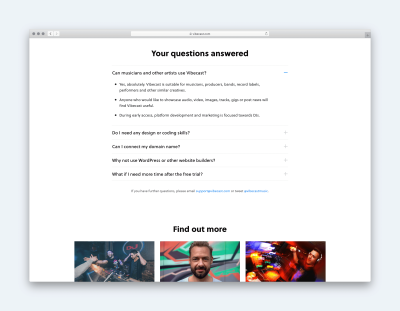
This approach works well for secondary content, that although useful to some users who want more detail, is not something the majority of people will be interested in.
Finally, if you cannot hide content, because all users must know it, ask can I shrink this element? For example, people may well want to know about your return policy, but that isn’t as important as the features or benefits your product offers. It, therefore, makes sense to visually deemphasis it, so it is less prominent.
That simple approach together with other design techniques should enable you to create a page with a strong visual hierarchy that draws the user’s attention to the most crucial screen elements, such as calls to action. However, to be sure you should test.
Test Your Visual Hierarchy
Fortunately, there is a quick and inexpensive way of testing whether users see the essential screen elements. It is called a five-second test.
As the name implies, this test involves showing the users your design for five-seconds before taking it away. You then ask the user to recall what elements they remember.
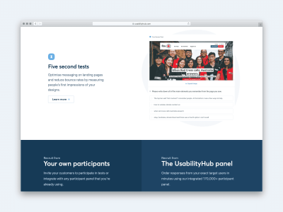
By paying attention to what the user remembers and the order in which they recall elements, you will gain a better understanding of how effective your page hierarchy is in drawing attention to items that matter the most.
Indeed, when it comes to designing a great landing page, testing will be crucial, even once you launch.
Monitor, Iterate And Test
No team will create the optimal landing page on their first attempt. There is always room for improvement, which is why post-launch testing is such an essential part of shaping the most effective landing page possible.
Once you launch your new landing page, you must monitor it carefully using a session recorder like Hotjar or Fullstory. These tools allow you to watch user behaviour on your page, that should suggest ideas for improvements.
You can test smaller improvements to copy, imagery and color using A/B testing, while more significant changes can be prototyped and tested through usability testing.
Whatever approach you adopt, ultimately it will be a cycle of monitoring, iterating and testing that will ensure the long-term success of any landing page.
Further Reading
- “Smart Interface Design Patterns,” Vitaly Friedman
- “Design Patterns Series,” Vitaly Friedman
- “Web Design Done Well: The Ordinary Made Extraordinary,” Frederick O’Brien
- “How To Create Customer-Centric Landing Pages,” Travis Jamison


 Click here to kickstart your project for free in a matter of minutes.
 Check the frontend report!
 Take a break with a 3D game built on Netlify!

 Start with a free demo —

