What Saul Bass Can Teach Us About Web Design
Web design exists at a lovely intersection of different disciplines. In previous articles, I’ve written about the lessons to be learned from newspapers and from ancient Roman architects. This time we’ll be looking at one of the all-time great graphic designers — Saul Bass.
Saul Bass is a graphic design legend. Responsible for title sequences in films like North by Northwest and Anatomy of a Murder, as well as a number of iconic posters and brand logos over the years. His work, in the words of Martin Scorsese, “distilled the poetry of the modern, industrialized world.”
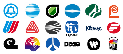
We’re in a different world now, a breakneck speed digital world, but that carries with it its own poetry. Although the backdrop has changed, Saul Bass’s methods and mindset have stood the test of time, and web designers would do well to remember them.
Making The Mundane Extraordinary
Before getting into the particulars of Saul Bass and his work, it’s worth outlining his approach to design in broader terms. Big characters inspire big ideas, but as is so often the case the real trick is in the details.
Concerning his approach to title sequences, Bass said:
“Deal with ordinary things, things that we know so well that we’ve ceased to see them; deal with them in a way that allows us to understand them anew — in a sense making the ordinary extraordinary.”
— Saul Bass (Source)
A similar ethos can and should be applied to web design. As we look at his work, yes, by all means envision homepage splashes, but also think about buttons and signup forms and legal disclaimers. There is just as much beauty to be found in the little things. Sometimes more.

That Bass is even renowned for title sequences is a testament to his creativity. Before Saul Bass entered the scene film titles were usually dull affairs, names and static images delivered with all the bizazz of divorce papers. Under his eye, they became pieces of art, statements on the tone, and texture of what was to come. As he so brilliantly put it,
“Design is thinking made visual.”
— Saul Bass
You can find more about Saul Bass’ vision of his work and his influences in the following pages and videos:
- Language of Vision by György Kepes, an early mentor of Bass
- ‘Saul Bass’s Movie Posters’, a video essay by The Royal Ocean Film Society, fittingly made in portrait orientation!
- The Man Who Made the Title Sequence Into a Film Star by Alice Rawsthorn
- Why Man Creates, the Oscar-winning short by Saul Bass and Mayo Simon
Color
Let’s start with the most basic aspect — color. Bass once said that ‘audience involvement with a film should begin with its first frame.’ So too should visitor involvement begin upon first load. We process the colors and arrangement of a website before we have time to process its content. You’ll find no greater advocate for quality content than me, but it is hampered if not given a quality canvas to unfold on.
For Bass is typically translated into simple, vivid color palettes with no more than three of four colors. Not too busy, but plenty of pop. Red, white, and black is one of the golden color combinations — one Bass put to use many times. Bright colors don’t always mean ‘loud’, sometimes they mean ‘striking.’
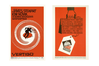
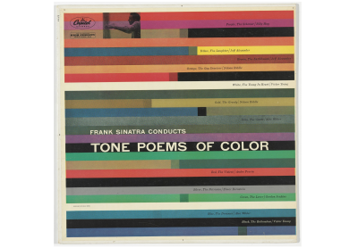
What does this mean in terms of web design? Well, a little more than ‘use bright colors,’ I’m afraid. Study color theory then apply it to your projects in tasteful, audacious ways. Several excellent articles on the subjects on the subject listed at the end of this section, and the ‘Colors’ category of Smashing Magazine is home to plenty more. It’s well worth the attention. The right palette can set a tone before visitors have even processed what they’re looking at.
For an uncannily Saul Bass-esque example of color and shape in action on the web, take the Holiday Center for Working Youth in Ottendorf. What better way to celebrate bold, functional architecture than through bold, functional design? It’s like a Vertigo poster in digital form.

Red, white, and black isn’t always the answer (though it is an incredibly sharp combination). The right mix depends on the story you’re trying to tell, and how you’re trying to tell it. Saul Bass knew full well that color is an incredibly powerful tool, and it’s one still often underused in the prim, white-space world of today’s web.
Audience involvement with a website begins with color, so make it count. For those unsure where to start here are a selection of Smashing articles on the topic:
- Color Theory for Designers, Part 1: The Meaning of Color by Cameron Chapman
- Color Theory for Designers, Part 2: Understanding Concepts And Terminology by Cameron Chapman
- Color Theory for Designers, Part 3: Creating Your Own Color Palettes by Cameron Chapman
- A Simple Web Developer’s Color Guide by Laura Elizabeth
- Hex Color: The Code Side Of Color by Ben Gremillio
Typography
Words, words, words. Design may be thinking made visual, but sometimes the best way to say something is to come right out with it in words. Bass had a typographical style almost as distinctive as his visual one. Rough, hand-drawn, and almost always all-caps, he made words powerful without being overbearing.
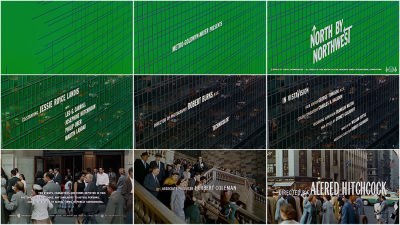
Fonts can tell stories too. They communicate tone of voice, formality, importance, and structure, among other things. Combined with a strong color scheme they can make copy dance where it might otherwise slouch along feeling sorry for itself.
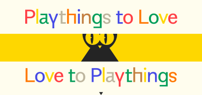
Copywriter Jon Ryder showcases this beautifully on his personal website, which is the full package of strong color and bold, playful typography. As you click the prompts the copy rearranges and edits itself. It’s a brilliant idea elegantly executed. If Saul Bass was around to design portfolios this is the kind of thing you’d expect him to come up with.

Art of the Title refers to Bass’s approach as ‘kinetic typography’, and I think that’s a lovely turn of phrase to keep in mind when choosing font combinations for the web. Yes, Times New Roman or Arial will do a job, but with the wealth of free fonts and CSS stylings available why wouldn’t want to try giving your words more life? It’s not always appropriate, but sometimes it can be just the ticket.
Resources
- Free Fonts With Personality And Style by Cosima Mielke
- A Reference Guide For Typography In Mobile Web Design by Suzanne Scacca
- Open Foundry, curated and open-source fonts
- Google Fonts
- Hitchcock font by designer Matt Terich, for fun
Drawing
This one is as much about the process as it is about websites themselves. Saul Bass was a big believer in drawing. Even as technologies advanced and opportunities arose to streamline the design process, he understood there is no substitute for working with your hands when trying to get ideas out of your head and into the world. To aspiring designers, he advised,
“Learn to draw. If you don’t, you’re going to live your life getting around that and trying to compensate for that.”
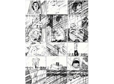
Whatever it is you’re dealing with — page layout, logos, icons — there is no faster way to get the ideas out of your head than by drawing them. In this day and age that doesn’t necessarily mean pen and paper, you can always use tablets and like, but the underlying principle is the same. There are no presets — just you and your ideas. I’m no Saul Bass, but I’ve had a few good ideas in my time (at least two or three) and most of them happened almost by accident in the flow drawing.
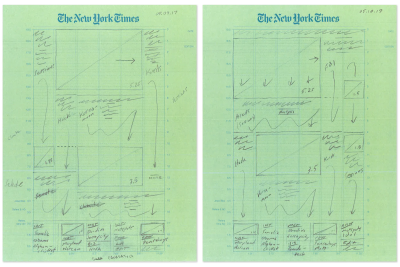
The value of drawing pops up in the unlikeliest of places and I love it every time I do. Every front page of The New York Times starts as a hand-drawn pencil sketch, for example. Are there fancy computer programs that could do a similar job? Sure, and they’re used eventually, but they’re not used first. It doesn’t matter if they’re brainstorming corporate logos, revamping a website’s homepage, or preparing the front page of a newspaper — designers draw.
Here are some good articles about the value of drawing in a web design context:
- The Importance of Sketching in Web Design by Carrie Cousins
- Significance of Sketch in Creativity Process Related to Graphic Design Education by Ezgi Karaata
An Interdisciplinary Approach
It’s near impossible to fix one label on Saul Bass. At any given time he was a graphic designer, a filmmaker, a photographer, an architect. The list goes on and on. Having to be literate in so many areas was a necessity, but it was also a genuine passion, a constant curiosity.
Take the title sequence of Vertigo. Its iconic spiral aesthetic dated back years earlier when Bass came across spiral diagrams by 19th-century French mathematician Jules-Antoine Lissajous. When asked to work on Vertigo, the idea clicked into place immediately. Mathematical theory found its way into an Alfred Hitchcock film poster, and who are we to argue with the results?
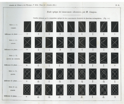
Having a specialization is obviously important in any field, but there is so much to be gained from stepping outside our lanes. Anyone with even a casual interest in web development has almost certainly found themselves needing a similarly protean approach — whether they wanted to or not.

Engineering, design, UX, typography, copywriting, ethics, law… much like in architecture there are few fields that don’t enrich one’s understanding of web design, so don’t be afraid to immerse yourself in the unfamiliar. You just might find the perfect inspiration.
Iterate, Collaborate
Even the masters are students, always learning, always iterating, often collaborating. Bass of course had strong ideas about what form his projects ought to take, but it was not his way or the highway. Look no further than Stanley Kubrick’s feedback on potential posters for The Shining. The two went through hundreds of drafts together. In one letter Kubrick wrote, “beautifully done but I don’t think any of them are right.”
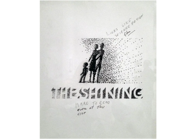
One can only imagine how many hours Bass slaved over those mockups, but when you look at those rejected it’s hard to disagree with Kubrick; beautifully done, but not quite right. I think the final result was worth the work, don’t you?
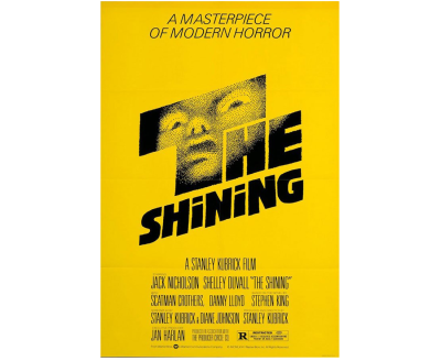
We live and work in a largely corporate world. Like Bass, that doesn’t have to hamstring the things you make. Hold your ground when that’s what the moment calls for, but always be on the lookout for genuine partners. They are out there. The client isn’t always right, but they’re not always wrong either. Collaboration often brings out the best in a project, and even geniuses have to work like hell to get it right.
There are few things more valuable than feedback from people you trust. It’s hard to beat that cool, communicative flow where egos and insecurities are out of the picture and it’s all about making the thing as good as it can be.
Here are a couple of articles on iteration and experimentation in web design that I’ve really enjoyed working on:
- The Principles Of Visual Communication by Elizabeth Lin
- Playfulness In Code: Supercharge Your Learning By Having Fun by Jhey Tompkins
Beauty For Beauty’s Sake
No-one dreams of doing corporate art, but Bass is a model example of excellence thriving in that world. Decades it still holds its own and is oftentimes genuinely beautiful. He showed better than most that designing for a living didn’t mean creativity couldn’t thrive. Whether you’re making brand logos or homepages there’s a lot to be said for creatives fighting their corner. You owe it to the work.
Bass put it better than I ever could.
“I want everything we do to be beautiful. I don’t give a damn whether the client understands that that’s worth anything, or that the client thinks it’s worth anything, or whether it is worth anything. It’s worth it to me. It’s the way I want to live my life. I want to make beautiful things, even if nobody cares.”
Everything else stems from this ethos, from beauty for beauty’s sake. From color to iteration to delight in the little details, Saul Bass showed the way for graphic and web designers alike. Be audacious, curious, and learning all the time. Make beautiful things, even if nobody cares.
Further Reading
- Interview With Björn Ottosson, Creator Of The Oklab Color Space
- Mastering Typography In Logo Design
- The Principles Of Visual Communication
- Learning JavaScript With Imagination


