Web Design Done Well: Making Use Of Audio
It’s easy to get hyper-focused on how things look on the web. There’s a lot to look at. You’re looking at this right now! However, in the age of touchscreens and home assistants, it’s safe to say sight isn’t the only sense worth caring about.
George Lucas once said half of any movie’s magic comes from its sounds. The same could be said of certain online experiences. For part two of this series, we’ve assembled some of our favorite examples of sound being used on the web. Most of us have had the misfortune of crossing bad examples (auto-playing videos being a particularly egregious example) but audio can give web experiences a whole new dimension when applied well.
What follows are some astounding sounds from the World Wide Web. We hope these bright ideas help you to think about your own projects a little bit differently.
Part Of: Web Design Done Well
- Part 1: The Ordinary Made Extraordinary
- Part 2: Making Use of Audio
- Part 3: Excellent Editorial
- Also, subscribe to our newsletter to not miss the next ones.
The New Yorker’s Audio Articles
The word ‘article’ generally brings to mind words on a page, with some wiggle room on whether that page is paper or on a screen. With each passing year, this assumption becomes more restrictive and reductive. Words can be heard as well as read. This is something a growing number of websites are clocking on to, with the The New Yorker being a particularly good example. Much of their writing — fiction and non-fiction — comes complete with an audio version, often read by the authors themselves.

Most websites don’t have the luxury of recording people like Margaret Atwood, but with text-to-speech software getting better and better, we love seeing sites incorporating it into their design and functionality. Nieman Reports did a fantastic article on the subject last year, and yes, there’s an audio version.
Tune In To The World’s Radios In Radio Garden
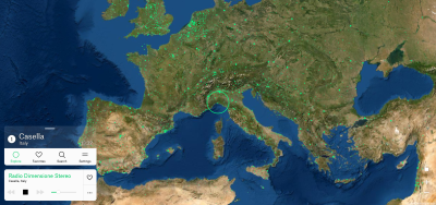
Lest we forget, websites can take forms other than grids. Radio Garden takes you around the world’s radio stations in an instant. It’s like Google Earth, but with music. Spin the globe, turn on, tune in, drop out. A deceptively simple idea executed with a playful elegance.

A lot of pieces are needed for this to be possible, among them CesiumJS for the globe, Esri for satellite imagery, and Free GeoIP for the location API. A wonderful idea beautifully executed. (An honorable mention must also go to Radiooooo, a kind of time travel equivalent.)
Botany And Symphonies In Penderecki’s Garden
We doubt you’ve ever seen a memorial garden quite like Krzysztof Penderecki. Wander the virtual garden of the legendary Polish composer (and keen gardener) with his music playing in the background. It’s a beautiful tribute, and a cracking case study in web design to boot. There’s a lot of cool stuff going on but the music seemed the apt thing to focus on.

Akkers van Margraten’s Oral Histories Of WWII
The scope for archival material to reinvent itself online in new and exciting ways is almost limitless. The Akkers van Margraten oral history project builds its website around its audio content, with the audio clips accompanied by mournful musical arrangements.

The music is supplemental, helping the interviewees to conjure the spirit of a time and place. Would the effect be the same without? We’re not so sure.
Netflix Brings Trailer-Like Intensity To Its Dark Series Guide
There is a wariness of media that plays automatically on web pages. This wariness is well earned. Still, the guide for Netflix’s “Dark” series shows how powerful it can be when done right. The site’s deep ambient tones pull you headfirst into the mood.

Imagine a long-form article with the right accompaniment — a horror story paired with dissonant ambient arrangements perhaps, or a look back at the Swinging Sixties with a Jefferson Airplane song playing in the distance. This Dark guide shows how much of a shot in the arm that can be.
IT Museum Brings Audio Tours To The Web
The DataArt IT Museum is an ever-growing collection of Eastern European tech hardware, each item appropriately brought online. This e-museum is beautiful in all sorts of ways, but its use of interview snippets is particularly sharp. Not unlike Akkers van Margraten, the audio snippets bridge the gap between then and now.

It almost feels obvious once you see it. Just about everyone has wandered through a museum or gallery or historical building while listening to an audio guide. Why shouldn’t the same option be available to us online?
Ethics For Design
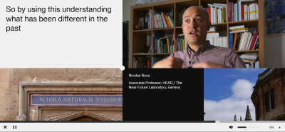
What is the role of a designer? That is the question posed to a dozen designers and researchers in Ethics for Design, with the answers presented in a way only the web could really pull off. Instead of presenting the results in one glossy run-of-the-mill video, the site instead separates all the pieces.

As much as anything else, it shows how much can be lost when we limit ourselves to one medium — be it text, sound, videos, photographs, or graphics. Although a little jarring to begin with, maybe that’s what’s needed to think about how each piece fits into a wider puzzle.
SoundCloud’s Sticky Music Player Bar
We figured we should close with a god-honest feature. For that, we turn to SoundCloud, which has a music player that plays independently of the rest of the site. Clicking on a new page doesn’t reset the player, allowing visitors to browse artists and albums without breaking the flow of what they’re listening to. It feels so natural that it’s hard to imagine there one not being there.

We’ve become used to this through apps like Spotify, but on the web proper, it still screams untapped potential. Think of how it might be combined with other ideas featured here. Imagine you’re on a news website and start listening to a story, a la The New Yorker. With a player like this, visitors could continue browsing the site while still listening to the original story. Sounds like the future.
Wrapping Up
The sites featured here only scratch the surface of what’s possible. Sound can take countless forms: radio, music players, interviews, narration, and navigation to name but a few. We’re not all that far away from conversing with websites.
If you’re interested in learning more, the articles below offer a sound starting point for audio design online:
- “Guidelines For Designing With Audio,” Karen Kaushansky
- “How Sound Design Is Transforming UX,” Richard Mattka, Creative Bloq
- “The UX Of Sound: Designing Audio Experiences,” Nick Babich, WebdesignerDepot
- “Applying Sound To UI,” Material Design
- “Designing With Audio: What Is Sound Good For?,” Karen Kaushansky
Technical capabilities have grown massively in recent years, with more and more flexibility demanded of the sites we use. They are seen, they are touched, and, increasingly, they are heard. We’ll hold off advocating for edible, pleasantly scented websites (for now) but sometimes it’s absolutely worth making them noisier.


 Take a break with a 3D game built on Netlify!
 Click here to kickstart your project for free in a matter of minutes.
 Start with a free demo —


