Why Designers Aren’t Understood
As designers, especially in large enterprises, we often might feel misunderstood and underappreciated. It might feel like every single day you have to fight for your users, explain yourself and defend your work. It’s unfair, exhausting, painful and frustrating.
Let’s explore how to present design work, explain design decisions and get stakeholders on your side — and speak the language that other departments understand.

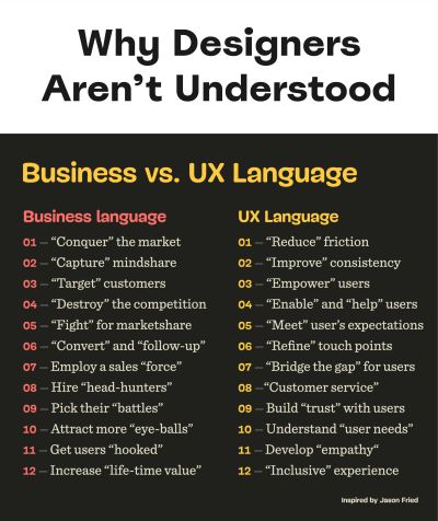
As designers, we might feel slightly frustrated by the language that often dominates business meetings. As Jason Fried has noted, corporate language is filled with metaphors of fighting. Companies “conquer” the market, they “capture” mindshare, they “target” customers, they “destroy” the competition, they want to attract more “eye-balls, get users “hooked, and increase “life-time value.
Designers, on the other hand, don’t speak in such metaphors. We speak of how to “reduce” friction, “improve” consistency, “empower” users, “enable and help” users, “meet” their expectations, “bridge the gap”, “develop empathy”, understand “user needs, design an “inclusive” experience.
In many ways, these words are the direct opposite of the metaphors commonly used in corporate environments and business meetings. So no wonder that our beliefs and principles might feel misunderstood and underappreciated. A way to solve is to be deliberate when choosing words you use in the big meeting. In fact, it’s all about speaking the right language.
This article is part of our ongoing series on design patterns. It’s also an upcoming part of the 10h-video library on Smart Interface Design Patterns 🍣 and the upcoming live UX training as well. Use code BIRDIE to save 15% off.
Speaking The Right Language
As designers, we often use design-specific terms, such as consistency, friction and empathy. Yet to many managers, these attributes don’t map to any business objectives at all, often leaving them utterly confused about the actual real-life impact of our UX work.
One way out that changed everything for me is to leave UX vocabulary at the door when entering a business meeting. Instead, I try to explain design work through the lens of the business, often rehearsing and testing the script ahead of time.
When presenting design work in a big meeting, I try to be very deliberate and strategic in the choice of the words I’m using. I won’t be speaking about attracting “eye-balls” or getting users “hooked”. It’s just not me. But I won’t be speaking about reducing “friction” or improving “consistency” either.
Instead, I tell a story.
A story that visualizes how our work helps the business. How design team has translated business goals into specific design initiatives. How UX can reduce costs. Increase revenue. Grow business. Open new opportunities. New markets. Increase efficiency. Extend reach. Mitigate risk. Amplify word of mouth.
And how we’ll measure all that huge impact of our work.
Typically, it’s broken down into eight sections:
🎯 Goals ← Business targets, KRs we aim to achieve.
💥 Translation ← Design initiatives, iterations, tests.
🕵️ Evidence ← Data from UX research, pain points.
🧠 Ideas ← Prioritized by an impact/effort-matrix.
🕹 Design work ← Flows, features, user journeys.
📈 Design KPIs ← How we’ll measure/report success.
🐑 Shepherding ← Risk management, governance.
🔮 Future ← What we believe are good next steps.
Key Takeaways
🤔 Businesses rarely understand the impact of UX.
🤔 UX language is overloaded with ambiguous terms.
🤔 Business can’t support confusing initiatives.
✅ Leave UX language and UX jargon at the door.
✅ Explain UX work through the lens of business goals.
🚫 Avoid “consistency”, “empathy”, “simplicity”.
🚫 Avoid “cognitive load”, “universal design”.
🚫 Avoid “lean UX”, “agile”, “archetypes”, “JTBD”.
🚫 Avoid “stakeholder management”, “UX validation”.
🚫 Avoid abbreviations: HMW, IxD, PDP, PLP, WCAG.
✅ Explain how you’ll measure success of your work.
✅ Speak of business value, loyalty, abandonment.
✅ Show risk management, compliance, governance.
✅ Refer to cost reduction, efficiency, growth.
✅ Present accessibility as industry-wide best practice.
Next time you walk in a meeting, pay attention to your words. Translate UX terms in a language that other departments understand. It might not take long until you’ll see support coming from everywhere — just because everyone can now clearly see how your work helps them do their work better.
Useful Resources
- Business Thinking For Designers, by Ryan Rumsey
- Business For Designers (d.mba), by Alen Faljic
- Corporate Language Metaphors, by Jason Fried
- Five Things That Business Cares About, by Jared Spool
- Direct Impact Of Design Work, by 👨🏻💻 Andy Budd
- It’s Time To End The Tyranny Of UX Terminology, by Joe Natoli
- How To Use Storytelling In UX Research, by Allison Grayce Marshall
- How To Defend Your Design Decisions, by Vitaly Friedman
Meet Smart Interface Design Patterns
If you are interested in similar insights around UX, take a look at Smart Interface Design Patterns, our 10h-video course with 100s of practical examples from real-life projects — with a live UX training later this year. Everything from mega-dropdowns to complex enterprise tables — with 5 new segments added every year. Jump to a free preview.

100 design patterns & real-life
examples.
10h-video course + live UX training. Free preview.

