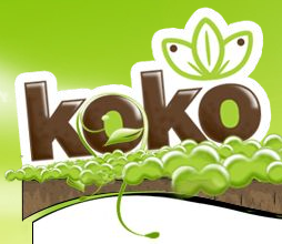
Logotrend 2007: Leaves
In 2007 logo-design leaves stand for fresh ideas or - more generally - for an innovative way of thinking. In Web they are mostly used to communicate light-weight solutions as well as clean and unobtrusive designs. In fact, leaves, plants or ornaments which appear to be related to the nature can be found almost everywhere; it’s a trend that will probably be reversed soon, due to an extreme overuse of the theme in modern designs. The sites themselves, using leaves for their logos, mostly do not have a relation to foliage - and even although often green color is used, that is not necessarily the case.
We’d like to present you some of them. The following logos aren’t supposed to represent the quality of logo designs with leaves, but the trend we observe on the Web. The images can be clicked and lead to the sites from which the logos have been taken. You’ll also find tutorials you can use to learn how to create “leaf logos” at the end of this post. Please notice that this post features only those logos which are related to the Web.
What do you think? Is an extensive use of leaves in logos a current Web 2.0 hype which will disappear soon or are the leaves here to stay?
Leaves on light background


Leaves on dark background


 Celebrating 10 million developers
 Register Free Now
 SurveyJS: White-Label Survey Solution for Your JS App


 Try ProtoPie AI free →

