Pagination – Examples And Good Practices
Structure and hierarchy reduce complexity and improve readability. The more organized your articles or web-sites are, the easier it is for users to follow your arguments and get the message you are trying to deliver. On the Web this can be done in a variety of ways.
In body copy headlines and enumerations are usually used to present the information as logically separated data chunks. An alternative solution is pagination, a mechanism which provides users with additional navigation options for browsing through single parts of the given article. Parts of the article are usually referred to by numbers, hints, arrows as well as “previous” and “next”-buttons.
Further Reading on SmashingMag:
- Infinite Scrolling, Pagination Or “Load More” Buttons?
- Reapplying Hick’s Law of Narrowing Decision Architecture
- Redefining Lazy Loading With Lazy Load XT
- 10 Principles Of Effective Web Design
Search engines almost always use pagination; newspapers tend to make use of it for navigation through the parts of rather large articles. And there are situations when pagination is also necessary for weblogs. Additional navigation can simplify the access to some site pages — e.g. make it easier for users to browse through the archives of the site.
In most cases pagination is better than traditional “previous - next” navigation as it offers visitors a more quick and convenient navigation through the site. It’s not a must, but a useful nice-to-have-feature.
Let’s take a look at the good practices of pagination design as well as some examples of when and how the pagination is usually implemented.
Good Practices Of Pagination Design
7 Aspects according to Faruk Ates
- Provide large clickable areas
- Don’t use underlines
- Identify the current page
- Space out page links
- Provide Previous and Next links
- Use First and Last links (where applicable)
- Put First and Last links on the outside
Mistake #1: Navigation Options Are Invisible
Since pagination’s primary purpose is to serve as an improved navigation, it is supposed to make it clear for the visitors where they are, where they’ve already been and where they can go next. These three facts give users a complete understanding of how the system works and how the navigation should be used.
Mistake #2: Pagination Isn’t Intuitive
If you have to decide between a quite complex (but beautiful) pagination and a simple one with necessary functionality always prefer the simple solution. If users don’t understand the mechanism behind navigation they won’t be able to use it and therefore won’t use your web-site.
Helium.com is a perfect example for this mistake. Take a look at the screenshot below: what do the arrows stand for? For the page you’ve already visited or for the page you are currently on? And why does the link to the second page have a white background color? Why do the arrows have different colors? This is unintuitive.

Unintuitive designs result from the lack of structure, hierarchy and well thought-out design decisions. “Blank” pagination is as unintuitive as overcrowded design solution.


Creative Solutions Can Be User-Friendly
The more frequently a design element is used, the harder it is for designers to introduce some creative approaches without risking to make the design less intuitive. Consequently, pagination designs have rather a variety of different patterns — revolutionary approaches are used very rarely.
However, creative approaches can be user-friendly. E.g. Dirty.ru uses a slider-based pagination menu; users can drag it to get more available options, that means links to the older pages of the site.

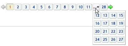
Erweiterungen.de, the German version of the official Firefox extensions web-site, provides more navigation options once the visitor clicks on the “…”-button.

Gallery - Screenshots taken in 2007
Although “standard” pagination — linked blue numbers following each other — is very common for most web interfaces, designers tend to experiment with colors, forms, backgrounds and shapes.
The pagination doesn’t need to look nice aiming to captivate users’ attention; as a part of site navigation it offers users an important functionality and as such has to be used effectively. Still, visual clues can be helpful. In most designs blue and grey colors dominate — colors traditionally used by services.
Simple Enumeration


Colors and Shapes In Use
Often designers use colors to highlight the current page and separate it from the other pages. The numbers of the pages are also given a shape: a rectangle, a circle or a button. The current page is usually not linked.


![]()


Pagination With Manual Page Input
In some cases users can provide the number of the page they’d like to see manually, via the input-element. This is common for paginations with the limited number of options — e.g. in these designs you can’t jump to the last page if you’d like to.


Unusual Solutions


 Try ProtoPie AI free →
 SurveyJS: White-Label Survey Solution for Your JS App
 Register Free Now
 Celebrating 10 million developers


