Data Visualization and Infographics
The main goal of data visualization is its ability to visualize data, communicating information clearly and effectivelty. It doesn’t mean that data visualization needs to look boring to be functional or extremely sophisticated to look beautiful. To convey ideas effectively, both aesthetic form and functionality need to go hand in hand, providing insights into a rather sparse and complex data set by communicating its key-aspects in a more intuitive way. Yet designers often tend to discard the balance between design and function, creating gorgeous data visualizations which fail to serve its main purpose — communicate information.
In both print and web design infographics — visual representations of information, data or knowledge — are often used to support information, strengthen it and present it within a provoking and sensitive context, depending on designer’s creativity.
This article presents some spectacular data visualizations and infographics which manage to combine a strong visual appeal with the effective presentation of information.
- You might want to take a look at the article Data Visualization: Modern Approaches we’ve written few months ago.
Data Visualization and Infographics
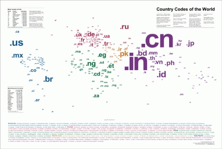
Country Codes of the World Country Codes of the World maps 245 top-level domain country codes encompassing all United Nations countries as well as numerous islands and territories. Each two-digit code is aligned over the country it represents and is color coded with the legend below for quick and easy reference.
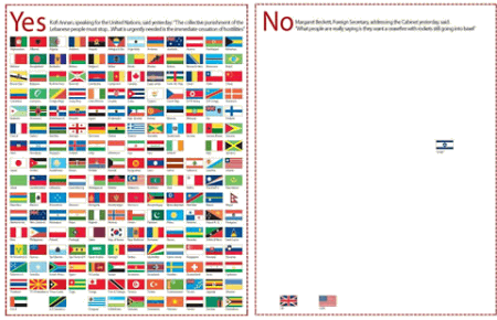
Independent: Infographic Middle-East: who backs immediate cease-fire? The infographic below was published on the front page of the “Independent” magazine during the Middle-East crisis in July 2007.
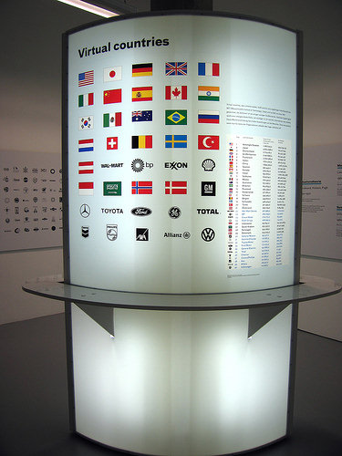
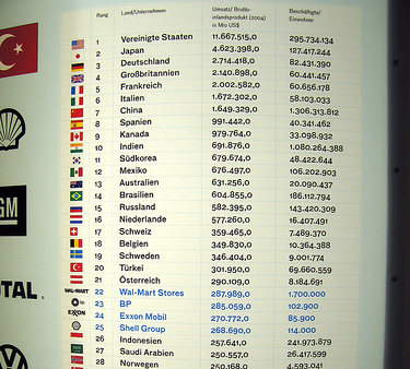
Virtual countries This stand present the largest virtual countries according to the gross domestic product of the countries and world’s largest companies.
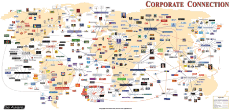
Corporate connections: An extremely compact and useful source of information.
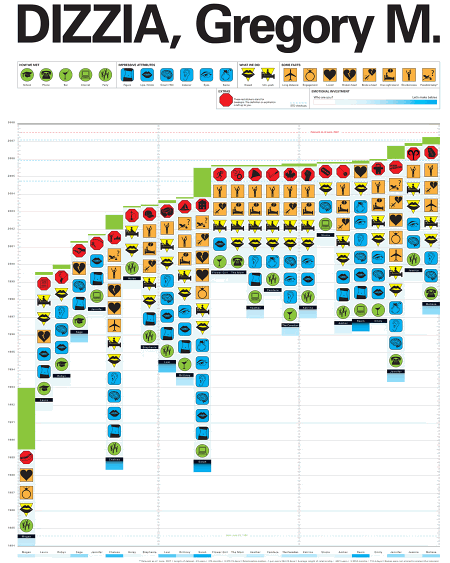
DIZZIA, Gregory M. This is the documentation of every intimate relationship Gregory Dizzia has ever had. The data spans 23 years.
Amadana Infographics Amadana is a Japanese company, which explains why they might not have realized that a scapegoat isn’t the same as an “acuarium.” The first row is for that toaster oven, the second and third rows are for an air purifier, while the last is for a hot plate.
The Japanese Wii Safety Manual This Japanese Wii safety manual is pretty much indicative of Japanese people’s general insanity. [via Gizmodo]
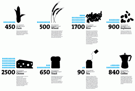
Virtual Water Simple, clean, elegant and effective. A double-sided poster visualizing the water footprint of products and nations.
Flickr User Model A slightly more complex data infographics, however still clear and well-presented.
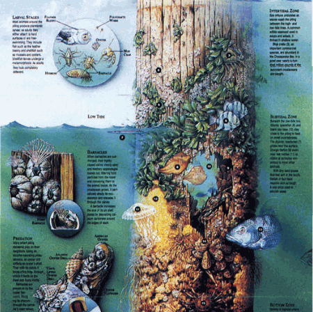
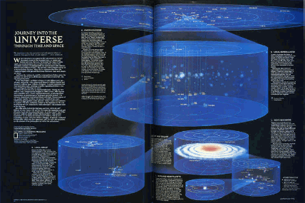
Journey into the Universe (1985) Information design, 1985.
Megan Jaegerman A review of Megan Jaegerman’s work by Edward Tufte. Notice how clean and legible the infographics are.
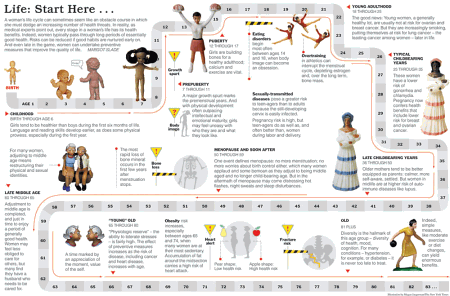
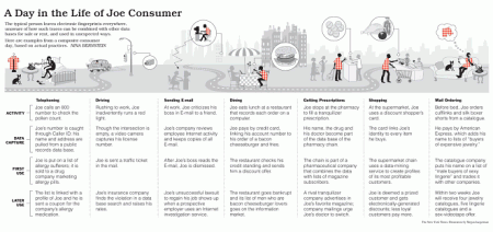
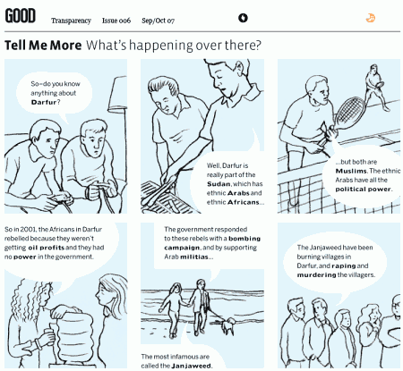
Good Magazine Infographics In each of its issues Good magazine offers good, even excellent, infographics related to aspects of our life. Some excellent examples below.
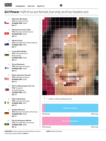
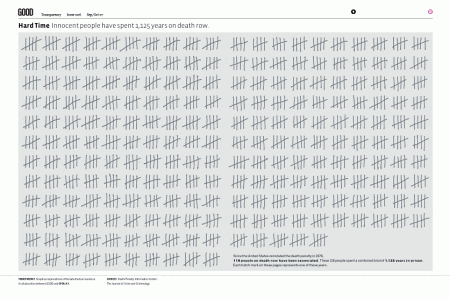
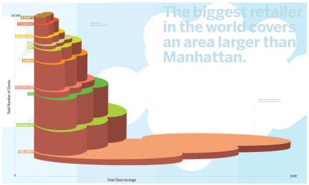
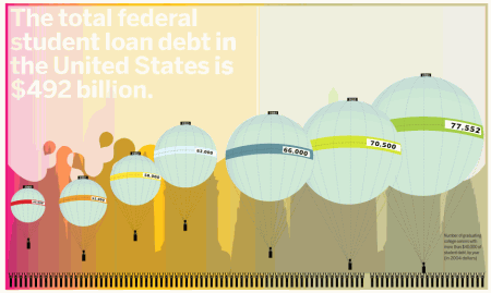
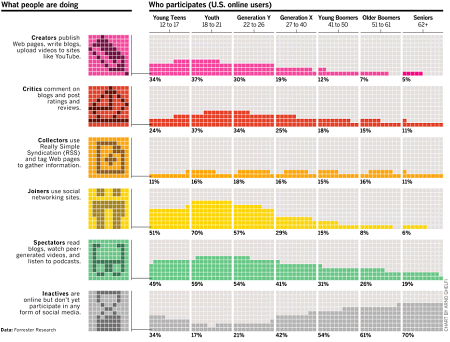
Who Participates and what people are doing online A slightly different presentation of usual charts gives it some uniqueness and appeal.
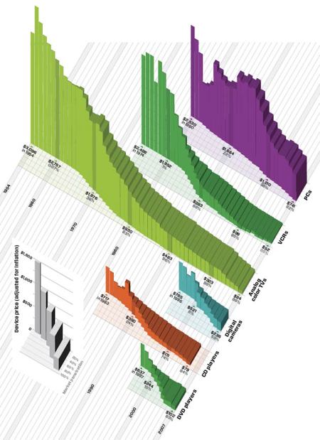
The Cost of Living on the Bleeding Edge of Gadgetry Price and market penetration of consumer electronics over the past 50 years. By Arno Ghelfi. Infographics from a quite different perspective.
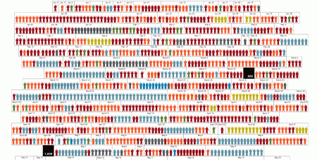
A year in Iraq An unusual data visualization which gives information on the type and location of each attack responsible for the 2,592 recorded deaths.
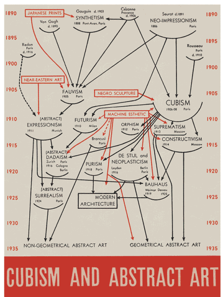
Cubism and Abstract Art Clean, informative and elegant. Alfred Barr’s work, found in Edward Tufte’s book.
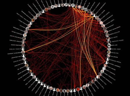
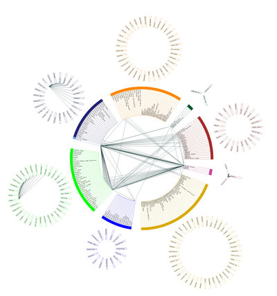
MyMap A data visualization application capable of rendering the relationships between the user and individuals in the address book by examining the TO:, FROM:, and CC: fields of every email in the 60,000-large email archive.the intensity of the relationship is determined by the color intensity of the line. “My Map” allows to explore different relational groupings and periods of time, revealing the temporal ebbs and flows in various relationships. My Map thus becomes a veritable self-portrait, a visual reflection of personal associations and relationships.
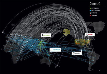
When Bots Attack Using rented botnets, you can launch hundreds of thousands — even millions — of infobombs at a target, all while maintaining total deniability. In this hypothetical scenario, a single attack launched by China against the US lasts only a few hours, but a full-scale assault lasting days or weeks could bring an entire modern information economy to its knees. This infographic is supposed to illustrate it.
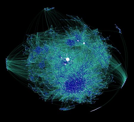
Mapping the Blogosphere This is what the blogosphere looks like…
Globalization …what about globalization?
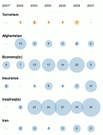
George W. Bush Speech Infographics An interactive infographic, compares the number of times certain words appear in the address. Both are a nice example of how information design can give readers more ways to evaluate and contextualize a given text or set of data. So simple, but extremely intuitive and clear.
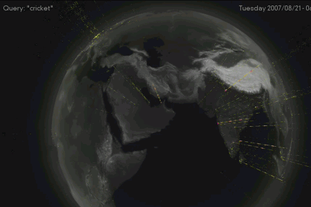
yHaus: BookScape, Query Bursts. Experimental projects by Yahoo! Design Innovation Team. These query bursts depict individual IP numbers that start very popular bursts of search queries. each particle shows a query from a unique location worldwide. Bookscape represents about 250,000 illustrations taken from children books, originally collected by the Open Library Project. The experimental interface uses dynamic resampling of image data to place all the images in a single zoomable space, arranged alphabetically by title.


 Register Free Now


 SurveyJS: White-Label Survey Solution for Your JS App
 Celebrating 10 million developers
 Try ProtoPie AI free →