Navigation Menus: Trends and Examples
Navigation is the most significant element in web design. Since web-layouts don’t have any physical representation a user can stick to, consistent navigation menu is one of the few design elements which provide users with some sense of orientation and guide them through the site. Users should be able to rely on it which is why designers shouldn’t mess around with it.
That’s why in most cases it’s where simple, intuitive and conventional solutions are usually the best option. However, it doesn’t mean that they need to be boring. One year ago we’ve presented modern approaches of navigation design. Let’s take a look at what’s different now, which trends one can observe and what ideas you can develop further in your projects.
Further Reading on SmashingMag:
- Web Design Navigation Menus – Articles And A Beautiful Showcase
- Planning And Implementing Website Navigation
- Efficiently Simplifying Navigation, Part 1: Information Architecture
- Showcase of Creative Navigation Menus: Good and Bad Examples
This article presents historical trends, examples and innovative solutions for design of 2008 navigation menus. The images are not clickable and do not lead to the sites from which they’ve been taken - all is gone.
1. Trend toward “speaking” block navigation
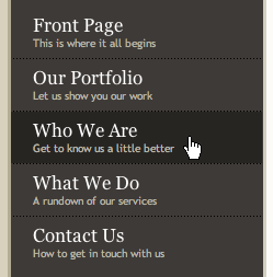
The most significant task a navigation menu has to fulfill is to unambiguously guide the visitors through the different sections of the site. However, often it’s quite hard to communicate the content of a site section within one or two single keywords, particularly if horizontal navigation is in use. That’s why often navigation options aren’t simply listed one after each other using some appropriate keyword (“silent” navigation); instead, designers attempt to concretely explain which options are available and what the visitor should expect from site sections once clicking on corresponding links.
In fact, over the last months we’ve observed a strong trend toward exactly this navigation scheme; and since designers try to initiate a more effective dialogue with visitors we prefer to call it “speaking” navigation — contrary to “silent” navigation based upon the listing of keywords.


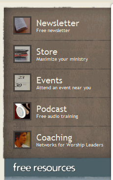
To make the perception of information easier, the navigation is often structured by using blocks of the same height and width; large icons are used quite often, but in most cases the decision whether they are appropriate or not depends on the content of the site and the overall layout. “Soft” hover-effects often support the navigation design by making the browsing more pleasant.


This navigation scheme can be used not only for the horizontal navigation; it can be applied to vertical navigation as well.
2. Mac-style still popular?
One can discuss if the Mac-style is the survivor of the Web 2.0 design attack or it becomes a standalone design element used independently from glossy colorful buttons with 3D-effects. Or maybe it’s just a temporary trends toward grunge style — nobody knows, really.
In any case over the last months a number of websites integrated Mac-styled-navigation in their websites. What’s interesting is that the style is used not only on Apple-related sites, but also on websites which aren’t directly related to Mac. Particularly when it comes to design of software products traditional Mac-style is often imitated. Reason: it is visually appealing and looks cool.


A navigation bar doesn’t need to look exactly like a typical Mac-style-navigation. Variations are also possible.

"Green" version of the traditional Mac-style menu

Since navigation bars can’t exist alone and need to be supported by the overall design, colorful one-page-sites with happy talk and overused stock photos designers are being replaced with more decent, serious and calm layouts. And that’s a good thing. However, when using the Mac-style please keep in mind that it shouldn’t be used for the sake of it but has to fit to the overall design.
3. Visually appealing icons are used more often
To communicate navigation options in a more effective way, designers often make use of appealing icons. In such cases it’s important to make sure that the icon is easily recognizable, clearly conveys the message, corresponds to the link it stands for and isn’t too small. Attractive icons are, of course, always preferred to the boring ones.


Icons can also be hidden into the links; this effect should be used sparingly.


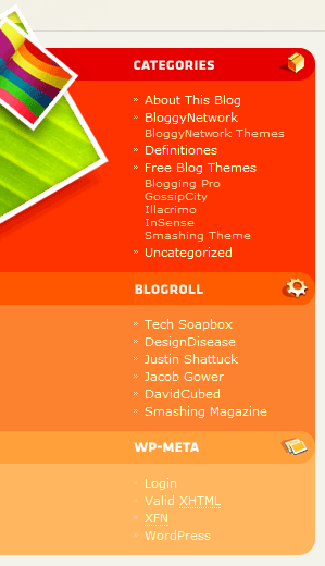
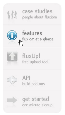
Icons can be placed on the left-hand side…
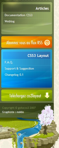
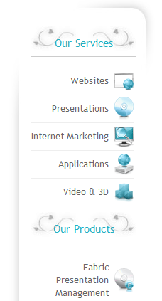
…and on the right-hand side in the sidebar.
4. Vertical tabs
Although traditional desktop-applications almost never make use of vertical tabs, in the office vertical tabs are used at least as often as horizontal ones. In fact, designers often try it out; and the results can be quite interesting.
Before using vertical tabs you should make sure that it is possible within your layout and you actually have enough area to cover all navigation options on every single page. And, of course, the text is harder to read.
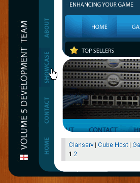
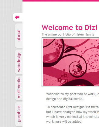
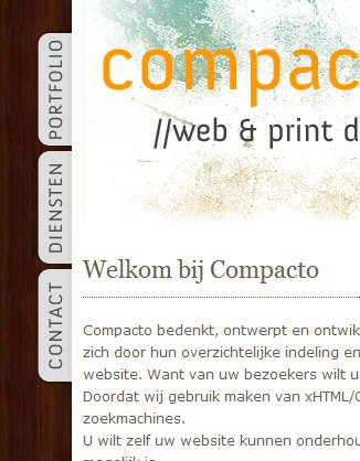
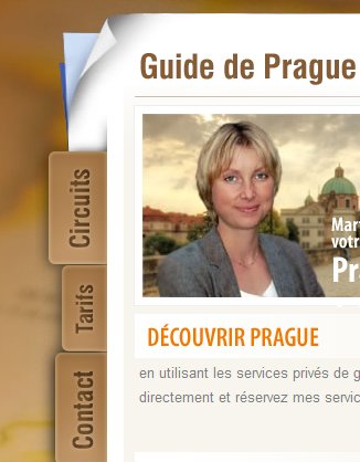
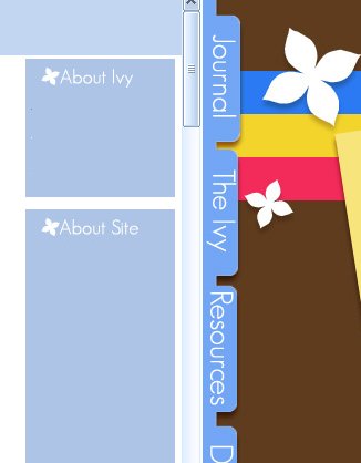
Tabs on the right-hand side.
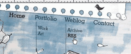
5. Handwriting in use.
Recently we already discussed the hand-drawing style in modern web-design. And what holds for design layouts also holds for its specific elements — for instance, for navigation.




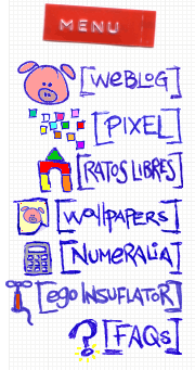
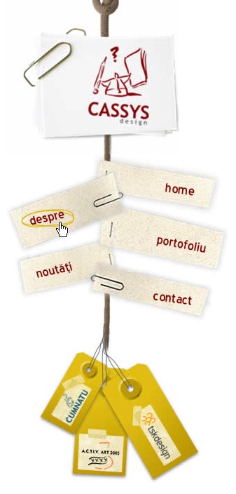
6. Experimental solutions
Although it’s usually not the best idea to come up with some strange and/or unique site navigation, designers tend to risk crazy and uncommon experiments. When trying out something new, make sure that you don’t put the usability of your site in danger by creating unnecessary barriers for your visitors. Any navigation menu fails if users can’t make sense out of it.
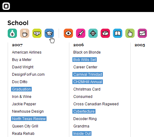
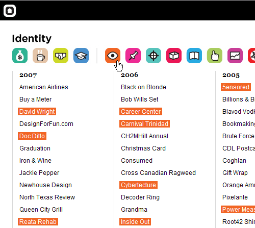
DesignForFun uses icons to help visitors to filter the content they’re looking for. Depending on the clicked icon the background of corresponding links changes. However, the selection of icons may be not the best one as it’s unclear hat icons stand for. Fortunately, title attribute is in use.
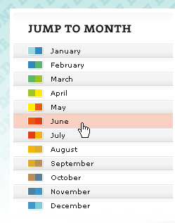
Interesting concept: the hover-effect on jBunti depends on the selected month of the year. Warm months are associated with reddish colors, cold months with blueish colors. 12 hover-colors in use.
Playground Blues tries out something completely different; each of 12 site sections has its color in the left sidebar. Once the visitor hovers the mouse arrow over the left-hand sidebar the icons pop up providing visitors with navigation options. Title-attribute is used as well. And to make sure visitors actually can find the navigation the icons pop out like harmonica first time the page is loaded.

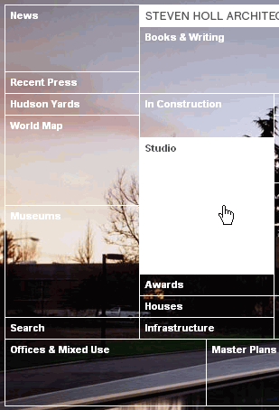
Steven Holl is an architect. Which is why his navigation menu looks like an architectural sketch. Each navigation option is given some weight in the map — apparently according to its weight on the site.
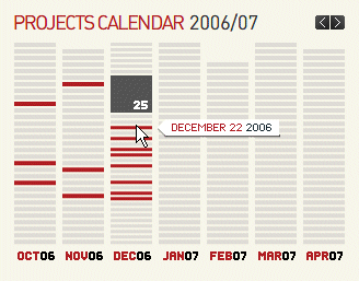
Polkdesign uses a calender as the central navigation element. Flash.
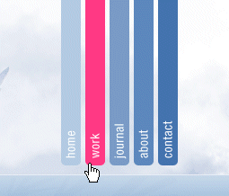
Hopkingdesign offers not a tabbed-navigation; it’s a vertical navigation placed at the top of the page. Looks at least unusual.
No, Adipintilie.eu has navigation options also placed at the top; however, these are only external links.

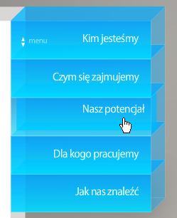
Flash-based 3D-effect used on Gol.com.pl. The menu can also be expanded.
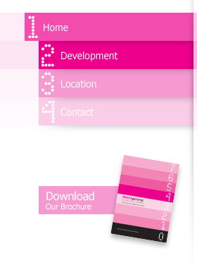
The navigation on Wards-Exchange.co.uk fits to the brochure design. Or the other way around.
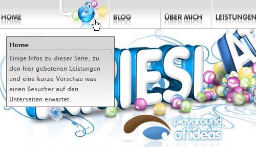
On Kriesi.at the hovered navigation option is dynamically expanded and shows the icons which illustrate what to expect in the section of the site. The effect is in this case not necessary.
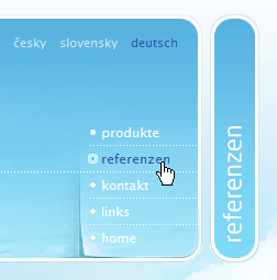
Not really new, but still beautiful. Folietto.at uses the free area effectively and sparingly. You may notice an interesting visual effect when hovering the links.
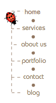
inBloom has a menu with animation. The beetle doesn’t care what option you choose, it crawls its long path through the navigation tree anyway. This is an example of how animation can be unobtrusive.
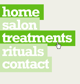
Cobahair.co.uk uses only BIG typography…
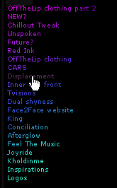
…and HelloColor.com uses small typography with rainbow colors.
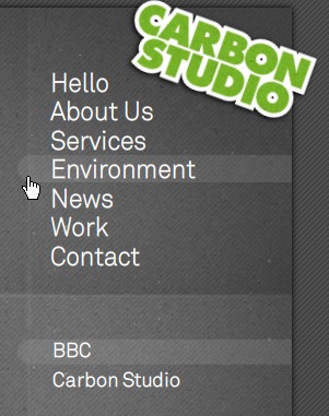
Carbonstudio.co.uk delivers a Flash-based navigation menu with sound-effects. It may sound annoying, but it isn’t: every navigation option has its own sound. If you train yourself a little bit you can even play your own melody while listening to birds in the background.
Maxandlous.com provides hover-effects with visual hints. It looks nice and unusual.


Not really new, but still beautiful. Folietto.at uses the free area effectively and sparingly. You may notice an interesting visual effect when hovering the links.

inBloom has a menu with animation. The beetle doesn’t care what option you choose, it crawls its long path through the navigation tree anyway. This is an example of how animation can be unobtrusive.

Cobahair.co.uk uses only BIG typography…

…and HelloColor.com uses small typography with rainbow colors.

Carbonstudio.co.uk delivers a Flash-based navigation menu with sound-effects. It may sound annoying, but it isn’t: every navigation option has its own sound. If you train yourself a little bit you can even play your own melody while listening to birds in the background.

Maxandlous.com provides hover-effects with visual hints. It looks nice and unusual.

Scrollomania in all possible directions on Letters-Numbers.com.
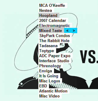
OK, how can you come up with this one? Nickad’s Flash-based construct becomes visible only if the mouse is clicked and remains being clicked.
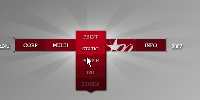
Nike offers a kind of remote control. To navigate you need to click and drag. While dragging, move the mouse up to move forward, down to move backward, and left/right to turn.


 Celebrating 10 million developers
 Try ProtoPie AI free →


 Register Free Now

