45 More Excellent Blog Designs
We, designers, are creative folks. And being creative, we permanently strive for inspiration — innovative approaches, crazy ideas, smashing concepts and, in general, unique designs which can help us to observe a given problem from a fresh perspective. This is why we always have some fancy design books laying around on our desk, and this is why we enjoy observing other people’s work — basically just because we can learn a hell of a lot from them.
There are things one can do a number of times without worrying about becoming boring. For instance, collecting and showcasing excellent blog designs. In this post we do it already the third time. Why? Web design lives in blogs; new developments appear there, that’s where the music plays. And that’s where you need to look for in order to keep up with current trends and developments.
This post presents 45 excellent blog designs with a perfect layout and unique personal note. We haven’t analyzed the content of the blogs; instead we focused on ideas, approaches, graphics and layouts.
If you miss some stunning blog designs in this showcase please let us know in the comments. However, it’s also possible that these designs have already been covered in one of our previous showcases:
- 50 Beautiful and Creative Blog Designs
- Corporate Blog Design: Trends And Examples
- 20 Extraordinary Blogs With Unique Post Designs
- Original And Innovative Web Layouts
Excellent Blog Designs from 2008
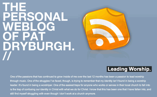
Pat Dryburgh has probably one of the largest RSS-buttons ever created.
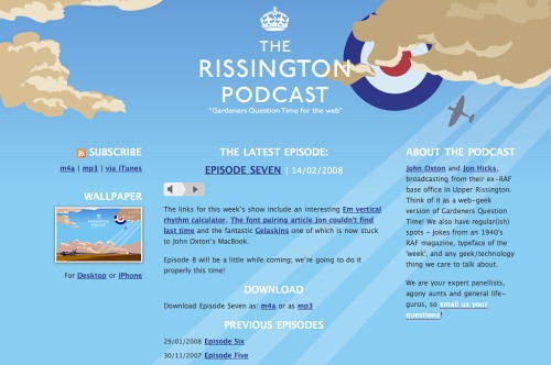
The Risington Podcast
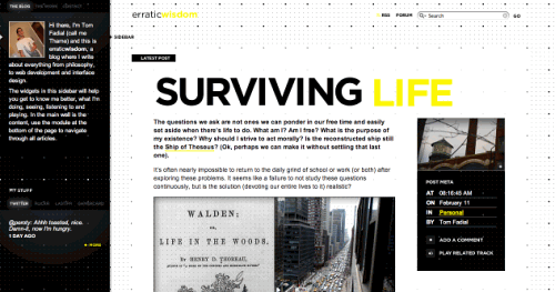
Erratic Wisdom
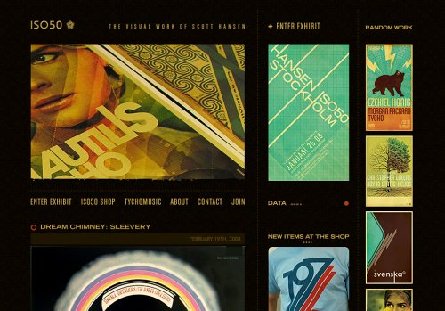
Iso50 Magazine-style, very stylish, and pretty impressive.
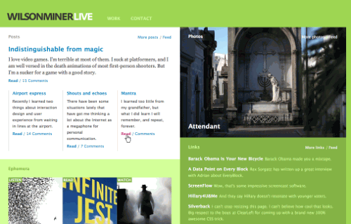
Wilsonminer A very thought-out design with attention to little details.
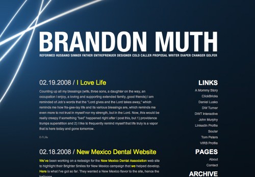
Brandonmouth
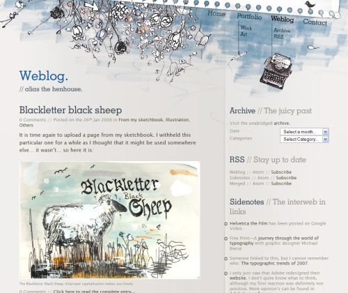
Squawk The “paper” theme in use.
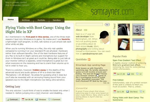
Sam Rayner
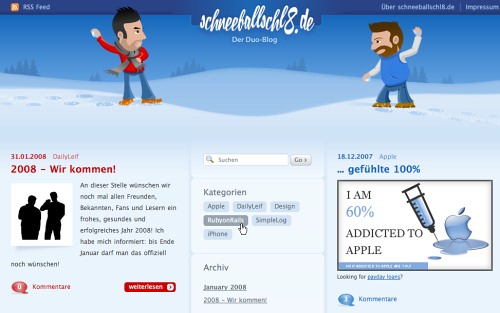
Schneeballschlacht Interesting not just because of two mascots, but because of a double-blog: two bloggers write together and against each other on both left and right sides of the navigation area. Interesting concept.
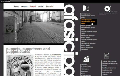
Papuasia Black and white at its best. Notice how well icons communicate information, block formatting in use.
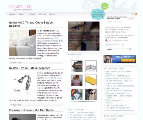
I Heart Luxe A shopping magazine powered by Wordpress.
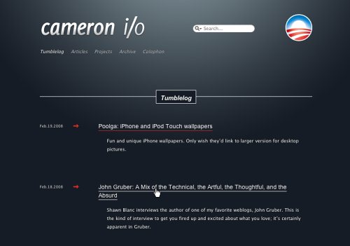
Cameron.io
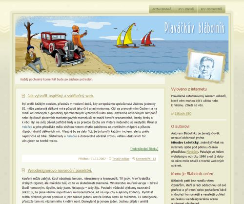
Plavackuv Blabolnik Whatever it means…
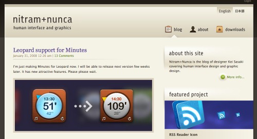
Nitram-Nunca
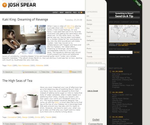
Josh Spear
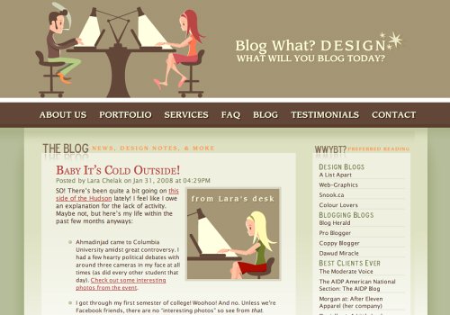
Blogwhatdesign
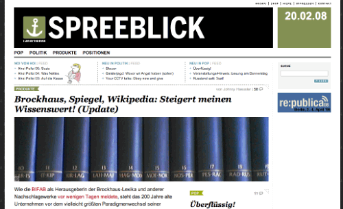
Spreeblick Magazine-style design based upon WordPress.
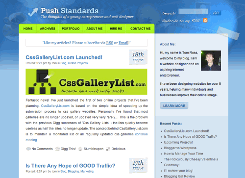
PushStandards Soft colors, visually appealing layout and hand-written links at the top of the page.
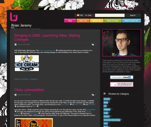
Brian Jeremy Loves colors…
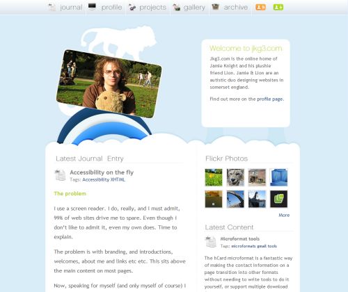
Jamie Knight Meet soft and cloudy design — that’s Jamie and his Teddy.
Jeriko
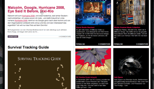
Clean, Simple Designs
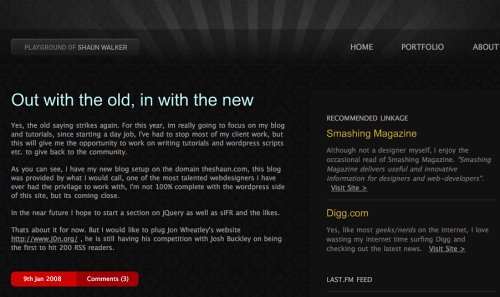
theshaun.com Seriously cool, elegant and simple.
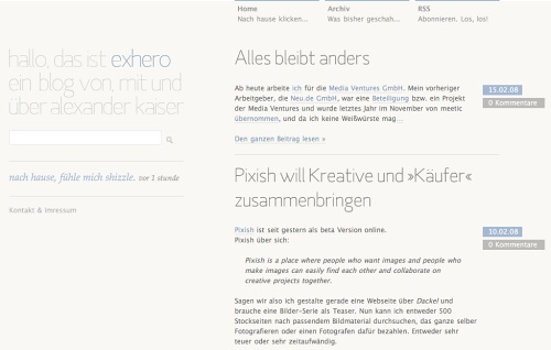
ExHero.de
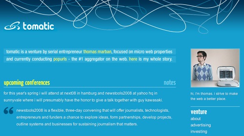
Tomas Marban
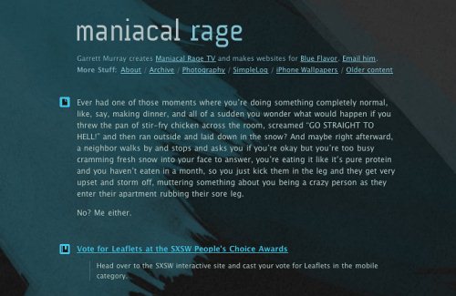
ManiacalRage
Experimental Designs
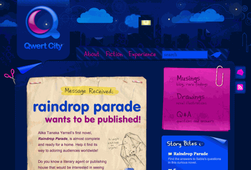
Qwertcity Vivid colors. Used together, they may be not that appealing, but they just can’t be not eye-catching.
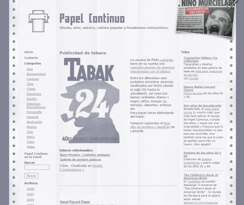
Papel Continuo Sometihng… completely different.
Ideate

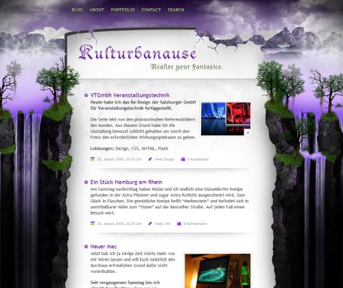
Kulturbanause The background determines the layout. You defintely haven’t ever seen a blog layout like this.
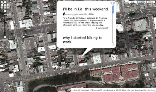
Chris Contollini An interesting integration of Google Maps into… well, a weblog!
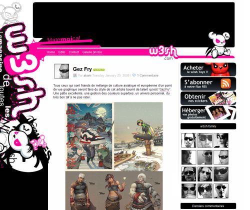
w3sh
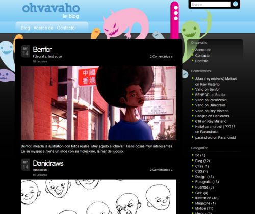
Ovavaho Focus on illustrations.


 SurveyJS: White-Label Survey Solution for Your JS App
 Celebrating 10 million developers

 Register Free Now


