Creating A Successful Online Portfolio
Your portfolio is the showcase of your work, your skills and your potential for your future employers. The more time and effort you dedicate for a usable and nice-looking design, the higher are your chances for getting better account balance in the end of the month. So how can you make sure your portfolio is better than the portfolios of your competitors? How can you point employer’s attention to your works?
Creating a successful portfolio is easier than you think. Focus on simplicity, ease of use, hitting your objectives, professionally managing the project, and you’ll end up with a successful portfolio. In this article we’ll review 5 pitfalls that commonly plague portfolio design. Then we’ll cover Portfolio Tips that if carefully considered and well executed will deliver quality results for your portfolio.
You might be interested in the following related posts:
- 10 Steps To The Perfect Portfolio Website
- Portfolio Web Design Showcases
- My (Simple) Workflow To Design And Develop A Portfolio Website
There are some common mistakes designers make in their portfolios. Let’s review these common pitfalls first to make sure you don’t fall into one of these traps.
Pitfall #1: Obfuscation
Clarity and focus should permeate your portfolio. With language don’t use twenty words when seven will do. Push your best content to the front. When possible place your important content above the fold. Avoid meandering in your language or paths in your website. Keep your portfolio to the minimum of levels deep, while still accomplishing your goals.
Over at Copyblogger there is an article that covers a simple list of writing tips from the man known for cutting out the fluff from writing in the early twentieth century. See the article Ernest Hemingway’s Top 5 Tips for Writing Well. Hemingway championed using short sentences, strong forceful language, and clarity. All principles that make for effective writing on the Web.
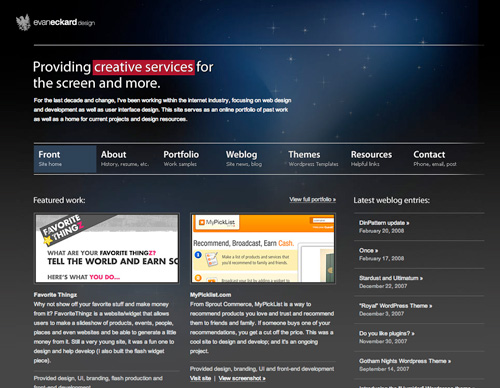
The Portfolio of Evan Eckard is an example of a website that promotes the work from the first page and Gets to it quickly.
In the article Creating The Perfect Portfolio author Collis Ta’eed offers portfolio advice from the perspective of a potential employer. One of his section titled Get to it on the reasons to limit the number of portfolio pieces you have and make finding your best portfolio pieces easy. A potential employer needs to review many potential applicants quickly. You are more likely to make the cut if your best work is promoted prominently. The Portfolio of Evan Eckard is an example of a website that promotes the work from the first page and Gets to it quickly.
Pitfall #2: Information Cramming
There is an issue of wanting to say too much in too little space when creating your portfolio. There is a balance that needs to be achieved with how many pages deep you have users clicking for more information and how much information you try to fit on a page. This is an issue to be aware of when constructing your portfolio.
The tighter you pack your portfolio the more likely it will appear cluttered. If you do need to put a large amount of information on a page see the post Grid and Column Designs over at Web Designer’s wall. It will give you some great ideas on how you can use the grid to your advantage when presenting a vast amount of information.
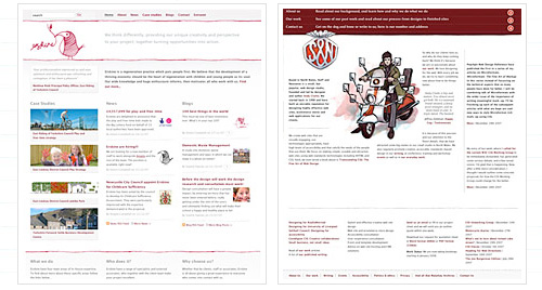
The article will give you some great ideas on how you can use the grid to your advantage when presenting a vast amount of information.
Pitfall #3: Overdoing It
You’re less likely to go wrong if you keep things simple and organized. You can apply this mindset to all areas of your portfolio. Less is more. The more you try to do in your portfolio the more chances there are for things to go wrong.
If you’re trying to showcase eighteen services you offer you’ll have less success than promoting a few prominently. If you show too many types of work or try to show too much work of any type than you’ll likely to drown the user. They won’t find your prominent pieces that show how great your work is.
Pitfall #4: Uncommon Navigation
Designers have an urge to stand out as unique. The last place to follow this urge is in your site’s navigation. It’s a matter of numbers. If a large number of people coming to see your portfolio will have difficulty navigating through it, your portfolio will fail to meet its goals.
On the blog Astheria in the post My Last Portfolio Sucked, Yours Might Too the author points out some excellent examples of navigation choices to avoid. In this article Kyle Meyer reviews 200 portfolios and points out the problems with using them. Navigation problems made up over 32 percent of the issues encountered.
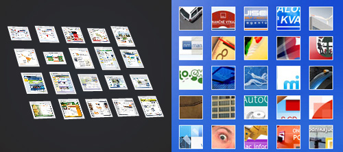
This article presents some excellent examples of navigation choices to avoid.
Pitfall #5: Visual Clutter
Consider the purpose of any decorative element you bring to your portfolio. If they fit your goals and compliment your work that’s great. Otherwise remove them. White space helps to give a professional feel to your portfolio. The more visual elements you try to push into an area the more difficult it will be to maintain a feeling of professionalism.
In the interview Where Visual Design Meets Usability - An Interview with Luke Wroblewski, Part II both page hierarchy and visual clutter are addressed. In the article he summarizes some of Edward Tufte’s teachings on avoiding superfluous data.
12 Principles of Effective Portfolio Design
Below you’ll find 12 suggestions which you can use to improve your portfolio or get it right first time when designing from scratch. Please keep in mind that some of these suggestions require patience, time and quite a lot of planning. However, it’s worth it. And the examples provided below show that one can achieve outstanding results with just following these 12 simple rules.
1. Define your Criteria and Strategies for Success
As with any project it will help you to clarify your goals before you begin. Once you know your goals then it will effect every decision you make about creating your portfolio.
Below are some common portfolio goals. Also, be aware that often portfolios try to accomplish more than one goal. Or, consider creating more than one portfolio that serves a different purpose.
- The Hire Me Portfolio focuses on getting you a job. If you are actively searching for a job then the current goal of your portfolio is to get hired. In this type of portfolio you can target the work you show to the type of company you want to work for.
- The Sales Generation Portfolio focuses on keeping a flow of work always coming in the door. The goal here is to generate leads. And move potential customers through your sales channel.
- The Reputation Building Portfolio focuses on building your name in the industry and online. This may take the form of an artist’s showcase. Or tie your work together with a blog on your portfolio site.
- The Networking Portfolio focuses on building relationships. There are many networks that have excellent portfolio building tools. They have some advantages to placing your portfolio on their website. Chiefly among them is to leverage the site space for networking.
2. Consider Using Multiple Portfolios
There are multiple reasons to have more than one portfolio. You may have more than one skill set that you would like to promote separately. You may want to create a portfolio that is targeted to landing a specific job and send it to a marketing director at a company. They’ll appreciate that. It saves them time and shows you really want the job. Even if it’s a one-page portfolio.
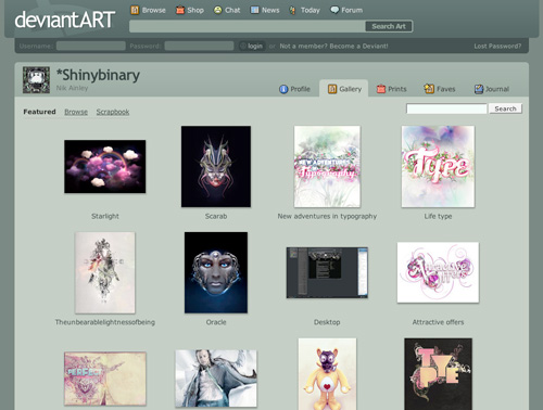
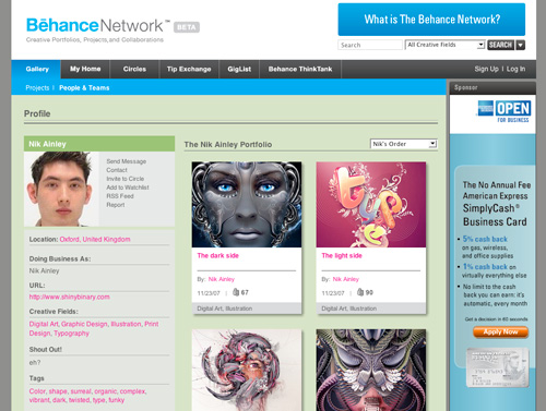
Even if you are filling the portfolio with the same work you will still benefit by having multiple portfolios within different groups online. Take the case of Nik Ainley, a UK-based designer and illustrator. He has multiple portfolios that all serve complimentary goals. He chose to participate in multiple portfolio-based communities to build his reputation and network with other designers.
He had a Portfolio on Behance. He’s involved in numerous groups there and has a large Inner Circle. And it prominently displays that he is available for Freelancing, Long-Term Contract, Full-Time Hire, or Consulting work.
Nick has a very popular Portfolio on DeviantArt. He’s been a member there since 2004. He has over 80 Portfolio pieces and over 1,000 comments on his work there. He has a lot of fans that have his works marked as favorites.
He is less active though he had a Gallery on CPLUV. His Portfolio on Depthcore is really good. This site features artists that have to be invited to contribute. So, the quality of work on this site is really high.
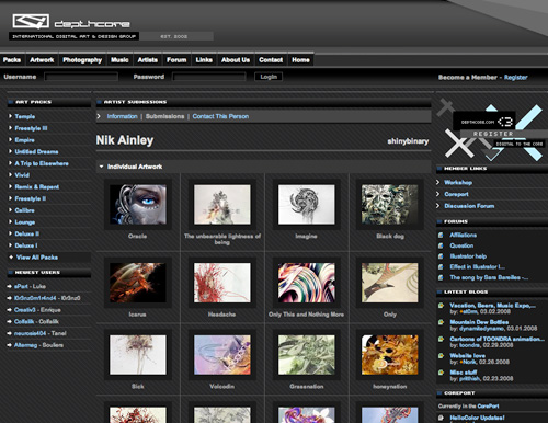
Overall Nik Ainley shows how you can benefit from having multiple portfolios online even when the work you are showcasing is similar in each portfolio. That is because you are taping into a different community with each portfolio you create. You’re meeting people, exposing them to your work, and making new connections by placing your portfolio within different communities.
Some portfolio communities to look at:
3. Target Your Market
The more you target your design to a specific market the more it will speak to the visitor within that market. If you are looking to land corporate clients in a conservative industry than present them with work that is clean, marketable, and looks successful. Don’t showcase edgy, grungy, or arty work unless that’s the market you’re going after.
In the article The Secret to Getting a Lot of Web Design Work the author has a section “Design the portfolio you think your clients want to see”. This is the point. Make your portfolio focused on your target market. If you’re trying to get clients then design keeping these clients in mind.
Consider this example: a web designer that specializes in designer Law Firm websites has a different target market than a company that builds Rock Band websites. The language, graphics, and approach such portfolios take will differ greatly. If a web designer has numerous successful Law Firm websites in their portfolio it will make it easier for a potential law firm client to choose them over another designer or design agency.
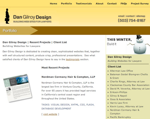
A designer is more likely to stand out by targeting a specific market. Their success rate at landing jobs in a specific niche and being perceived as an expert in that area will increase. Take a look at the Dan Gilroy Design Portfolio for an example of a website that successfully targets a specific market.
Having a target market in mind is essential to choosing your portfolio pieces and your approach to designing your website.
4. Make Usability a Top Priority
Navigation is a top consideration as a user being able to view your portfolio is of paramount importance. See the point about Uncommon Navigation above. Some other considerations are using web standards. This is especially true if you’re looking for a job as a web designer today. Read this article Five steps to a better design portfolio by Jefferey Veen. In it he discusses some issues around best practices in your portfolio in relation to how you will be perceived by a potential employer.
Also, don’t discount the search bots. Work toward better Search Engine Optimization. The blog at SEOBook is a rich resource on this topic. Good SEO will improve the ability for potential clients to find you through the major search engines.
5. Utilize the Right Technology
If there are technologies inherent in your job description then it may make sense to build your portfolio with that technology. Sure Flash is cool, but is it right for your website. Probably not if you’re a logo designer. Though if you’re trying to land a job as a Flash Designer at a top notch Interactive Design Agency like Story Worldwide than its the right choice.
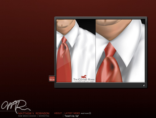
The New Media Designer Portfolio of Mathew V. Robinson presents an easy to use navigation. Essential to the success of a Flash site, it’s fast loading. His portfolio is highly usable and looks great.
Consider maintainability when deciding on technologies. Simplifying your portfolio as much as possible will ease the time you’ll have to spend on upgrading or making changes to the website. You should consider how easy it is to add and remove portfolio pieces.
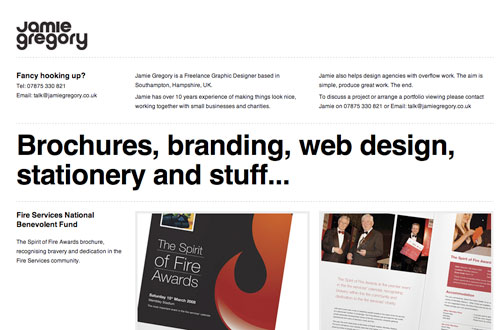
The easier it is the more likely it is you’ll update your portfolio on a regular basis. Jamie Gregory has an simple, elegant, and effective one page portfolio. He would have no trouble adding or swapping out pieces from this portfolio.
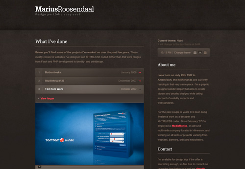
Consider enhancement when looking at technology. Often a wise choice is to add a little Javascript or other technologies rather than rely on them. It can help you to achieve your goals without overly complicating your portfolio design. When visiting Marius Roosendaal’s Portfolio take a moment to explore how clean the source code is. This is done while providing elegant Javascript-based solutions.
Choose between creating a static site or utilizing a CMS (Content Management System). One page portfolios are really easy to update and a good way to quickly show your best work. You’ll also have no issues with navigation, as there is only one page. Though there is little flexibility there and you’re not leveraging some additional features that content management systems have for promoting your work, like having a blog.
6. Plan Your Portfolio Project
One of the key ingredients to creating a successful portfolio is to approach it like you would a client project. Manage this project as professionally as you would any other web project you take on. Set aside the time needed to achieve the goals you’ve outlined for the portfolio. Make sure you set up deadlines so that you have key targets to hit.
7. Narrow the Scope and Type of Work Promoted
Your portfolio should be limited to the best work you will promote within the scope of your goals. If you are taking on website redesigns then your portfolio should consist only of that, not logo designs or print work that you’ve done. If its not the work you’re targeting than don’t include it. You will be more successful.
Jesse Bennett-Chamberlain redesigned his website 31three back in May of 2007. Before doing so he used to have print and logo designs in his portfolio. In the redesign he clarified his target market by focusing on assisting developers with design. His current portfolio only presents website and interface designs he has created because that is the type of work he is looking for. This portfolio is very successful on many points and has been referenced in many articles throughout the blogosphere.
That doesn’t mean he doesn’t do logo or identity design. He does do that, but he’s recognized that logo design is not why people come to him. They come to him for website designs for new or existing sites and logo design may be a part of the package.
Certainly some designers or firms will have mixed bag portfolios. The more types of work you do successfully the greater challenge you’ll have in promoting that work. When possible keep the work on display to a minimum. Displaying 10 of your best pieces of work is often better than displaying 50 good pieces.
8. Provide Adequate Contact Information, Documentation, and Explanations
Contact information should be easy to find and in the case of contact forms they should be easy to use. Prominently place this kind of information. The Hicksdesign Portfolio has contact information displayed well on every page.
It helps to build confidence with your target market to clarify your role in the projects you present in your portfolio. If you designed the website, but someone else coded it, then state that. If you did everything then confidently declare that as well.
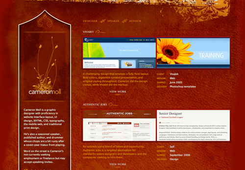
The Portfolio of Cameron Moll employs this strategy on each portfolio piece.
Providing case studies gives a deeper view into your process. Once a potential employer or client has narrowed down their list they may come back and start to take more time with your portfolio. Case studies will show how competent and thorough your process is. David Airey does a good job of providing easy to find case studies on his portfolio pieces.
Client testimonials are effective for persuading those that visit your site that you will deliver on your promises. It increases the level of professionalism when tastefully incorporating testimonial into your portfolio. David Airey has an article titled The Importance of Client Testimonials that has useful information on this subject.
9. Present Your Work Within the Confines of Your Goals
Your work needs to stand out foremost in your portfolio. If your portfolio site design overpowers the work on display then you’re not likely to meet your site goals. Consider carefully every visual element you add to the design. When unsure shoot for simplicity.
10. Infuse Your Personality Into Your Design
Nick La has a portfolio design that shows his design style and interests. The unique background illustration stands out. It doesn’t interfere with the usability of the site, but it gives it a beautiful wrapper. For some this would be too much and interfere with the work being presented. Though the work presented in his portfolio works fine. He sets the portfolio pieces against a solid white background in a strong column-based design. The work presented fits with the style of the sites background illustration. Pulling off this kind of personal infusion into the design of your site is difficult to achieve.
Doing this well makes your portfolio not only memorable but remarkable! Nick La achieved tremendous success with his portfolio for N.design Studio. Being remarkable in the design of your portfolio often means bringing to fruition the personal design taste unique to you that has been cultivated over the years.
Seth Goden has some excellent points about being remarkable in his post How to be remarkable. Here is a quote from the post “Remarkability lies in the edges. The biggest, fastest, slowest, richest, easiest, most difficult.” This is a good point, but there is a huge risk involved in that pursuing the remarkable edge you ride right off the cliff.
Carefully consider how you will blend your remarkable personal elements into your portfolio without sacrificing usability and without misaligning the balance between the prominence of your portfolio and the design of the site itself.
11. Promote and Leverage Your Work
There are many techniques for promoting your portfolio. Consider joining professional online communities and networking with other community members. We’ve already looked at some communities that you can place a portfolio on. Place a thread in a design forum about your portfolio. Submit your design to gallery websites. Almost any technique that can be used to promote a website can be used to promote your portfolio.
Add a blog to your website. The more traffic you can pull to your website the more exposure your portfolio will receive. Dan Cederholm was an early adopter of this technique and achieved fame with his blog Simplebits. His portfolio resides successfully on the same site.
Leveraging your work involves linking to it when you send emails. Include a link to your portfolio site in your Facebook profile or any other community you belong to. Infuse your portfolio site within your communications and your online identity.
12. Develop Your Long-Term Portfolio Goals
It always helps to have a view toward the future. Your portfolio needs are likely to change many times as you develop different projects over the course of your career. Though even looking at the whole of 2008 and not only at the next week can make a big difference in the choices you make when creating your portfolio.
Putting it all together: a successful portfolio finds that perfect blend of your personality, prominence of work, simplicity, and ease of use that makes your portfolio stand out from the crowd and achieve your goals.


 SurveyJS: White-Label Survey Solution for Your JS App
 Celebrating 10 million developers
 Register Free Now