How to Design the Firefox Logo in Photoshop
This tutorial will go through how you can create the Firefox logo in a scalable Photoshop format.
The World
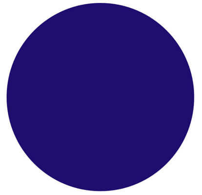
Firstly create a new document at 1024px x 970px and start off with selecting the ellipse tool (U) and drawing a large circle (hold SHIFT to constrain the proportions) and make the top of the circle nearly touch the top of the document and the bottom of the circle nearly touch the base of the document. Change the colour of this new shape by double clicking the colour next to your shape in the Layers Palette and then entering #1f0e6d in the space underneath RGB. This is your basic shape for your globe and should look like this:
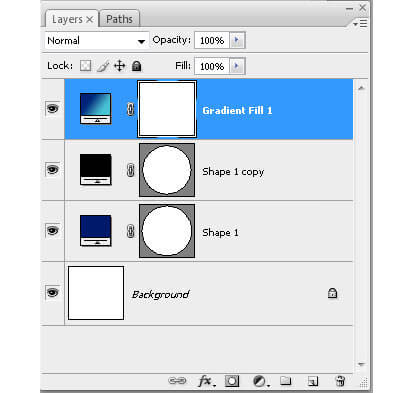
We now need to duplicate the world shape by right clicking on the circle we’ve just created in the Layers Palette and clicking Duplicate. We need to scale this down slightly, so press CTRL+T and you will be switched to Free Transform in which we can manipulate the shape freely. Scale the shape down ever so slightly by selecting the top-right resizing handle and by dragging inwards whilst holding both SHIFT+ALT. Now we add a new gradient layer by going Layer>New Fill Layer>Gradient. Give it a name and click OK and you should be brought up with a gradient fill dialogue. Now you need to click on the gradient next to Gradient: (not the dropdown, the actual gradient) and this should bring up a gradient editor. Along the gradient slider there should be a black box on the bottom left and a white box on the bottom right. Double click on the left black box and change its colour to #251979 and then double click the right box and change the colour to #67c4d4. Then click the top right box and change its Opacity value to 100%. Click OK and you should be presented with a Layers Palette that looks like this:
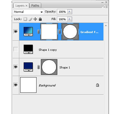
Now you need to click on your 3rd layers (or what should be called ‘Shape 1 Copy’) vector mask and drag it onto your newly created gradient fill layer. This should create a vector mask for your gradient fill layer and should look like this:
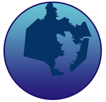
Now comes the tricky part, creating the land on the globe. To achieve this we use the pen tool (P) to create the organic shapes required to look like the land. Select the pen tool (P) and make sure Shape Layers is selected in the tools menu instead of Paths. Now begin the clicking and dragging process involved in using the pen tool until you achieve the following result (I can’t help any more than this for the pen tool (P) but if you want to cover the basics check out this tutorial):
Now we need to subtract a piece of land from the island we’ve created and to do this you click on the vector mask on the land shape in the Layers Palette (with the pen tool (P) still selected) to select the land; then click the Subtract From Shape Area button on the tool options bar. Now just remove the piece of land using the same method used for adding it until you have removed the piece shown in the image below:
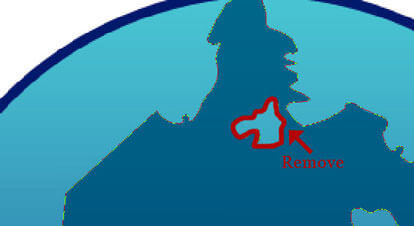
With your shape selected, we now need to invert the land so that it appears the same as on the Firefox logo. To do this, select the path selection tool (A) and select just your main land (not the subtracted one). Now press the ‘-‘ (minus) button to invert the selection and then click your subtracted piece of land and press ‘+’ (plus) to add the island back to the shape. Now right click on your layer in the layers palette and select Create Clipping Mask to clip your land to the globe and it should look like this:
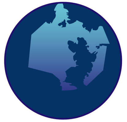
Now to achieve a gradient effect utilising layer styles. To achieve this you need to select Layer>Layer Style>Gradient Overlay in the Photoshop menu and you will be presented with the options needed to edit a gradient. Click on the gradient next to Gradient: (not the dropdown, the actual gradient) and this should bring up a gradient editor. Along the gradient slider there should be a black box on the bottom left and a white box on the bottom right. Double click on the bottom left black box and change its colour to #00022e and slide it along until Location reads 40%. Then double click the bottom right box and change the colour to #0f80bc, click OK, OK, OK and you should be presented with this:
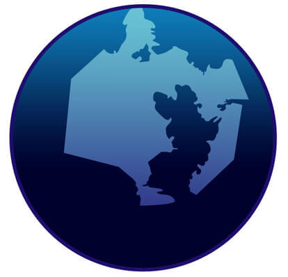
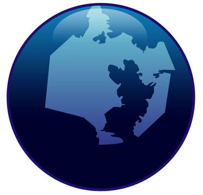
Now we need to create the classic Web 2.0 shiny orb effect (when will we tire of it?) by selecting the ellipse tool (u) and drawing an oval at the top of the globe so that it looks like this:
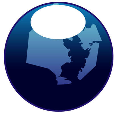
Now select Layer>Layer Style>Gradient Overlay in the Photoshop menu and you will be presented with the options needed to edit a gradient. Click on the gradient next to Gradient: (not the dropdown, the actual gradient) and this should bring up a gradient editor. Along the gradient slider double click the bottom left black box and change it to #ffffff (white). Now click the upper left black box and change the Opacity to 0% and location to 40%. Click OK and this will appear to make no difference. Click the Blending Options in the layer style dialogue and look for the Advanced Blending section. In this section should be a Fill Opacity slider which you need to drag to 0%. Above that section is General Blending where you’ll find an Opacity slider which needs to be dragged to 50%.
After this brief bit of advanced blending, click OK and you should be presented with this:
The Fox
The fox is definitely the tricky bit and you’ll need to have a good understanding of the pen tool and how it works to pull this off. I am writing the following on the presumption that you have managed to achieve the previous section of this tutorial and are confident with the pen tool and layer styles.
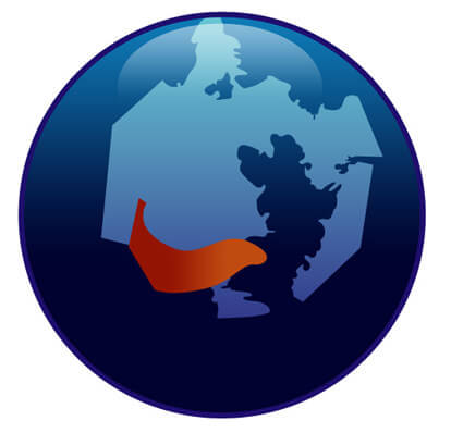
First we need to start off with the arm. Draw the following shape with the pen tool (P) and double click the layer to bring up the Layer Style dialogue. Change the gradient properties until you achieve a result that resembles the image following. I used the colours #941403 and #c04b11 to achieve the following effect (remember to tweak the angle and scale in the layer styles dialogue to achieve the desired result):
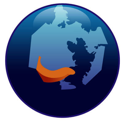
Now we have the base of the arm. We now need to duplicate this layer so we can add the orange upper-half of the arm. After the layer has been duplicated (right-click, duplicate in Layers Palette) we need to subtract a chunk out of it in the same way we removed land from the globe in the first part of this tutorial; click on the vector mask of your duplicated shape in the Layers Palette and with the pen tool (p) selected click the Subtract Shape Area Button. Now draw a curve that matches the image that follows, removing the lower part of the foxes arm. Once complete, double-click the colour at the side of the layer and apply #d46518 as the shapes fill colour. Tweak the angle and scale in the layer styles dialogue to achieve the desired result and you should now have something that resembles this:
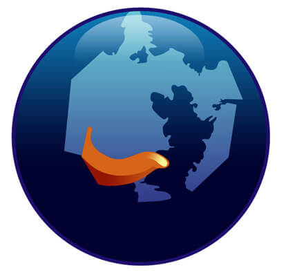
We now need to create a quick highlight. To do this select the pen tool (p) and draw a shape on the fox’s paw that resembles the image that follows. Apply a simple layer style with a gradient that uses #f5f498 colour for the left gradient box and the same colour on the right but with 0% opacity. Click Ok, Ok and go to Blending Options in the layer styles dialogue and in Advanced Blending change Fill Opacity to 0%. Tweak the angle and scale in the layer style dialogue to achieve the desired result and he result should be something like the following:
Now we need to start creating the bulk of the fox’s shape. We’ll start with the initial outline and can then build the details of the fox as individual layers. Begin by creating the fox outline that includes the ear but excludes the head as the following image demonstrates (using the pen tool (p)).

Then bring up the layer style dialogue and apply a new gradient using the colours in a similar manner to what I have used as follows (to add new colours to the palette, click an empty space on the gradient slider). Tweak the angle and scale in the layer styles dialogue to achieve the desired result.
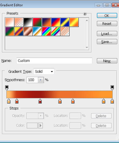 The fox's body gradient.
You’ll notice that the fox’s tail is far too red with the existing gradient applied. A quick and easy way to get rid of this is to duplicate the foxes outline and with the pen tool selected and Subtract From Shapes Area selected, draw a shape removing everything but the foxes tail. Then in the layer style dialogue, tweak the gradient to remove the redness of the tail tip.
Now using the techniques employed before we need to begin on the fox’s jaw and snout. Begin by drawing the lower part of the snout with the pen tool (P) and change the shapes fill colour to #ffffcc.

We now create a new shape to act as the jaw’s highlight. Draw a shape similar to that which follows, using the fill colour #eea273. The shape can spill over the bottom half of the jaw because we then apply a clipping mask by right-clicking on the new layer and selecting Create Clipping Mask. This should nicely anchor your new shape to the jaw and remove any of the shapes overspill.

The upper snout now needs to be created, so with the pen tool (P) draw the following shape and change the gradient in the layer styles dialogue (double click the layer in the layers palette) to use the colours #9a1d06 and #db5009, remembering to tweak the scale and angle in the layer styles dialogue.

We now need to create a subtle highlight to the fox’s upper snout. To do this, duplicate the upper snout you’ve just created and with the pen tool (P) selected, select the Subtract From Shape Area and remove the chunk as illustrated below.

Now change the layer style of this highlight to have a gradient using the colour #df731b in both boxes, but with the right box having 0% opacity. Then remember to go to Blending Options, look for Advanced Blendingand change the Fill Opacity to 0%. Remember to go back to Gradient Overlay in the layer style dialogue and tweak the Angle and Scale to match the image below. You should end up with something like this:

Finally add a black button nose with a simple black/white Gradient Overlay and drag the layer beneath the other snout shapes in the layers palette.
Now we need to refine the details of the fox’s tail. Create a shape that resembles the following and apply a Gradient Overlay layer style with a gradient that resembles the following (remember to tweak the angle and scale in the Gradient Overlay options in the Layer Style dialogue):
The shape should look like this:

The gradient should look like this:
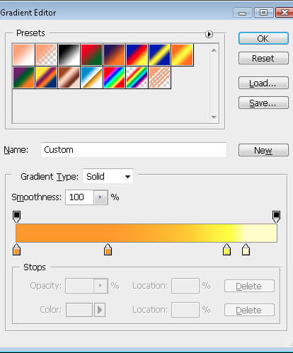
Together they should look like this:

Repeat this process until all the detail on the tail is complete, using the same gradient styles, just tweaking them slightly to suit each separate bit of detail. After you have finished the detail you should have something that looks like this:

Now you need to create the final piece of detail to the tail that also acts as the shadow to the fox’s back. To do this, duplicate the shape that makes up the fox’s body and in the Layers Palette, drag in to the top so that it overlays all your existing layers. Now select the pen tool (P) and CTRL+click your shape to bring up the shapes outline with all the anchor points displayed. Single click the majority of the anchor points to delete them and pull a few of the existing ones about until you get a shape that resembles the image that follows. Change the gradient overlay in the Layer Style dialogue to also resemble the following (tweak the layer style you used for the tails detail before):

The fox’s head of hair now needs to be created by drawing the following shape with the pen tool (P). You need to create a Layer Style with a Gradient Overlay that uses the colours #df731b and #e79041 and in the Gradient Overlay properties in the Layer Style palette, change the gradient type to Radial instead of Linear. This way we can add a circular highlight that follows the arch of the fox’s head. Your result should look something like this:

This radial gradient that we employed previously unfortunately hasn’t encompassed the top of the fox’s head as hoped, so we need to duplicate the previous layer and using the pen tool (p) select Subtract From Shapes Area and remove 80% of the fox’s hair from roughly below the snout. I have highlighted the shape as green in the following example so you can see what I mean:

Now change the gradient overlay in the Layer Style dialogue to create a highlight on the upper part of the fox’s head. The result should be as follows:

Now we need the ear to appear in front of the head, so we have to duplicate the layer you just created and cut off everywhere apart from the ear using the pen tool (P) with Subtract From Shape Area selected. I have an example below, with the ear highlighted in green so you can see the exact shape that needs to be used:

Now apply a gradient overlay in the Layer Style dialogue and modify the gradient so it resembles the following image:

Finally you need to create the last bits of detail to the fox’s hair in a similar fashion to how you created the detail to the fox’s tail. Draw a succession of spiky hair shapes as seen in the image below and create a gradient that uses the colours #e27d23 and #efa869, making sure you alter the angle and scale for the gradient in each spike to blend it in with the fox’s hair.

Whew…
That should be it, you should end up with a Firefox logo that looks like the one above. This uses several techniques that perhaps aren’t as manageable as if you approached the same task in Illustrator, but it avoids the classic problem of having to jump between Illustrator and Photoshop to make alterations, giving you a bit more flexibility. Now you have a customisable, scalable Firefox logo for whatever uses you desire. If there are any questions, please leave a comment below and I’ll try and help you as best I can.
You can download the source file here: Download Source


 SurveyJS: White-Label Survey Solution for Your JS App
 Celebrating 10 million developers

 Try ProtoPie AI free →

