Textures and Patterns Design Showcase
Textures and patterns are used more often than one may think. The reason we don’t see them is because they usually remain in the background, supporting the overall design, replacing a standard background color and creating a more inviting atmosphere. But they almost never stand out. Used primarily for background images, they need to fit the overall design making the content easier to perceive. In fact, wood textures seem to have become so popular that designers suggest that wood is the new glossy style and wood is the new white.
Well, we don’t think that wood is a new revolutionary trend — after all, it was used and explored for years. However, since wood isn’t used everywhere — incorrect and wrong contexts — experimenting with it makes perfect sense. Still, there are some options beyond wood: e.g. fabric patterns, tiles, ground, stone, walls, bricks, stitches, cardboard, ceramics, decay, rust, old tapes, illustrations, plastic and glass.
In this post we present a showcase of sites using textures and patterns— we want to focus designer’s attention on design options available beyond wood. Reason: we firmly believe that vibrant, realistic background images are becoming a new trend. If it sounds familiar to you, you are right: we saw the same pattern 8-10 years ago.
The 2008 Showcase of tiles and patterns in web design
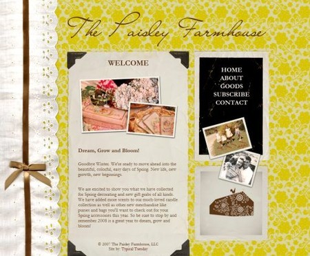
The Paisley Farmhouse uses nicely packaged retro wallpaper tiles as the background image.
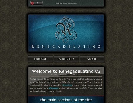
Renegade Latino uses dark tiles for the background image. The content should probably be larger.
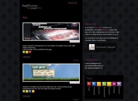
t!agOliveira uses a hardly recognizable, dark pattern as the background image. The image supports the content and fits to the overall site layout.
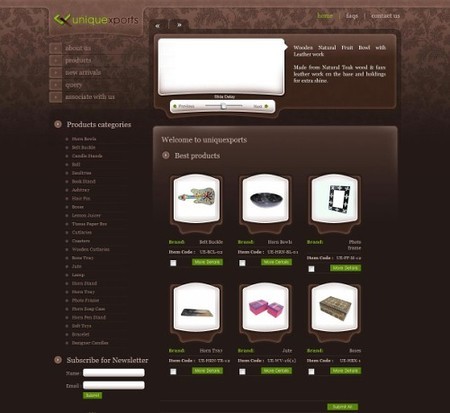
Uniquexports uses patterns and tiles for the background image for an online-shop. The pattern resembles a usual (not desktop) wallpaper. The design looks unusual yet attractive and definitely distinctive.
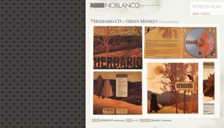
Noblanco with a background patterns on the left side of the page. The layout is right-aligned for some reason.
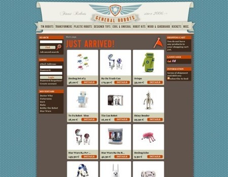
General Robots uses stars tiles on both the left and the right side of the centered layout. It is also an online-shop.
Booreiland: any friends of blue, pink and yellow out there?

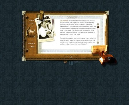
Warfield.net with a classic wallpaper patterns…
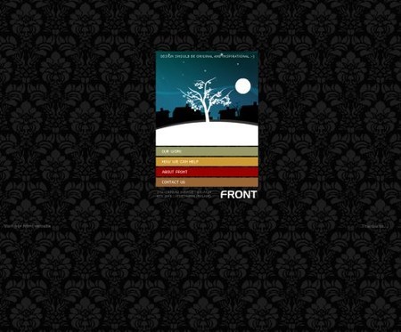
…and so does Designbyfront: the same theme, a different color.
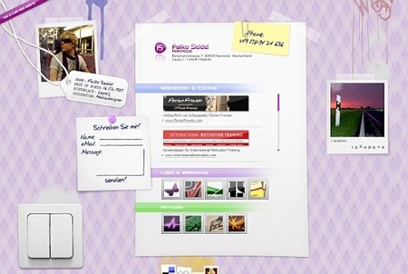
Falko Seidel with some tiles which one can find in old sweaters or on indoor walls.
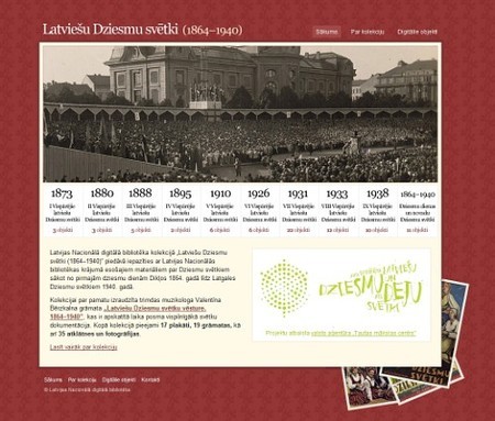
Latviešu Dziesmu svētki with traditional wallpaper tiles.
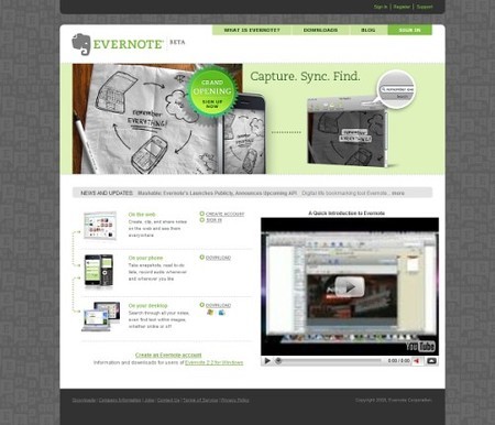
Evernote has a corporate design with quite strange background patterns.
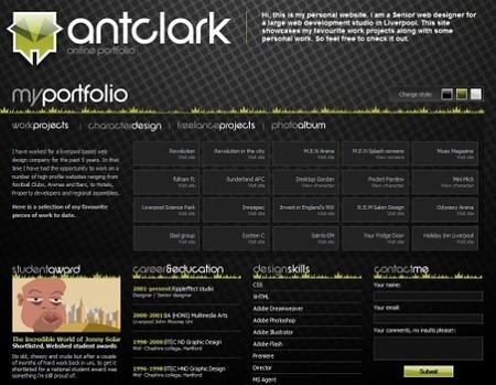
Anthony Clark uses a fading background pattern in the header of his portfolio.
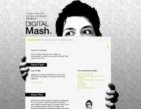
Rob Morris with a classic pattern used as the background image.
Eden Organix is a wellness store with a classic wallpaper pattern.

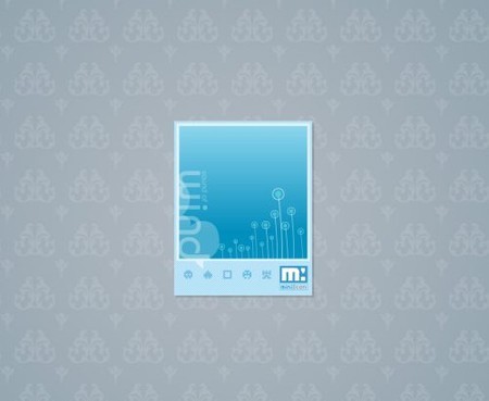
MiniIcon keeps it to minimal; tiny content area is surrounded by background tiles.
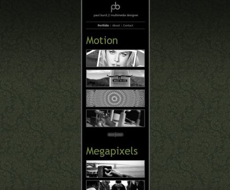
Paul Burd uses the same concept.
Images and Textures
Ground
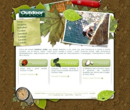
Outdoor Italia uses crumbly pieces of the ground as the background image. Other illustrations on the site fit to the background. The ants on the right hand side of the layout are pretty cool.
Stone and walls
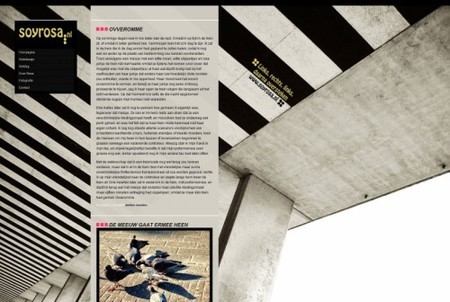
Soyrosa uses vibrant stone stripes as the background image.
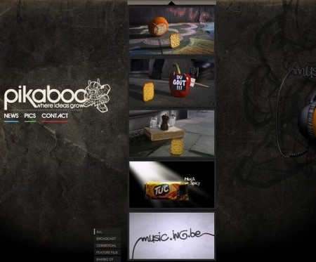
Pikaboo.be with hard, strong and dark stone and an unusual vertical scrolling.
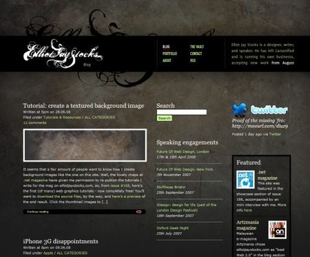
Elliot Jay Stocks uses stones as well and has even a tutorial which explains how to Create a textured background image
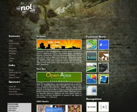
Nolgraphic makes it differently: a photo of a wall is used.
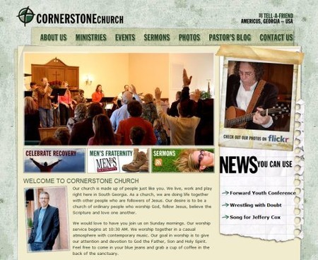
Corner Stone Americus is a church web-site with a grunge look.
Bricks
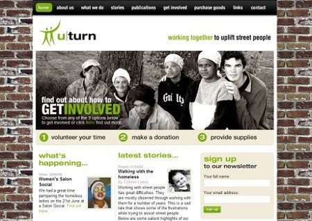
uturn with bricks used as the background image. Here the background fits to the theme of the site which aims to “work togther to uplift street people”.
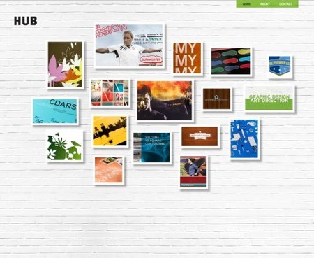
Hubltd.com with bricks painted in a white color.
Illustrations
Tennessee Education uses a vibrant background image with lines from primary school writing books.

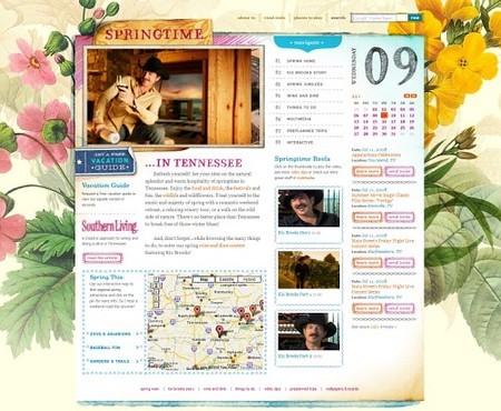
Springtime in Tennessee is a section on the same site and uses the same approach.
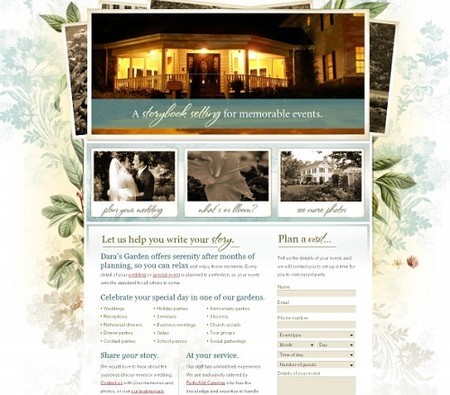
Dara’s Garden with beautiful flowers which make the background more lively and lovely.
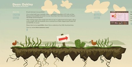
Dean Oakley’s design isn’t long but wide. Users need to scroll horizontally. The background image (illustration) always remains the same.
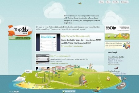
DivVoted fills the whole page with a vibrant background image.
Stiches and Fabric
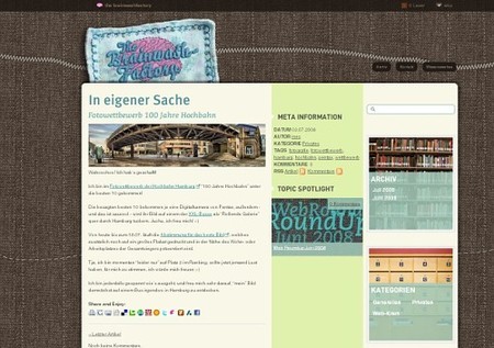
the brainwashfactory with stiches and fabric. Notice the sewed header at the top of the site.
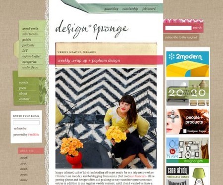
Design Sponge is dedicated to home and product design which explains why its background image is a fabric.
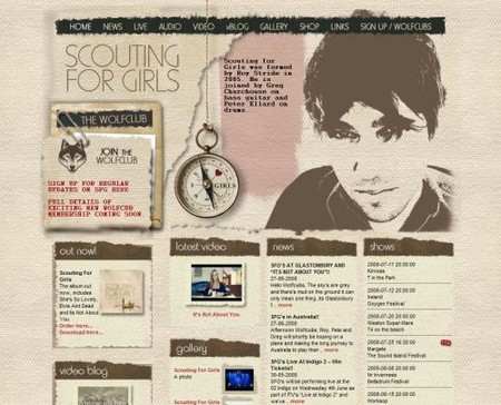
Scouting for Girls doesn’t only offer a “sewed” background image; it has a beautiful ladybug at the bottom as well.
Paper and Cardboard
Raufaser with an old paper pattern used as the background image.
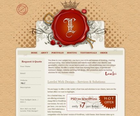
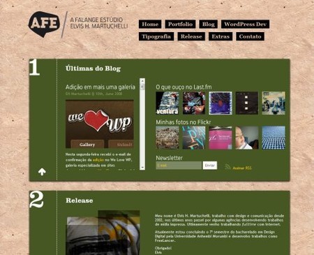
A-Falange.net uses old-looking paper…
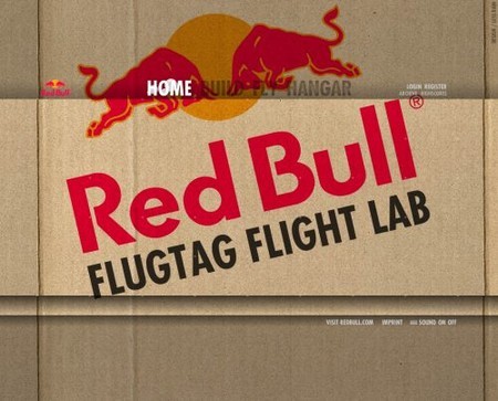
RedBull with a huge ragged cardboard. Flash in use.
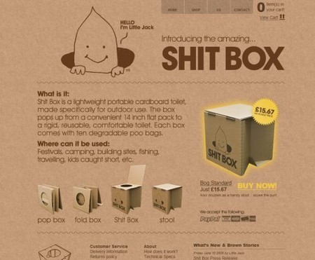
The Brown Corporation uses a similar idea. The site name (Shitbox) is probably not the best title from the marketing perspective.
Ceramics
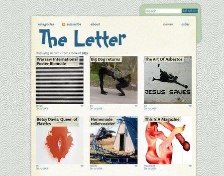
The Letter with a ceramics theme.
Decay, Dirt and Grunge
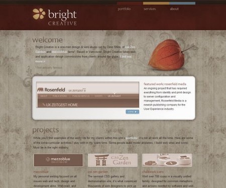
BrightCreative: ornaments and patterns in use.
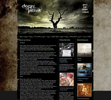
Decay of Intent: the title of the site defines the layout of Alessandro Cammarota’s portfolio. Apparently, the background image stands for decay, the main theme of the site.
Old movie-tape
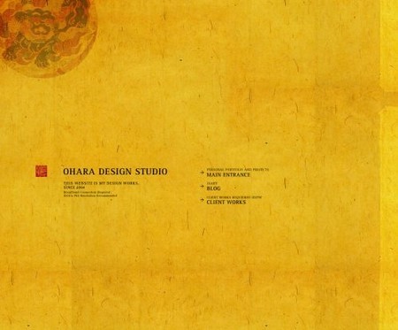
0hara uses an old movie-tape for the background.
Rust
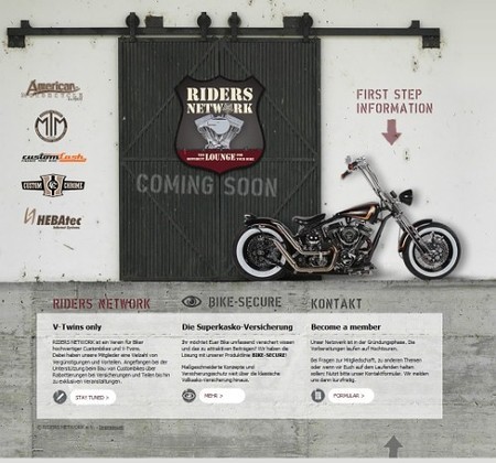
Riders network: riders drive on the roads which is why this riders’ club uses rusty road as the background image.
Life Style Sports has a rusty background image with asymmetric points spread across the background image.

Wood
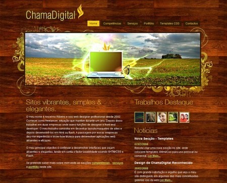
ChamaDigital with a “wood”-theme. Clean and beautiful design.
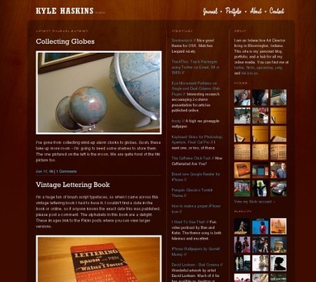
Kyle Haskins uses subtle “woody” background image which doesn’t stand out yet manages to support the content effectively. The design itself is clean and attractive.
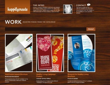
Robert Strickland uses wood as the background image; the colors in the design are chosen accordingly.
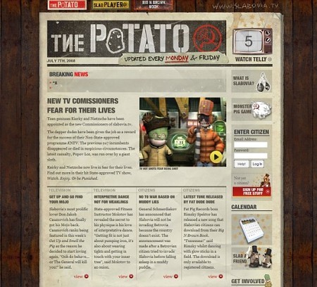
Slabovia.tv combine a unique retro-design with grid-based approach and with wood. The result is impressive.
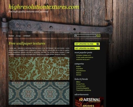
Highresolutiontextures with, well, high-resolution textures and the wood used as a background image.
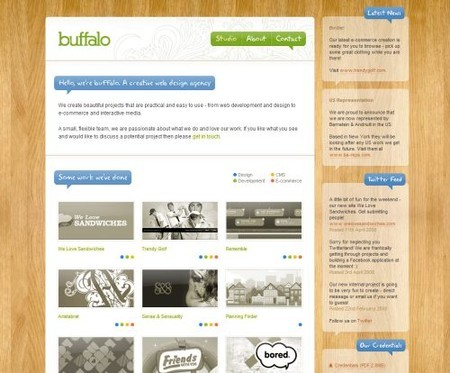
Built by Buffalo with a high-quality wood background.
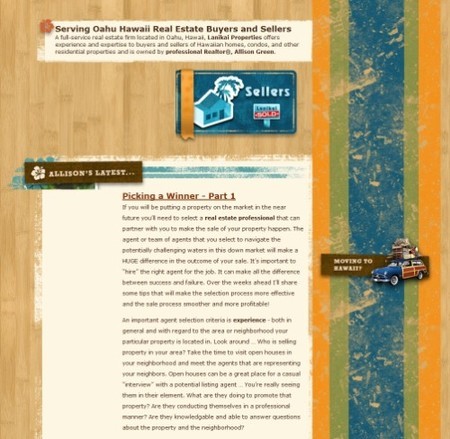
Oahu Hawaii real estate attempts to combine grunge with retro and wood. The result is definitely unusual, but in some sense quite appealing.
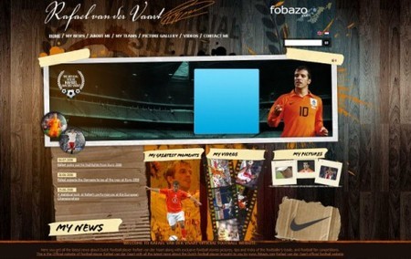
Rafael van der Vaart: the site uses wood as the background image. Beware: on the site music automatically starts to play.

Stiches and Fabric
the brainwashfactory with stiches and fabric. Notice the sewed header at the top of the site.

Design Sponge is dedicated to home and product design which explains why its background image is a fabric.

Scouting for Girls doesn’t only offer a “sewed” background image; it has a beautiful ladybug at the bottom as well.

Paper and Cardboard
Raufaser with an old paper pattern used as the background image.

A-Falange.net uses old-looking paper…

RedBull with a huge ragged cardboard. Flash in use.

The Brown Corporation uses a similar idea. The site name (Shitbox) is probably not the best title from the marketing perspective.

Ceramics
The Letter with a ceramics theme.

Decay, Dirt and Grunge
BrightCreative: ornaments and patterns in use.

Decay of Intent: the title of the site defines the layout of Alessandro Cammarota’s portfolio. Apparently, the background image stands for decay, the main theme of the site.

Old movie-tape
0hara uses an old movie-tape for the background.

Rust
Riders network: riders drive on the roads which is why this riders’ club uses rusty road as the background image.

Life Style Sports has a rusty background image with asymmetric points spread across the background image.

Wood
ChamaDigital with a “wood”-theme. Clean and beautiful design.

Kyle Haskins uses subtle “woody” background image which doesn’t stand out yet manages to support the content effectively. The design itself is clean and attractive.

Robert Strickland uses wood as the background image; the colors in the design are chosen accordingly.

Slabovia.tv combine a unique retro-design with grid-based approach and with wood. The result is impressive.

Highresolutiontextures with, well, high-resolution textures and the wood used as a background image.

Built by Buffalo with a high-quality wood background.

Oahu Hawaii real estate attempts to combine grunge with retro and wood. The result is definitely unusual, but in some sense quite appealing.

Rafael van der Vaart: the site uses wood as the background image. Beware: on the site music automatically starts to play.

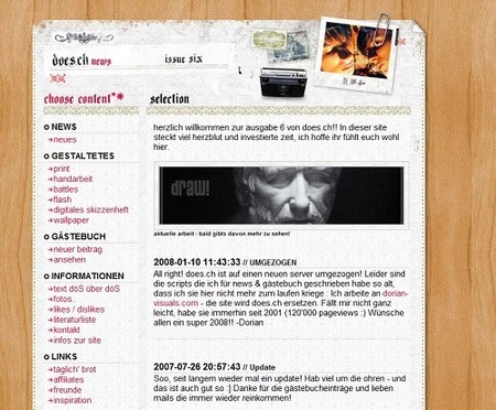
Does.ch uses wood, stiches, old paper and grunge together. Well, that’s an unusual combination.
WebRevolutionary with the black-white wood.

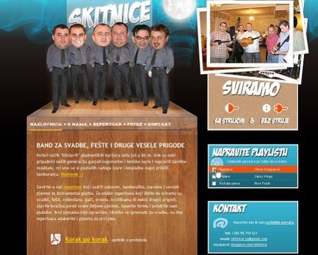
Skitnice uses wood not as the background image for the layout, but only as the background for the main content area.
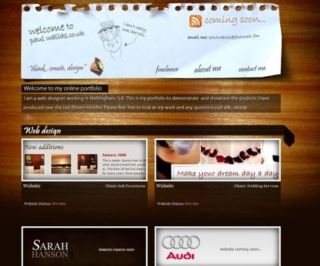
Paul Wallas with a light falling on the wood.
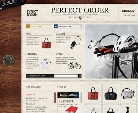
Bfrancesi.com with a dark sprayed “woody” background image.
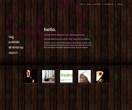
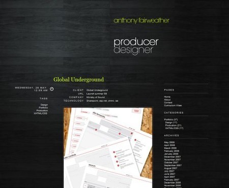
Anthonyfairweather is a producer and designer and he seems to love black wood.
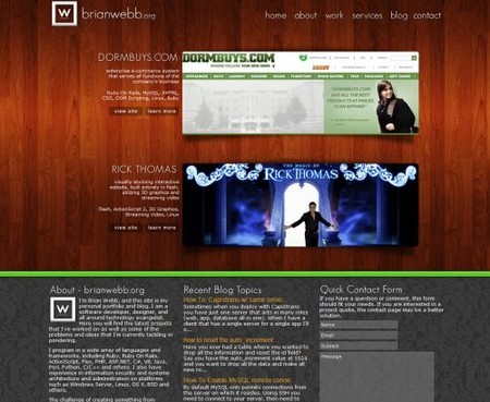
Brianwebb: surprise, surprise! This design combines two popular background themes, wood in the header and tiles in the footer.


 Register Free Now

 SurveyJS: White-Label Survey Solution for Your JS App

 Celebrating 10 million developers

