40 Creative Design Layouts: Getting Out Of The Box
Over the last months we have seen a strong trend towards more individual web designs. These designs use realistic motifs from everyday life, such as hand-drawn elements, script fonts, pins, paper clips, organic textures and scrapbooks. That’s not a big surprise as they serve the function that faceless, shiny, glassy 3D-buttons completely fail to deliver: individuality and personality. “Personal” designs appear more familiar and more friendly. Used properly, such elements can give a human touch to design and communicate the content in a truly distinctive manner.
However, apart from visual design elements, one can also get creative with the layout of the site — its structure and the way the information is presented and communicated. To give you some ideas of how exactly it can be done, we have been collecting examples of creative design layouts. Design was more important to us than a concrete implementation of some creative idea. We also weren’t interested in whether the code validates or not. Below are some examples we have found so far.
You may also be interested in the following articles we published earlier:
- Original And Innovative Web Layouts
- Responsive Web Design: What It Is And How To Use It
- Fixed vs. Fluid vs. Elastic Layout: What’s The Right One For You?
- Applying Divine Proportion To Your Web Designs
In the showcase below we present 40 creative out-of-the-box layouts that break the boring 2- and 3-columned, boxed layouts. We have collected pure CSS -designs, CSS+JavaScript -layouts as well as Flash -designs. Most designs presented below risk their site structure and content presentation with unusual approaches. That’s what makes them different. Hopefully you will find some creative ideas that you can develop further in your future projects.
We strongly encourage designers to break out of the usual boxed layout conventions, experiment with new approaches and risk crazy ideas. Show what you are capable of!
20 × Getting Creative With CSS
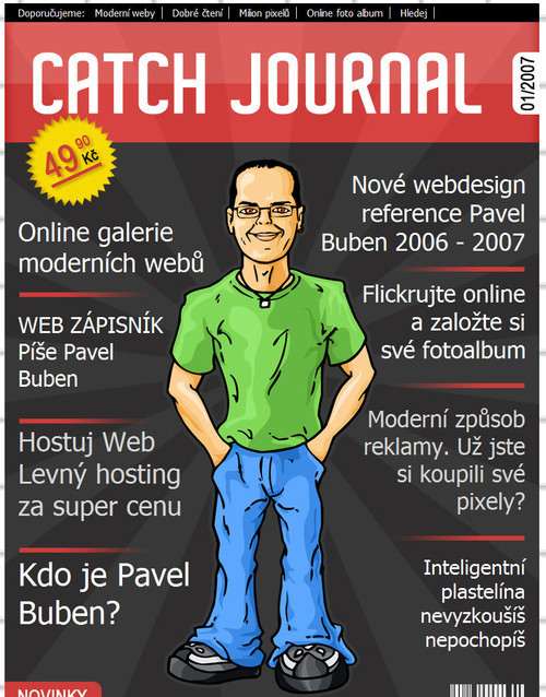
Pavel Buben Pavel Buben uses a magazine cover-style layout for his one-page-site. Unfortunately, there are no internal pages — it would be interesting to seek how they would be designed. An interesting and unusual approach.
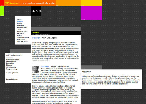
AIGA Los Angeles AIGA Los Angeles uses boxes in a creative way. All design elements are placed according to the underlying grid, however they clearly break out of the boxes. This approach creates tension within the design and looks truly distinctive.
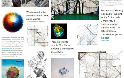
SpaceCollective For its gallery section SpaceCollective uses a five-column grid. Text and images are perfectly placed on the grid giving the layout a complete form and a sense of order. Notice various font sizes and text styling in the design — they introduce a profound visual hierarchy into the layout that works perfectly within the complex, unpredictable layout.
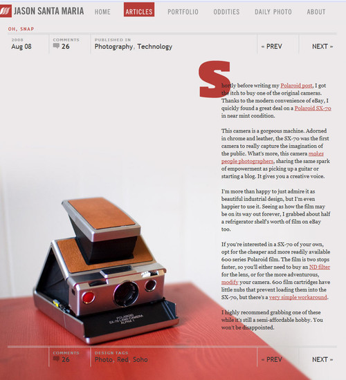
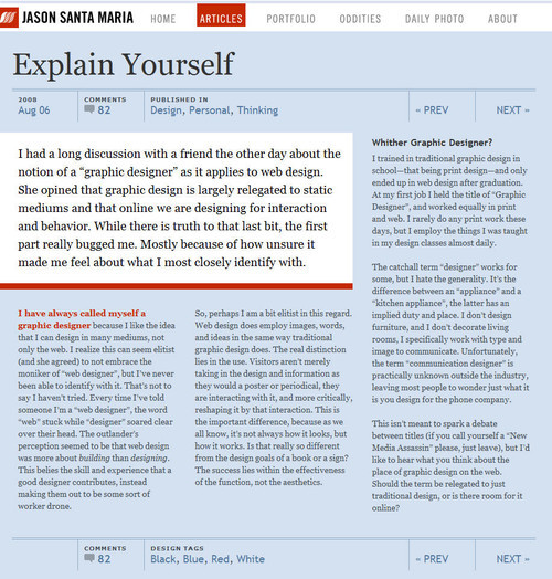
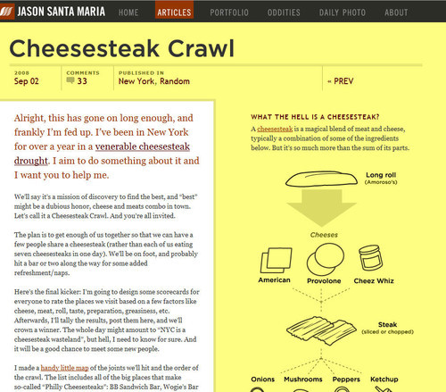
Jason Santa Maria Jason Santa Maria has taken a truly different route with his site layout. Each article is laid out differently, with strong focus on typography and visual clarity. Below three of the layouts are presented. You may have a hard time finding similar layouts on the Web.
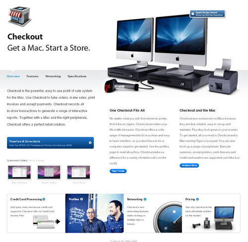
Checkout: Point of Sale for Mac (POS) At the first glance, Checkout looks like an ordinary Apple grid-layout. What makes the layout interesting is not only the position of its visual elements, but the fact that each section of the page has its individual (although consistent) design. Still, the layout is very scannable and intuitive.
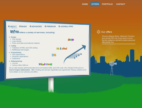
NOFRKS.design NOFRKS uses JavaScript to slide between various parts of the site. What we found more interesting was the way the content is presented. Most elements are placed within a context, giving the content a secondary meaning.
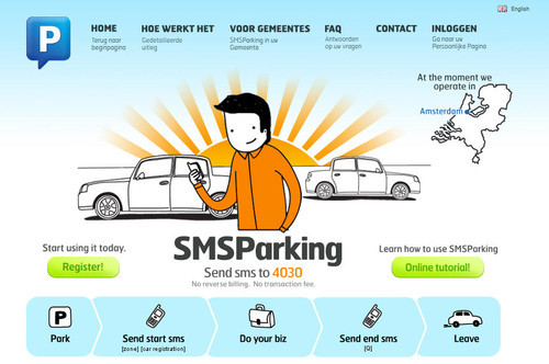
SMS Parking At the first glance SMSParking has no layout at all. The design appears to be one single illustration — all elements fit perfectly with each other, creating visual harmony and a sense of balance and closure.
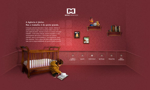
Matriz Communicacao This Brazilian company delivers a perfect example of how design and content can seamlessly be integrated within a complete yet simple layout.
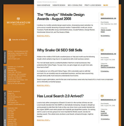
Mihmorandum Mihmorandum uses a common 3-column-layout in an unusual way. Although the structure is quite usual, the design itself looks distinctive and resembles a pile of paper put inside a folder.
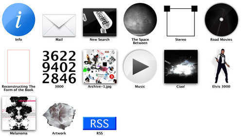
3rdM 3rdM uses icons to indicate various navigation options. This is not a type of layout you will find in many other web designs. And that’s what makes the layout creative.
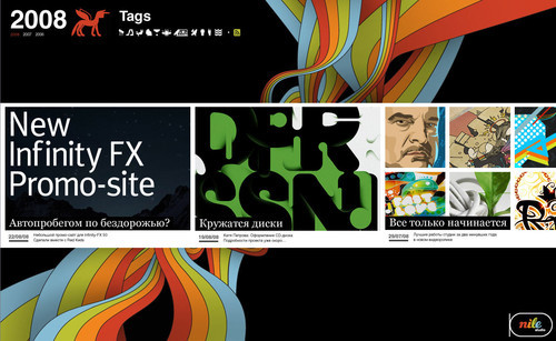
Nile Inside Many portfolios use vertical layout to showcase their works. Nile.ru displays its works in a chronological order as if it was a horizontal blog.
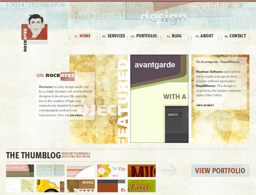
Rockatee Rockatee uses asymmetry to position content blocks in an unusual yet appealing style. Notice that the left block perfectly aligns with the navigation option “Home” at the top of the page. The screenshot in the middle of the page spans exactly two navigation options and has the same width as the description block on the right side of the page.
The distortion in the layout is caused by the underlying organic texture. Although the design is perfectly aligned according to the grid, it seems to be chaotic at first glance. The tension between order and chaos creates tension in the layout and looks very appealing.
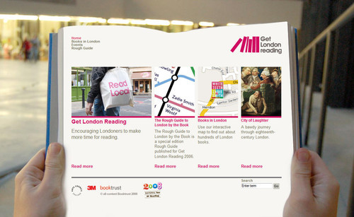
Get London Reading An effective background image can help a layout stand out. The effect achieved here fits with the objective of the project — to encourage people to read more.
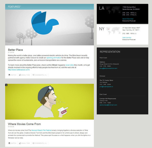
BL:ND ( blind ) At the first glance, the layout looks underwhelming. What distinguishes it, though, are the choice of images sizes and a good use of white space. Notice how well negative space is used in the sidebar, where individual elements are clearly separated and properly aligned. The width of the images equals the width of the content blocks. Yes, the layout is boxy, but the wise use of whitespace makes it far from boring.
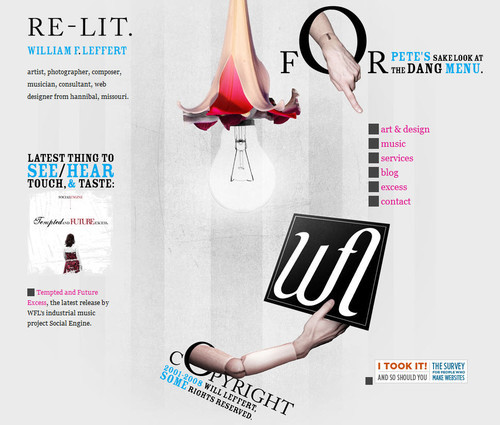
The portfolio of Hannibal Usually, navigation menus are placed in the sidebar or at the top of the site. William F. Leffert does it differently. His non-linear layout literally breaks out of the boxy structure and offers something quite different. Sometimes it’s enough to simply experiment with the position of design elements to achieve striking design solutions.
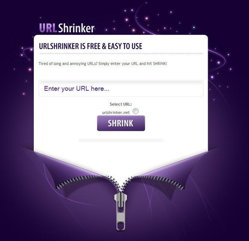
URLshrinker Creative design solutions can be as simple as this one. An elegant and attractive layout by URLshrinker.
15 × Getting Creative With CSS+JavaScript
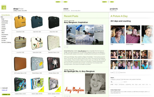
ShopComposition ShopComposition offers a sliding navigation at the top of the site. Users can choose the content they would like to read and select the width of the content blocks. This store has an integrated blog and some further projects (such as picture-a-day) to attract customer’s attention. JavaScript in use.
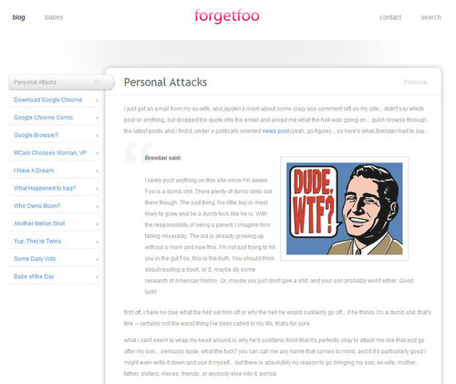
forgetfoo Forgetfoo uses an almost minimalistic, simple layout with a sidebar and a content area. Designers removed all necessary and unnecessary details focusing only on last blog entries. The design doesn’t contain any category navigation options. That’s unusual, but may be a little bit too much of the minimalism. Navigation through blog posts is realized with Javascript.
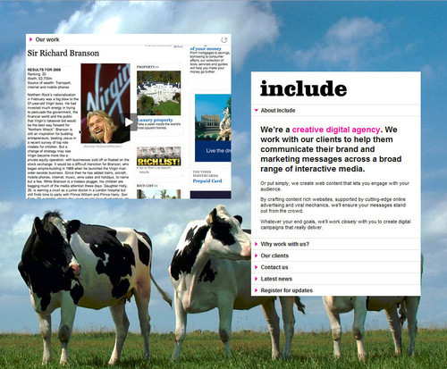
Include On Include one content block and the corresponding navigation block seem to “hang in the air”. Essentially the page has two columns; however. the layout seems to be quite original — maybe because of the cows placed on the background for some reason. The navigation on the right-hand side is realized with Javascript.
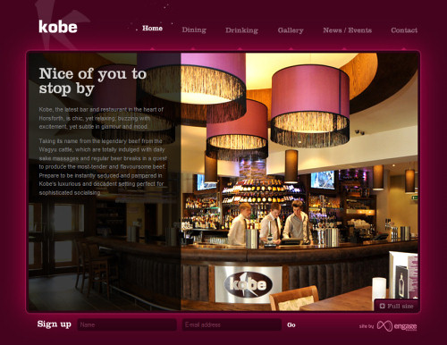
Kobe The navigation options at the top of the site are slightly animated yet creating an appropriate atmosphere. Once one of the sections is clicked, the main content area slides vertically — first the background image, then the content. If the content area also has some navigation options, they are slided vertically as well. In this situation it might be a slightly better design decision to use horizontal navigation instead to make it easier for visitors to distinguish between the primary and secondary navigation.
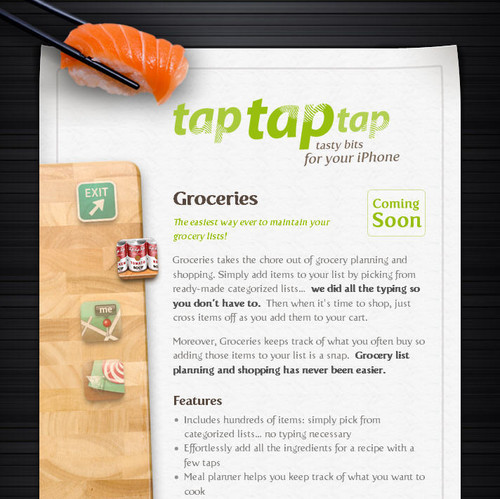
tap tap tap tap tap tap uses a bold and eye-catching layout to deliver the message to its visitors. The layout, although basically consisting of the sidebar and content area, is not boring at all and looks attractive. The left-hand side navigation and further effects are created using JavaScript.
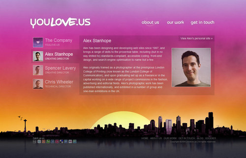
youlove.us The layout on youlove.us is definitely very vibrant. It uses a large vivid background-image and a the scroll-effect to enable users to quickly jump from one section of the site to another. Notice that the navigation area is repeated four times, in each of the categories. Sliding effects are also used for each of the categories. Instead of using 20 separate page, the layout combines them all on one single page. The result is compact and user-friendly.
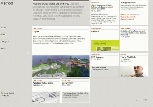
Method: A Brand Experience Agency This design agency uses a flexible JavaScript-based layout which updates its size depending on the browser window size. The content is “packed” in boxes is usual for such a grid-based design; however, the alignment of the boxes makes the design literally stand out.
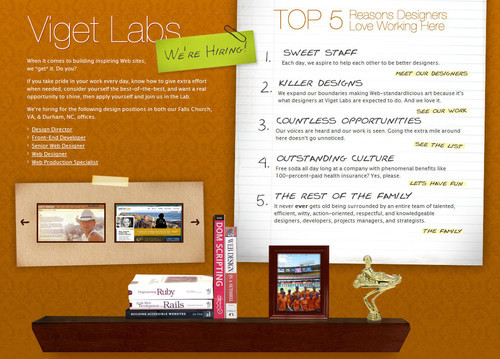
Viget Labs Viget Labs also uses a sliding navigation and a horizontal scroll-effect to make the user interaction more dynamic and hence more appealing. However, more importantly, the layout itself stands out: the layout is invisible and resembles interactive Flash-interfaces. CSS+JavaScript in use. Smashing says: five out of five stars.
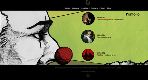
Lucuma Lucuma also uses horizontal layout as well as a horizontal slider-navigation. The simple yet effective integration of background images, navigation, videos and content makes the layout unusual and distinctive.
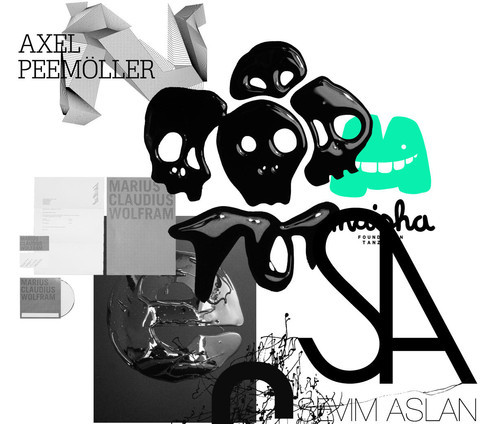
Axel Peemoeller Design On this page all design elements are draggable and some of them are clickable. Images seems to be thrown on you in the first moment, but in the end they all make sense. This is an unusual portfolio which is memorable and interesting to explore.
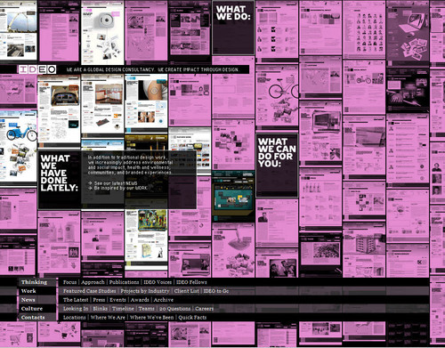
IDEO IDEO presents everything on its main page. The navigation options are placed in the black boxes and somehow arranged among other content boxes. Once one of the black boxes is hovered, related content blocks are highlighted. That’s not something most users would expect from a layout.
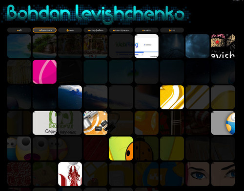
Bohdan Levishchenko Bohdan Levishchenko uses the same approach as IDEO, but presents all navigation option at the top of the page. Single works are presented as images under the navigation and spread throughout the layout.
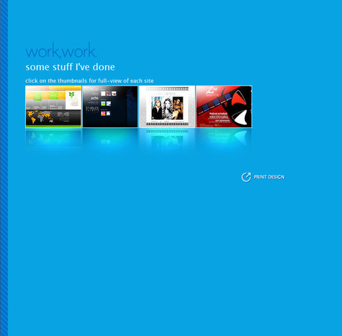
MelissaHie.com Melissa Hie places all deign elements on a single large page. Visitors are basically driven from one site are to another using a scroll-effect.
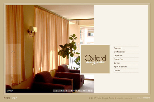
Hotel Oxford - Timisoara A single-page-site with a very calm and comforting layout. All navigation options are available at the first glance. Once some of the options is clicked, the content block on the left is dynamically replaced. The logo of the Hotel Oxford always remains on its place.
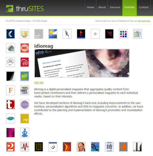
thruSITES / Portfolio In this portfolio the illustrations of a designer’s works seem to somehow be loosely placed on an invisible rope. When one of the illustration is clicked, all other elements arrange themselves in such a way that the content which this illustration represents becomes dominant.
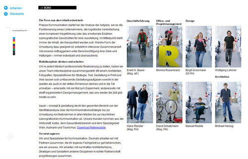
Erwin Bauer KEG The portfolio site of Erwin Bauer takes a different approach to using a pannable user interface, but implementing in JavaScript rather than in Flash. The site allows users to click and drag to pan the canvas, or to use links positioned around the content to move around. The design is clean, and mimics a design document with regisration and crop marks, and visual cues about the directions the canvas will pan to when you navigate.
5 × Getting Creative With Flash
The Secret Location The Secret Location, a media agency based in Toronto, Canada exemplifies their work, by providing an immersive flash experience around a conjured up story leading a character to follow a mysterious path that leads to the secret location. Very interactive approach, a very unusual site layout.
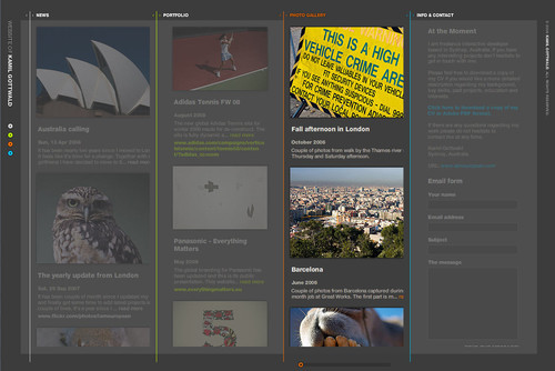
Kamil Gottwald In his layout Kamil Gottwald enables users to define the width of site columns manually. To navigate vertically users need to scroll horizontally. Hence no vertical scrollbar is necessary. Multiple site views are possible.
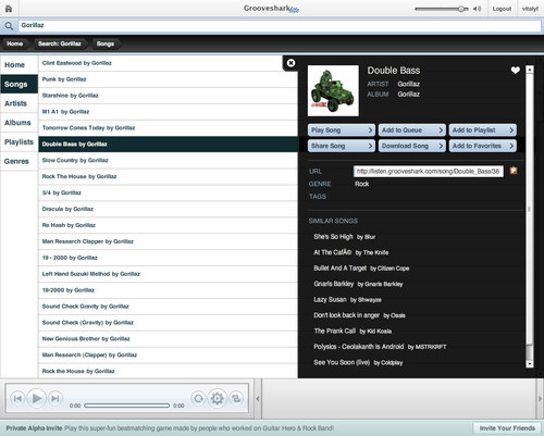
Grooveshark Lite Grooveshark seems to imitate an iPod-interface and does it indeed very well. Although it may be not very creative, such layouts are hard to find on the Web.
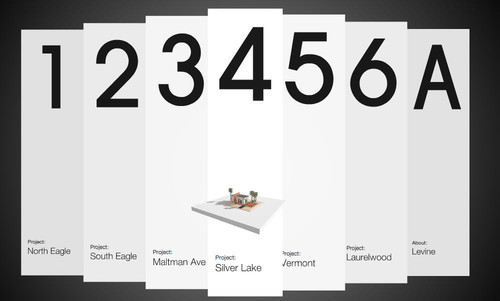
Jeremy Levine Design Flash offers many creative possibilities for an interactive navigation design. Jeremy Levine uses dynamic paper strips which seem to hang in the air.
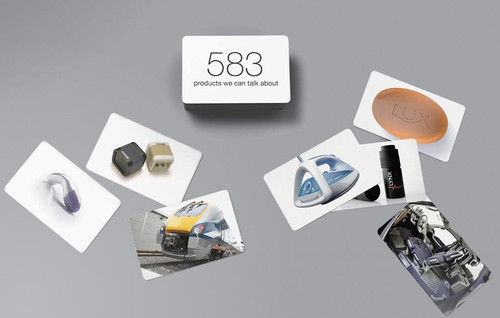
SeymourPowell SeymourPowell has come up with an interesting idea to provide its visitors with some intuition of how good its work is. Click on the pile to find out.
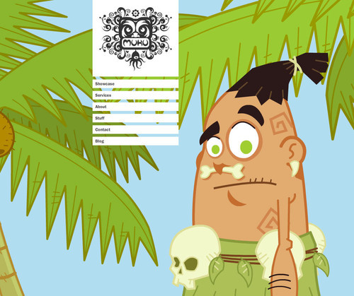
Muku Studios “Let Muku Do You”: this friendly buddy just wants to remain visible and hence he tries to find some place on the screen to keep an eye on site’s visitors. The layout of the site is simple yet memorable — well, Muku makes sure he’ll be remembered after the browser window is closed.


 SurveyJS: White-Label Survey Solution for Your JS App
 Register Free Now
 Celebrating 10 million developers

