Eight Inspiring Stories Of ASCII Art
Labels are fragile: text and pictures have always been closely connected. From the dawn of written language to the era of microcomputers, much of human creation has explored the relationship between the literal and the figurative, the form and the function. Within this is the future site of retro, ASCII art. It’s often used as a catch-all term for “text-based art,” regardless of the actual character set being used.
In this post, we’ll stroll through the past and present of ASCII art, assessing the influence of key pioneers, so that you might feel inspired to go forth and create. I hope you come across both familiar guideposts and unknown territory, and come away enlightened!
You may also want to take a look at the following related posts:
- All About Unicode, UTF8 & Character Sets
- About Art – What Do We Really Mean
- The Art And Science Of The Email Signature
- Learning From The Past: Design Legacies & Arts
Nude women never fail: Ken Knowlton’s mosaics
There’s an old joke that if you want to advance technology, introduce pornography. From smutty BBS GIFs to the erotic HD streams being broadcast in glorious 1080p, the softer side of this issue is that age-old question, “Is it porn or is it art?” I don’t think computer graphics pioneer Ken Knowlton intended to titillate when his colleague, Leon Harmon, called upon centuries of Renaissance masters and coaxed Knowlton into converting a photo of a nude model into this famous forerunner of ASCII art:

Photo from Ken Knowlton
While composed of “small electronic symbols for transistors, resistors and such” and not from the ASCII set (one reason why the term is a misnomer), it’s a clear link to the ASCII pr0n that would eventually circulate in colleges. Nothing grabs attention like the female form, and as Knowlton himself expressed:
We did make similar pictures — of a gargoyle, of seagulls, of people sitting at computers — which have appeared here and there. But it was our Nude who would dolphin again and again into public view in dozens of books and magazines.
No matter how sophisticated we get, we simply can’t escape our primal urges. As indicated, Knowlton wasn’t a one-trick pony; he went on to accomplish many variations on this mosaic theme, from cars to crossword puzzles, including Braille art made into Helen Keller’s visage (if only she had been able to see it!), turning painted keyboards into Bert Herzog’s steely gaze and, in more recent years, turning the typography of playing cards into magician Lennart Green. All this, like much great art, stemmed from a successful experiment that would set the tone for years to come.
On a somewhat less risqué note…
Knock, knock. Who’s there? Chuck Close’s mosaic of Philip Glass
As we’re seeing, the recurring theme of turning many individual elements (with details finer than mere pointillism) into grand canvases carries a heavy weight in early ASCII art history. No jaunt into this craft’s past would be complete without revisiting this iconic square-by-square composition of minimalist master Philip Glass:
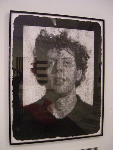
Photo by A.M. Kuchling
Look closely and you’ll notice it’s composed of “proto-pixels,” pseudo-squares of varying grayscale values that, when put together and you step back, form a recognizable face. This is also the same base technique used in many ANSI creations (keep reading!). Like Glass’ music, tiny units (or cells) are elongated into elaborate patterns. In this respect, the portrait serves as a fitting parallel to the sound of the man it represents.
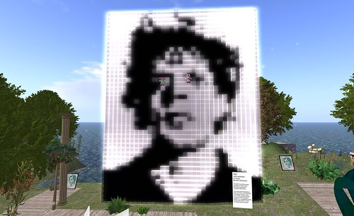
Close went on to further trendify this image by redoing it in several iterations, such as a watercolor, and later a t-shirt for The Gap. CHI5 Shenzhou would bring an unofficial glowing version into virtual world Second Life, where its bond with quasi-modern ANSI art is solidified:
For you naughty aestheticologists who just can’t get your mind off of naked women, Close also worked on Kate Moss. But he didn’t pixelate her.
“A Computer Era Masterpiece”: Digital Mona Lisa
One more mosaic, I promise, then we’ll speed up several decades. This one is so significant, it must be mentioned on principle! New art sometimes finds its direction by emulating the old, then putting a twist on it.
So let me ask you: what’s the most famous piece of art in the world? Many would call out da Vinci’s Mona Lisa. In 1964, H. Philip Peterson “utilized a CDC 3200 computer and a ‘flying-spot’ scanner to create a digital transposition/representation”:

Photo from Digital Mona Lisa
How long did it take? A far cry from today’s real-time rendering, this particular reinterpretation took 14 hours and, as you can see if you look closely, is made of numbers. While this arguably didn’t take much imagination, the endurance required would pave the way for more creative developments by showing what this system was capable of. (You may recall a somewhat similar story involving scanners and Lenna.) Information on H. Philip Peterson is scant; unlike Chuck Close and Ken Knowlton, he doesn’t appear to have gone on to a prolific art career.
On a relevant tangent, Mona Lisa is also among the most parodied works of art. Sure, by now you’ve seen flat characters being formed into cohesive pictures, but what about an assembly of 3D objects? Suitably, if computer parts are the order of the day, this Mona “Motherboards” Lisa from ASUS’ HQ takes the prize:
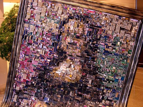
Photo by Sifter
It must’ve taken some pretty obsessed people to make that!
Beam me up: Star Trek ASCII art
Obsessions are a funny thing. And when they’re a healthy thing, I call them gladdictions (glad + addictions). ASCII art is pretty geeky, and so is Star Trek. When you put the two together, you get computer nerdom of astronomical proportions, and as a result, much progress is made.
Just as some of the aforementioned pre-ASCII art debuted in the 1960s, so did the classic Trek series. There are many repositories of Star Trek ASCII art that take the familiar characters on your keyboard and shape them into familiar faces, like William Shatner’s, and various starship classes. Among my favorites is Joshua Bell’s Star Trek ASCII Art Archive (disclosure: Josh is a colleague of mine at Linden Lab), which is a meticulously classified collection and even hilariously warns the uninitiated:
Please stop sending me email complaining that the images are made out of little dashes. It’s an art form, albeit a strange one.
Also worth looking at, if you like a refreshingly clean, long-scrolling page, is the self-proclaimed Largest Compendium of Star Trek ASCII Art. Picard’s head at the end is somewhat misshapen and resembles a Tenctonese more than a human, but I can’t really complain.
![[ The Sunny Spot ] ASCII-Art - The Largest Compendium of Star Trek ASCII-Art](https://farm4.static.flickr.com/3515/3187501723_65a9f100cb_o.png)
The point of all this? Advancing art skills by practicing it on the zealot magnet that is Star Trek will lead to these images being uploaded and propagated via BBSes – including as downloadable files and email signatures – and thus promote awareness of ASCII art.
As a consequence, newer generations are exposed to the art, and the art flourishes beyond the artscene. In time, select pieces will even become cultural phenomena. And as text graduates to pictures, pictures graduate to…
ASCII art on the move: Full-motion videos
Simon Janson’s Star Wars ASCIIMATION has proudly made the rounds. It is, essentially, Star Wars as a text-art movie. And thanks to Jeremy, aka bullfrog117 on YouTube, there’s even an earlier version with sound:
Meticulously assembled frame by frame with dialog subtitles, it’s far from complete but is a laudable effort that has spanned over a decade. Simon started it in July 1997 and, as of this writing, last updated it in April 2008. It even has a nice little surprise at the end, if you’re into Rick Astley. Or is it… Rick ASCII?
This “ASCIIroll” points to the increasing automation of ASCII effects, which usually involve down-sampling still or motion pictures into a set of values that correspond to various characters. Logically, sparser-looking characters like “.” would be lighter values, whereas busy, noisy ones like “@” and “&” would be darker values. Some purists decry this as cheating; others see it as the best way to create effects that can’t otherwise be produced.
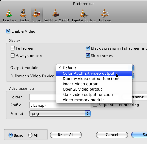
Other movies, like Pixar’s The Incredibles, have been ASCIImated via automatic means. (Although leaving the letterbox in doesn’t make much sense.) Tools like VLC’s own “Color ASCII art video” output module (found in Preferences > Video) make it possible to ASCIIize any movie clip with minimal effort. While it may not be art, it is a fun party trick and good for at least a few laughs.
These laughs just skim the surface of the most exciting possibilities. So let’s dive deep, really deep now.
ASCII demoscene: Not just for show
In a demoscene, the demo is essentially a showreel, a multimedia portfolio of a tight team’s skills presented with pop! I have high admiration for the demoscene’s ethos of resourcefulness: where else can you find so much creativity packed in such a compact space?
This is even truer when you look further to demos that carry a stompin’ soundtrack while being efficiently economized in text mode. Trauma’s “The Turing Machines Didn’t Care” (more info) is a beautiful recent example, mixing stylized type with delicious flavors of transition effects, fluidly evolving geometric patterns through an ever-shifting gauntlet of color. Accompanied by Crystal Method-worthy beats and snarling synth lines, it’s hard not to rock out to the ragged forms before you.
Another perennial fave is the briefly titled “BB,” which, should be noted, can run entirely in DOS. At first, it’s hard to imagine such dynamism emerging from such a staid OS – the electronic soundtrack does help – but keep an open mind and enjoy:
Entirely in monochrome, the amount of variance is staggering. From a Space Invaders-like blip to zooming fractals to flame simulation to text entry that conjures cyberpunk terminal hacking, it’s a breathtaking show. While watching it in its original non-YouTubed format gives the most authentic experience, it can also be a deterrent to the casual visitor, so I’m thankful that DiimitR shared this with us.
For more awesomeness, see:
Emoticon evolution: The Japanese new wave
Emoticons have come a long way, from simple “:)” smilies to fully featured expressions riding atop articulated characters made out of, well, characters. It’s unfortunate there aren’t more TV shows like Train Man, which highlight the life of a geek in a non-disgraceful manner. In addition to the exposure it gave otaku, Train Man has some pretty wild scenes involving these evolved emoticons. Project Densha has translated scenes that are helpful, and there’s no substitute for watching one of the scenes for yourself:
Nothing like Electric Light Orchestra’s “Twilight” accompanying a young chap gazing at ASCII art while he has an emotional outburst, eh?
The story that inspired Train Man was, like so many other modern yarns, originally unspooled on Japanese uber-BBS 2channel.
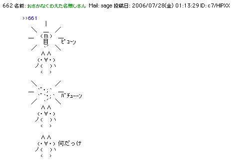
Photo by hawkexpress
2channel has emoticons like you wouldn’t believe, in part because their extended character set – actually Shift JIS – contains characters that are apparently well suited to be shaped into cute little cats and radical soy sauce mascot Kikkoman. As Lisa Katayama described in a lucid pictorial on Wired:
The Soy Sauce Warrior started as a simple ASCII image on a 2channel thread. But as more and more posters chipped in, he quickly developed into a fully fleshed-out character with an elaborate backstory. Kikkoman hails from Soybean planet. His friends Sugarman and Saltman help him battle the Sauce Brothers and Ketchup Man, and they employ powerful fighting moves like the Kikko-punch and the Kikko-beam.
The past is present: ANSI scrolls on
While ASCII art is a catch-all term, as I mentioned earlier, ANSI art is a special case, not just because it has extended characters, but precisely because its escape sequences allow for dithered blocks of varying shades. These can approximate graphics much easier, and it’s a close kin of pixel art.

Photo by Joe Smooth
ANSI art found a foothold in many BBSes, because it was easy both to add colorful vibrance and to transmit across dial-up modems in an age before widespread broadband. As a type of digital graffiti, ANSI art often has an organic, grungy appearance, with type simulating fantasy flourishes. Accompanying imagery often includes fierce dragons, surreal landscapes and – you guessed it! – naked women.
ANSI art is impressive not just because it continues to go strong, but specifically because improved display technology, like flat-panel LCD and plasma screens, allow us to enjoy it in ways that weren’t originally envisioned. As nostalgic as an amber CRT hooked up to a genuine IBM PC is, it doesn’t hold a candle to today’s massive monitors. Here’s a great example from Geek Entertainment Television, where ANSI art is decked out on widescreens like the cinematic posters they’ve always dreamed of being:
ASCII art isn’t for everyone and never will be. By virtue of its humble beginnings and subsequent growth, it demands an understanding of the dedicated culture in which it was born and recognition that while it originated with primitive technology, novel innovations are helping to expand it into unforeseen regions.
By viewing these electronic masterworks, I hope you’ll be inspired to create new pieces to populate your own canon.
Do you have fave ASCII art? Share it with us in the comments!


 SurveyJS: White-Label Survey Solution for Your JS App
 Celebrating 10 million developers
 Register Free Now

