Designing Drop-Down Menus: Examples and Best Practices
Yes, that’s right: drop-down navigation menus can be user-friendly. Just yesterday Jacob Nielsen the results of his recent drop-down menus study, in which he found out that big, two-dimensional drop-down panels that group navigation options help users to avoid scrolling and can precisely explain the user’s choices with effective use of typography, icons, and tooltips.
These panels appear temporarily and disappear on their own when users move the pointer to another top-level option or to a “regular” part of the screen.

In this article, we take a closer look at the nature of drop-down navigation menus, analyze situations in which they should or should not be used, discuss various implementations and finally showcase a couple of bad and good examples of such menus. The article also includes various tips and suggestions to help you work with your drop-down menus.
Where To Use Drop-Down Menus
You will often see many trends in which drop-down menus are used. Here are a few of the most common ones.
Organize Pages In A Section
Most commonly, drop-down menus are used to pull all of the pages in a certain category together in one organized element. This is essentially sub-navigation. Take a look at the design below. A drop-down element contains all of the different categories for a certain section of the website.
Organize Categories In A Blog
You will see many blogs use a drop-down menu to organize categories and tags. Why? Blogs are driven by a large amount of information, so the layout needs to be as clean as possible to hold that content. A drop-down menu ultimately helps pull together links, such as categories, out of layout elements, such as the sidebar.

Show Products on an eCommerce Website
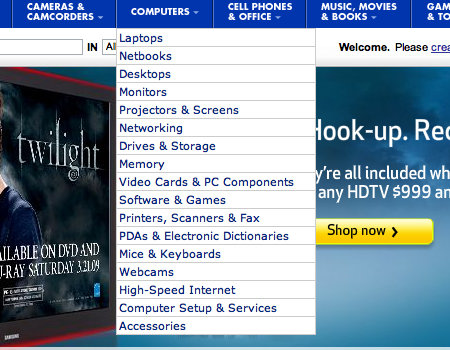
You will see many e-commerce websites use drop-down menus to show products or categories of products. The drop-down menu is a friendly feature that all consumers can easily figure out, so it is a perfect way to organize products. The Best Buy website, shown below, does just this.
Display Modules
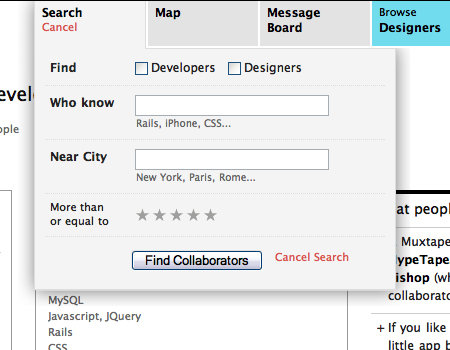
A drop-down can be an excellent way to tuck away an obstructive menu, which the user can click on to reveal. Take the example below, for instance. The sign-in element is part of the navigation, then appears in the form of a drop-down. This is a great way to take this large element out of the layout without negatively impacting usability.
Best Practices
Drop-down menus do in fact organize content into small, uncluttered elements, but if not done correctly, they can be just as bad as a messy layout. Here are some ways to make this controversial element more usable.
Avoid a Drop-Down with More than Two Levels
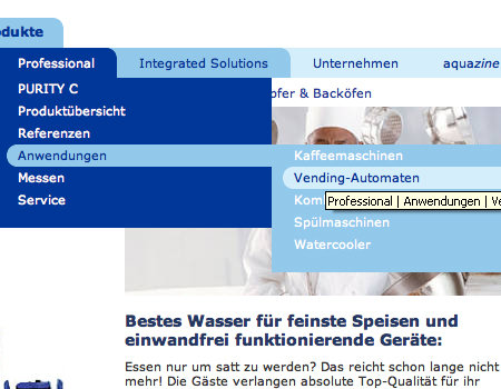
Overall, this is just about the worst mistake one could make with drop-down menus in terms of usability. If done with a hover menu structure, the user will lose focus of the menu whenever the mouse pointer moves away from it. If done with a clickable structure, it has too many buttons and doesn’t work nicely.
The website shown below makes this mistake. The menus are very difficult to use because if you even slightly lose focus of the menu with the mouse pointer, you have to start from the top. Notice the tooltip, which also gets in the way of the navigation.
Option 1: Hover Menu
Basically, there are two ways to approach the drop-down menu: with either a hover or a click to activate the menu. From a design and convenience standpoint, a hover menu is better.
Option 2: Clickable Menu
On the other hand, many will argue that a clickable menu is better because it is much more usable. Reason? Because of the way a hover menu is constructed, the user has to have the pointer over the menu at all times. If the user loses focus of the hover menu, it closes. Therefore, it is better to go with a drop-down menu that is activated by clicking a button, then deactivated by clicking the button once more.
CSS-Tricks has a tutorial showing how to create a layout similar to that of Digg. It is a perfect drop-down menu with a click-to-activate/deactivate feature, so it’s certainly something you should take a look at.
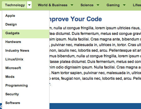
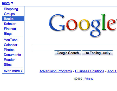
Also, Google features a usable drop-down menu using the click on/off trick.
Delay the Deactivation of a Hover
Avoiding a hover structure and many levels in a drop-down may be too much of a restriction for the navigation you are trying to create. There is a solution, though, that can improve the usability of a hover and multi-level menu. With most menus, the drop-down disappears immediately after the user moves the mouse pointer away from the menu. The solution is to delay its disappearance. Or, have a click function that requires users to click outside the menu area to close the drop-down, similar to how a Lightbox functions.
Take Dell, for example. It uses a multi-level drop-down menu, but it is still somewhat usable. This is the only exception to the use of multi-level drop-down menus.

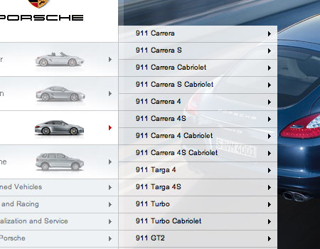
Furthermore, the menu on the Porsche website has multiple levels. However, the menu has a very wide focus range. This means you have to move your pointer a certain distance away from the menu to close it.
Add a Hover Effect to Menu Options
The navigation itself actually affects the usability of the drop-down menu. One way to make the menu work better with the drop-down is to add a hover effect to the menu options. This shows exactly which button in the navigation the menu is extending from, which will certainly help users.
The example below, the MediaTemple home page, shows a strong hover effect on the navigation options, which helps to support the drop-down menu.

Seamless Transitions
When a drop-down menu appears, it should appear seamlessly and without interruption. The menu should load immediately. Many websites make the mistake of making the menu so “heavy” that it takes more than an instant to load upon the hover.
Transition effects are one more detail that can look really cool. Instead of the menu simply appearing, try throwing in a wipe down or fade in. Just be sure to make the transition quick and not disruptive.
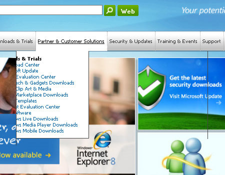
You will notice that Microsoft doesn’t do a very good job of creating a seamless menu. Observe the image below closely. You will notice that outlines from adjacent menus are still visible when the main menu is loading. When you move from button to button in the navigation, the drop-down menus have a slight lag, which looks bad. Of course, this doesn’t occur in all browsers, but it shouldn’t occur in any.
Remove Tooltips
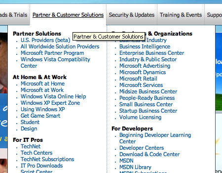
Of course, when designing drop-down menus, there are always little details that impact usability. One important practice you may overlook is the presence of tooltips, or the lack of tooltips. You should always remove tooltips from buttons with drop-down menus. Reason? Tooltips just get in the way and sometimes even block the first list item in the drop-down menu.
Yes, we will be picking on Microsoft once more. Microsoft makes this mistake on its corporate page. Notice how the tooltip blocks many of the list items, which makes navigation that much more difficult.
Styling Techniques
Content backgrounds can be somewhat of a challenge, too. The background has to be subtle, or it will ruin the content. Here are a few ways to liven up content backgrounds without going over the top.
Use a Clean List
Not only is the element styling important, but the content styling is important, too. Clean typography and a readable list are important. Use smart spacing between elements in the list, and add a border above and below list items.
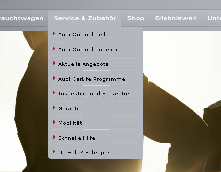
The example below from Audi shows a very well-organized and readable list. The list items are separated, and there are even list item icons.
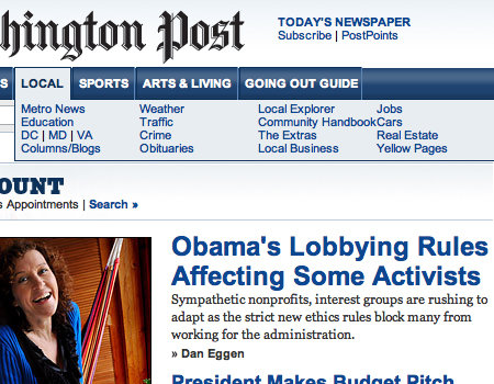
On the other hand, The Washington Post’s website has a very poor list in the drop-down menu. There is not enough spacing between list items, so the menu is very cluttered and difficult to use.
Hover Effects on List Items
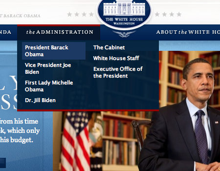
All buttons need some sort of hover effect to be more usable. In drop-down menu lists, apply subtle hover effects, perhaps just a text color or background change. The White House website uses only a background change on list items, but it still helps the user.
Semi-Transparent Background
This won’t work for all designs, but you should consider a semi-transparent background for the menu. The website shown below has a transparency, so the user can still see through to the image background. The key to semi-transparent elements is to keep a strong and readable contrast.

Keep Styling Consistent with Menu
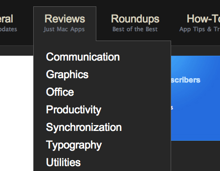
You will hear everywhere that consistency in styling is a must, and it certainly is. For navigation and a drop-down menu to work together as one unit, as they should, the styling needs to be similar. Use the same fonts and a similar background.
In the example below, the drop-down menu looks as it should.
Poorly Constructed Menus
Below are some examples of drop-down menus that fall short somewhere with styling and usability.
Navigant Consulting
This menu is poorly styled and dysfunctional.

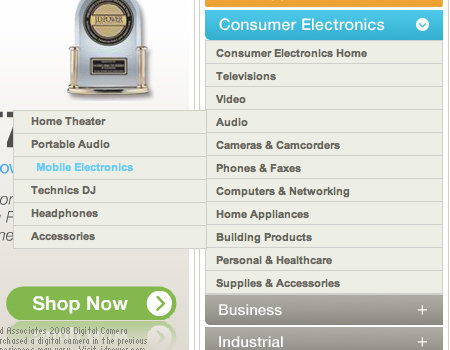
Panasonic
Although this menu is well-styled, it is difficult to use because of a bad hover effect.
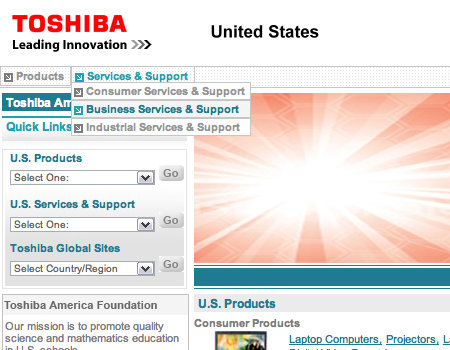
Toshiba
The Toshiba menu is too small and does not follow good styling practices.
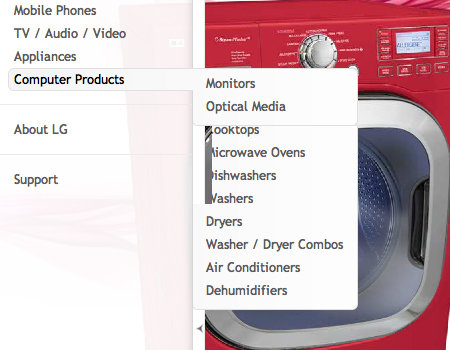
LG
Like the Microsoft menu above, this one has a slight lag, which makes it hard to use.
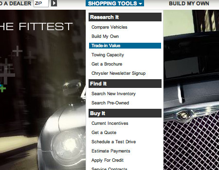
Chrysler
The Chrysler page uses a drop-down menu with very small text, which makes it difficult to read.
Sun
These drop-down menus are rather fidgety and hard to use. The tooltip gets in the way, too, and directly above the main navigation is another drop-down menu. All of this makes it very difficult to navigate.

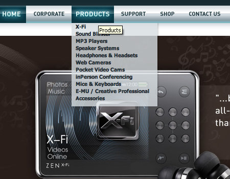
Creative Labs
The menu below is cluttered and does not have a delayed hiding or similar technique, so it is not very usable.
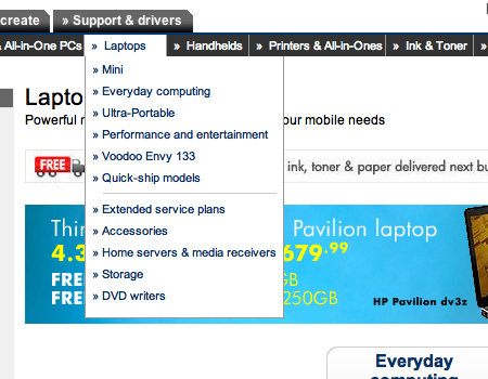
HP
Another hover menu that lacks usable features.
Alienware
The black menu on the black design makes this drop-down difficult to use.

Good Drop-Down Menus
Here are many drop-down menus that have good usability and styling features.
Sony
A well-constructed hover menu with a good list.

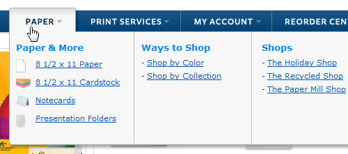
ActionEnvelope
A clean vertical drop-down panel with a lot of padding; notice, how the panel appear to be above other design elements. Simple and beautiful solution.
Helmy Bern
A beautifully styled menu, with a fade transition.

RedBrick
This menu is cleanly styled and very readable.

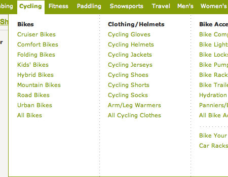
REI
This drop-down is very wide, so it is easy to keep the mouse in focus.
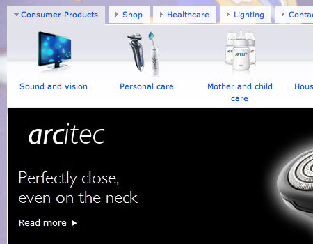
Philips
Philips has a large and usable drop-down module.
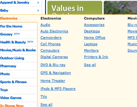
Walmart
On the Walmart site, the user clicks on the area outside the menu to close it.
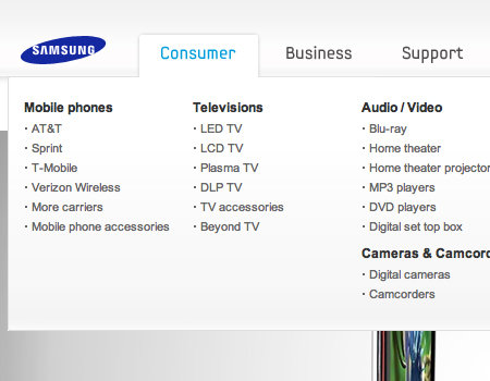
Samsung
The Samsung menu is usable because of its large size and styling.
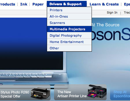
Epson
Epson shows another usable drop-down menu.
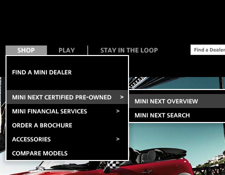
Mini Cooper
This website uses a drop-down menu with delayed closing.
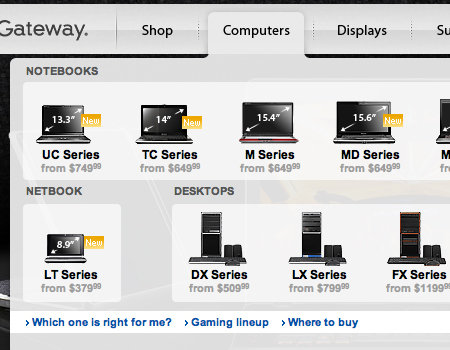
Gateway
Here is another usable drop-down element.
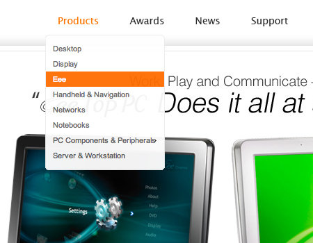
Asus Global
A well-styled menu that has delayed hiding.
Intel
A very clean drop-down menu.

Target
A well-organized menu that has delayed closing.
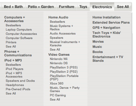
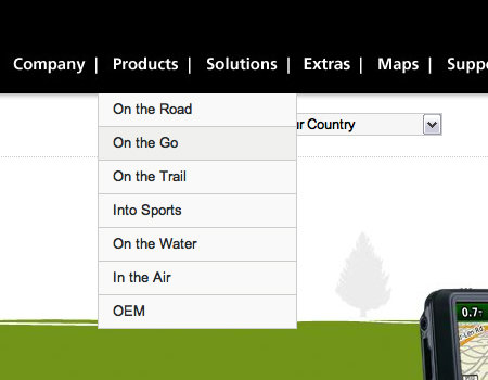
Garmin
This drop-down menu is simple yet functional.
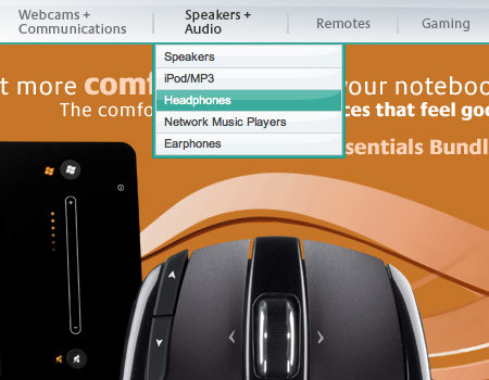
Logitech
A drop-down with very nice styling that matches the menu.
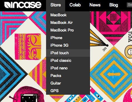
Incase
This menu is very basic but serves its purpose.
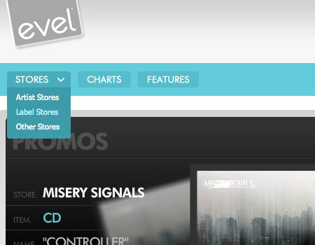
evelMerch
A small yet functional drop-down, with a graphic to show users that the button opens a menu.
IBM
A multi-level drop-down is used here, but a slight delay makes this one easier to use.

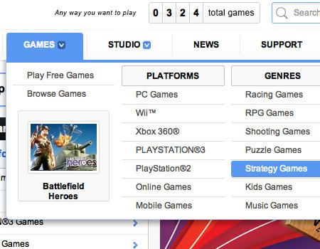
EA
A very clean and well-organized drop-down element.
Further Reading on SmashingMag:
- Showcase of Creative Navigation Menus: Good and Bad Examples
- Planning And Implementing Website Navigation
- Breadcrumbs In Web Design: Examples And Best Practices
- Web Design Navigation Menus – Articles And A Beautiful Showcase


 Celebrating 10 million developers
 Register Free Now
 Try ProtoPie AI free →
 SurveyJS: White-Label Survey Solution for Your JS App

