How To Create A Great Web Designer Résumé and CV?
The economy is bad. No one’s job is really 100% safe, so it’s time we all bucked up and got our recession bags packed (just in case!). Your portfolio is already gorgeous, but have you created a drool-worthy web résumé or design CV?
This flimsy one-page document is more important than many people think: the web résumé is the first portfolio piece that potential employers see, and if they’re not impressed, chances are they won’t look at the rest of your portfolio. “But I’m not a print designer!” you moan. It doesn’t matter, and I don’t want to hear your excuses! You need to conquer this, because if you’re a great Web designer, you don’t want your first impression to be mediocre.
Further Reading on SmashingMag:
- My (Simple) Workflow To Design And Develop A Portfolio Website
- Creating A Successful Online Portfolio
- 10 Steps To The Perfect Portfolio Website
- Don’t Forget The Small Stuff This Year
The Steve Stevenson Web Designer Résumé Challenge
Everyone likes a competition. How about one in which ten good Web designers have to design the same résumé in only a few hours? Meet Steven Stevenson.
Steven Stevenson, a fictional Web designer, doesn’t have a résumé. The competition: each designer must translate his work experience, education and interests into their own unique style. Watch and learn, people. At the end is a summary of good tips for Web designer résumés. (If you’re interested in taking the challenge yourself, check out misterstevenson for all the rules these designers followed, Steven Stevenson’s raw data and the chance to add your own entry.)
And in no particular order, here are the contestants’ entries!
Contest Entries
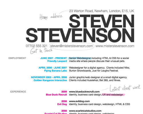
Sam Brown made a real effort to distinguish between the three main components of Steve Stevenson’s life and adds a touch of personality with some handwritten text and highlighting. He shows he isn’t afraid to mix media but manages to do so in an elegant, fun way. Download the PDF | Download the source file (.ai)
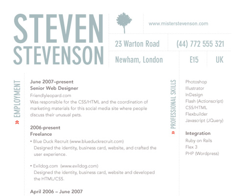
Ali Felski’s design is beautiful and simple, but manages to convey Steve Stevenson’s strong design skills. Her usage of colour is muted, but appropriate, and she’s left out a lot of extra information that could clutter up this one page document. Ali is also aware of the boundaries of the medium. She says, “A résumé should be designed well, but just like the Web, it has constraints, and even as designers, we should respect them.” Download the PDF | Download the source file (.eps)
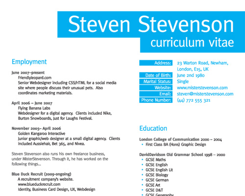
Chris Spooner opts for a purely typographic, clean design that showcases his ability to display information without the need for adornment. Clean design is a skill that Steve Stevenson may possibly need should he be looking for a corporate Web design job, in which case he’d need to present something simple and professional. Download the PDF
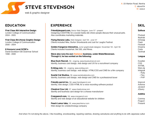
Niamh Redmond makes Steve Stevenson’s résumé stand out by choosing a landscape-style document with well-divided content and good branding. Niamh says about her design: “My aim was to design something in which each element served a function. Every shape and line, the colors and their use, the font variations and text sizes were chosen to communicate something to the reader.” Download the PDF | Download the source file (.eps)
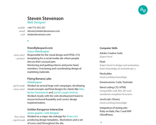
Eva-Lotta Lamm chose to keep her résumé simple and typographic: “The only illustrative element is Steve’s little logo (playing with the nice alliteration of his first and last name). It is repeated as a small blue dot to separate different section sin the résumé.” The result is a beautiful, yet simple piece, which is easy to follow. Download the PDF
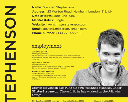
Sarah Parmenter goes with a solid yellow background and a very prominent photo of Steven Stevenson (who is quite cute!). She breaks up the copy and puts emphasis on his freelance work. Download the PDF | Download the source file (.ai)
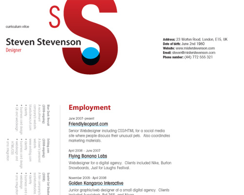
Wez Maynard has simplified the information and given it lots of room to breath. His design could easily be used as a Web design. He’s also given a lot of space and prominence to branding and has effectively separated the freelance work from the work experience. Download the PDF
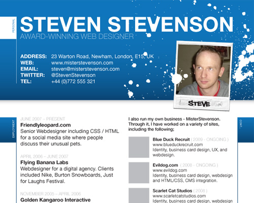
Luc Pestille has added some great imagery without making it unprintable. He’s allowed spaces for a photo and company logos, and he brings in arty spray-painting. While most likely inappropriate for a corporate work environment, it is playfully suited to a funkier job opportunity. Download the PDF | Download the source file (.ai)
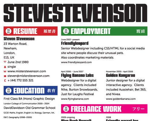
Ollie Kav chose to use Steve Stevenson’s love of Japanese culture to organize his résumé. These personal touches give the CV a huge dose of personality, which would give employers something interesting to speak with him about in the interview. “I’ve based the design on the signage in the Tokyo subway stations, which has bright bold colors,” Ollie says. This boldness makes for a resume that shows Steve Stevenson’s confidence and passion. Download the PDF | Download the source file (.indd)
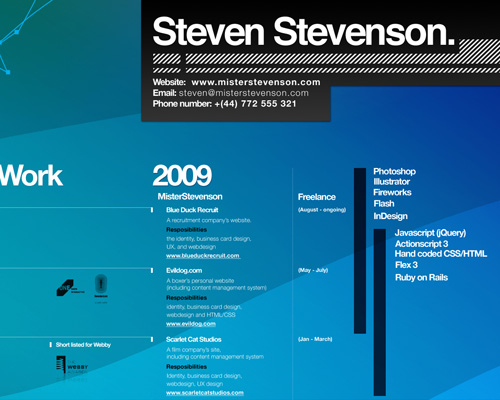
Albert Lo has broken an important rule by making his résumé virtually unprintable. But he has also organized the information very differently: chronologically, with awards, skills and work all intertwined, just as they would be in real life. Albert says his inspiration came from listening to house and trance; his colors and illustration really communicate the type of designer he is. Download the PDF
You can download all of these entries in a handy ZIP file (5 Mb). Thanks to all designers for their participation!
10 Useful Tips For A Great Résumé Design
Let’s now take a look at some useful ideas and guidelines that – in our humble opinion – may help you to achieve a great, compact and beautiful CV.
1. Make It a Summary
Your résumé needs to tell an employer (at a quick glance) the details most relevant to him or her. This means the whole thing should fit on one page! If you’re a Web designer, keeping it short and punchy is even more important. Sure, writing for Web is different than writing for print, but by showing your potential employer that you can keep things concise, you are actually showcasing an important Web skill. Besides, you need to leave something to talk about in the interview!
2. Keep It Simple and Understandable
When designing a CV, remember first and foremost that you are a designer, but don’t go overboard. Many people over-design their résumé. It’s a chronic problem: they’ll add so many fancy bits that the actual content gets lost. Most design jobs are all about your ability to organize content, so simplify, simplify, simplify!
But that doesn’t mean boring either. “Simple doesn’t mean simplistic; simple is hard to achieve,” says Niamh. Remember that you are applying for a design job, not to become a managerial assistant or to compete in an art college creativity competition.
3. Leave Some Details Out
Some people include their entire life history and every personal detail on their résumé. Your job as a clerk at the corner store 10 years ago won’t ever get you a job in Web design. Mentioning it only takes focus away from your relevant work experience. Keep your marital status, age and grades off, too. What if a potential employer wants to see your grades? Wez Maynard offers some great advice about this: “If the employer wants to judge you on your grades and not your portfolio, believe me, you do not want to work for them.”
4. Make It Perfect
You are a professional, so attention to detail is critical. Everything on your CV should line up, every pixel should be absolutely perfect. And even though the job is not to be a writer, a large proportion of employers throw away résumés with spelling or grammatical mistakes in them. By making it perfect, you are showing potential employers that you aren’t sloppy and that you will care about every detail of their projects. Get 10 people who can spell to look it over. Just do it.
5. Use a Grid
Over and over, Web designers scream about “the grid.” Why is the grid so important for a Web designer’s résumé? If you’re applying for a design job, the employer will most likely have an understanding of grids and baseline grids. “If you’re not using a grid, you run the risk of giving the impression that you don’t have an understanding of basic design principles,” Olliekav warns us. For those employers with no design background, grids make your résumé look cleaner and more organized.
6. Make It Printable
When working on designs for websites, you are allowed to have dark, moody and texture-heavy backgrounds. They look fantastic on your browser, but they are simply inappropriate for web résumés. Most CVs are printed out and given to hiring managers in batches, but not everyone has a photo-quality color printer; and, without contrast, your background-heavy résumé will become illegible.
So make sure your résumé
- matches the paper size for your country (letter size for the US and A4 for the UK, for example), so that employers don’t have to make any adjustments before printing,
- has a white background,
- looks okay in black and white,
- will print well at 300 dpi. The best way to avoid a pixelated result is to create a PDF with embedded fonts.
7. Link to Your Online Projects
Displaying URLs for your projects is crucial. If the employer will be viewing the résumé as a PDF, link the URLs back to your portfolio (using anchors if it is very long) or the projects themselves. Here’s how to create links in a PDF document.
(Many of the designers in the Steve Stevenson challenge noted that they would have done this, but because the applicant is fictional, the links wouldn’t have gone anywhere!)
Once your résumé is printed out, it should serve as a quick reference for potential employers to check out your projects. So, spell out the URLs alongside your project descriptions. You don’t need the https://www at the beginning of each URL, though.
8. Don’t Use a Template
A little inspiration here and there never hurt anyone. But imagine you submitted a web résumé and it was the exact same as someone else’s? Gosh, would your face be red. If you are a Web designer, you probably wouldn’t want to use a template for your portfolio website either. Take some time and think about the impression you want to make: I bet it isn’t that you can enter data into a template.
9. Update it often
Résumés are an often neglected aspect of a web designer’s portfolio. Make sure you update it every time you update your portfolio and make it accessible from your portfolio.
10. Show Your Personality
You are a designer, so I hope you have your own style. Steve Stevenson, from his interests, sounds like an interesting guy. Olliekav used his love of Japanese culture to give his résumé a personal touch without going overboard. If the job you’re applying for requires a lot of creative thinking, the employer wants to know you’re not a pixel pusher or a drone. Let them know you have personality, a sense of humor and a sense of style.
Bonus: If You’re Going to Break the Rules, Do It Well
Albert’s resume is completely unprintable, but it’s also absolutely beautiful. If you’re going to take risks like this, make sure you’re willing to alienate a few haters en route to more creative employers who will appreciate your ability to think outside of the box. Always make sure you’re aware of the rules, and break them cautiously. Done right, you’ll shine from the crowd.
The web résumé is an oft-neglected piece of the Web designer’s portfolio. Make sure you update yours every time you update your portfolio, and make it accessible from your portfolio.


 Try ProtoPie AI free →
 Celebrating 10 million developers
 SurveyJS: White-Label Survey Solution for Your JS App


