Lessons From Swiss Style Graphic Design
Also known as International Style, the Swiss Style does not simply describe a style of graphic design made in Switzerland. It became famous through the art of very talented Swiss graphic designers, but it emerged in Russia, Germany and Netherlands in the 1920’s. This style in art, architecture and culture became an ‘international’ style after 1950’s and it was produced by artists all around the globe. Despite that, people still refer to it as the Swiss Style or the Swiss Legacy.
Further Reading on SmashingMag:
- Why Won’t Helvetica Go Away?
- Bauhaus: Ninety Years of Inspiration
- Learning From The Past: Design Legacies & Arts
- The Dying Art Of Design
This progressive, radical movement in graphic design is not concerned with the graphic design in Switzerland, but rather with the new style that had been proposed, attacked and defended in the 1920s in Switzerland. Keen attention to detail, precision, craft skills, system of education and technical training, a high standard of printing as well as a clear refined and inventive lettering and typoraphy laid out a foundation for a new movement that has been exported worldwide in 1960s to become an international style.
Emerging from the modernist and constructivist ideals, the Swiss Style can be defined as an authentic pursue for simplicity – the beauty in the underlines of a purpose, not beauty as a purpose in itself. The principle “form follows function” became a battle-cry of Modernist architects after the 1930s. As a consequence of this principle, most of the Swiss Style craft is devoted to the minimal elements of style such as typography and content layout rather than on textures and illustrations.
“Perfection is achieved, not when there is nothing left to add, but when there is nothing left to remove.”Antoine de Saint-Exupéry
Here are some great resources if you want to dive deep into the Swiss Style Graphic Design.
- Blanka Gallery of posters and prints
- Book: Swiss Graphic Design: The Origins and Growth of an International Style
- International Poster Gallery
- Josef Müller-Brockmann Flickr gallery
- Swiss Graphic Design History Flickr gallery
- International Typographic Style Flickr gallery
How the Swiss Style Relates to the Web
This style of graphic design was born in the institutional context. The majority of pieces from this movement are in the form of posters, stamps, institutional typographical identity, street signs, etc. In this sense, these artists are leveraging much more than just top-down communication, they’re creating user-friendly interfaces.
As a result of that, Swiss Style artists tend to put their artistic efforts in that the content they are conveying delivers its intended message in a clear, unobtrusive fashion. One can make the point that they were thinking, in a broader sense, about usability long before the web even existed. How can we not learn from these great masters?
Uniformity and geometry
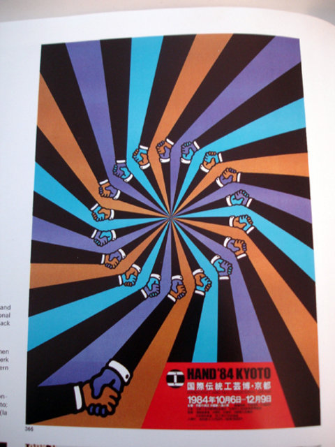
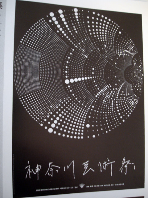
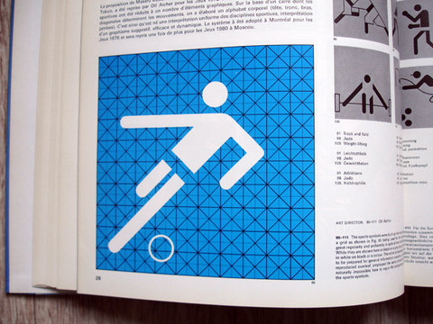
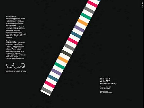
Even a quick study of classic Swiss style works reveals a strong attention of graphic designers to uniform design elements and strong geometric shapes. Graphic artists have experimented with abstract geometric patterns, uncomon color combinations, text manipulations and striking abstract visuals that were used to clearly convey their purpose in a very remarkable way.
Whitespace: Let The Text Breath
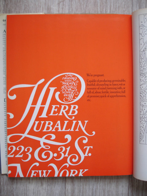
Whitespace can never be underrated. It’s a very important element for both visual impact and readability. It feels quite inviting when a web page is laid out in such a fashion that the organization of the page (and the site) is clearly conveyed in a split of a second. It’s also good for business, since people use interfaces that they understand and tend reject the ones they don’t.
A common way that people pursue organization is by having markers that separate the different parts of the site: in web design icons and illustrations are used to separate various types of content. But Swiss style is all about using less, so instead of adding more elements to work with, they prefer to remove as much as possible. This is a great example of the ‘less is more’ principle and of the ‘the content is the interface’ wisdom.
Grid Systems
A grid system is a rigid framework that is supposed to help graphic designers in the meaningful, logical and consistent organization of information on a page. Rudimentary versions of grid systems existed since the medieval times, but a group of graphic designers, mostly inspired in ideas from typographical literature started building a more rigid and coherent system for page layout. The core of these ideas were first presented in the book Grid Systems in Graphic Design by Josef Müller-Brockmann which helped to spread the knowledge about the grids thorough the world.
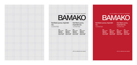
Nowadays grid systems are an established tool that is often used by print and web designers to create well-structured, balanced designs. There are many resources on the subject, one of them is an article by your own Smashing Magazine: Designing With Grid-Based Approach. You may want to take a closer look at it if you want to learn and find out more about grid-systems.
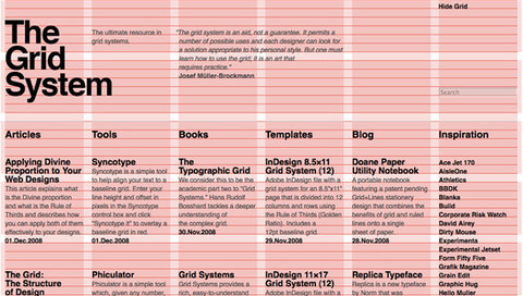
More than grids, structured information
When we learn from the Swiss Style literature, it’s very easy to embrace the grid system as a purely visual framework. However, upon a further examination we can see that grids are more than just the art of placing elements; there’s a subtle layer of semantic organization of data which, despite not being inherent to the use of the grid, is a big part of the Swiss Style’s essence.
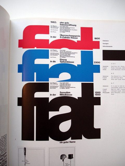
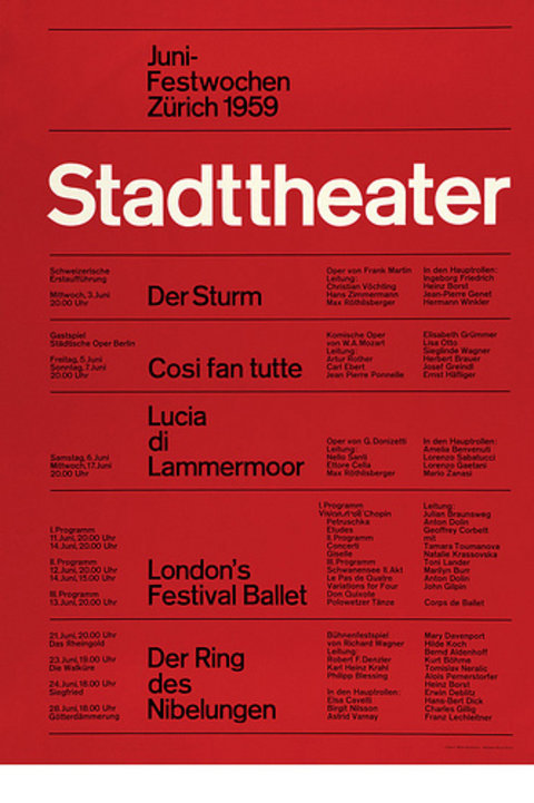
These posters have a very well-defined structure. It definitely feels like tabular data and tabular data is one such case that the disposition of the information extrapolates the realm of graphic layout and starts hinting on the meaning of data and how various chunks of data relate to each other.
The abuse of tables as structural elements was, and still is, very harmful to web accessibility. However, blindly replacing tables for div tags does not help to make code more semantic. List elements are a great solution for collections of similar data, but ULs and OLs do not define any kind of relation between this data.
Enter Definition Lists
Definition List (DL) is probably one of the most underestimated HTML elements. It’s a list element such as UL and OL, but it is supposed to present a collection of terms (DT) and descriptions (DD). Its most obvious use case is to represent dictionaries, but its potential goes way beyond that. The W3C Recommendation gives the example of a dialogue where DTs are character names and DDs are the text lines. It could also be used to represent calendars (days and assignments), articles summaries (titles and descriptions) and much more.

Elementary
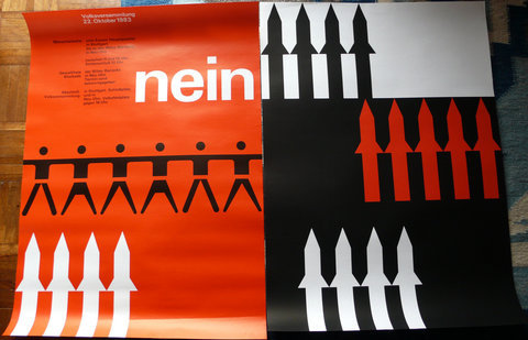
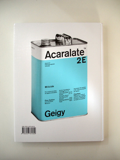
There is also a direct influence from the constructivism, elementarism and minimalism movements in the Swiss Style artists. Minimal design is about removing the unnecessary and emphasizing the necessary; it’s about a functional and simple use of fundamental elements of style for the purpose of the artists’ objectives.
This principle is one of the core reasons why Swiss Style graphic designers pay so much attention to type. Typeface is one of the most fundamental elements of visual communication that is able to deliver the message in a very precise, clear way. According to the Swiss movement, adding more elements without fully exploring the potential of the fundamental ones can be considered a ‘waste’. As these basic elements, like typography, have so much aesthetic potential, there’s rarely a need for other visual graphics elements.
In many aspects, these ideas touch on the core proposals of the De Stijl movement. The neoplasticism, as proposed by De Stijl artists, is about elementarism and geometry not only as a form of exploring the potential of the fundamental elements, but as a pursuit of beauty and harmony, hinting on a more mystical belief in ‘ideal’ geometric forms.
Drop the Serif (…or rather don’t)
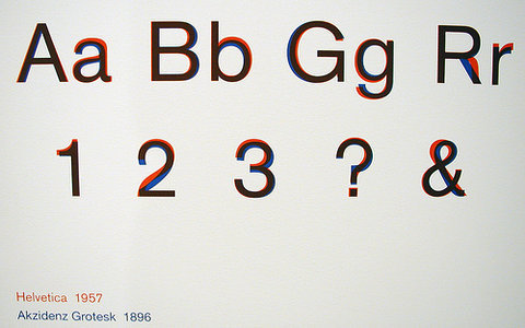
One of the strongest characteristics of the Swiss style typography is the use of sans-serif typefaces such as Akzidenz Grotesk and Neue Haas Grotesk (a.k.a Helvetica). In fact, when Jan Tschichold wrote Die neue Typographie, he ignored any use of non sans-serif typefaces. With this philosophy, graphic designers were aiming at clarity, simplicity and universality. Helvetica, for instance, is a typeface that is famous for its pervasiveness: it is used in corporate identity, street signs, magazines and pretty much everywhere else. The Swiss Style advocates that the typeface does not have to be expressive in itself, it must be an unobtrusive instrument of expression.
“I don’t think that type should be expressive at all. I can write the word ‘dog’ with any typeface and it doesn’t have to look like a dog. But there are people that [think that] when they write ‘dog’ it should bark.”Massimo Vignelli in the documentaty Helvetica.
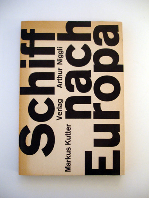
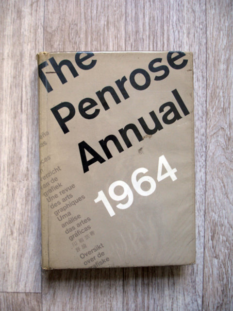
This is by no means a rigid rule. When Swiss Style graphic designers advocate the use of sans-serif typefaces, they weren’t paying attention to the historical legacy and experimented with something new. Even Jan Tschichold himself admitted that his book was too rigid. If there’s one single lesson from the Swiss Style it is to love and respect typefaces.
Font-size as a tool for readability, impact and rythm
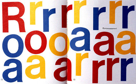
It’s very common to spot the use of font-size contrast in the works of the Swiss Style.
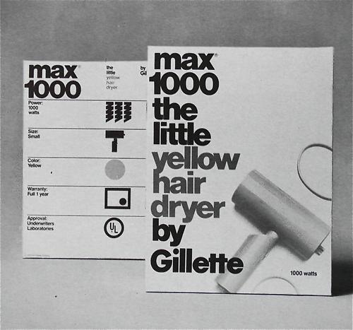
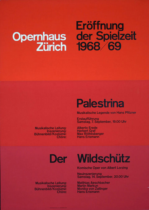
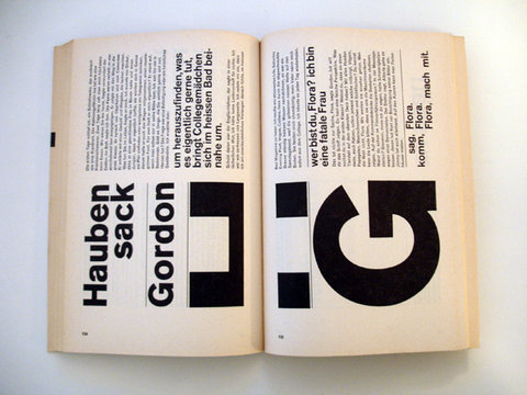
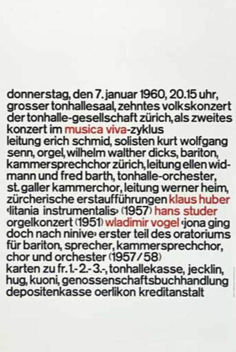
Different font-sizes not only generate visual impact, but also provide readers with a hint about the hierarchy of the presented data. Huge words are the entry points, the top-level elements in the content’s information architecture and page’s hierarchy. This is a very efficient way of guiding the reader’s eyes through the page, thus working as an interface to the content.
Photography. Yes, photography.
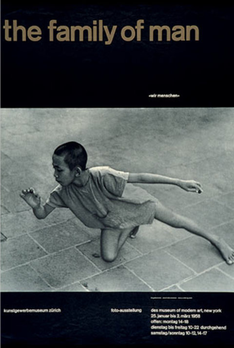
Despite not being particularly famous for it, one important part of the Swiss Style is its remarkable use of photography. Following the modernist ideas in which photography was a much better tool to portray reality than drawings and illustrations, the Neue grafik magazine, a very important Swiss graphic design publication at the time, dedicated a big part of its content to photography and its application in design.
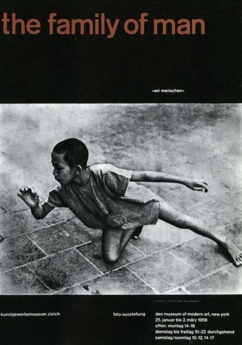
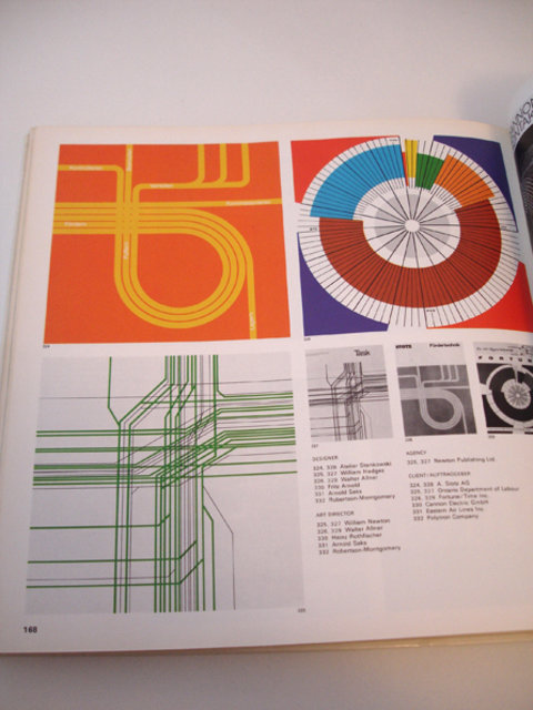
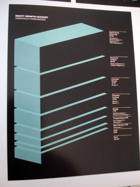
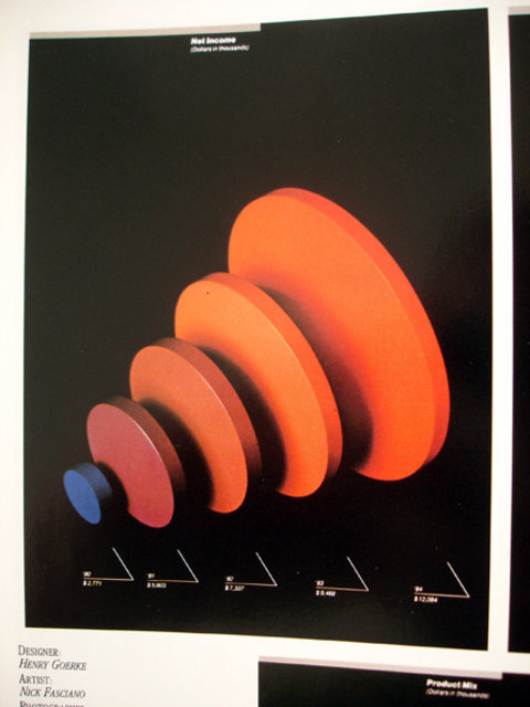
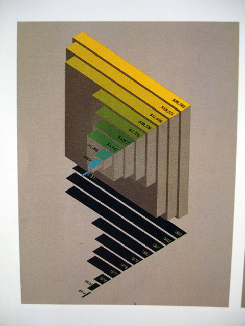
Showcase of Swiss Graphics Design
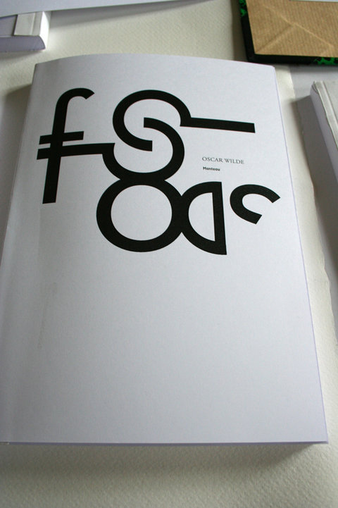

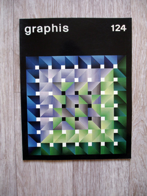
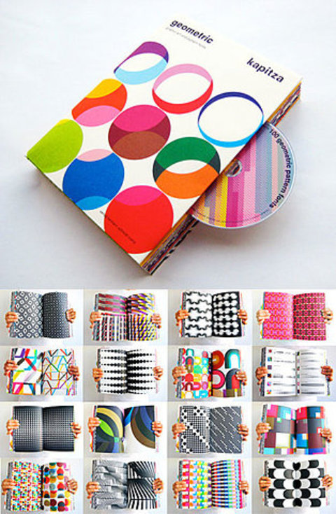
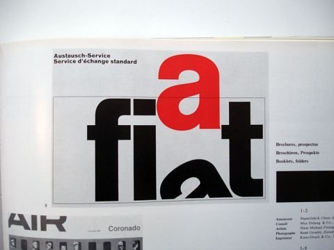
Book Cover A book cover with an interesting use of geometric forms.
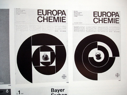
Swiss modern graphic design for the chemical industry
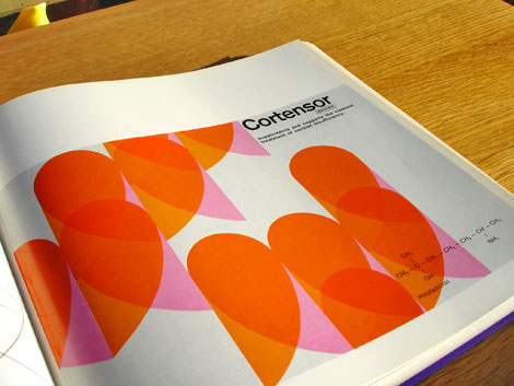
Swiss modern graphic design for the chemical industry
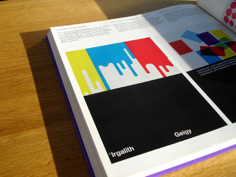
Swiss modern graphic design for the chemical industry
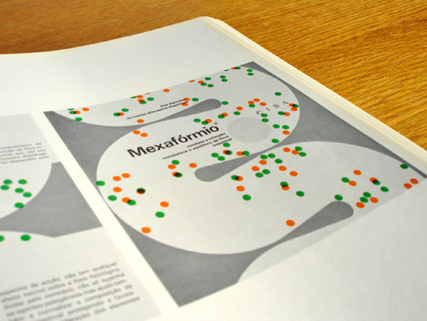
Swiss modern graphic design for the chemical industry
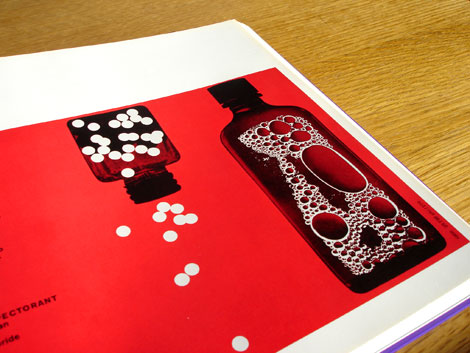
Basic Typography – Ruedi Rüegg/Godi Fröhlich 1972
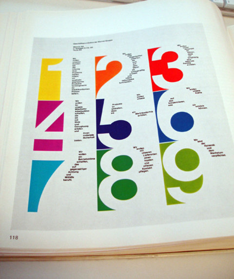
publicity and graphic design in the chemical industry
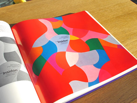
Corporate Design International – Wolfgang Schmittel
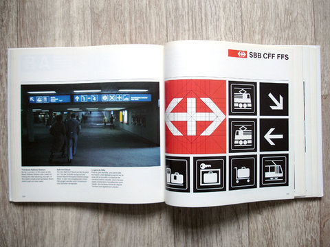
Karl Gerstner: Review of 5x10 years of graphic design
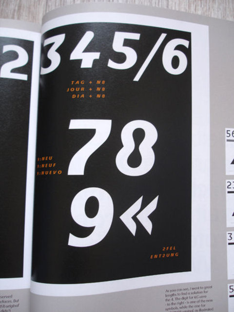
Karl Gerstner: Review of 5x10 years of graphic design
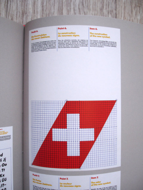
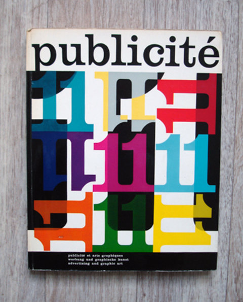
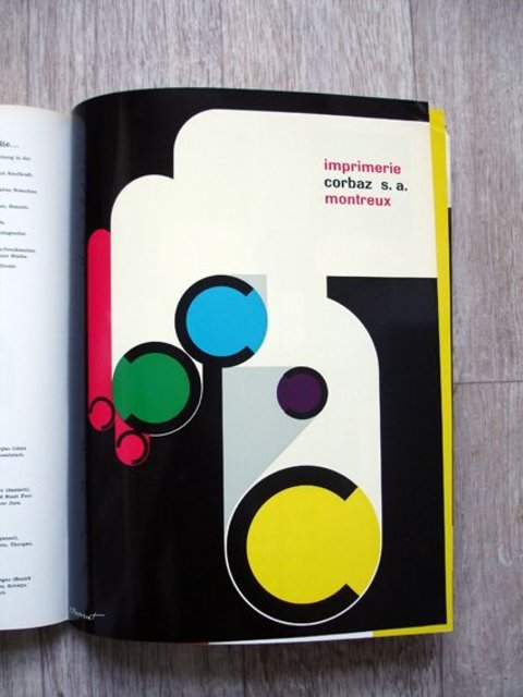
Karl Gerstner: Review of 5x10 years of graphic design
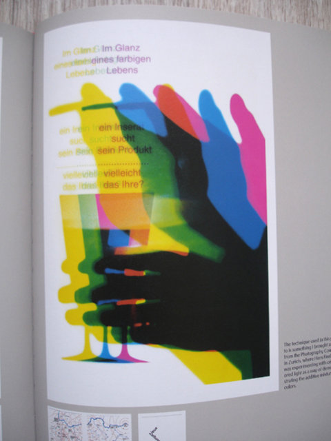
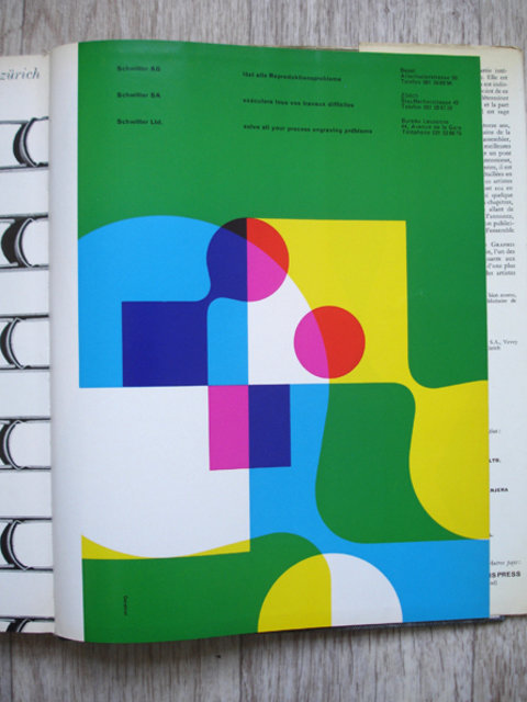
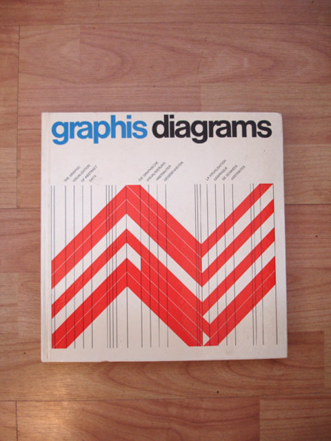
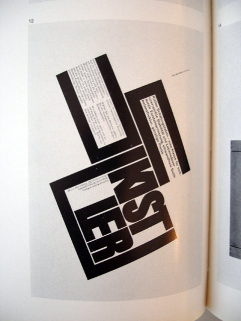
Odermatt & Tissi: Graphic Design
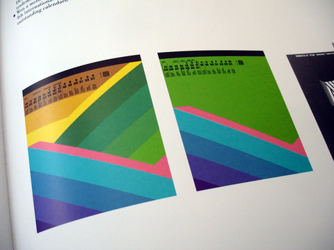
TM Typografische Monatsblätter - 1968
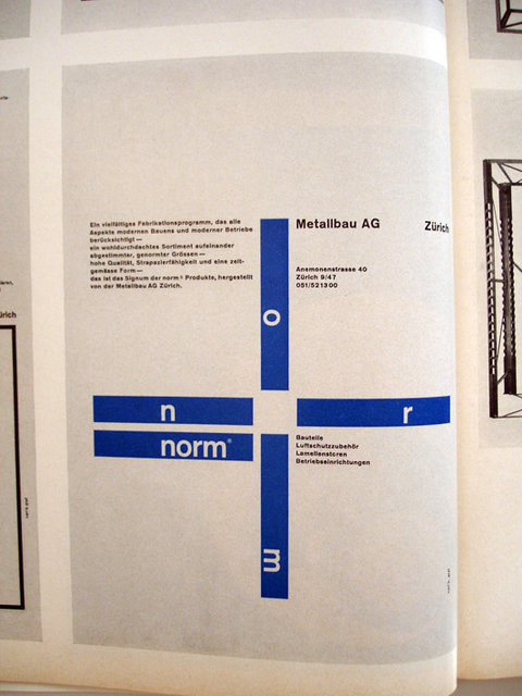
TM Typografische Monatsblätter - 1968
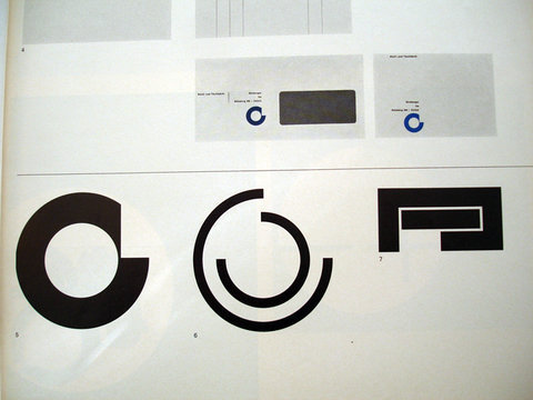
Film + Design by Peter Von Arx
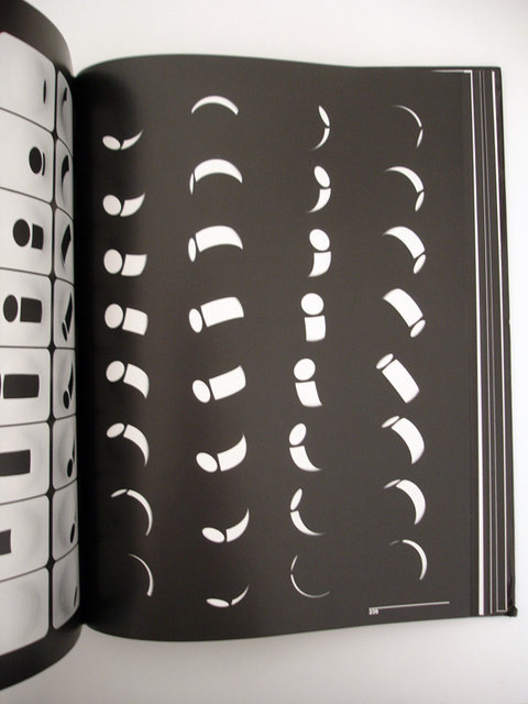

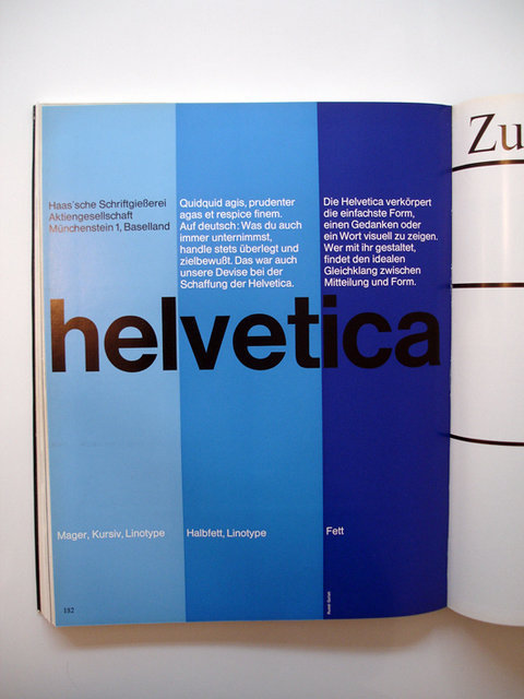
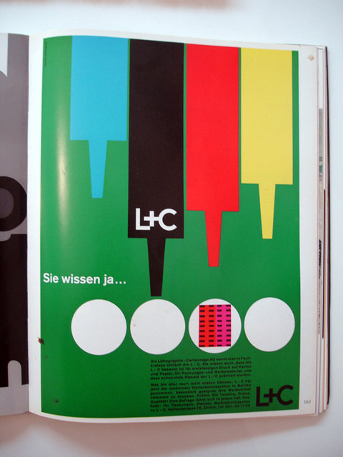

abc verlag_publicity and graphic design in the chemical industry (82⁄91)
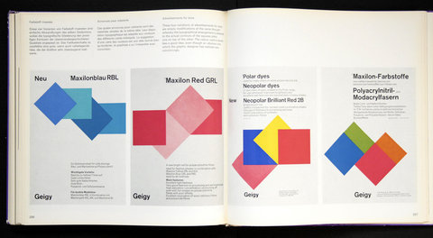
FFFFOUND! | Swiss Graphic Design
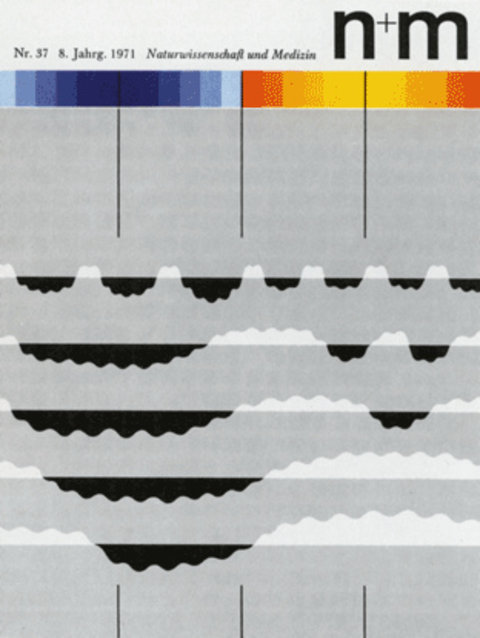
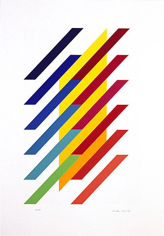
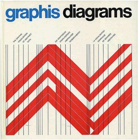
Corporate Diversity – Swiss Graphic Design and Advertising by Geigy 1940-1970

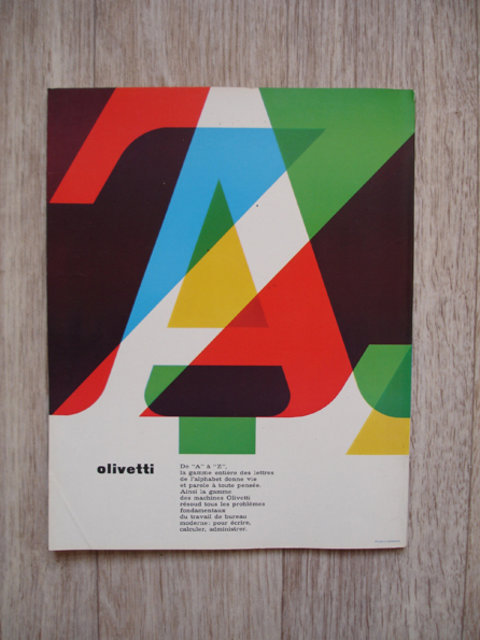
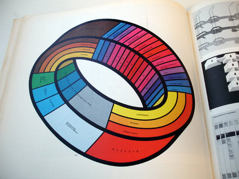
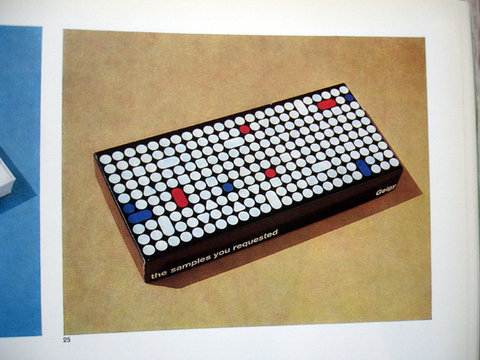


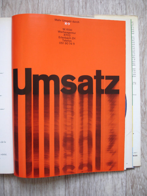
Graphis International – Wim Crouwel interview
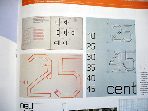
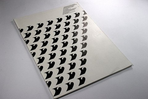
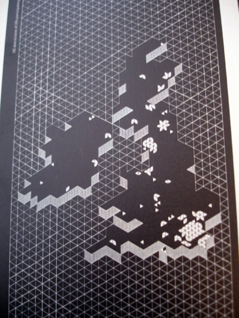
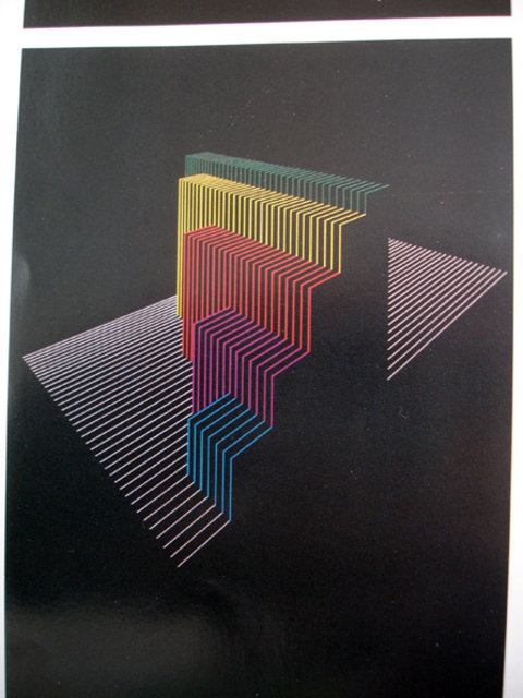
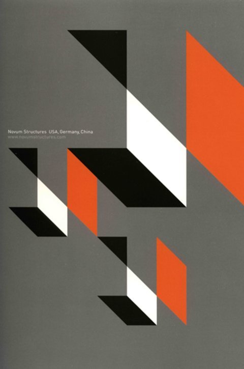

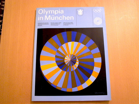
otl aicher visual communication - munich olympics - münchen olympia 1972

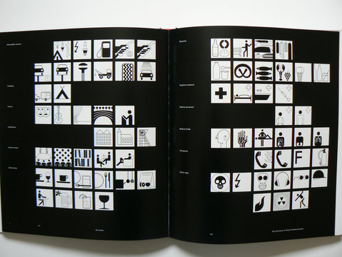
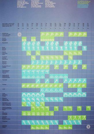
Erscheinungsbild Flughafen München
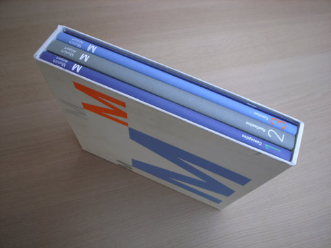
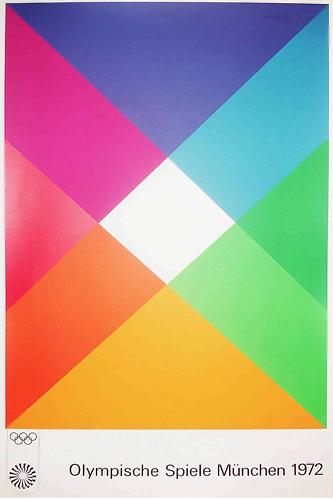
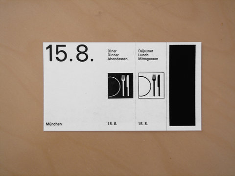
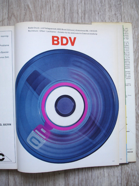


Graphic Design in Swiss Industry / Schweizer Industrie Grafik
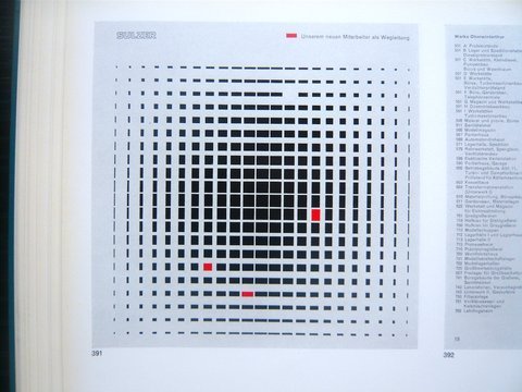
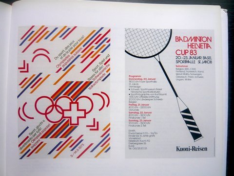
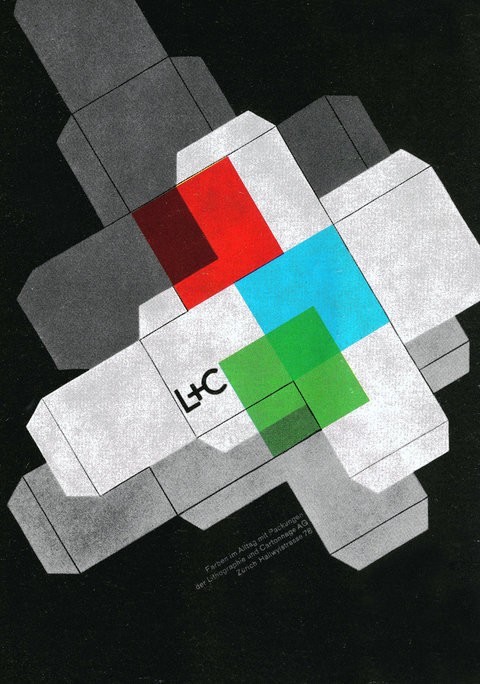
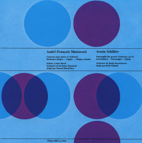
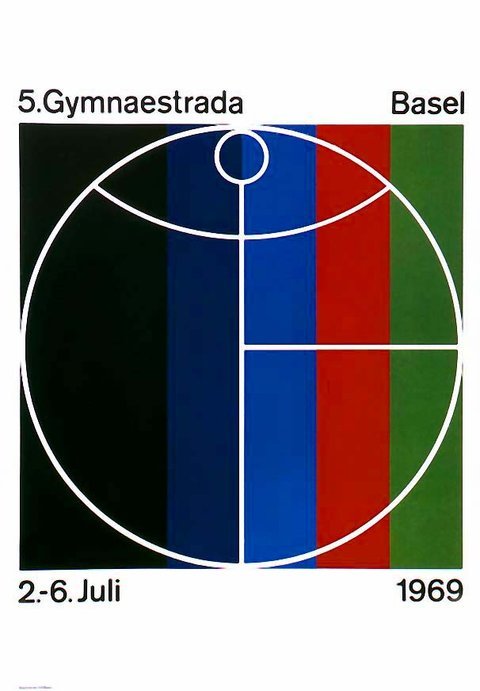
International Typographic Style 7
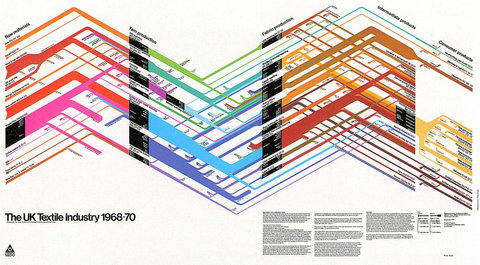
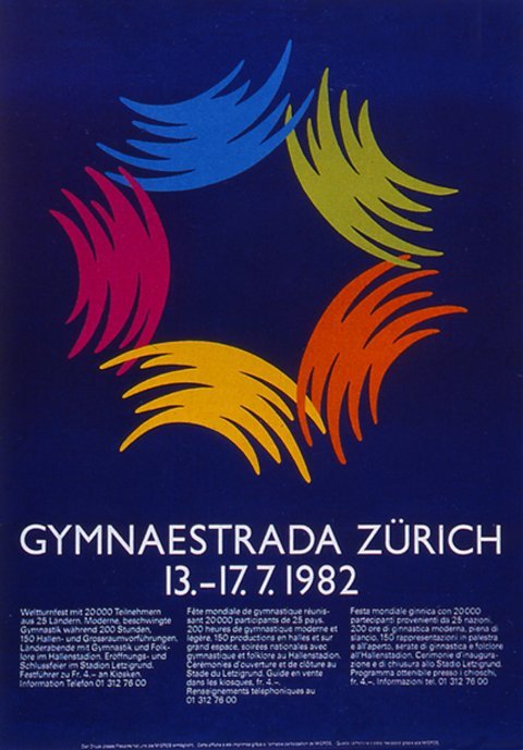
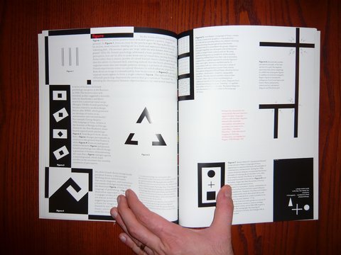
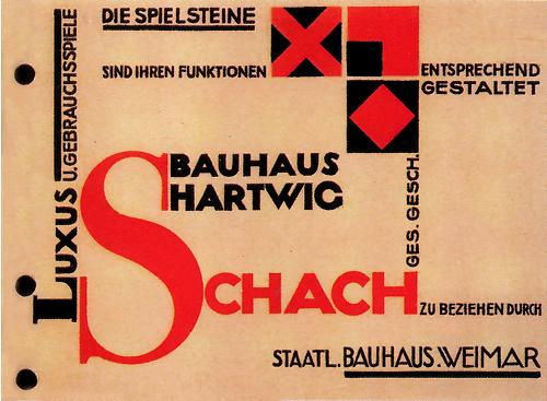
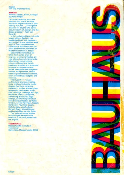
History Swiss Graphic Design, Wohnbedarf
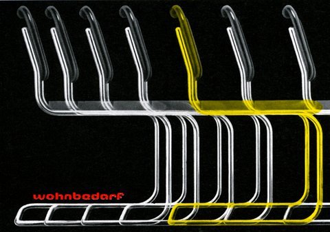
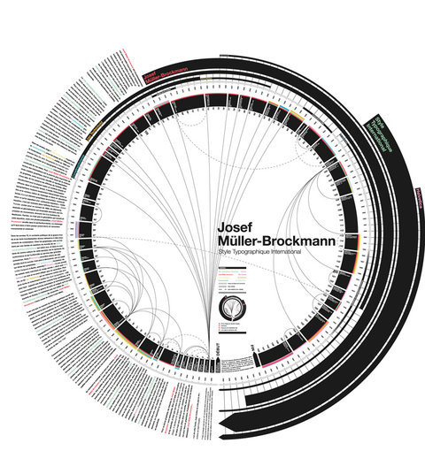
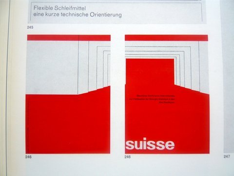
Graphic Design in Swiss Industry / Schweizer Industrie Grafik
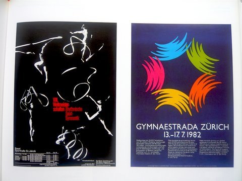
Graphic Design in Swiss Industry / Schweizer Industrie Grafik
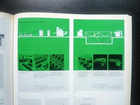

Schiff nach Europa –– Markus Kutter/Karl Gerstner 1957

Publicity and Graphic Design in the Chemical Industry / Chemie Werbung Und Grafik
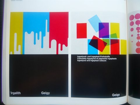
Schiff nach Europa –– Markus Kutter/Karl Gerstner 1957


Masters
Theo Ballmer
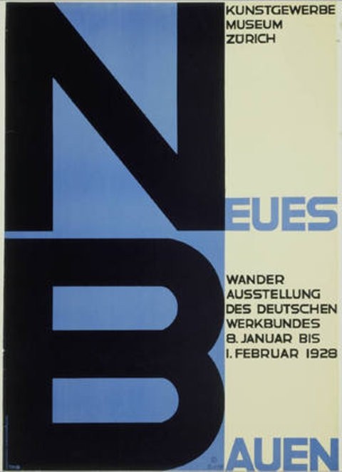
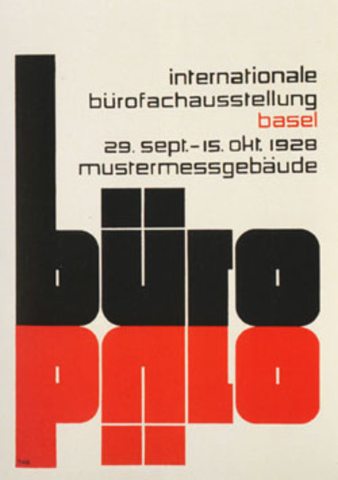
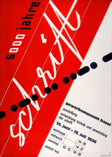
Theo Ballmer is best known for his posters, but he also worked as a photographer, lettering designer, teacher and typographer. He demonstrated talent from a very early age when he studied at the Zürich Kunstgewerbeschule, where he had Ernst Keller as one of his professors. Like many other Swiss Graphic designers Ballmer went to the Bauhaus, but only after he was already an established designer.
Max Bill
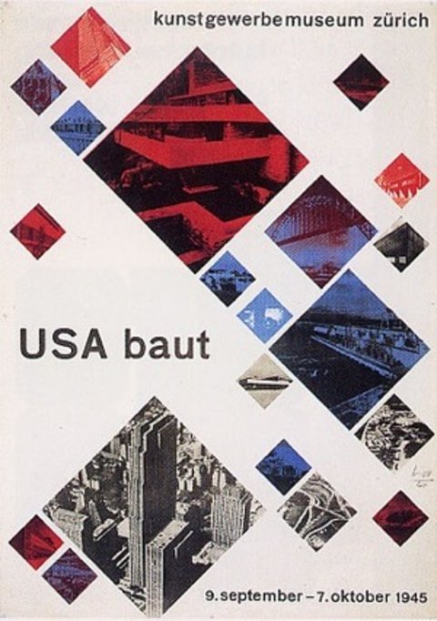
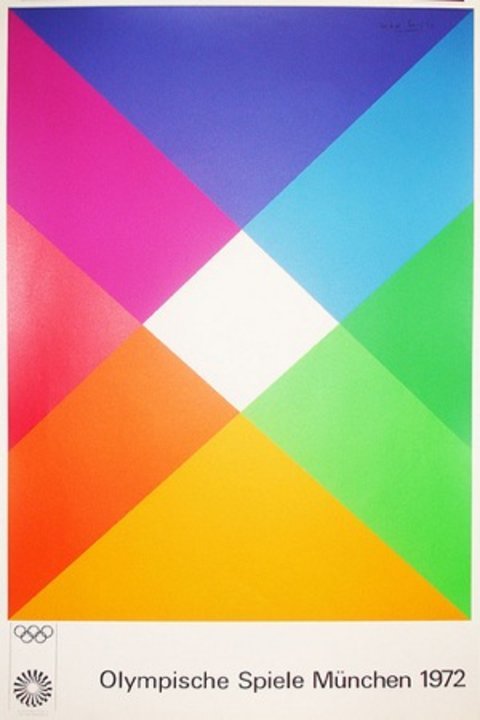
Max Bill was an architect, painter, typographer, industrial and graphic designer. He studied at the Bauhaus until late 1920’s when he moved to Zurich where he became a teacher and prime member of the Allianz group of graphic designers.
Adrian Frutiger
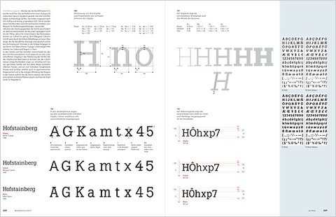
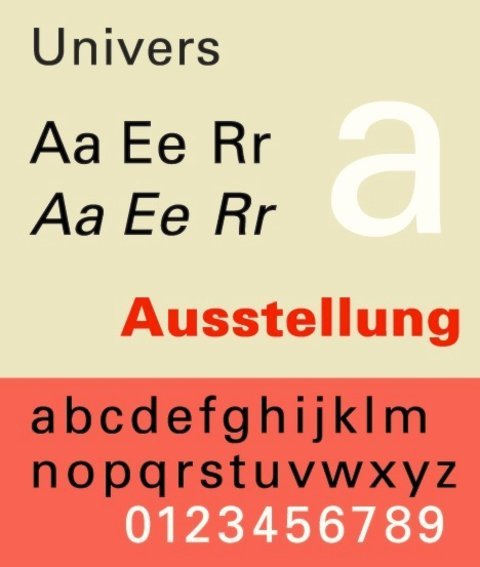
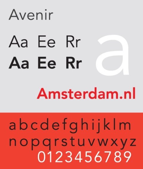
Adrian Frutiger is the master typeface designer behind the Univers, Frutiger and Avenir typefaces, just to mention a few. He studied calligraphy at the Zürich Kunstgewerbeschule, which along with his interest in sculpture helped shape his style as a typeface designer.
In the early 1970’s he designed the Paris Metro signature with a variation of Univers, he was then asked to design the ‘way-finding signature’ for Paris Charles de Gaulle International Airport. His work on that resulted in the Frutiger typeface.
Karl Gerstner
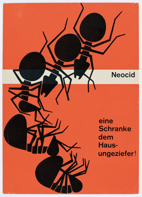
Painter, graphic designer and typographer, Karl Gerstner is as important for his design as for his ideas about design as a process. He developed ideas of a flexible grid with computational systems in mind. He also developed the notion of ‘integral’ typography: where the message and its form are inseparable and interdependent, the idea being inseparable from typography.


Armin Hofmann
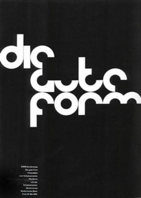
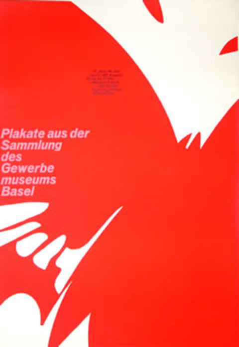
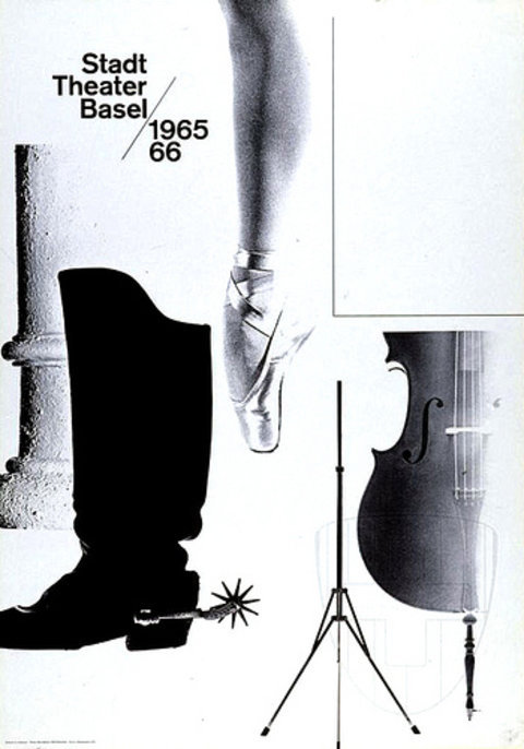
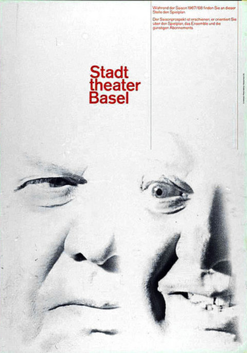
Armin Hofmann taught and worked as a director at the Basel school of Design. Basel was a small city of about 250.000 inhabitants that became very important for the development of the Swiss modernism, most due to the direction of Hofmann of his predecessor Emil Ruder.
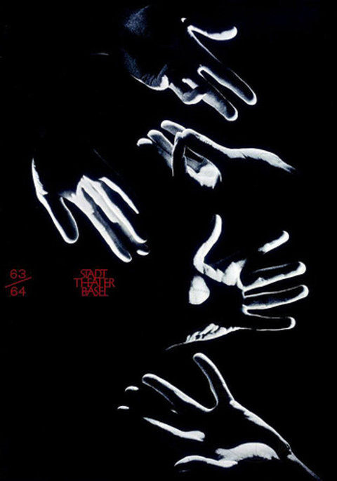
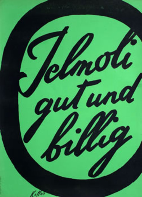
Ernst Keller
Ernst Keller was a professor at the Zürich Kunstgewerbeschule from 1918 to 1956 where many of his pupils went on to become influential graphic designers, for what he’s consider one of the fathers of the Swiss school of graphics
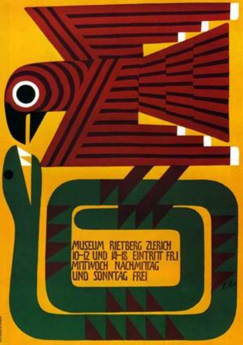
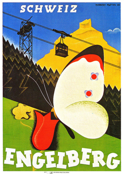
Herbert Matter
Matter was a pioneer in the use of photomontage, which with its talented use of type earned him great international acclamation. After working for the Swiss National Tourist Office and Swiss resorts he moved to the United States in 1936 and started teaching Photography at Yale University in 1952.
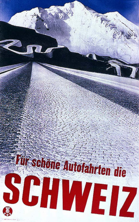

Jan Tschichold
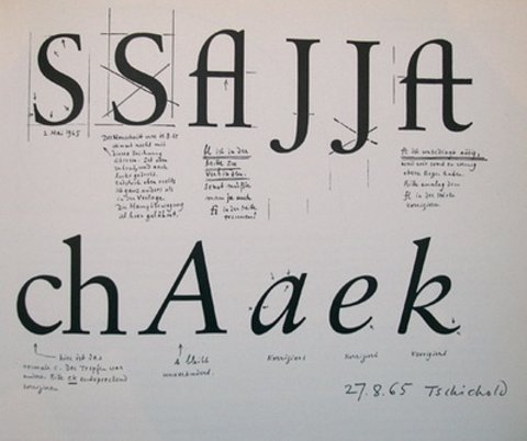
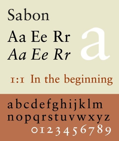
Jan Tschichold became a leading advocate of modernist design after visiting the Wiemar Bauhaus exhibition in 1923. His most famous work is the book Die neue Typographie which organised most of the modernist design principles. He went to England in 1947 were he was wired to Penguin Books and directed the creation of the famous Penguin Composition Rules. He is the designer of the Sabon typeface.
Josef Müller-Brockmann
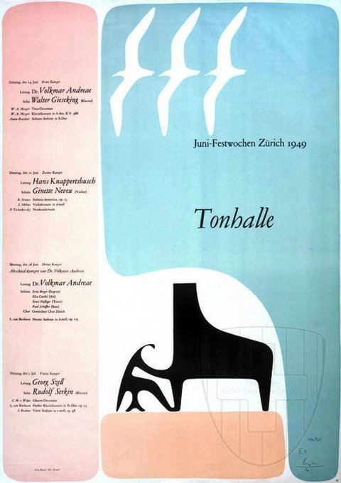
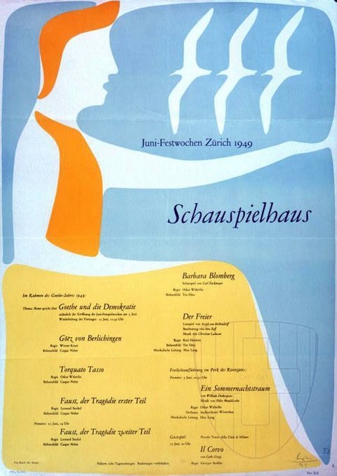
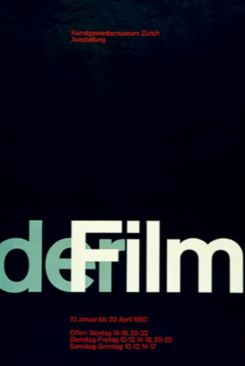
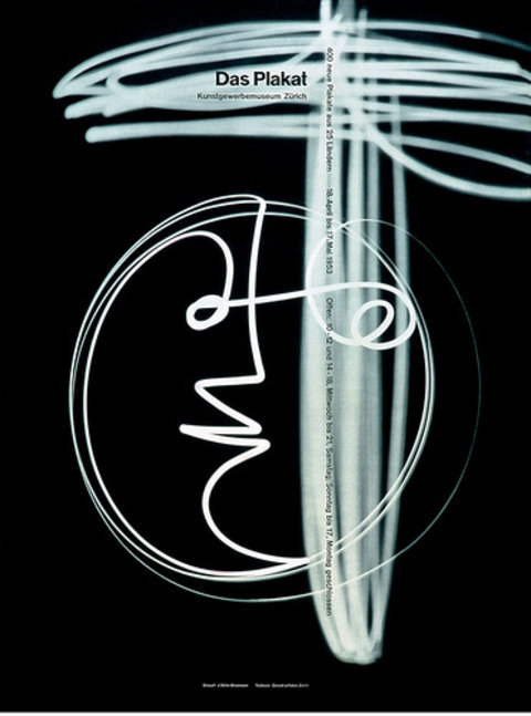
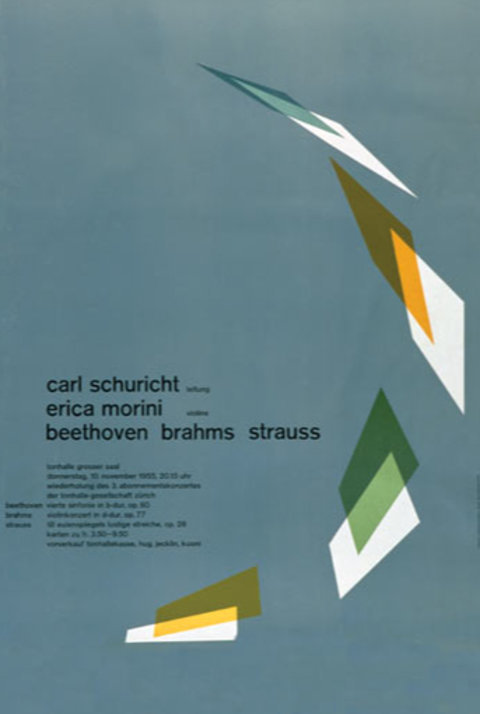
Müller-Brockmann studied at the Zürich Kunstgewerbeschule and years later returned as a professor, succeeding Ernst Keller. He opened his own studio specialised in graphic design and photography where he produced the famous concert posters for the Tonhalle in Zurich. In 1966 he was appointed European design consultant to IBM.

Cases
Subtraction
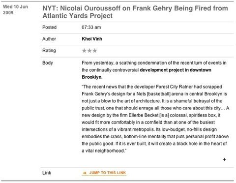
subtraction is the personal web site of Koi Vinh, the Design Director at NYTimes. Vinh is famous for his advocacy of the use of grid systems and is often quoted as an authority on the subject.
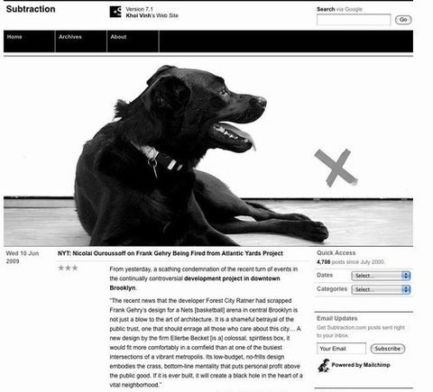
Apart from the simplicity and the obvious use of a grid, Subtraction employs a very well defined structure that makes it very intuitive to understand the content that’s presented and how we can interact with it.
V+Lourenco
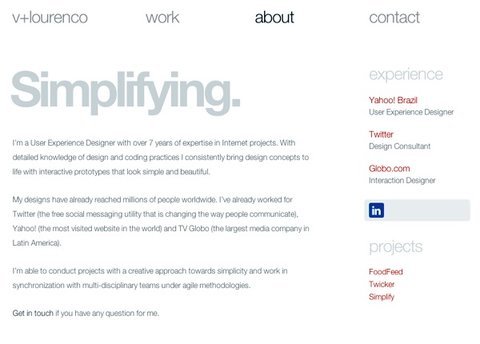
vlourenco is the home site and portfolio of a Brazilian interactive designer Vitor Lourenço. Amongst many other interesting works, Vitor was in charge of the latest redesign of Twitter.
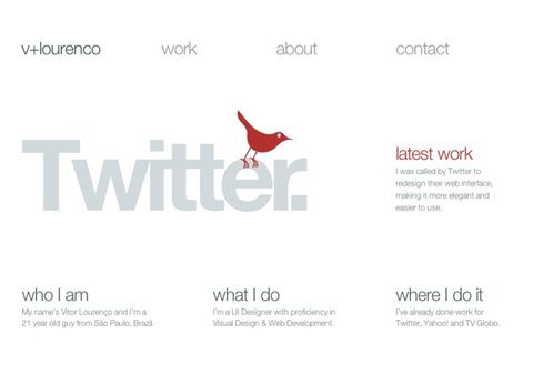
Vitor’s site stands on the edge of simplicity: if there were less elements it would be too hard to navigate, but if there was more it wouldn’t be as beautiful as it is. The beautiful Helvetica Neue Light gets all the whitespace it deserves and the minimal content is organized simply by contrast and color.
Design Judge
designjudge.co.uk is the online portfolio of Matt Judge, a London based designer.
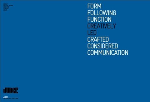
This site employs many of the lessons from the Swiss Style: beautiful typography along with the strong background colors, a hint of a grid structure and a nice use of a font size.
Kingston University - Out There
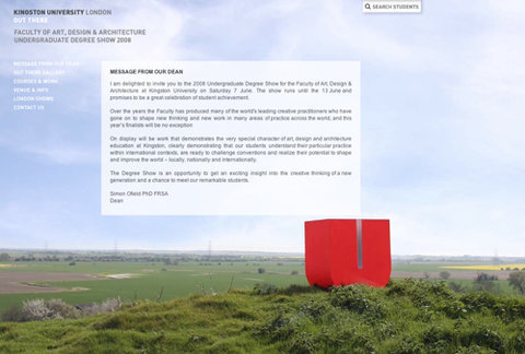
kingston.ac.uk/outthere is the site of the Faculty of Art, Design & Architecture of the Kingston University in London.
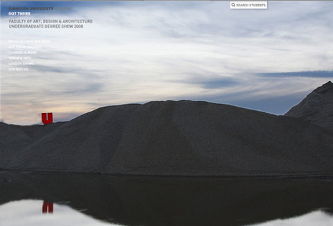
The great visual impact of this site are the big photographs that stand from the background. Along with that, there’s only typography.
WilsonMiner

wilsonminer is the home of Wilson Miner, designer and co-founder at EveryBlock. Miner worked on the first major redesign of Apple and designed the identity (and the admin interface) of the Django web framework.

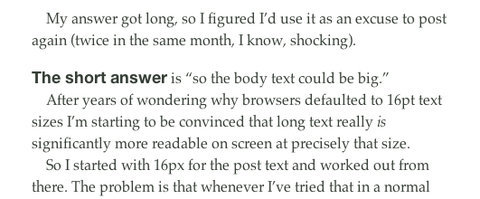
This site’s post page has a very interesting use of typography - it mixes big bold Helveticas with greyish Palatino, sometimes on the same text line. The contrast looks very beautiful and shows that there are use cases for both serif and sans-serif typefaces. Along with that, there’s a significant amount of whitespace that greatly leverages readability.
Further Resources
Here are some interesting resources on some of the core subjects of this article:


 Register Free Now
 SurveyJS: White-Label Survey Solution for Your JS App
 Celebrating 10 million developers
