Data Visualization and Infographics Resources
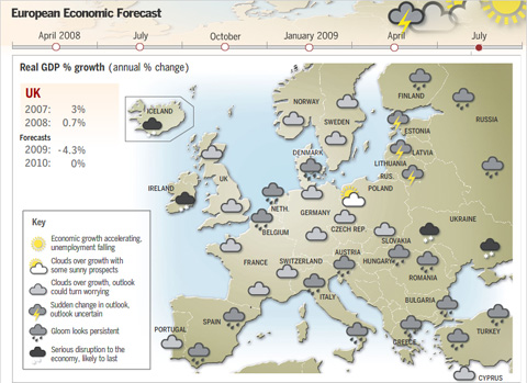
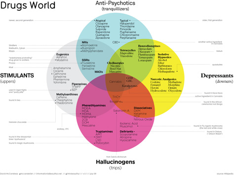
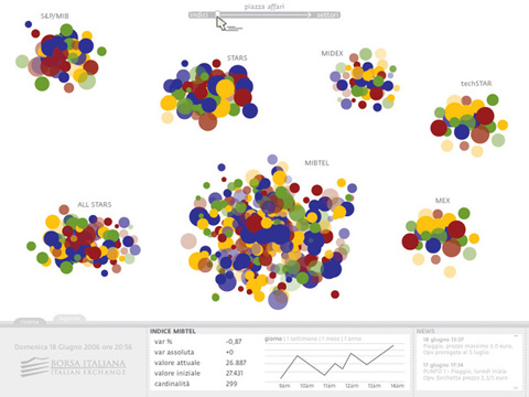
Data visualizations and infographics can make complex datasets easier to understand and comprehend. By creating a graphical represenatation of data and statistics, complicated concepts and information can make more sense in less time.
Many visualizations focus on representing a specific set of data or statistical information. Others focus on less-concrete topics, providing a visual representation of abstract concepts. Generally speaking, the first type appear more like graphs or charts and the latter are often more creative and imaginative.
But visualizations and infographics can be used poorly, too. Putting in too much information (or not enough), using improper formats for the information provided, and other failures are common. Below are more than 25 useful resources for infographics and data visualization. Most are galleries of effective graphics though some also provide how-to information for information designers.
Further Reading on SmashingMag:
- The Do’s And Don’ts Of Infographic Design
- Data Visualizations and Infographics
- Data Visualization: Modern Approaches
- Designing Flexible, Maintainable Pie Charts With CSS And SVG
1. Data Visualization Sites
Here are some blogs and website that provide great information for information designers, including how-to articles, visualization showcases and galleries, and other resources. Some even include tools for creating your own visualizations.
Strange Maps
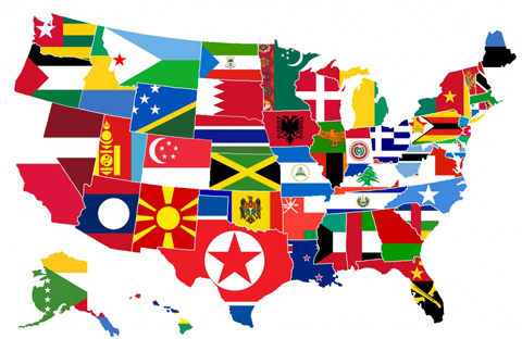
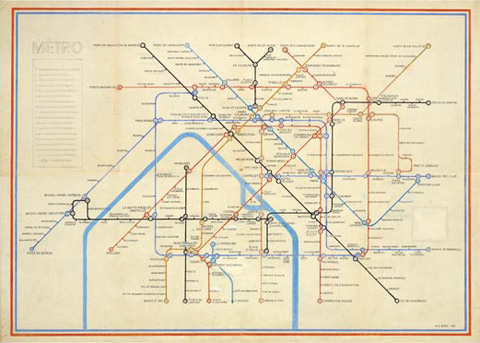
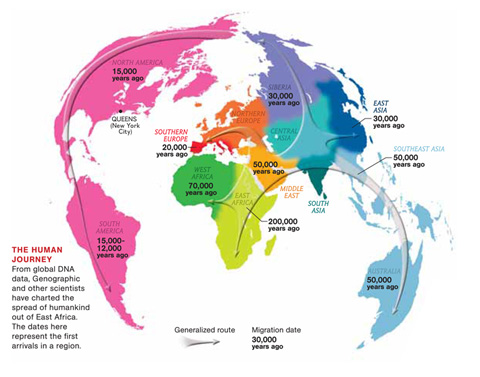
Strange Maps features only map-based graphics, both modern and historical. The commentary accompanying the maps is what really makes the site interesting, especially on the historic maps.
Wall Stats
Wall Stats includes original infographics depicting discretionary spending in the United States. The graphics are also available in poster form. They also provide coverage of other infographics about political and economic topics.
Visual Complexity
Visual Complexity - This site showcases infographics and data visualizations from a wide variety of sources and has nearly 700 projects included. Graphics are categorized to make finding specific projects easier and plenty of information is included about each image.
Cool Infographics
Cool Infographics is an awesome blog that chronicles infographics and data visualizations from all over the web. They cover almost every topic you could think of. Posts are tagged to make it easier to find the specific kinds of graphics you’re looking for.
Data Mining
Data Mining is a blog that covers data visualization, social media and data mining. They aggregate tons of infographics from other sites, including National Geographic and The Economist.
Edward Tufte
This site presents a wide variety of infographics from multiple sources interspersed with other images. The commentary about the graphics is what sets it apart, and there are some incredibly interesting images included.
Infographics News
Infographics News is dedicated primarily to news infographics. They also cover news related to data visualization and unusual infographics.
Information Aesthetics
Information Aesthetics is a blog that details beautiful infographics and data visualizations from all over the web. Grahpics featured include political, financial and econimic, and other visualizations, dating as far back as December 2004.
Chart Porn
Chart Porn features charts and graphs from all over the web, all beautifully designed and covering a wide variety of topics. Posts are categorized by topic and source to make it easier to find specific charts.
Behance Network
The Behance Network has tags for Information Architecture and specifically for infographics. They have dozens of graphics in either category from a selection of graphic artists.
Good Magazine
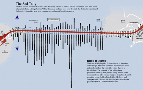
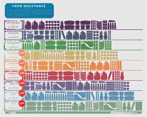
Good Magazine presents some of the most interesting original infographics out there. They’ve created infographics on everything from water issues to the growth of food stamps to Obama’s effect on voter turnout.
Matthew Ericson
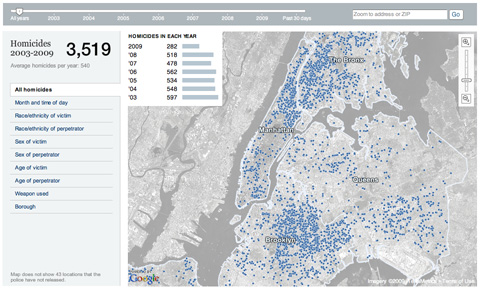
The blog of infographic designer Matthew Ericson that includes visualizations created by others as well as himself. Recently featured visualizations include a map of murders in New York City and an industrial production data visualization.
NiXLOG Infographics
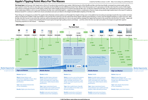
NiXLOG has a great infographics section that includes an aggregation of infographics from all over the web. There’s also an original infographic of the evolution of Apple computers and their adoption by consumers.
Virtual Water
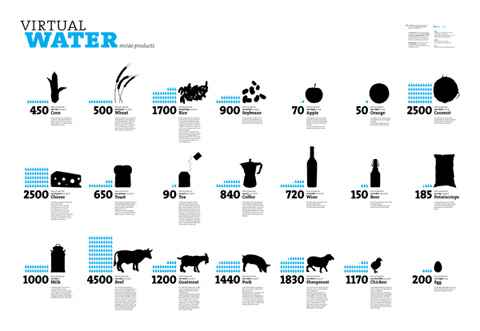
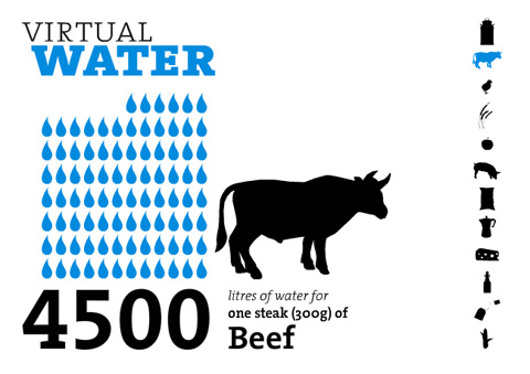
Virtual Water is a specialized blog covering the usage of the virtual water content infographic poster and the information it contains. They provide the info from the poster as well as links to publications that have used it (in whole or in part) and other infographic-related content.
History Shots
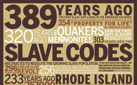
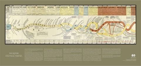
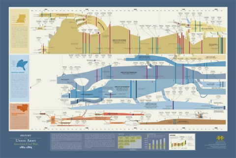
History Shots is a commercial site that sells infographic and visualization products (posters, notecards, etc.) for a variety of topics. Most of their images focus on historic events, time periods and subjects and you can browse based on political, military, sports, or general graphics. It’s an incredibly interesting site and you can zoom into the graphics shown to read them onscreen.
Flowing Data
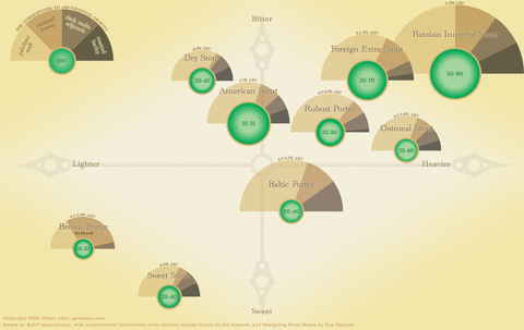
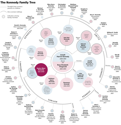
Flowing Data offers up some amazing infographics and visualizations, with their own dedicated category. They’ve covered the best beer in the U.S., wine personality profiles, the Kennedy family tree, and the religious geography of the United States, among tons of other awesome graphics.
Many Eyes
Many Eyes is a data visualization site that offers tools for creating your own visualizations as well as for browsing infographics created by others. There are already thousands of visualizations included on the site.
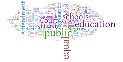
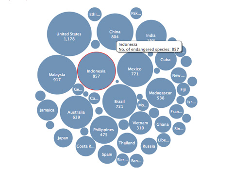
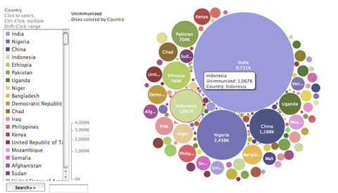
The New York Times
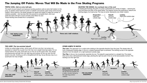
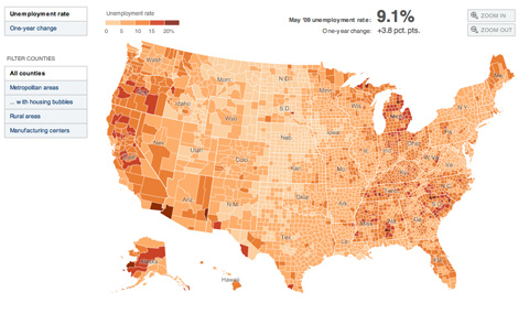
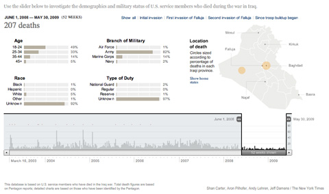
While you’ll have to search around a bit to find the best infographics on The New York Times site, it’s definitely worth the effort. They have some of the best infographics in the business representing and breaking down really complex data sets so their average reader can easily understand what’s actually going on.
Nicolasrapp.com
nicolasrapp.com is an information design blog that covers primarily the infographics and data visualizations the author creates for The Associated Press.
DataViz
DataViz showcases images of beautiful data visualizations from all over the web. No commentary is included, but the images really speak for themselves.
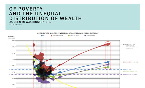
iGraphics Explained
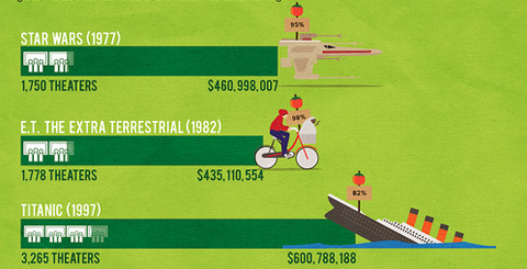
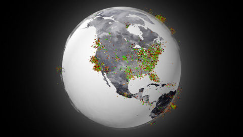
iGraphics Explained - This blog aims to shed some light on the world of infographics and data visualizations by explaining their effectiveness and how they were done. They showcase some beautiful graphics from sources all over the internet, so it’s a great place to go for inspiration and to see what kinds of graphics work and which kinds don’t.
Simple Complexity
Simple Complexity - This site showcases data visualizations that take complex data sets and display them in an easier-to-understand format that can help make sense of their true meaning. They showcase infographics from all over the net, as well as posting some how-to articles on creating better infographics.
Well-formed Data
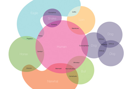
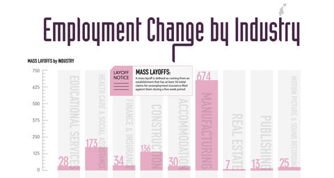
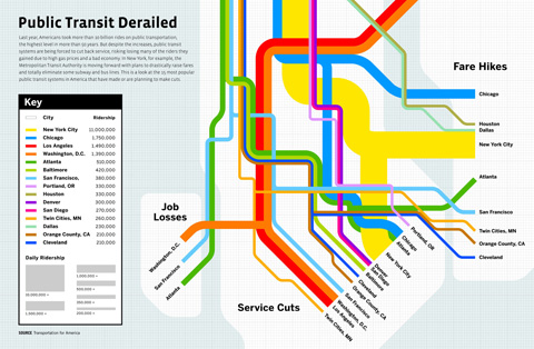
Well-formed Data - This blog covers interface design, infographics and data visualizations, and statistics in general. The commentary accompanying the graphics is especially interesting, often delving deeper into the topics the visualizations cover.
Information is Beautiful
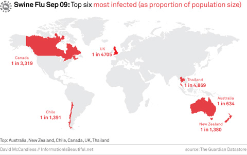
Information Is Beautiful - This blog celebrates beautiful information design, infographics, and data visualizations. They cover a wide variety of topics, create their own visualizations, and showcase those designed by others.
3. Flickr Pools for Infographics
Flickr pools can be a great source of information and inspiration. The ones featured below are dedicated to infographics and data visualizations, and most include examples from all over the world and a variety of different eras. They’re an excellent place to go to get ideas or see what infographics trends are around the globe.
Infografia | Infographics - A pool with more than 700 infographic images, posted by 120+ members.
Infografistas.com / Infographics News - This pool has nearly 350 items posted, all data visualizations and infographics from a huge variety of sources.
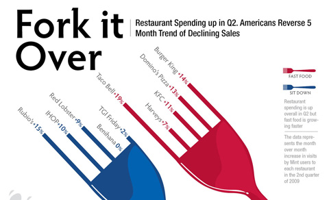
Visual Information - A pool with nearly 650 items posted. There are visualizations for everything from restaurant spending to library maps.
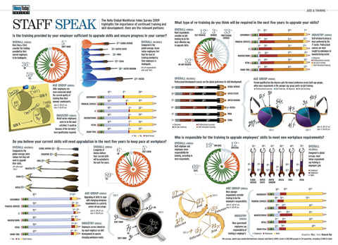
The Info Graphics Pool - This seems to be the largest Flickr pool dedicated to infographics and data visualizations, with more than 700 members and 1800+ items included.


 See the full picture →
 Celebrating 10 million developers


 SurveyJS: White-Label Survey Solution for Your JS App
