50 Beautiful and Creative Blog Designs
The most recent collection of creative blog designs was featured here on Smashing Magazine back in July. Only three months have passed and we’ve got a new dose of inspiration for you. Beautiful and sophisticated designs are constantly appearing on the Web; creative activity is in non-stop mode, despite global economic shocks and unfortunate events; and this is surely a positive sign.
Today, we showcase 50 fresh, beautiful, inventive and, hopefully, inspiring blog designs. The variety of styles represented in this collection is considerable, so everyone will be able to find a tasty piece of inspiration for their own creative aspirations. Notice that every screenshot is clickable and leads to the website itself.
You might be interested in the following related posts:
- Corporate Blog Design: Trends And Examples
- 20 Extraordinary Blogs With Unique Post Designs
- 45 More Excellent Blog Designs from 2008
- Original And Innovative Web Layouts
Beautiful and Creative Blog Designs
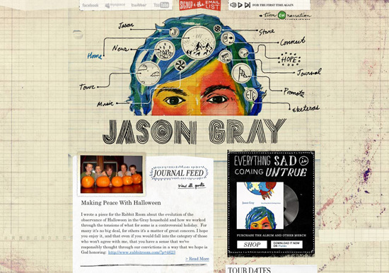
Jason Gray Music Jason Gray’s blog was initially WordPress-based, but it now has a beautiful and original Flash appearance that we just couldn’t pass up.
The Pixel Blog This exquisite blog belongs to a Web design and marketing company called The Pixel. Amazing graphics in the header and footer, along with a giant tree (the branches of which separate the posts), make this design pure eye-candy.
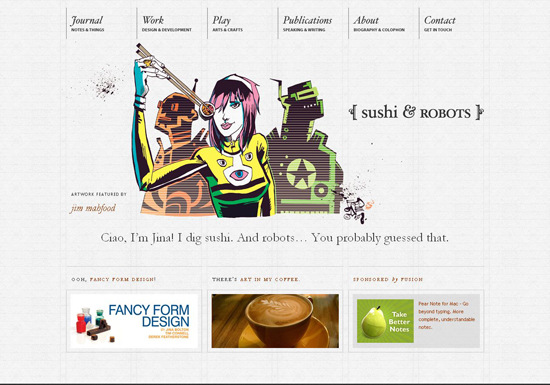
Sushi & Robots Sushi & Robots is the journal and portfolio of Jina Bolton, a San Francisco-based designer, developer and author. If you’re looking for creative inspiration, this website is definitely a master class.
WorkAwesome The neat desktop-themed design of WorkAwesome’s blog is definitely worth your attention.
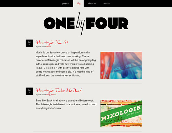
One by Four
Dustin Curtis
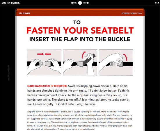
Jack Cheng
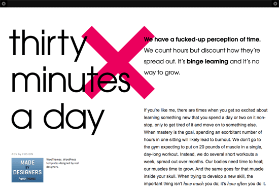
Abduzeedo Abduzeedo, which is bookmarked by every Web design fan, was recently redesigned. The highlights are considerably enhanced usability and unique post teasers.
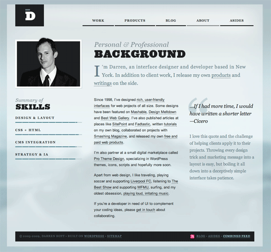
Darren Hoyt
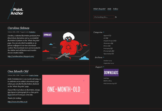
Point & Anchor It’s all about the lines here. Point & Anchor’s blog design is quite engaging.
Trent Walton Neatly combining a few uncomplicated code hooks, the founder of Paravel Web design agency, Trent Walton, has created an original, attractive blog. The presentation of each individual post and the overall layout of the blog are remarkable indeed.
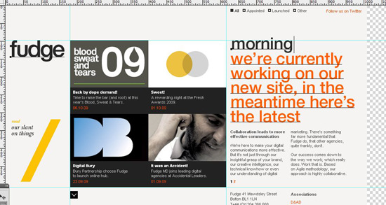
Fudge The website of digital studio Fudge is currently under construction. Still, the way it has designed its latest news log is worth mentioning here. Photoshop interface imitating design is a neat idea. Plus, the navigation is a treat for the eye.
daus.trala.la
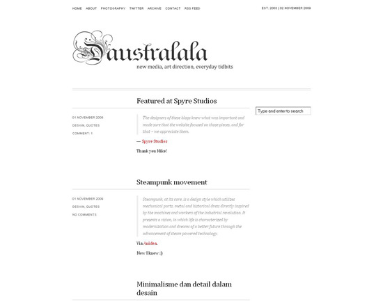
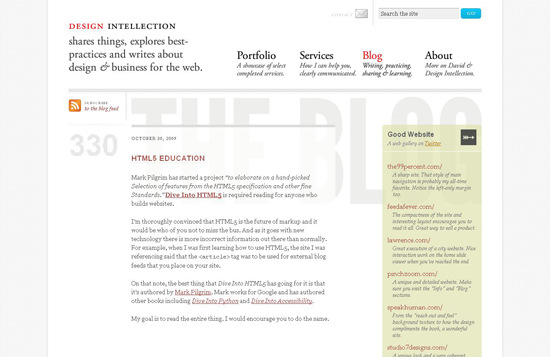
Design Intellection This simple yet admirable blog design is achieved using HTML 5 markup. The dotted typography for post numbers is a nice touch.
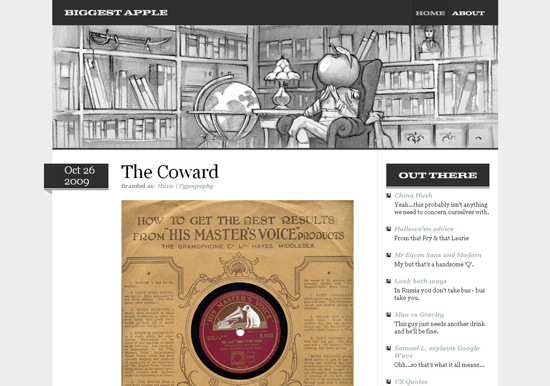
Biggest Apple The pure style of Biggest Apple’s website features a gorgeous sketch in the header and some pretty icons all around.
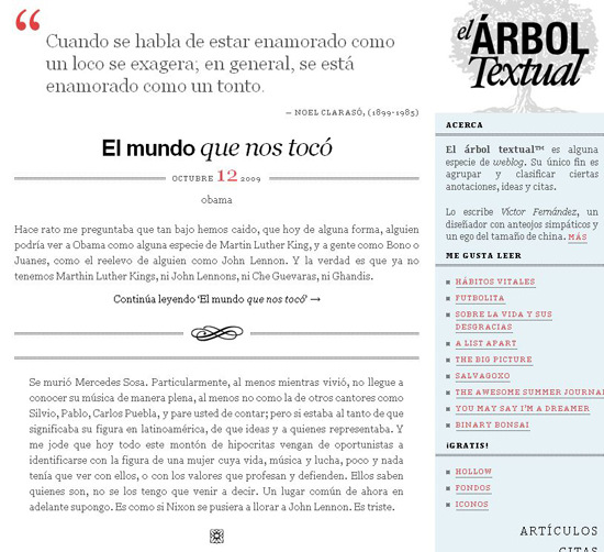
árbol textual
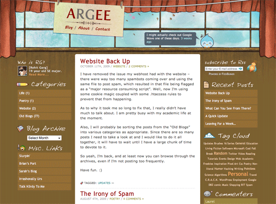
Argee
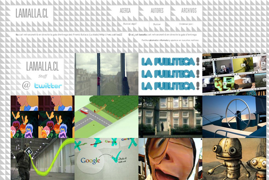
LaMalla.cl (Chile) This amazing blog belongs to a small community of creative people, a space to share links to inspirational info from all over the globe. A grayscale geometrical background and cool jQuery effects make our exploration of this website a really enjoyable experience.
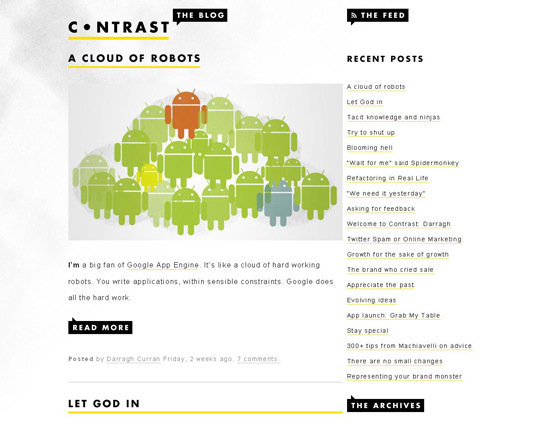
Contrast A clean style, nifty typography and hover effects make for a great blog design. Excellent work by Contrast, a Web apps development crew from Ireland.
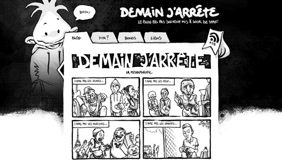
Demain J’arrête (France) This classy comic strip is available in French only, but the blog’s design won’t leave you cold.
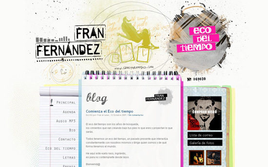
Fran Fernández The blog of Spanish singer Fran Fernández features an expressive and slightly careless-looking graphic design, which reflects the passion of the musician best.
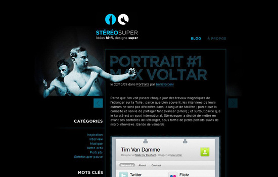
Stéréosuper (France) Stéréosuper is a successful duo of creative folks working in the field of multimedia. Boris and Jean-Francois are keen on karate: perhaps this explains the imaginative fighting characters in their design. The dark color scheme and hatched elements are quite appealing, too.
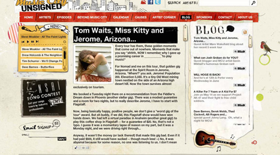
Music City Unsigned This cute blog belongs to the Nashville community of emerging artists. Although it is Flash-based, you won’t have any problems with accessibility or navigation here.
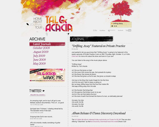
Tal & Acacia Unpretentious beauty: this is how we would describe this design. Pastel-themed graphics give it a special flavor.
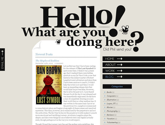
Denis Chandler’s Blog (Another Blog About Stuff) The style of this blog is fairly conventional, but look at the header! This bit of spice elevates the otherwise formal design, bringing in some splash.
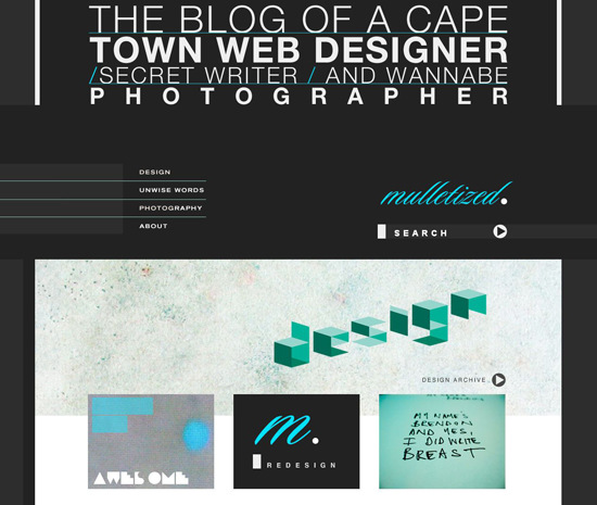
Mulletized This blog of Cape Town Web designer Brendon Grobler features an offbeat layout and great use of typography. This is what Brendon says about his blog redesign: “I tried to create something less “bloggy” and more graphic, focusing strongly on typography (which is one of my great design loves) and imagery.” The result is impressive, wouldn’t you agree?
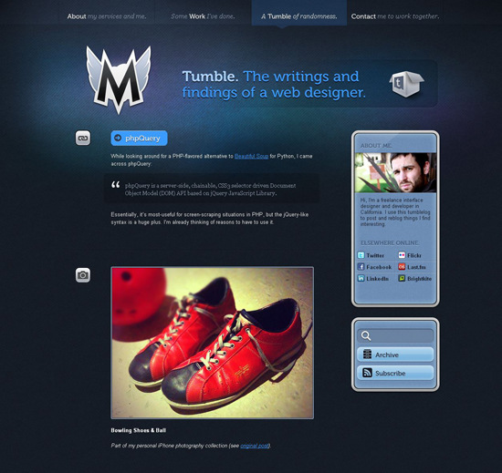
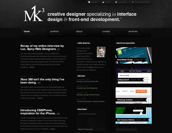
M1K3 This blog (belonging to UI designer and developer Michael Dick) is an example of an excellent dark design.
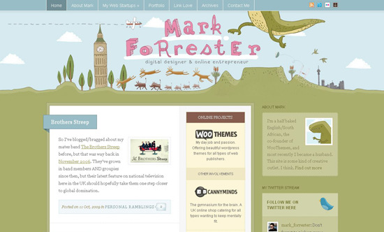
Mark Forrester This awesome blog-styled website is a creative outlet for Mark Forrester, a “half-baked” (his words) English/South African freelance designer and entrepreneur. The journal is easy and pleasant to navigate, and the cartoon illustrations in the header and footer are incredible. (They were designed by Cape Town-based illustrator and cartoonist Alex Latimer).
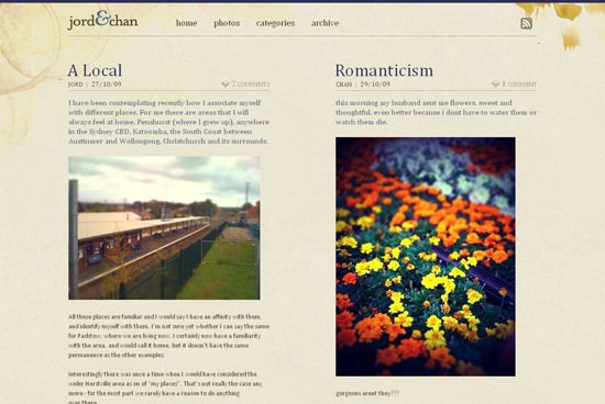
Jord & Chan This nice duo-themed layout presents two strips of content on the same page, a very original idea. The smooth background texture adds more charm to the design.
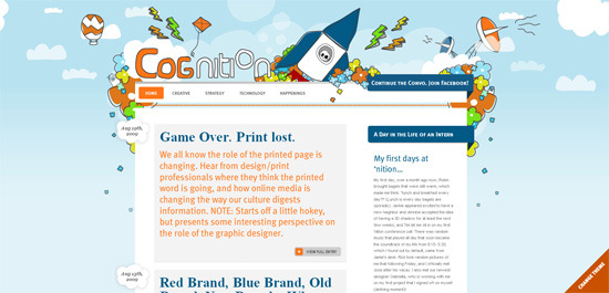
Cog’Nition This blog has a lovely surprise: you can change the design’s theme, choosing from two amusing cartoon-style backgrounds.
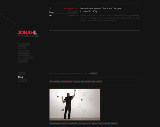
JonahL Jonah Levine’s blog follows simplicity and a pure style. An attractive dark design, and a good use of lines.
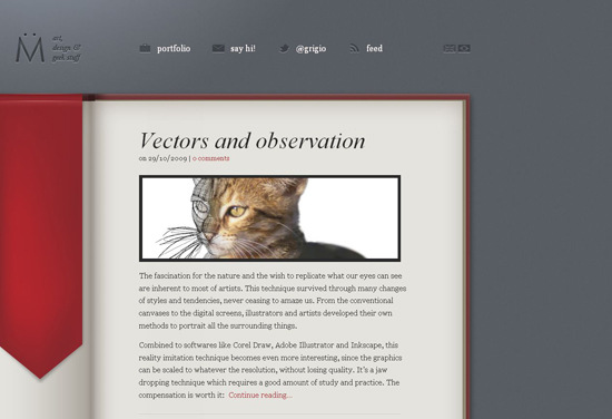
Marcel Müller blog Marcel Müller’s blog has a stylish, corporate look. Another good example of precise, minimalist design.
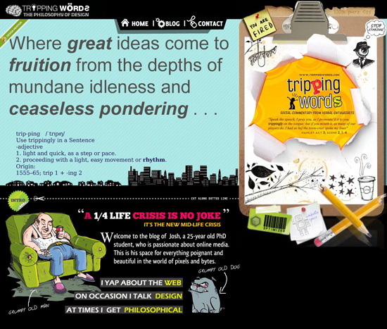
TrippingWords This really is something striking. Everything here, from the header to the footer, is extraordinary and hyper-creative.
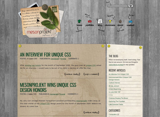
mesonprojekt
Related Articles
- Corporate Blog Design: Trends And Examples
- 50 New Beautiful Blog Designs
- Showcase Of Elegant And Original Blog Designs


 SurveyJS: White-Label Survey Solution for Your JS App
 Register Free Now
 Celebrating 10 million developers