Designing “Coming Soon” Pages
Deciding what to do once you’ve purchased a domain but haven’t yet launched the website is always a bit of a conundrum. Leaving up your domain registrar or Web host’s generic page seems unprofessional, especially if you’re trying to drum up advance press for your new project. At the same time, you don’t want to spend too much time on a temporary page when you really should be working on the website itself.
The best thing to do is create a simple “Coming soon” page to notify visitors of what will eventually be there. Good “Coming soon” pages come in two basic varieties: the informational design, which simply tells visitors what will be there after launch; and the page that invites early visitors to sign up for updates or even to request a beta (or alpha) invitation. Below are some great examples of each, followed by some best practices for creating your own “Coming soon” page. You definitely won’t see among these the generic “Under construction” page (with the cute construction graphic) that used to litter the Web.
You may also want to check out the following Smashing Magazine articles:
- Building An Effective ‘Coming Soon’ Page For Your Product
- Elements Of A Viral Launch Page
- Effective Maintenance Pages: Examples and Best Practices
- A Comprehensive Website Planning Guide
1. Tips On Designing A Good “Coming Soon” Page
Here are some best practices and tips to keep in mind when designing your own “Coming soon” pages, as well as examples.
Tell Us What to Expect
When someone lands on your “Coming soon” page, they should get an idea of what your website will be about and why it might be useful to them. This is especially important if you’re asking visitors to sign up for updates or to check back regularly. If we can’t tell what the website is for, why would we bother coming back?
Give us at least some indication of the website’s purpose. This doesn’t mean you have to spell out everything the website will offer; rather, hint that it’s something we might be interested in. For example, if you will be offering a time management app specifically for Web designers, you might say that the website will help streamline the workflow of Web designers. It gives a taste of what the website will do, while maintaining some mystery. Design a Successful Coming soon Page is an article from SitePoint that covers some essentials of a good “Coming soon” page and includes some great examples.
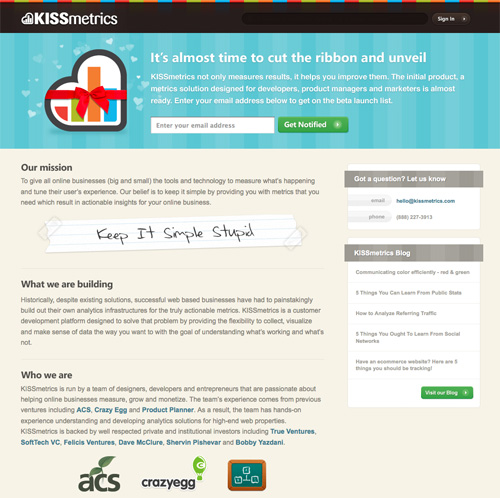
KISSmetrics provides a ton of information on its “Coming soon” page, including a form to sign up for updates and a blog to keep abreast of new developments. It’s a great example of a “Coming soon” page that keeps visitors informed and gets them excited about the pending launch.
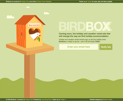
Birdboxx gives a basic explanation of the services it will provide when the website launches.
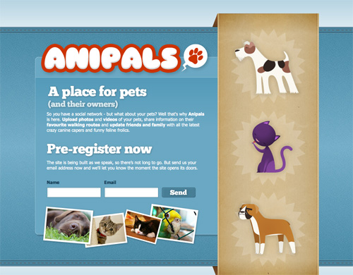
Anipals gives plenty of information on the website’s features without giving away too much.
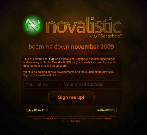
This “Coming soon” page explains what the new page will be about, when it will be released and also allows its visitors to sign up for the future updates.
Should You Provide Updates?
Letting visitors sign up by email to be notified on the website’s launch can be a useful marketing tool. If you don’t offer this feature, by the time your website does launch, those visitors may have forgotten about you. Of course, how often you send out an update is entirely up to you. Some websites send out an announcement only when the website has actually launched. Others send out regular updates on the progress of website’s development.
If you’re trying to build advance buzz around your website’s launch (which, in all likelihood, you are), then sending updates on a semi-regular basis could go a long way to building your website’s credibility and name recognition. If you send an update every week or two, your prospects likely won’t forget about you. Just indicate on the sign-up page that updates will be sent that often, to avoid being labeled a spammer.
You have a couple of alternatives to the standard email sign-up form, though. One is to run a blog that keeps visitors updated on your progress. This is most commonly done for Web apps, with the blog offering regular updates on development. Another common method is to use a Twitter account to keep prospective users updated. Just make sure that the link on your page to your Twitter account is prominent.
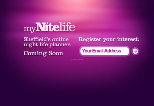
MyNiteLife lets visitors sign up for updates via email.
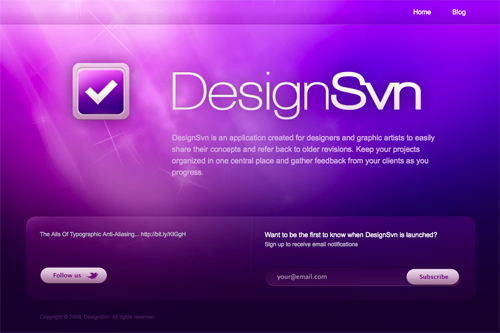
DesignSvn gives visitors the option to sign up for updates via email or to follow it on Twitter.
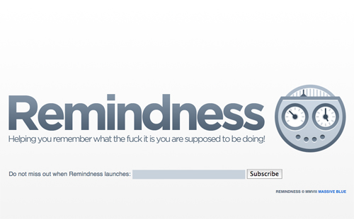
Remindness lets visitors sign up for email updates.
Brand Your “Coming Soon” Page
If you already have a logo, a basic design or color scheme and font picked out, include them on your landing page to start building the brand in your visitors’ minds. Advance branding sets your website apart from your competitors and generally doesn’t cost any more to implement or take additional time. Even something as simple as using your website’s eventual font or color scheme can make you much more recognizable to future visitors. When your website finally does launch, it will have an air of familiarity to your visitors.
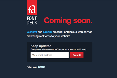
Fontdeck includes its logo and what will presumably be the website’s color scheme on its “Coming soon” page.
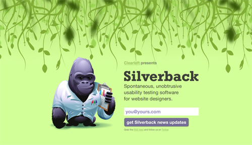
Silverback used the gorilla cartoon and basic design theme of its website on this “Coming soon” page.
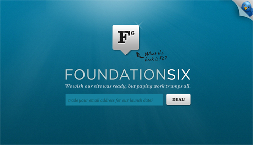
Foundation Six uses what will presumably end up as its logo and color scheme.
Create Some Intrigue
The point of your “Coming soon” page is to get people to talk about, and come back to, your website. Even if you want to give some information on what the website will be about, creating some mystery around the launch is helpful. Curiosity is a great motivator and may get more people to sign up for updates. It also gets people talking, because visitors will ask their friends if they have any new information about the pending launch. Advance buzz can bolster your launch traffic and even attract media attention.
Better Blogger gives us a basic idea of what its web site will be about without giving away too much.

Good Morning gives away virtually no information about what the app might do, but the name suggests that it might be related to time management or productivity.

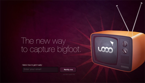
uoOo seems to be somehow related to video, but it doesn’t give us any more information than that.
Remember SEO
While a “Coming soon” page won’t likely make a big difference in your search engine ranking, that’s no reason not to optimize it for search engines. Use keywords and proper meta tags, and encourage those linking to your website to use good anchor text. And if you use good SEO practices to begin with, you won’t be penalized by search engines (and might even gain some decent credibility among search engines), meaning that when your website does launch, its search engine ranking will climb that much faster.
2. Informational Designs
Informational designs do what you would expect: inform early visitors about the current and future status of your domain. This design can be very simple, with just a name and text like “Coming soon,” or it might go more in depth. In either case, it is usually a single page, sometimes with an additional information page. In some cases, it also includes the owner’s contact information.
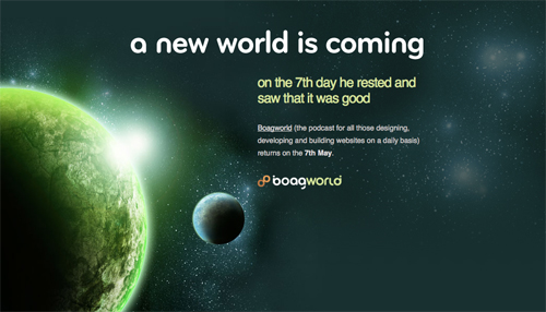
A great design with basic information about the return of a well-known podcast.
This website takes a slightly different approach, providing a link to a video with more information.
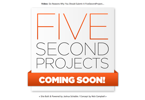
A unique “Coming soon” page that links to the website’s MySpace page.

This page include a quite lengthy introduction to the site as well as links to Twitter and Facebook.
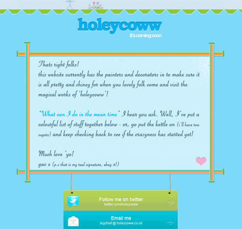
Another very simple “Coming soon” page, with contact info of the owners.
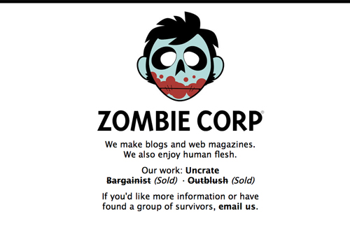
A simple page that gives information about the website owner’s current business activities.
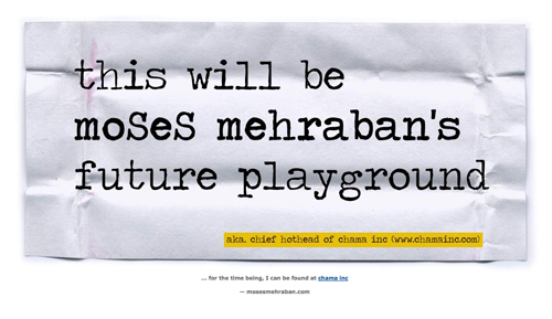
A minimalist page with a link to more information.
A fun page that includes contact information for the website’s developers.
A very minimalist page design, but with a fun twist.
![]()
Another really fun page design that gives plenty of information on what the website will eventually hold.

A more advanced page that includes a link to a website preview and pricing information.
Another very minimalist design that includes plenty of hints on what the upcoming website will include, as well as a link to the Twitter feed.
A very well-designed page, with links to various social media feeds.
3. Page To Receive Updates Or Request Invitation
These pages allow visitors to sign up for updates or receive an invitation to a beta or alpha test. They’re especially popular for online apps, but other websites use them as well. Sign-up forms are generally short, with a field for an email address and maybe one for a name. The page often includes some information about the website, too, though emphasis is kept on signing up for updates.
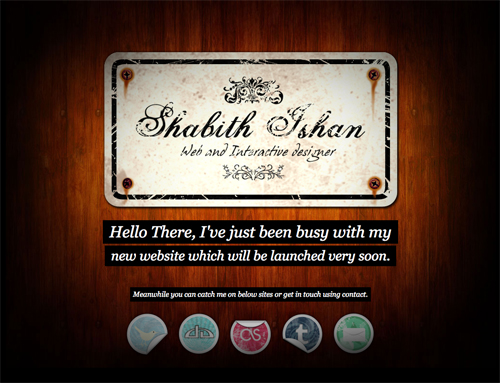
The title gives sufficient information on what the website will feature, and the sign-up form is simple.
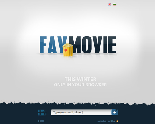
A simple page with a single-line sign-up form for receiving updates.
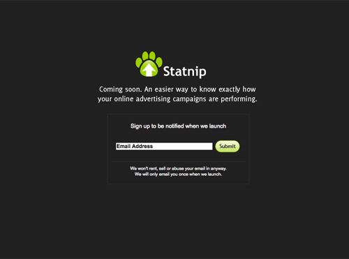
A basic page that includes a single-line form for requesting an invite.
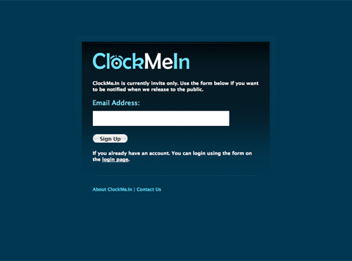
A simple and clean “Coming Soon”-page with a newsletter web form.
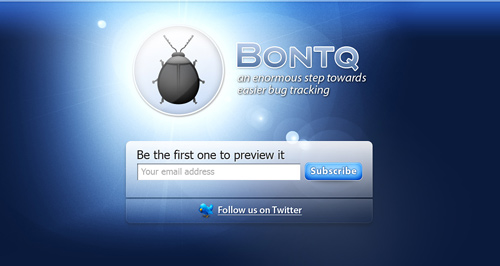
This page gives some basic information as well as a single-line form to sign up for the newsletter.

A unique page design that includes a single-line form to request a beta invitation.
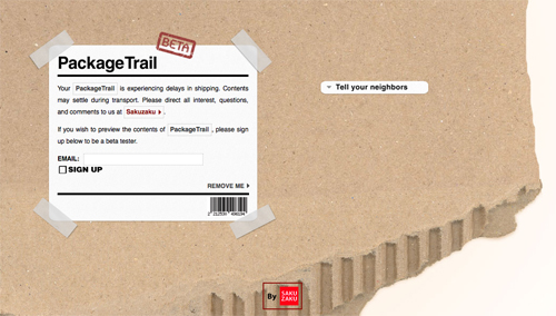
A “Coming soon” page that includes both informational and beta invitation request elements.
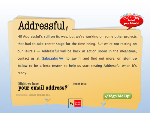
Hello Human Icons Icon Collection One offers information on the upcoming launch and invites visitors to sign up for updates with just their email address.
![]()
Another page that incorporates both informational and sign-up elements, plus a link to the group’s Twitter feed.
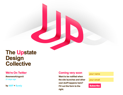
A slightly longer update sign-up form.
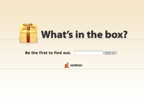
A basic sign-up form that includes a teaser to generate more interest.
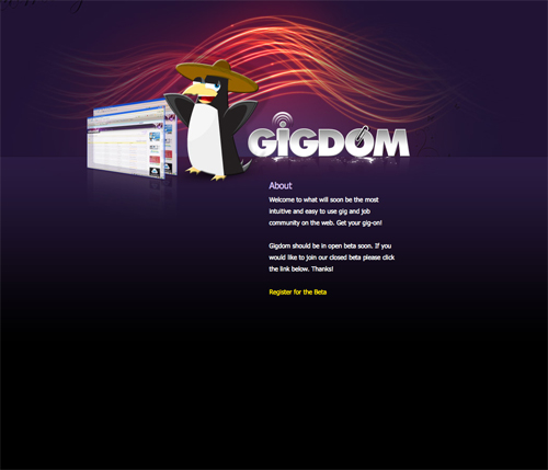
An informational page that includes a beta test registration link.
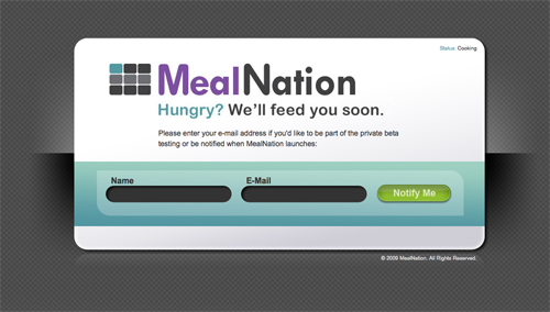
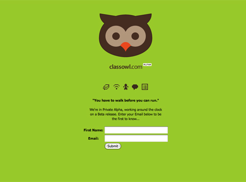
A simple two-field sign-up form to get updates.
A “Coming soon” page that lets visitors choose between updates via RSS and email.
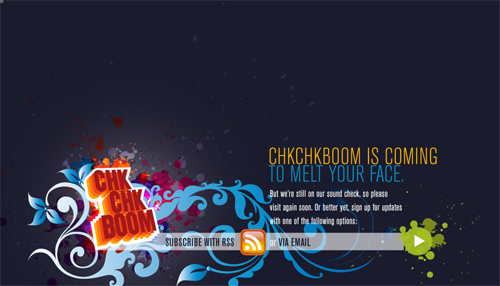
A very simple page, with a couple of lines on what’s coming and a one-field sign-up form.
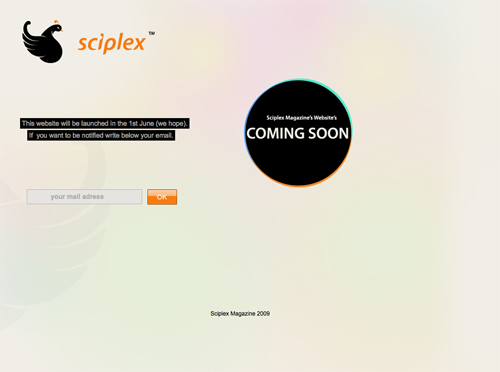
A simple page with basic information and a one-field sign-up form.
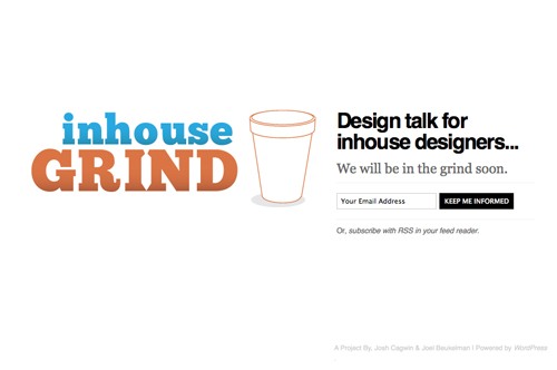
Another very simple form that lets you sign up for a beta invitation.
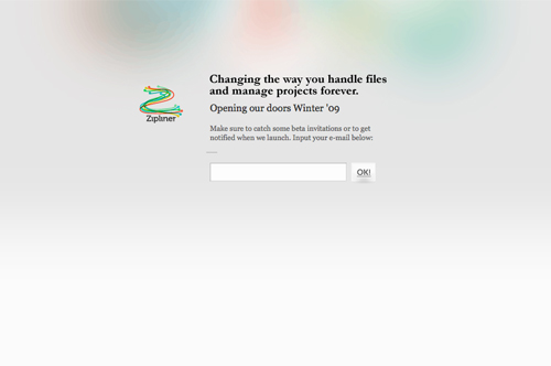
A graphically bold page with a simple sign-up form and basic information about the website’s purpose.

Further Resources
- 27 Cool “Coming soon” Page Designs A great round-up of “Coming soon” pages from 2008 and earlier.
- 25 Best “Coming soon” Pages Another excellent round-up of “Coming soon” page designs.
- Tips for Designing an Awesome “Coming soon” Page A great article from Line25 that offers some tips on designing great “Coming soon” pages, as well as some design examples.


 Register Free Now
 Celebrating 10 million developers
 SurveyJS: White-Label Survey Solution for Your JS App

