Designing Social Interfaces: Overview and Practical Techniques
The standard approach to interface design is to craft a channel that allows you to easily and efficiently control hardware or software; it’s all about the interaction between people and computers. But today, the two entities on each side of the user interface are changing: it’s no longer about people interacting with computers, but rather about people interacting with people through computers.
This is the nature of the social Web. Social news websites, message boards, social networks, online stores and blogs all have some sort of user interaction going on, whether it’s comments on a blog post or social games on Facebook. The critical issue here is that people are not interacting directly with other people; rather the interaction occurs through a user interface. The computer acts as a mediator.
You may want to take a look at the following related posts:
- 12 Useful Techniques For Good User Interface Design
- 10 Useful Techniques To Improve Your User Interface Designs
- 10 Principles Of Effective Web Design
- Five More Principle Of Effective Design
In essence, we control the flow of user interaction on our websites. By crafting an interface to facilitate certain behaviors, we can influence the direction in which our community goes.
“Small software implementation details result in big differences in the way the community develops, behaves and feels.” — Joel Spolsky, More Joel on Software
In this article, we’ll demonstrate the power of social interface design and what it can do for you, using several practical examples.
Social Interface Design Techniques
User points and Badges
Achievement, and more importantly, the feeling of achievement, can play a big part in social websites and games. You may be familiar with the massive multi-player games that have a system whereby players progress through levels as they play the game. Each level brings more prestige to the player and so keeps them playing more — with the next level always just a little bit out of reach.
The same idea can be used on social websites by recognizing your users’ contributions. For example, for a social news website, you could award points to users for submitting stories. You could also give users special badges when they perform a certain number of tasks. In a social environment, these badges would lift the recipient’s ego, and so people would be motivated to compete for badges.
These kinds of things enable us to influence the direction in which our community moves. For example, to increase user participation, such as the number of comments people leave, you could give users a badge after they’ve made a certain number of comments. The same could be applied to any other user driven-content: submitting stories, answering questions, asking questions, writing reviews and so on.
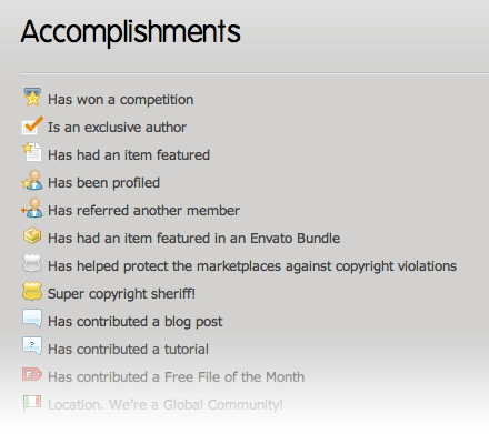
 The Envato marketplace awards badges to its sellers and buyers.
Of course, the flaw to this method is that while getting quantity may be easy, controlling quality may not be. You want users to leave a lot of comments or reviews on your website, but you want these contributions to add value. There is no exact science or formula for how to do this, so the best advice is simply to keep this factor in mind when designing a social mechanism of this type. Will the technique you’re considering add more volume or value?
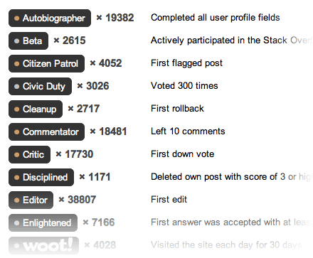
Social news websites tend to give their users points from the submissions that people have liked. This drives people to find better and more interesting stories to submit. Websites such as Envato marketplaces and Stack Overflow give people badges when they perform certain actions or do something a set number of times.

Stack Overflow’s achievement badges.
Unlockable Features as Rewards
Points and badges are superficial prizes: they’re all about ego. You can go a step further and offer tangible benefits to your biggest contributors, such as by unlocking new features for your website or application. Unlocking new features differs from things like badges and points because the user isn’t interested here in building their ego; they’re interested in getting more value out of your website or application.
You may be familiar with the “Skinner Box,” the famous psychological experiment developed by B. F. Skinner that saw a rat placed in a box with a button and a food dispenser. If the rat stepped on the button, it would receive some food. The food here was the reward for pushing the button, and it worked. The rat kept pushing the button to get more food.
The same principles apply to social interface design. By giving your users little rewards for accomplishing certain things, you can steer the direction of your community. The trick is to make the rewards beneficial enough for people to want to achieve them.

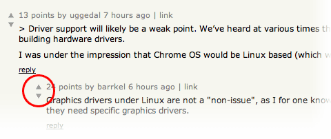
Hacker News unlocks comment down-voting when you accumulate a certain number of points (highlighted).
Hacker News, a social news website for developers and entrepreneurs, unlocks things like comment down-voting as you earn points from your submissions and comments. While you cannot lose points for your submissions (there is no down-voting for submitted stories), you can lose points for your comments. Coupled with the fact that you could potentially gain or lose certain functionality on the website depending on the quality of your comments, this makes users more careful about what comments they leave, and they have more incentive to add real value to what another user says.
Reply Notifications
A popular feature on blogs and message boards is email-based notification of new replies to your messages. The feature works like this: you submit a new post to a social website, and when somebody replies, you are notified by email. This allows you to keep track of new replies without having to visit the website.

The reply notification checkbox on the Webdesigner Depot comments form.
While this feature makes sense from the user’s perspective, it might not make sense for the website owner. Email notifications move your audience from direct on-site browsing to off-site email. If users can be notified of new replies, why would they check the website manually?
But they do have a reason to come back. When users come back to your website they not only check for replies to their messages, they also read other messages and browse other new content. This keeps the website alive and visitor loyalty high. So while providing such notification systems may not seem logical at first, think about the long-term effects of such features.
Dealing With Troublemakers
However much we want our community members to all get along, there will inevitably be one or two people who seem to want to cause nothing but trouble. Unfortunately, one rotten apple can spoil the barrel, so you’ll want to deal with these troublemakers quickly and efficiently.
The traditional method of dealing with such people is to remove their access to the website, to ban them. This is the inclination of most people because that’s how things work in the real world. If someone causes trouble in your home, shop or bar, you ask them to leave. In more extreme cases, you might ask security personnel to escort them out. But you just want to get them out by any means.
That’s exactly how most people deal with troublemakers online: they simply ban them using one of several methods. These methods include deleting their messages, de-activating their account and blocking their IP address. In many cases, this works just fine. The user is booted from your website and order is restored. However, things don’t always go smoothly. Some people enjoy the attention they get and may create new accounts to continue making a disturbance.
A social interface technique can come in handy here. Instead of banning these individuals, we could let them stay and use the website as they like, but we would hide all of their messages and content from everyone… everyone, that is, but them. So the troublemaker would still see all of their messages and wouldn’t suspect that anything is up, but no one else would see them, so they would cause no disturbance. Yes, the troublemaker may eventually find out that something is going on, but then again, they may assume that everyone is just ignoring them, which is not an unlikely scenario. Whether they leave or stay wouldn’t matter anyway if they’re invisible.
Reply Threading
Threading, or branching, is a way to organize comments and posts on message boards and blogs. A thread, or branch, is a collection of comments that stem from one particular post, and so they focus the discussion on whatever that parent post is about. Threads organize different topics on the same page, usually by indenting the child comments under the parent. This technique may not work in all circumstances.
Threading comments under blog posts or message board posts may result in parallel discussions taking place. If you don’t want this — if you don’t want people to talk about different topics but instead focus on the original post — then it may be best to keep the comments and replies in a flat, linear structure.
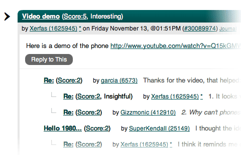
On the other hand, threading can be effective in different contexts. For example, on social news websites such as Slashdot, which feature heavy threading of comments on posts, it effectively turns the comment area into a platform for related discussions, each wrapped in a separate thread. This means that if someone had an interesting angle to explore related to the entry, they could pursue it, and subsequent comments would follow that tangent.

Slashdot features deep comment threading on stories, with each comment following its own tangent.
Threading can be useful on blogs because it allows you to effectively reply to individual commenters. One of the best ways to generate healthy discussion is to take the time to reply to as many comments as possible. This sends a clear message: you care. When someone leaves a comment and gets a reply from the blog’s author, they know that their comment is being read and that the author is interested in what they have to say. This makes them much more likely to add more comments in future because they know their input will be read and considered and that they won’t be wasting their time. Threading better organizes comments when there are a lot of such targeted replies.
Wrapping Up…
So, how do you go about designing an interface with social elements in mind? Focus on your goals. Before you can come up with an effective interface, you need to know exactly what your goals are. What do you want to happen? Do you want people to leave many comments on your blog? Do you want to encourage people to post answers to questions, or to submit them? Do you want people to submit files or leave ratings? Form a clear picture in your mind of what you want the interface to promote. Before you set off, you need to know your destination.
Only when you have defined your objectives can you begin to develop a strategy to meet them. Social interface design is a new field. Much has been written about usability and interactive design, but still not a lot on social interface design. It is an intersection of various fields: interface design, sociology and psychology, and as such it requires more than just an understanding of usability and design; it requires an understanding of human behavior and interaction. Using concepts from these other fields help you make interfaces that aren’t just easy to use, but that steer your community in the intended direction.


 SurveyJS: White-Label Survey Solution for Your JS App

 Try ProtoPie AI free →
 Celebrating 10 million developers
 Register Free Now

