Smashing Highlights 2009
2009 was a very successful year for Smashing Magazine. It was a year of ambitious goals and an intense time schedule, which brought many changes over the past year. In 2009 we published more posts than ever (on average, 8 posts per week). We broadened our areas of interest: for instance, we explored freelancing and the business side of web development, but also tackled user interface design and mobile web design. We also discovered new formats, such as the “Global Web Design” series and Q&A-Sessions — unfortunately, the latter (the Ask SM series with Chris Coyier) lasted only a couple of months.

None of this would have been possible without the tremendous support of our authors, contributors, and editorial staff. We express sincere gratitude to them for all the ideas and hard work they’ve put into articles published here on Smashing Magazine. We also want to thank you, the readers, for your attention, criticism, ideas, suggestions, emails, tweets, and links over the past year. Smashing Magazine is driven by your support which is why we are always listening to you and we truly appreciate every message we receive.
We have tried our best to improve the quality of our articles so as to increase their value for designers and developers. In this post, we’ll review what has happened on Smashing Magazine over the past year: smashing highlights, setbacks, and small sensations of 2009 — which we present in a month by month timeline. You can compare the highlights of 2009 with those of 2008 or 2007 (which, by the way, include links to some really useful articles).
January
The year starts with a rather lengthy post 100 (Really) Beautiful iPhone Wallpapers which actually doesn’t gain a lot of attention in January, but gains traffic significantly throughout the year. We start gathering material for this ultimate collection of iPhone wallpapers in early December and four writers help by selecting the most useful resources and the most beautiful wallpapers.
By far the most popular article of the month is Web Design Trends For 2009. We carefully examine what’s happening on the web in 2008 and came up with a couple of trends that we think will appear in the web design landscape in 2009. Some of our predictions turn out to be correct. And yes, we’re already preparing a similar post for 2010.
February
In February, Paul Boag reveals 10 Harsh Truths About Corporate Websites. His article seems to speak from the heart of thousands of designers and developers. The article gets positive feedback and we even receive tweets from two corporate site owners who agree to keep the key points of the article in mind for future redesigns.
Also, Alexander Makarov takes a couple of work days off, tests 9 popular PHP IDEs, and presents a very detailed review of popular PHP IDEs in the article The Big PHP IDE Test: Why Use One And Which To Choose. He also prepares an extensive spreadsheet for public review. An editable version is available as well (we hope that other developers will voluntarily add reviews to other IDEs), however we are forced to close editing because of vandalism.
February is also a busy month for us and our readers. We announce a Hardware Giveaway with almost 9000 comments — more comments than WordPress can handle at the time. Newer versions of WordPress offer comment pagination – probably added for that reason. We also announce the Smashing Book — our most important project in 2009. As you may know, there was a long road leading up to its final release in early December.
March
In March, we get technical. We publish articles related to Ruby On Rails, MySQL, Subversion, and PHP. The latter is a first-ever rebuttal of one of our previous articles; it’s written by PHP gurus Chris Shiflett and Sean Cotes. They take a closer look at the previously published article, explain its errors and reveal what is right and wrong in its theory and practice. From this point on, we consider getting experts to technically review articles before they’re published.
The most popular post of the month is 70 New, Useful AJAX and JavaScript Techniques, prepared by Noura Yehia. We get back to our roots, to the good old days when we picked the best coding and design-related resources and present them in a well-researched round-up. Although many people have criticized the “list” article format, most readers still find such round-ups useful, so we continue publishing them. Over the course of the year we pushed lists back a bit, trying to publish more unique and thought-provoking content.
The most controversial inspirational post of the month is definitely Bizarre Surreal and Dark Art Pictures, prepared by Aquil Akhter. The post doesn’t seem to leave anyone unaffected; some readers hate it, some readers love it, and it brings a large spike in traffic.
This month we also announce the Smashing Community Icon Set where we ask readers what icons they need with plans to design the icons together with a professional icon design agency, then release them for free. Unfortunately, the winner — portfolio icon set — is still not ready (the design agency is working on some nifty features), but we hope to finally release the set in early 2010.
April
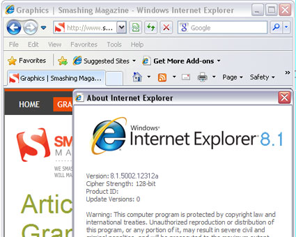
In March we start discussing with Jacob Gube what would be an interesting twist for April’s Fools Day and we come up with a nice idea. As a result, we publish Jacob Gube’s article Breaking: Internet Explorer 8.1 Eagle Eyes Leaked. The article takes a look at the new version of Internet Explorer and claims that it has Mozilla Firefox extensions support, excellent performance against the Acid 3 test, and a server-side code decompiler. The news spreads across social media and the article gets a nice traffic spike through StumbleUpon.
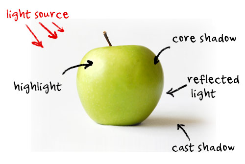
In April, Rob Morris presents 5 Simple Tricks To Bring Light and Shadow Into Your Designs. In general, April turns out to be one of the best months of the year. We publish 47 articles related to very different topics (freelancing, graphics design, typography, CSS, conversion rates, logo design) and thus manage to cover a wide variety of topics — resulting in much positive feedback. Many readers, however, complain that we publish too often, so in the following months we begin to publish at a more moderate pace.
May
May turns out to be a practical month. We re-discover round-ups with very useful resources. We publish a round-up of useful glossaries, the ultimate general guide to industry terms that should get our readers well on their way to understanding what web designers are talking about. We also discuss ways to put your content in front of more people.
The most popular posts of the month are graffiti artworks and Free WordPress Themes for 2009. Inspirational posts work well, but the appetite of our readers is growing. Over the coming months we begin to see a rise of resistance against inspirational posts which are labeled “lazy content”. We listen and do our best to improve the quality of inspirational posts while reducing the number of such posts and making room for more practical articles.
June
June turns out to be a time for experiments. Because we observe a large number of Mac-users in our stats, we decide to publish a couple of Mac-related posts. We started slowly in May, and continued in June with Exposé tips and tweaks for your Mac. However, in the articles we’re not just praising Mac. As it turns out, if you want some traffic and discussions on your blog, banter Apple, its products, or fans. We do it and the article Why Web Developers Don’t Need A Mac gets 655 comments. However, focusing articles on Mac is not a good idea — the feedback is very negative. After June we focus on more general design-related topics and let the Windows-Mac debate rest in peace.
The most remarkable posts of the month are Inayaili de Leon’s challenge to take your design to the next level with CSS3 and Gareth Hardy’s discussion of common mistakes in logo design. One of the most useful posts of the year is Cameron Chapman’s round-up of web design checklists and questionnaires which performs fairly well in terms of traffic and user feedback.
In general, through the first six months of the year, CSS-related articles perform best. We notice this and start looking for more professional CSS/JS-developers who have time for writing. We also intensify our cooperation with our current writers. The results are seen in the months to come.
July
July is another month with a wide variety of design-related topics. Our advanced readers learn about clever PNG optimization techniques. The most-discussed article of the month is The Roadmap To Becoming A Professional Freelance Web Designer. We start to get more requests for freelance-related topics, ranging from pricing to organization to project management. We carefully write down the most promising ideas and assign topics to regular and new authors.
We try to take our inspirational posts to a new level, making them more extensive and less random. Our first result is Diogo Terror’s article about Lessons From Swiss Style Graphic Design. The article goes to extreme lengths explaining various techniques from the time as well as showcasing beautiful Swiss style artworks. Unfortunately, very few readers appear to be interested. Although the article takes a couple weeks to prepare, the traffic is very low and it gets just 75 comments.
We present the results of our Typographic Layout Design Contest in which we aim to collect beautiful typographic (X)HTML+CSS-based layouts created by the design community and release them for free. The response is overwhelming and we release 45 free typographic (X)HTML/CSS templates. Unfortunately, this is the last contest we offer in 2009. But no worries, new contests are coming in 2010!
August
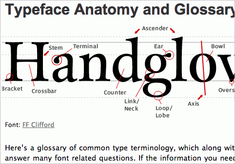
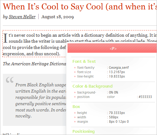
In August we present the findings of our large study of typographic design practices in modern web design. We identify 13 general typographic problems and issues related to typographic design and present answers to them that we found through our research. Among other things, we discover the most popular typefaces, average font sizes, line height, and the number of characters per line. The study is extremely time-consuming, but we don’t care. The results are very useful and that’s what really matters.
We publish a quite controversial article If Famous Graphic Artists Were Web Designers… in which our author Francisco Inchauste explores inspirational paintings and artists who have influenced modern design. The article gains a lot of attention and instigates some rough discussions in the comments to the post.
We explain how to code your first HTML 5 layout and your first iPhone application. And, of course, we publish probably the most bizarre post ever: Unique TV Series Episodes That Inspire Creativity, written by Louis Lazaris. It’s a review of how particular TV episodes were different from what came before, and how this can serve as motivation for future designs. The article doesn’t make sense for some readers, but most are quite intrigued, which is a good sign.
September
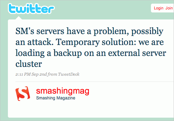
September starts unpleasantly for Smashing Magazine. We are under siege. Someone attempts to infiltrate our main server and manages to manipulate some HTML data. The consequence: a new server (we moved from a cluster to the cloud), a new internal security policy (which still causes some problems for us and appears to be a bit too restrictive), secure FTP and, of course, more costs.
We need a little time to recover, but get back on track quite quickly. We follow the attack with a few involved, thought-provoking articles: in the article CSS Wishlist: New Ideas, Debates and Solutions Kayla Knight discusses the current state of CSS and describes some alternative CSS syntaxes and CSS programming concepts as well as already-available techniques and tools. We reveal professional team management tips as well as the findings of our portfolio design study.
Many coding articles on Smashing Magazine cover various WordPress-related tips, tricks and techniques. Almost every month we published at least two articles related to WordPress; in September we published one of the most popular WordPress-related posts of the year: How To Integrate Facebook With WordPress, written by Thiemo Fetzer. You can bet that we will continue publishing more WordPress-related articles in 2010.
Also in this month, Jon Tan helps us to create the Smashing Experts Panel: because some articles were incorrect or contained factual errors, we invite experts and professional designers and developers to do paid reviews of Smashing Magazine’s articles before they’re published. As of this writing, we have over 25 experts in the panel. This turns out to be bittersweet news for our authors: editing and feedback now need more time and authors need to be more precise in their articles.
October
Louis Lazaris explains CSS Differences in Internet Explorer 6, 7 and 8 which is a new format for Smashing Magazine. For the first time, we’re publishing a useful reference article that can be looked up when our readers are handling browser inconsistency issues. And it works; the article has 238 comments and gains organic traffic from search engines. Also, in October we start our new series “Global Web Design” in which we feature web developers and web designs from different countries of the world and explore what’s happening in the web design scene worldwide. We start with Russian Web Design. The new series is a success, so you can expect more exciting posts in the series in 2010.
Apart from classic CSS and usability posts, the month brings many original articles. For instance, Brand = User Experience: The Interface of a Cheeseburger. Our readers share their excitement about the original content and want to see similar posts on Smashing Magazine in the future. We listen and start preparing other thought-provoking articles in the months to come. And, of course, it was pretty cool to put the image of a tasty cheeseburger on Smashing Magazine’s front page. We’re sure no design-related blog has done that before!
Important to us was Smashing Magazine’s Redesign and the Smashing Network. The redesign is done by Liam McKay and his design agency, WeFunction. However, we subsequently tweaked a couple of things in the design (and Liam is still unhappy about these changes). Footer and sidebar illustrations are designed by Pasquale D’Silva. The idea behind the network is to promote high-quality content on the Web design scene and to make it worthwhile for publishers to produce useful and interesting design-related articles. We want our community to benefit from these articles and support the publishers with direct traffic from Smashing Magazine.

November
November is another important month for us. Finally, after 3 years of working in different cities, we move to our first joined office in Freiburg (Germany). This is also the reason why the rest of the year is a bit hectic: there are literally hundreds of things that had to be considered, discussed, and taken care of.
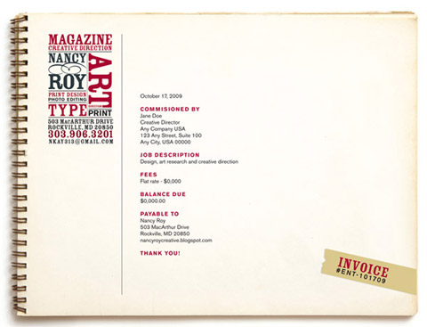
Probably the most practical article of the month is Kat Neville’s post about invoice design. The article presents some general guidelines, best practices and examples that will help you make sure your invoices are up to spec. Some articles need tremendous work and vivid discussions before they finally get published. One of these is The Ails Of Typographic Anti-Aliasing by Thomas Giannattasio. Can you spot all the hours of work that were put into it?
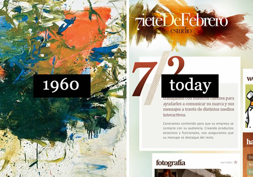
In November we have quite a surprise for our readers. Together with Paddy Donnelly, we discuss creating a spectacular post that covers a recent trend in modern web design: magazine-style blog post designs, or art-directed blog posts. Paddy refers to it as a ‘blogazine’. After four weeks of preparation, the article The death of the boring blog post? finally goes live. The surprise is that when a user clicks on the link to the post, he lands on a page which has a layout and design that’s completely different from the rest of Smashing Magazine. According to our stats, many users reloaded the page wondering where the “usual” layout had gone.
The article is one of the best posts of 2009, as it manages to spark a huge discussion in the design community and gains over 550 comments. The readers are in disagreement about the design of the article, but the idea is inspiring and shortly after it’s published we start to see a couple of emerging new ‘blogazines’.
December
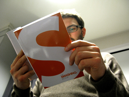
Finally. The Smashing Book is released. Announced in February, and discussed in several posts throughout the year, in December it finally arrives. Actually, you can buy the Smashing Book right now, available exclusively from Smashing Magazine — all orders are now shipped right away. This one was really hard work and most things didn’t work out as we had planned, but the positive reactions and impressions of our readers are definitely worth it. We see huge involvement from our readers who post their images, videos, tweets and reviews in social media. Feedback is overwhelming and users’ expectations are high. The coming months will show how well we did our job with the book.
Among other news, in December we hire our regular writer Cameron Chapman — she becomes the editorial manager on Smashing Magazine. Cameron is a professional writer, web- and graphic designer with over 6 years of experience. She will still be writing articles for Smashing Magazine, but now she also handles communication between many of our new and regular authors, discussing article ideas with them.
In terms of content, December turns out to be a slow month with less traffic and fewer comments — apparently, our readers have other things to take care of. Still, we keep publishing useful and original content. We explain how you can push your buttons with CSS3 and support IE and still be cutting-edge.
In December, we publish the most challenging article of the year: we encourage our readers to design something every day for the next 365 days. We encourage participants to tweet each new design along with #daily365 so that everyone will can see the progress of each project. Some designers are already participating! So are you up for the challenge?
What should you expect in 2010?
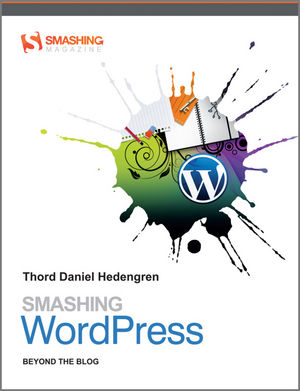
We’re planning some big changes in the coming months. Soon we will release the Smashing Network Widget for your website and a mobile version of Smashing Magazine. Well-known authors and experts are currently writing articles for us. You can also expect to see more new team members and newly released books in cooperation with a publishing house. Also, the translation of the Smashing Book to other languages (currently only Korean version) is being prepared. We also have some interesting plans for Smashing Magazine and the design community, so you better stay tuned to our updates in 2010.
We’ll do our best to deliver useful and inspiring high-quality articles in the new year. We’ll come up with new ideas to keep Smashing Magazine an exciting place. And we’ll be listening to your ideas, suggestions, complaints and criticism. Have a truly smashing, successful, healthy and peaceful new year in 2010!
What was the most memorable Smashing Magazine post in 2009?
Your opinion has always been very important to us. Please share your impressions about our work over the last year and let us know what you would like to see changed on Smashing Magazine in 2010. Also, what was your most memorable Smashing Magazine’s post in 2009? We’ll do our best to improve Smashing Magazine in the new year!
(ll)


 Register Free Now
 SurveyJS: White-Label Survey Solution for Your JS App
 Celebrating 10 million developers