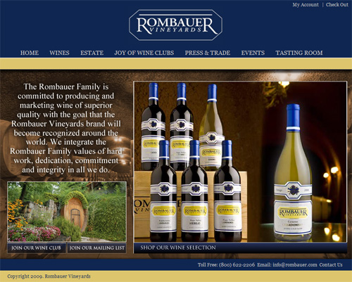
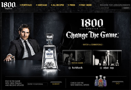
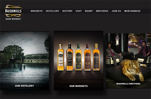
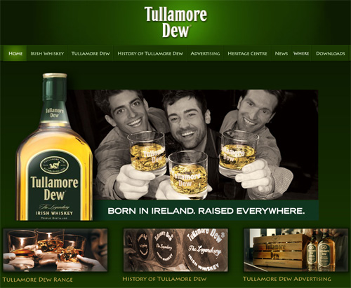
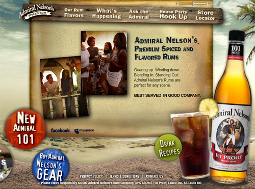
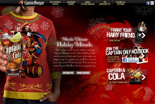
The Unusable and Superficial World of Beer and Alcohol Websites
I was pretty excited when I came up with the idea of examining and showcasing some of the most famous beer and alcohol-related websites from a number of countries around the world. After all, who doesn’t like the odd drink now and again? (Well, besides me — I can’t stand alcohol in any form.) Surely this would make for an interesting article that would elicit quite a few comments. Well, if that’s the result, it wouldn’t be for the reasons I suspected when beginning to research this piece.
Instead, I’ve concluded — due to problems related to typography, accessibility, and usability — that the apparent “beauty” present on many of the websites related to this industry is merely “skin deep”. To put it quite bluntly, the designers and developers people responsible for decision-making in the beer and alcohol website industry should be ashamed of themselves for creating such horrendous user experiences. My analysis here will attempt to inspire modern-day designers and developers to avoid imitating the superficial design and development techniques employed by these web professionals.
You may also be interested in the following related posts:
- Web Design Showcases From Various Industries
- Global Web Design Showcases
- 60 Rare and Unusual Vintage Signs
But I won’t just focus on the negative. There are some positive things to be mentioned, and a showcase of some of the nice sites is certainly in order, so that will round out the article (and might even fool a few of the “I’m here for the pictures” visitors).
The Painful “Age Verification” Screen
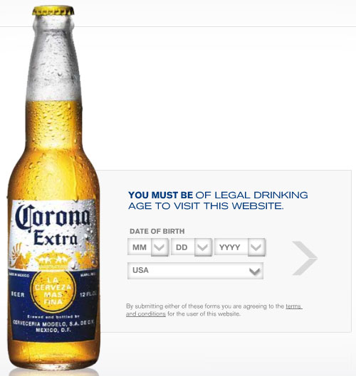
Something that is common to nearly every site I found when researching this article is that all the sites require that you confirm your date of birth before you can view the content of the site. Obviously, alcohol is a very serious issue, and reasonable precautions must be taken to ensure that the owners of these sites are not encouraging underage drinking. So, typically, a site will have a “date picker” form where the website visitor can enter their date of birth (month, day, and year), as shown below on the Corona website:
A Legal Requirement? Or a Waste of Time?
Since it is impossible for such a welcome screen to actually ensure the user is really old enough to drink, then why not simplify this process? You’ll notice that the welcome screen on the Corona website also asks the user to enter their country of residence, which further complicates the process of entering the site. But don’t get me wrong; I am not suggesting that alcohol-related websites remove the age verification screen. In most countries, they’re probably required by law to do this. I’m suggesting that they make this process easier for the user.
First of all, if you want to know what part of the world your website visitors are from, use Google Analytics (or similar technology), or track IP addresses. Don’t waste your visitors’ time with a question that they could lie about anyhow. I certainly hope the owners of these sites are not depending on those statistics for any serious demographic analysis.
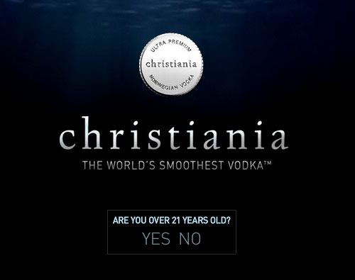
But more importantly, since the user can enter any date of birth they want, and the site will never permanently block a person that enters a non-qualifying date, why not just have a simple screen that clearly asks if they are of drinking age in their country of residence? It was surprising how many sites did not have a simple means of entering. Below are two of the few examples that I found that had a user-friendly intro page:
JETT VODKA
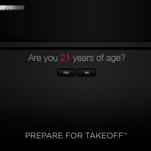
At the very least, if you must ask for their age, why not just ask for the year? It’s true that the person’s exact day of birth could determine whether or not they’re qualified to enter, but let’s be honest here — this screen isn’t stopping anyone. And you can’t drink a website. So simplify the process and get on with what you really want people to see.
During my research, I wondered if there were any laws in Canada or the United States that required the use of such a splash page. I contacted Labatt Breweries of Canada and I was informed that there was no law requiring the age verification screen, but that it was a company policy to have the user enter their date of birth. Okay, that’s fair enough. But I wondered why they would opt for the complicated version over the simple examples shown above. The woman I spoke to reemphasized that it was a company policy to have the user enter their exact date of birth. She suspects it’s the same for most other companies as well. I had also contacted Anheuser-Busch but hadn’t heard back from them.
Maybe the site owners are ensuring that they don’t risk any legal trouble (regardless of laws), thinking that the more difficult the process, the better it would look in their behalf. But considering the age form isn’t really stopping anyone from entering, it’s more likely that these sites suffer from poor usability management and tend to fall back on bad habits that were carried over from the old days of the web design industry. Also, some sites did have a simplified version of the age verification screen (as shown above), so there really is no reason for the overly complex version of that screen. If anyone involved in the alcohol website industry would like to provide some feedback on this matter in the comments, I will make any corrections as needed.
Unnecessary Complications
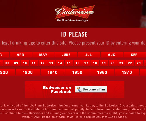
Some age verification screens are complicated for no good reason, and certainly for no legal reason. Take for example the Budweiser landing page:
After selecting the month and day you were born, the years are shown in 10-year blocks, with the start of each decade representing each block. In order to select the specific year you were born, you have to hover over the appropriate block, then slowly move your cursor until the year you want appears. What a usability nightmare!
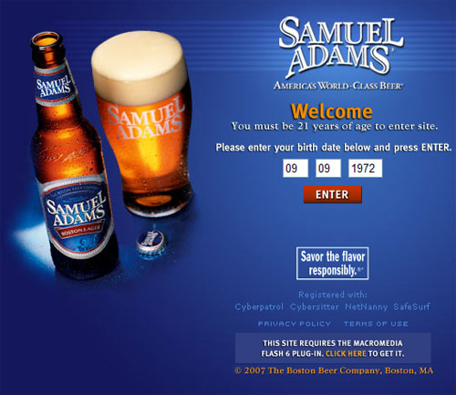
The Samuel Adams website goes beyond ridiculous in who it allows to enter. Initially the user is presented with this screen:
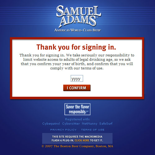
Then, after you’ve entered a date of birth, you’re informed that you’ve “signed in” (which is not technically correct and can potentially be confusing) and now you have to reenter your year of birth:
It’s safe to say the Samuel Adams’ website architects have turned the bad intro page into an art form.
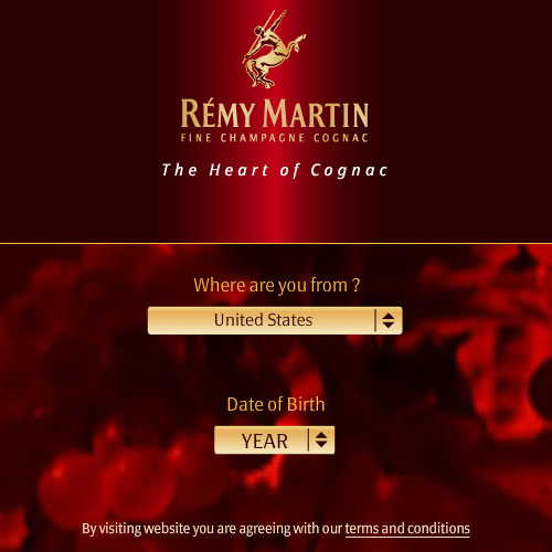
Yet another example that has two different age verification screens is the Rémy Martin website. When you first visit, you’re presented with this screen, unnecessarily created with a barely usable Flash-based date picker:
Then you’re redirected to a completely different domain, and once again are asked to enter your age:
The site colors and branding are different from the first screen, leaving the user wondering if they’re even still on the correct website. I really don’t know what they’re thinking with this dual age verification system, but it’s obvious that the site architects have little knowledge of modern website usability best practices.
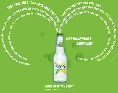
Below is another overly-complex age verification screen, on the ZIMA website. Try to find your year of birth in this unnecessary mess:
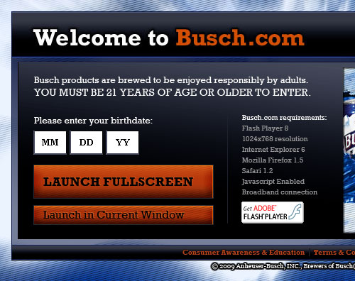
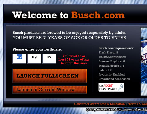
Another problem with the age verification screen was that some sites required you to manually enter a 4-digit year, while others allowed you to choose a year from a <select> box. The Busch Beer site is one of a few sites that expects the user to enter the year in just two digits:
After customarily entering a year in 4-digit text format, or from a familiar select box, this 2-digit option comes as a bit of a surprise. So naturally, when I tried to enter the site, I typed a 4-digit year beginning with 19 — and the “19” part stuck. I got this error message:
What if I was born in 1919? Well, after some experimentation, I discovered that anyone born before 1930 is considered “too old to drink” (which is fine), but despite initially receiving an error message, if you continue to attempt to enter a year prior to 1930, the site instead redirects the user to Worlds of Discovery, “a place of enjoyment for people of all ages.” All usability problems aside, that was pretty funny.
You may have also noticed the 1999-style “site requirements” notification in the above screenshots. Another strong reminder that the sites we’re dealing with here seem to be managed and developed by people who have not done a whole lot of research on modern design and usability trends.
Overuse of Superficial Elements
What makes a website “cool” today, is not the same as what made a website “cool” 8 years ago. In fact, if you didn’t know any better, after visiting 10 or more alcohol-related websites, you’d think it was 2001. It was astounding how many of these sites employed self-indulgent, superficial techniques that make the entire experience quite a drag.
While perusing some of these sites, I often had no idea what was clickable, when an animation was going to finish, or where a particular sound was coming from.
Too Much Flash Animation
Most modern developers understand that creating an entire website in Flash is rarely a good choice. Granted, in some industries Flash is useful for full sites. Kids websites and games sites are two good examples. But for the most part, the use of Flash in the alcohol web design niche is often unnecessary and seems to be used in a trendy way because of the false assumption that a complex Flash site equates to a “classy, upscale” experience. As mentioned, around 2001, that may have been the impression that users got, but that’s not the case anymore.
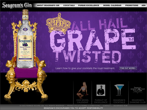
The Seagram’s Gin website is one of many examples of a full Flash website, an extremely common practice in this industry.
Why Not JavaScript-Based Animation?
I’m not saying that these sites should never use Flash. Some of the sites I visited had some complex user interactivity that would certainly require the use of Flash-based technology. But in many cases, animation and effects could be implemented through good semantic code manipulated unobtrusively with jQuery or another JavaScript library.
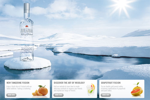
For example, the Finlandia vodka website has a mostly-Flash interface with promo boxes that could have been done with plain HTML and JavaScript:
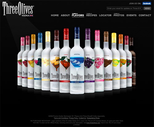
Another site that overused Flash is the Three Olives Vodka website. Take a look at the screen capture below:
The content section displays the different vodka flavors, with a Flash-animated rollover effect for each bottle — which is understandable since the animation is somewhat complex. But the entire site is created in Flash, including the very static logo, top navigation, and text-based footer. All of those sections could have been done using conventional coding methods, making the site cleaner and more usable. In fact, many of the animations on this site could have been accomplished with JavaScript, making the experience much more up-to-date, intuitive, and flexible for future development.
The BACARDI website is another one done completely in Flash, including the header, footer and dropdown menus — all of which could have been done with HTML and JavaScript without losing anything aesthetically:
The Outdated “Skip Intro” Link
Another 8-year-old web design trend used on many commercial alcohol sites is the “skip intro” button, which is obviously a symptom of what was discussed in the previous section — overuse of Flash. Below are a few examples of sites with Flash intros that have the option to be “skipped”.
Even worse, after verifying your age, the Jameson Irish Whiskey website loads up a Flash intro of a super-fancy animated 3-D cube that does not even have a “skip” button:
Auto-Playing Sounds and Video
When Flash is overused, it’s inevitable that embedded sounds will be also. Sound should generally only be triggered by the user, and should always have an obvious method for toggling or reducing the volume. Many of the sites I investigated failed miserably in this regard.
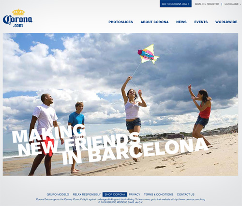
After passing the age verification screen, the Corona website plays an intro-style photo animation with music playing. As seen in the screen shot below, there is no way to skip this animation and no way to turn off the sound.
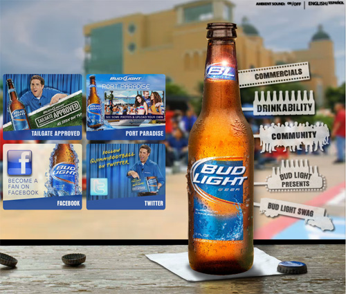
The Bud Light website doesn’t even wait for you to pass the age verification screen to trigger automatic “ambient sounds” (people talking in the background, like at a party). The sounds are mildly annoying — but at least there’s an easy-to-locate on/off switch in the top right corner of the screen.
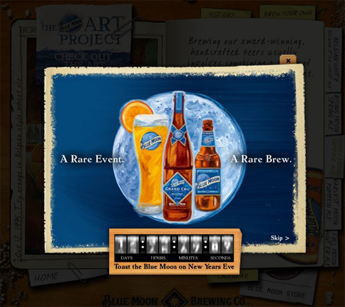
The Blue Moon Brewing Company website is a very beautifully-designed but nightmarishly-unusable site. It’s done with a book-style look that has nice animation, but is really out of place on the modern web. After verifying your age, a lightbox-style overlay initiates to advertise something about New Year’s Eve. This overlay is accompanied by the sounds of Auld Lange Syne — with no apparent method to disable the song.
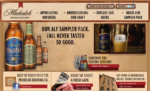
The Michelob website plays a video during the age verification, and again when the site loads. In both cases this is done without initialization from the user. In this case, they weren’t annoying and obtrusive, and they were very brief — so I’ll give them credit for a much nicer and more usable experience than some of those we’ve already considered.
A better option would have been to have a large play button to indicate the video is there, and allow the users to initiate it at their leisure.
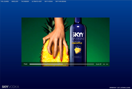
The SKYY Vodka website plays a series of videos after you verify your age. At first glance, there is no apparent way to disable the videos or the sound. But when you roll your mouse over the video area, a video toolbar appears allowing you to pause the video and/or turn off the sound. Better than some of the other options we’ve considered, but considerably less than user-friendly.
And now for the Russian Standard Vodka website. What can I say about this horrendous, irritating, and unusable monster of a site? It’s a full Flash, fluid-width site that embeds a giant video as the background in the Flash movie, and, as is common, does not have an obvious way to disable this annoying video that shocks you to your very core — until you realize that clicking anywhere on the background of the movie will toggle the pause/play option. A true usability nightmare, and one of the most self-indulgent techniques you’ll ever see on a web page.
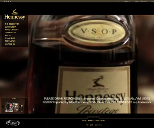
They weren’t the only ones to implement this bad practice, however. The Hennessy website similarly has a giant auto-playing background video with no apparent method to pause or stop it. The sound can be muted, but the background plays a series of videos with no end in sight.
There were so many more examples of sites that embedded sounds and videos. It’s amazing how the sites in this niche hold so much in common in the area of bad practices. The designers and site architects seem to live in their own little world of “trendy” web design and have, for the most part, failed to break out of many old-school techniques from which most modern designers have moved on.
“Mystery Meat” Navigation (in 2009?)
Until I started researching this article, I thought mystery meat navigation was an old-school practice that was overcome by a modern-day movement of user-centric design — but that is obviously not the case in the commercial alcohol website industry.
Because of the many superficialities, the overuse of Flash, and other self-indulgent design tendencies, many of the sites in this industry suffer from this “mystery meat” or “Where’s Waldo?” phenomenon — that is, pages where the user has no idea what is clickable and what is not. Take a look at some of the screen shots below and see if you can clearly identify the clickable elements. Below each screen shot I’ve included some explanations to decrypt the “mystery” elements so you can see how unusable some of these sites really are.
San Miguel Beer
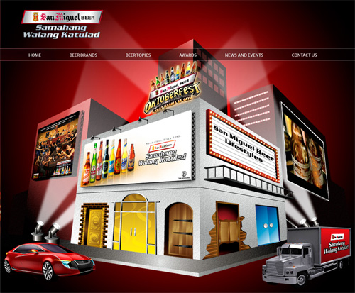
On the San Miguel Beer website (above), in addition to the navigation bar links, nearly all the graphical elements in the content area are clickable, including the car, the truck, all the doors on the building, and signs. Who knew?
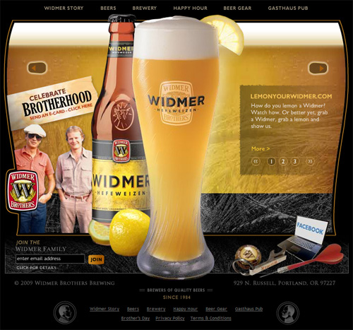
On the Widmer Brothers Brewery site (above), there is a “mystery” link associated with each of the following elements: Both Widmer brothers, the big glass of beer, the lemon slice, the bottle cap, the keychain, the laptop, and the dart.
After enduring through the auto-playing “island” sounds, repeating animations, and the obtrusive “drink mixer” overlay advertisement, the Malibu Rum site visitor is presented with a semi-underwater island scene with “mystery meat” navigation as the focal point of the page. The five primary page elements (the mirror ball, the binoculars, the coconut, the bottle, and the drink mixer), however, are not the only clickable items; there’s also the satellite dish in the background.
Up to this point, all the examples of “mystery meat” navigation display a graphic or text hint, on mouse over, that explains what the clickable item points to. The next example doesn’t even go that far.
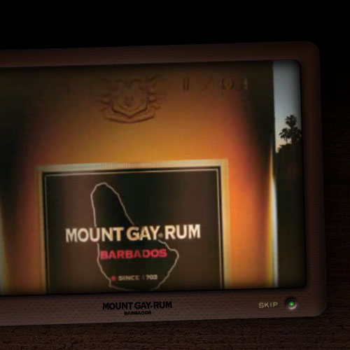
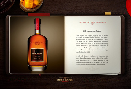
The Mount Gay Rum site (above) is all Flash, and the main content area is a book with pages that turn when clicked. First of all, finding the exact spot to click on the corner of each page is not the smoothest experience. But there are other clickable elements outside of the book object; you can click the liquor bottle (the barely-visible object in the top left, not the one in the content area), the glass of rum with ice, and the red hat (top right). In my experience, after turning the pages and clicking the mystery items multiple times, I still don’t know what those extra mystery links are for, and why they’re not labelled.
Outdated Design and Typography
From my research, many of the sites that do not suffer greatly from the problems discussed above, and are actually fairly usable, incorporated outdated trends and layouts. A few examples are shown below.
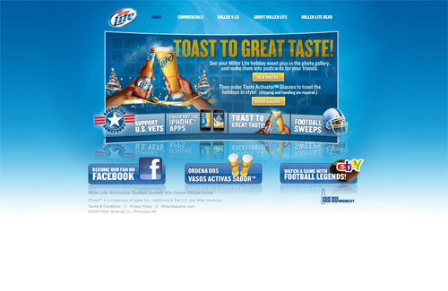
The Miller Lite website is too small for modern screen resolutions.
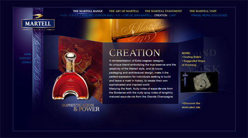
The Martell Cognac website has tiny font sizes and other small elements.
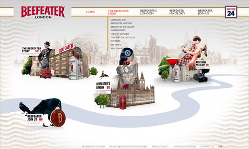
Beefeater Gin has small navigation text and even smaller drop-down menu text.
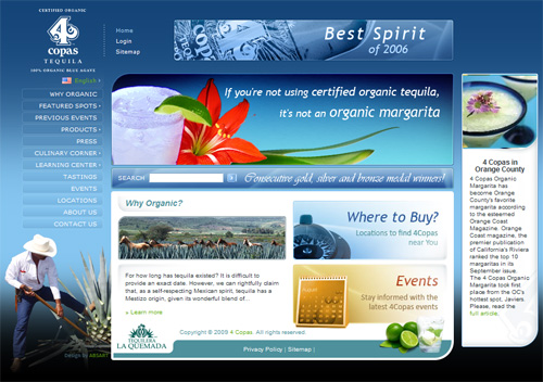
The 4Copas Tequila site is somewhat old-looking, uses small typography all over its pages, and has an outdated vertical navigation bar.
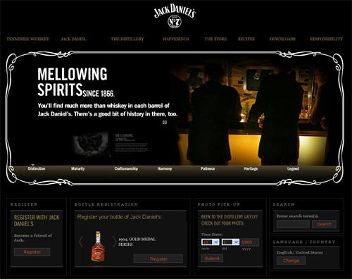
The Jack Daniel’s site is too dark, and many sections are almost unreadable because of the small typography.
Showcase of the Best Sites
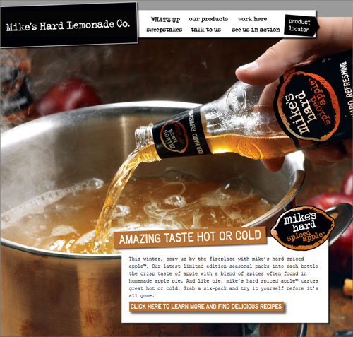
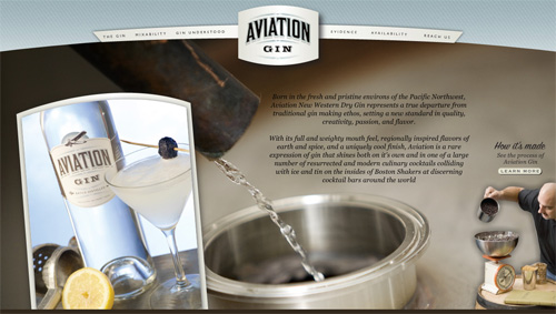
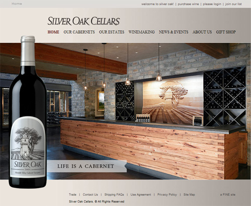
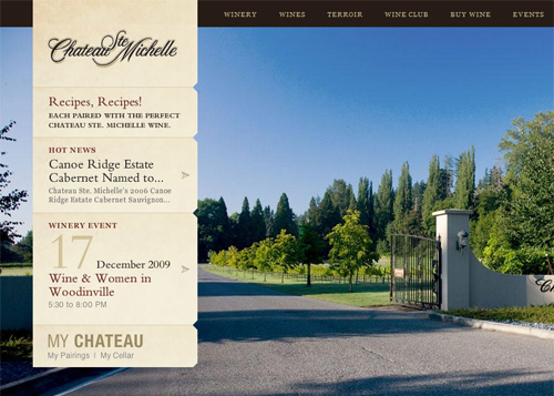
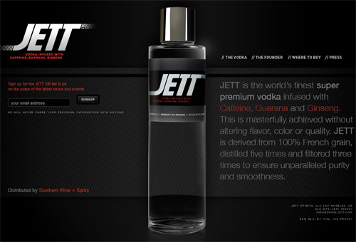
As promised, although this article did come down quite hard on the designers and developers of many alcohol-related websites, there are many sites that are well-designed, usable, and do not overuse Flash animation and other obtrusive techniques.
Many of the sites I’ve already considered are actually nicely designed (usability issues aside). Therefore, this last section is not necessarily showcasing sites that are “pretty”, but instead taking all factors into consideration to compile a list of the highest quality sites, in line with modern web design and development standards and best practices.
Some of these sites have a few of the weaknesses I’ve discussed, but generally are more intuitive, non-obtrusive, and easier to navigate.
JETT VODKA
Conclusion
In no way does this article mean to imply that the designers of these sites are not talented. In fact, most of the designs presented here are far beyond anything that I could personally accomplish. But, as web developers have learned in recent years, beauty in web design does not guarantee success — and in many cases, a quest for a more visually appealing experience can often weaken the more important aspects of a website.
As shown by the final showcase in this article, not every site in the beer and alcohol website niche is unusable or superficial. But the number of poorly-executed design and navigational techniques and the overwhelming amount of self-indulgent elements I’ve discussed here make it clear that this industry has some important ground to make up in usability, accessibility, and best practices.
The SKYY Vodka website plays a series of videos after you verify your age. At first glance, there is no apparent way to disable the videos or the sound. But when you roll your mouse over the video area, a video toolbar appears allowing you to pause the video and/or turn off the sound. Better than some of the other options we’ve considered, but considerably less than user-friendly.
And now for the Russian Standard Vodka website. What can I say about this horrendous, irritating, and unusable monster of a site? It’s a full Flash, fluid-width site that embeds a giant video as the background in the Flash movie, and, as is common, does not have an obvious way to disable this annoying video that shocks you to your very core — until you realize that clicking anywhere on the background of the movie will toggle the pause/play option. A true usability nightmare, and one of the most self-indulgent techniques you’ll ever see on a web page.
They weren’t the only ones to implement this bad practice, however. The Hennessy website similarly has a giant auto-playing background video with no apparent method to pause or stop it. The sound can be muted, but the background plays a series of videos with no end in sight.
There were so many more examples of sites that embedded sounds and videos. It’s amazing how the sites in this niche hold so much in common in the area of bad practices. The designers and site architects seem to live in their own little world of “trendy” web design and have, for the most part, failed to break out of many old-school techniques from which most modern designers have moved on.
“Mystery Meat” Navigation (in 2009?)
Until I started researching this article, I thought mystery meat navigation was an old-school practice that was overcome by a modern-day movement of user-centric design — but that is obviously not the case in the commercial alcohol website industry.
Because of the many superficialities, the overuse of Flash, and other self-indulgent design tendencies, many of the sites in this industry suffer from this “mystery meat” or “Where’s Waldo?” phenomenon — that is, pages where the user has no idea what is clickable and what is not. Take a look at some of the screen shots below and see if you can clearly identify the clickable elements. Below each screen shot I’ve included some explanations to decrypt the “mystery” elements so you can see how unusable some of these sites really are.
San Miguel Beer

On the San Miguel Beer website (above), in addition to the navigation bar links, nearly all the graphical elements in the content area are clickable, including the car, the truck, all the doors on the building, and signs. Who knew?
On the Widmer Brothers Brewery site (above), there is a “mystery” link associated with each of the following elements: Both Widmer brothers, the big glass of beer, the lemon slice, the bottle cap, the keychain, the laptop, and the dart.
After enduring through the auto-playing “island” sounds, repeating animations, and the obtrusive “drink mixer” overlay advertisement, the Malibu Rum site visitor is presented with a semi-underwater island scene with “mystery meat” navigation as the focal point of the page. The five primary page elements (the mirror ball, the binoculars, the coconut, the bottle, and the drink mixer), however, are not the only clickable items; there’s also the satellite dish in the background.
Up to this point, all the examples of “mystery meat” navigation display a graphic or text hint, on mouse over, that explains what the clickable item points to. The next example doesn’t even go that far.
The Mount Gay Rum site (above) is all Flash, and the main content area is a book with pages that turn when clicked. First of all, finding the exact spot to click on the corner of each page is not the smoothest experience. But there are other clickable elements outside of the book object; you can click the liquor bottle (the barely-visible object in the top left, not the one in the content area), the glass of rum with ice, and the red hat (top right). In my experience, after turning the pages and clicking the mystery items multiple times, I still don’t know what those extra mystery links are for, and why they’re not labelled.
Outdated Design and Typography
From my research, many of the sites that do not suffer greatly from the problems discussed above, and are actually fairly usable, incorporated outdated trends and layouts. A few examples are shown below.
The Miller Lite website is too small for modern screen resolutions.
The Martell Cognac website has tiny font sizes and other small elements.
Beefeater Gin has small navigation text and even smaller drop-down menu text.
The 4Copas Tequila site is somewhat old-looking, uses small typography all over its pages, and has an outdated vertical navigation bar.
The Jack Daniel’s site is too dark, and many sections are almost unreadable because of the small typography.
Showcase of the Best Sites
As promised, although this article did come down quite hard on the designers and developers of many alcohol-related websites, there are many sites that are well-designed, usable, and do not overuse Flash animation and other obtrusive techniques.
Many of the sites I’ve already considered are actually nicely designed (usability issues aside). Therefore, this last section is not necessarily showcasing sites that are “pretty”, but instead taking all factors into consideration to compile a list of the highest quality sites, in line with modern web design and development standards and best practices.
Some of these sites have a few of the weaknesses I’ve discussed, but generally are more intuitive, non-obtrusive, and easier to navigate.
JETT VODKA

Conclusion
In no way does this article mean to imply that the designers of these sites are not talented. In fact, most of the designs presented here are far beyond anything that I could personally accomplish. But, as web developers have learned in recent years, beauty in web design does not guarantee success — and in many cases, a quest for a more visually appealing experience can often weaken the more important aspects of a website.
As shown by the final showcase in this article, not every site in the beer and alcohol website niche is unusable or superficial. But the number of poorly-executed design and navigational techniques and the overwhelming amount of self-indulgent elements I’ve discussed here make it clear that this industry has some important ground to make up in usability, accessibility, and best practices.
If you’re reading this and thinking that I’ve chosen a few specific examples to serve as a basis for an overblown opinion, you should know that there were dozens of other examples of poor usability and downright annoyances that I didn’t include. I also did not discuss special needs users, graceful degradation, semantic markup, and table-based layouts — any of which could have provided further evidence that these sites, for the most part, are downright awful.
Maybe there are underlying reasons for many of the decisions made in these designs. Those reasons could be due to business politics, legal issues, or even a failure to encourage forward thinking — so I will acknowledge that some of these criticisms could be, upon further analysis, overly harsh.
Or maybe these problems have something to do with the possibility that these designers are exposed to a lot of free alcohol…? Hmm…


 SurveyJS: White-Label Survey Solution for Your JS App
 Celebrating 10 million developers
 Try ProtoPie AI free →
 Register Free Now