Web Design Iterations and Algorithms
If you were to ask me what’s the best way to showcase your creativity, then I would definitely say that it is in designing a website. I would not be exaggerating if I said that the sky’s the limit when it comes to creative possibilities in web design. Needless to say, we all want to come up with beautiful, usable, and creative designs to make a name for ourselves in the web design community.
You might be interested in the following related posts:
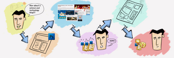
In this process of coming up with the best, our designs often go through a number of iterations until we come up with what we originally envisioned. Nick La published a nice post on his blog in which he demonstrated his design process and the manner in which his design went through a number of iterations.
So, why is it that our designs go through so many different iterations?

- Initially, he comes up with a simple two-column layout. However, in due course, he stumbles upon some great design blogs like Smashing Magazine and Web Designer Depot and is inspired to see all those beautifully designed blogs.
- He redesigns his blog only to find out that now his blog looks too similar to some of those which he saw earlier.
- To avoid the similarity, he adds a number of different elements and unnecessarily features to his blog which makes it overly complicated to use.
- Finally, after all these iterations, Joe decides to have a minimalist but beautiful design for his blog.

So what can we do to keep all these iterations to a minimum? The answer to this question is simple.
We carry out our work in a structured manner or in designer’s terms, we do it in layers.
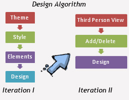
This is something which I call the “Web Design Algorithm.“
Theme
Deciding upon a theme is the first obvious step in the web design algorithm. For example, in Joe’s case, the theme was Science and Technology.
Style
We often come across a number of inspirational blog posts like “20 Extraordinary Blogs With Unique Post Designs” or “50 Beautiful and Creative Blog Designs.” I prefer storing the screenshots of all these websites into four different folders, namely:

- Professional
- Cartoonish/Caricature
- Photo Manipulation
- Purely Artistic
You will also notice that most websites broadly fall into these four categories. Scanning through these screenshots will give you lots of ideas and inspiration to decide on a style for your website depending upon your skills and project requirements.
Moreover, if you go for a purely artistic style, then you can have many more options like surrealist design, cubist design, futurist design or a symbolic design.
For example, in the case of Joe's Science and Technology blog, he can opt for a a purely artistic style with futuristic artwork.
Elements
Elements directly correspond to the central theme of your blog. For a science and technology blog, elements could be robots, planets, satellites and other gizmos. For a child’s website, elements could be slides, toys and teddy bears. You just have to make sure that your elements blend perfectly with your style.
Now that you have decided your theme, style and elements, you can go on to design your layout in Photoshop. This will be your first design iteration.
Third Person View
Once you are done with your layout, you can ask a couple of your friends and mentors to give you their honest opinion and any criticisms that they may have. I would also suggest that you get your feedback from those who really know their stuff when it comes to web design. Most people don’t like to ask because they think that the experts would not answer, but quite the contrary. The design community is very tight-knit and helpful, so I suggest getting a panel of experts/mentors that you can refer to for any web design and development questions.
Note: They are not always going to like your designs. There may be times that they may be a little harsh, but be ready for this and don’t take anything personal.
Add / Delete

Thereafter, you can make small additions to the design and you might also remove and change different elements based upon the feedback that you received. This will be your second design iteration, and most probably the last one.
Final Thoughts
Now you can see how the web design algorithm can help you minimize your iterations. As a new web designer, this is an extremely helpful process that can simplify the task of designing websites. You might take some time in deciding upon your style and elements, but that will surely improve as you work on more projects. Also, the more you do this, the easier it will be.
In conclusion, please note that this is just my personal process when I design websites and everyone has their own process. I just wanted to share with you what works for me. So did you find this process useful? Is there any steps that I should add to my web design algorithm? Feel free to leave a comment below and let me know. Also, what is your web design process? I’d love to hear your thoughts.


 Try ProtoPie AI free →

 SurveyJS: White-Label Survey Solution for Your JS App
 Celebrating 10 million developers
 Register Free Now

