User Interfaces In Business Web Application Design
Business web application design is too often neglected. I see a lot of applications that don’t meet the needs of either businesses or users and thus contribute to a loss of profit and poor user experience. It even happens that designers are not involved in the process of creating applications at all, putting all of the responsibility on the shoulders of developers.
This is a tough task for developers, who may have plenty of back-end and front-end development experience but limited knowledge of design. This results in unsatisfied customers, frustrated users and failed projects.
So, we will cover the basics of user interface design for business Web applications. While one could apply many approaches, techniques and principles to UI design in general, our focus here will be on business Web applications.
Further Reading on SmashingMag:
- 40+ Helpful Resources On User Interface Design Patterns
- Lean UX: Getting Out Of The Deliverables Business
- 45 Incredibly Useful Web Design Checklists and Questionnaires
- Taking Pattern Libraries To The Next Level
Webdesign vs. Web Application Design
Confusing Web applications and websites is easy, as is confusing user interface design and website design. But they are different both in essence and in so many other ways, which we’ll explore in this article.
A website is a collection of pages consisting mostly of static content, images and video, with limited interactive functionality (i.e. except for the contact form and search functionality). The primary role of a website is to inform. Some websites use content management systems to render dynamic content, but their nature is still informational.
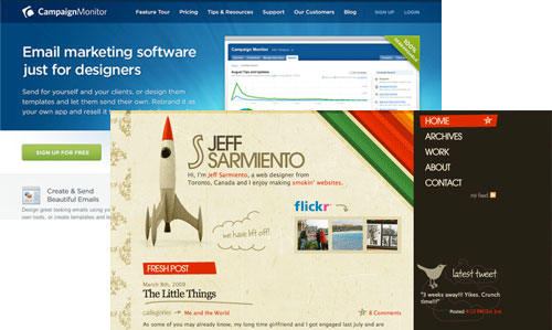
Web applications, on the other hand, are dynamic, interactive systems that help businesses perform business critical tasks and that increase and measure their productivity. Thus, the primary role of a Web application is to perform a function that serves the user’s tasks and according to defined business rules.
Web applications require a higher level of involvement and knowledge of the system on the part of the user. They don’t just stumble upon the application, do their work and bounce off. They use it as a tool to perform critical business tasks in their daily work. In the end, they cannot easily discontinue using the application and switch to another if they don’t like how it’s working, as is the case with websites.
Different Types of Web Applications
Business applications range in type from invoicing for freelancers to content management systems to document management systems to banking and financial systems.
We can distinguish between open and closed applications. Open systems are online applications that are easily accessible to anyone who opens an account. Users can access such applications via the Web and can open an account for free or by paying a fee. Closed systems (or line-of-business applications) are usually not accessible outside the company that uses it, and they can be considered “offline” applications (though many systems expose their functionality to business partners via either services or specialized interfaces). Such systems usually run on the company’s local network and are available only to employees.
I don’t know who coined it, but one term I like especially is weblication, which describes what a Web application is in general. This doesn’t mean, though that a Web application is a half-website half-application hybrid. It is far more complex that that.
First, Know Your Users
You’ve probably heard this a thousand times, and for good reason. A successful user interface focuses on users and their tasks. This is key, and too many developers have failed to create a good user experience. As Steve Krug said, “Developers like complexity; they enjoy discovering how something works.”

When identifying your users, keep in mind that clients are not users, and you are not a user. Although a client’s management team will usually be interested in the project and try to influence decisions, remember that they won’t be sitting in front of the computer several hours a day (unless the application is specifically for them).
How to Identify Users?
Identifying users can be done using several techniques, such as user interviews, business stakeholder interviews and the “shadowing” method of observation. Interviews can give you answers to questions about the users’ knowledge of the system and computers in general, while shadowing can yield more detailed information about how users perform tasks and what errors they make. The method is called shadowing because the observer is like a shadow, watching and noting the steps a user takes.
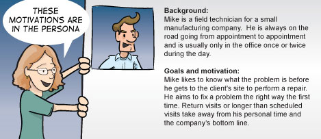
If you don’t have access to real users—either because you don’t have permission or are designing for open application—you can use personas, a tool to help identify users. Personas are a representation of real users, including their habits, goals and motivation. Because certain information about users is often identified through business analysis, you can make use of it to create personas. If you are not familiar with the tool, a comic by Brad Colbow will help.
Task analysis helps identify what tasks users perform in their jobs, how they do them, how long they take and what errors they make. Sometimes clients will be using an old version of the application that you are designing to replace. Make use of that old system and watch how users use it. Understanding their tasks and challenges will be easier that way.
Regardless of who your users are, one thing is certain: in most cases, you will have to consider both novices and experts. Novice users should be enabled to learn as fast as possible, while expert users should be enabled to perform their tasks extremely efficiently. This may mean creating separate interfaces. But in many cases you will be able to accommodate both types of users in the same interface through various techniques, such as progressive disclosure.
Such research is usually done by business analysts. But if no one else is responsible for it, you should do it. Once you have the necessary information, you can begin with design.
Design Process
You can follow one of any number of processes in designing the user interface. You might already have one. However, I would suggest that you consider the Agile approach. Why, you ask? Well, because for users (and clients), the user interface is the product. The bottom line is that they don’t care about your sketches or about fantastic back ends or powerful servers. All they want to see is the user interface.
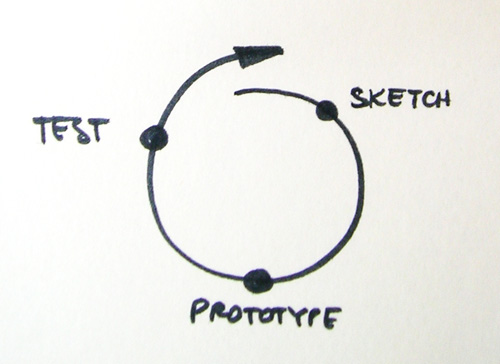
So, how does Agile help? It helps through its key principle: the iterative approach. Each iteration consists of all of the phases defined by your process. This means that at the end of the first iteration, you will have a product that can be tested, a prototype.
Sketching
Sketching is a powerful way to explore ideas. The goal is to arrive at the solution by sketching out different concepts. Most sketches will be thrown out, but that is okay. As Bill Buxton says in his “Sketching User Experience” book, sketches are fast to create and easy to dispose of, which is why they are so powerful.
Are sketches the same as wireframes? Well, the differences can be blurry, but I would say no. Wireframes don’t capture rough ideas but rather develop them. Read a fantastic discussion on IxDA: Sketching Before the Wireframes.
Once you get the “right” sketches, or at least the ones that you think are right, you can create more detailed wireframes or go straight to creating interactive prototypes.
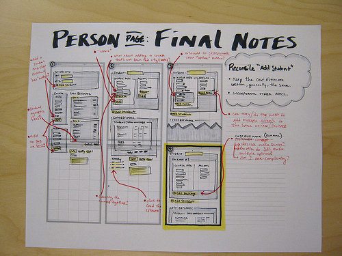
Interesting reading on sketching and wireframing:
- 35 Excellent Wireframing Resources
- Tools for Sketching User Experiences
- 20 Steps to Better Wireframing
Prototyping
The next step in the process is to create prototypes that will simulate the real application. A prototype can contain one or more features (or all of them), but it actually does nothing. It merely simulates the behavior of a real application, and users will feel that they are actually doing something. Prototypes may contain some functionality if needed (such as complex calculations).
Because the nature of a prototype done in HTML is temporary—its purpose, after all, is to test ideas—don’t bother with the code; just make it work with minimal bugs. You will throw it away anyway. You can also use specialized prototyping software such as Axure. Some people even prototype in PowerPoint.
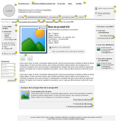
Further reading and tools for prototyping:
- 5 Useful Online Tools for Web Design Planning and Prototyping
- A Practitioner’s Guide to Prototyping: A book from Rosenfeld Media
- 16 Design Tools for Prototyping and Wireframing
Testing
Prototypes are useless unless you test them. This is not rocket science. People like Jakob Nielsen and Steve Krug support so-called “discount usability testing,” which is cheap and fast and yields valuable insight into your design decisions. You will use this information as the basis of another iteration of sketching, prototyping and testing. Do this at least until major issues have been fixed. We all know that software projects are tight on time and budget, so to be more efficient, test early and test often.
One of the best resources for discount usability testing is a new book by Steve Krug, “Rocket Surgery Made Easy.” Pick up a copy and read it.
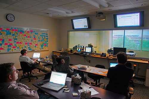
Further reading:
Design Principles
There are many design principles, but there doesn’t seem to be a general consensus on definitive ones. So, we’ll go through design principles more informally, leaving out strict definitions.
No One Likes Surprises
Probably the key factors in a good UI are consistency and familiarity. A user interface should be consistent across all parts of the application, from navigation to color to terminology. This is known as internal consistency. But a user interface should also be consistent within its context, such as the operating system or other applications in its group or family. A typical example is the applications in the Microsoft Office family. This is called external consistency.
A good approach to consistency is to define user interface guidelines for each project or for a group of projects. These should guide the decisions you make for all of the details. This will not only maintain consistency but also serve as documentation to help team members better understand your decisions.
Consistent user interfaces have a shorter learning curve, because users will recognize parts of the system and be able to fall back on prior experience. But familiarity is sometimes confused with consistency. Familiar user interfaces draw on concepts from the users’ previous experiences and use appropriate metaphors. Folders, for example, are a well-known metaphor for file organization, and they have replaced “directories,” which were used previously in command-line operating systems. In short, speak the language of your users.
A common belief among business owners is that a great user interface should look like a Microsoft Office product, especially Outlook. I won’t go into explaining how pointless this is. Rather, I will offer alternative advice: defend the user-centric approach, and explain why creating an application for employees, clients and partners (i.e. their users) is so important.
All the same, most businesses are unique, as are their work processes. For example, two businesses from the same branch could have significantly different processes, forcing you to go beyond what is familiar and start to innovate. This part of the design process can be very interesting, although you have to be careful in how far you go with innovation.
Further reading:
Users Should Be Able to Be Efficient
Without a doubt, users should be able to be efficient when using business applications. This is what they are paid for, and this is what managers expects from the application. User interfaces should allow users to be efficient and should focus them on completing tasks in the easiest and fastest way. But this is not always the case. There is an opinion, or at least practice, among developers that says the user interface should be as complex as the back end system. No matter how ridiculous this sounds, the problem is real and might give you a headache. This is one reason why good communication and collaboration between developers is a must.
Users are efficient when they focus on a particular task. As mentioned, task analysis can help you identify tasks and determine how users perform them. If tasks are long, accelerate them by breaking them up into smaller units. You can also increase efficiency by providing keyboard support and shortcuts. Think how inefficient it is for a user to have to switch back and forth between mouse and keyboard. In some cases, you will be designing for users who are accustomed to working on command-line operating systems and the applications made for them. They will be keen to have keyboard support. One suggestion: when defining keyboard shortcuts, keep them consistent with those of common applications. For example, Ctrl + S should always be save, and so on.
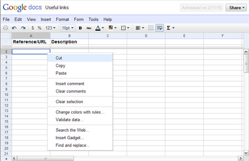
Efficiency can also be enhanced through personalization. Users who can personalize an environment will learn it faster and, more importantly, will be more confident using it. Personalization can be done in many ways: choosing widgets for the dashboard; defining shortcut options and favorites; changing the order of elements; etc.
Pay attention to accessibility. Although many assume that accessibility doesn’t matter in Web applications, it certainly does. Treat the application as if it were a public website.
A Web application also has to be efficient in the speed with which it processes information. So, consider heavy interactions that result from partial renderings and AJAX requests.
Help!
An interface should provide meaningful feedback that describes the state of the system to users. If an error occurs, users should be notified and informed of ways to recover. If an operation is in progress, users should be notified about the progress.
We can go even further and declare that user interfaces should prevent users from making errors. This principle, called forgiveness, can be followed with confirmation dialogs, undo options, forgiving formats and more. Forgiveness makes it safe to explore the interface, decreases the learning curve and increases overall satisfaction.
Because of the complexity of business Web applications, you would also need to provide a comprehensive help system. This can be done with inline help, a support database, a knowledge base and guided tours (which mix video, images and text).
Further reading:
- Forgiveness in UI design
- Web Form Validation: Best Practices and Tutorials
- Handling User Error with Care: Getting Users Back on Track
Can’t Get No Satisfaction
Satisfaction is a subjective term that refers to how pleasant an interface is to use. Every design principle we have described here affects satisfaction. And a few more principles are worth mentioning here.
Simplicity is a basic principle of UI design. The simpler a user interface, the easier it is to use. But keeping user interfaces for business applications simple is a challenge because the apps often have a lot of functionality. The key is to balance functionality and simplicity. Restraint is one of the most efficient ways to achieve this balance: i.e. finding the simplest way to solve a problem.
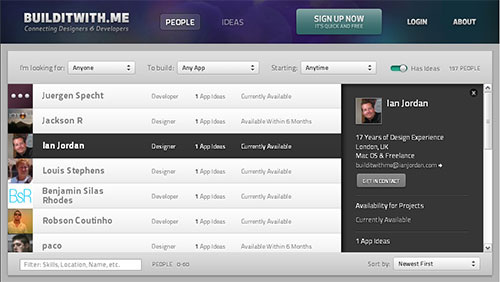
Aesthetics, though subjective and somewhat arbitrary, play an important role in overall satisfaction. Users respond positively to pleasing user interfaces, sometimes even overlooking missing functionality. But you’re not creating a work of art. One of the best articles that explains aesthetics is In Defense of Eye Candy.
In the end, users will be spending a lot of time in front of a business application, and no matter how usable, consistent or forgiving the interface is, satisfaction will be critical in determining how good the user interface is.
Further reading:
- 7 Interface Design Techniques to Simplify and De-clutter Your Interfaces
- Restraint
- In Defense of Eye Candy
Other resources related to UI design:
- 12 Useful Techniques for Good User Interface Design
- 8 Characteristics of Successful User Interfaces
- Principles of User Interface Design (Wikipedia)
- 10 Principles of the UI Design Masters
- 20 Websites to Help You Master User Interface Design
Essential Components Of Web Applications
Every Web application is unique, but many of them contain common features. Although the implementation of any one of these features will vary, let’s look at the basic concept of the three most common ones.
Web Forms
Forms in general are important to Web applications. But as Luke Wroblewski says in his Web Form Design book, “No one likes filing in forms.” That includes sign-up forms, including business applications with dozens of fields.
Minimize the frustration of filling in forms. Provide inline validation and good feedback. Use defaults when possible. Don’t forget about novice users. Use wizards to help them complete tasks faster, or use progressive disclosure to hide advanced (or infrequently used) features.
Master-Detail Views
This is the technique of showing data in two separate but related views. One view shows a list of items, while the other shows details of the selected item. Master-detail views can be implemented across multiple pages or on individual ones.
Dashboards
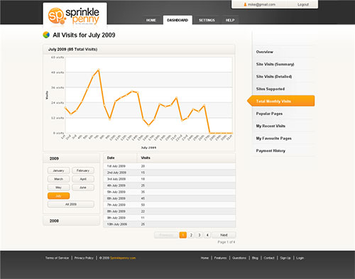
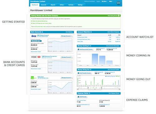
Many Web applications have dashboards. A dashboard is a view of the most important information needed to take action and make decisions. It is confined to a single page and is usually the starting point of an application. Dashboards are important because they enable users to access information and take action without having to dig through the application.
Heavy Use of Tables
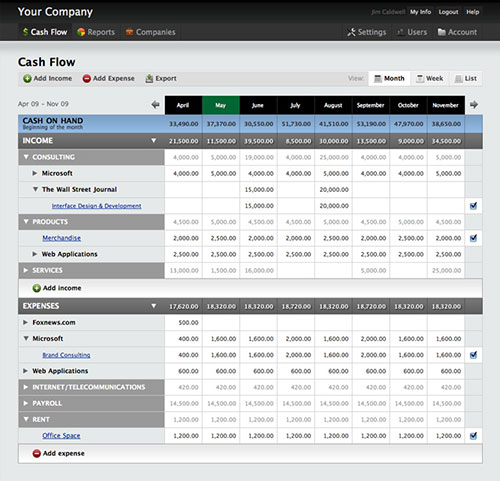
Because Web applications typically deal with large quantities of data that are easily accessible and sortable, tables are unavoidable. But this is not a bad thing. In fact, tables were made for this purpose. Don’t confuse this with table-less layouts. Effective tables are easily readable. So, in most cases you will need a meaningful header, an optimal number of columns, pagination, alternating row colors, proper column alignment, sorting and filtering capabilities and much more.
Tables can also be interactive, meaning they can generate additional info and even modify the data they contain.
Reports
Most businesses work with some kind of reports. Printed reports are usually required, so pay attention to the design of reports. Printed (or exported) reports are usually simplified versions of online reports, optimized for monochrome printers.
Don’t Forget UI Design Patterns
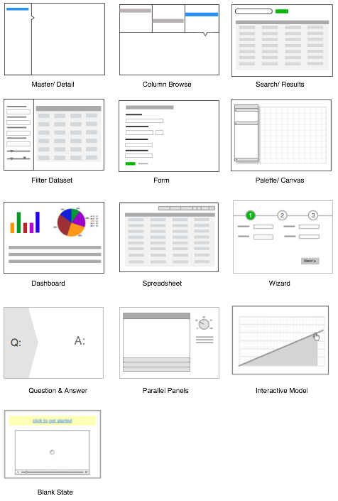
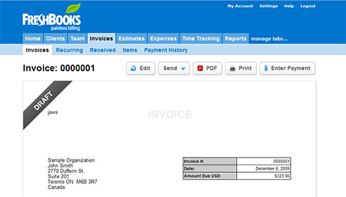
We’re so used to hearing and talking about UI design patterns that we sometimes forget about them! UI design patterns are helpful for designing user interfaces. The important thing is to consider them early on in the design process, ideally at the sketching stage. Because patterns often solve common problems, the right pattern can facilitate the user’s familiarity with an interface and increase the speed at which they learn it.
This screenshot is from the article 12 Standard Screen Patterns, which goes over the most common screen patterns.
Further Reading
- Designing Web Interfaces: Principles and Patterns for Rich Interactions A fantastic book that covers more that 70 Web design patterns.
- 40+ Helpful Resources On User Interface Design Patterns
Case Study: Online Banking Application
To take an example from the real world, I will briefly explain the process of designing the user interface for one small bank’s online banking system. The team I worked with was hired to improve the system. The main reason for the redesign was that, according to management, “users complained and many stopped using it.”
After only a couple of hours spent with actual users, the main problems were uncovered. Information about accounts and credit cards was buried in poor navigation. Understanding how much money users were spending and the state of their accounts and credit cards was also hard. The application, however, was obvious to bank employees; they were familiar with the terminology and could interpreted the numbers in the application perfectly well.
Give the tight deadlines, we followed the process I have described, and we partially succeeded. Despite the short time, the major problems were so obvious that we clearly understood our main task and how to go about it. We created a dashboard that provided clear information on the state of all accounts and credit cards. With this new navigation, finding information became easier. Reports were easier to understand, and several new features were implemented.
Although we made only a few changes, the changes affected critical user tasks and resulted in significant improvements to the overall experience.
Final Thoughts
Designing user interfaces for business Web applications is a challenging job that is full of compromises. You have to make compromises between client and user needs; business requirements and users; novice and expert users; functionality and simplicity. It requires a solid understanding of users and their tasks, as well as of UI design principles and patterns. Despite the difficulties, the job is interesting, and you learn many new things on each project that influence the way you design websites.
While this article reflects some well-known concepts and things I have learned from designing business applications over the years, I look forward to hearing your experiences and stories.


 Celebrating 10 million developers
 Try ProtoPie AI free →
 Register Free Now