How to Create a Promotional Snail Mail Campaign
It’s important to promote your design business. This is especially true when economic times are challenging, you’ve got news to announce, or you’re simply hungry for growth. Many forms of promotion are available to the modern designer – with banner ads and Google AdWords among the most popular. In this digital age, it’s easy for web and graphic designers to overlook one of the most effective and fun forms of promotion: the mail campaign. In an era when people are accustomed to communicating electronically, the value and meaning of something you can hold in your hands is greater than ever before.
Also consider the following Smashing Magazine articles:
- Smart, Effective Strategies To Design Marketing Campaigns
- Designing Badges (And More) For A Conference
- Design A Print-Ready Promotional Ad Using Photoshop and Illustrator
The promo mailer is perhaps most popular among illustrators and graphic designers working for editorial clients, which means that it is a powerful, untapped resource for some web designers. Likewise, it was probably a much more common practice ten years ago than it is today due to the rise of online promotion techniques – but those who ignore its potential are missing out on a tool with the power to gain new clients, increase web traffic, and attract publicity for your business and events.
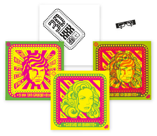
This promotional mailer for Ultra Design Co. includes 3-D posters (complete with 3-D glasses!). Designed by Humberto Howard/UDC
Common types of mailers include postcards and brochures, but designers featured in this article have produced everything from faux newspapers to toys and even promotional eyepatches.
In other words, this can and should be much more than just another opportunity to promote your work. It is also an opportunity to have a heap of fun, think outside the rectangle, and even present former and potential clients with a unique objet d’art. If you give them a piece of art and design that they’re unlikely to forget, then they’ll be unlikely to forget you.
How to Create a Postcard
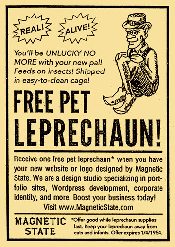
Promo postcard by author and designer Dan Redding at Magnetic State
The type of mailer that you send is limited only by your imagination, but the most common form is the postcard (we’ll look at other forms momentarily). Postcards come in a variety of sizes (standard is 4.25” by 6”) and are available on cardstocks in a variety of weights and finishes. There is no right or wrong way to create a postcard design, but one steadfast rule is that your greatest talents and skills should be in the spotlight. You’ll probably only have a moment to connect with the recipient of your card, so be bold and communicative.
Your design work should go on the front – perhaps your strongest portfolio piece, or a small selection of them – along with your name, URL, and a list of services provided: ‘Illustration and Design,’ ‘Graphic Design and Web Design,’ etc. The back of the postcard usually includes a designer’s logo along with contact information. Some designers will print a huge logo or alternate design back here, while others will leave enough space for a personal, handwritten note. No matter what your design, make sure to consult USPS guidelines to ensure that your design is acceptable for mailing (any quality printing company can assist you with this).
Avoid the Trash Can
If your postcard looks like every other advertisement out there, it will probably end up in the recycling bin. In fact, it might not even make it past the intern that sorts the mail at that publication you sent to. Then it will get recycled, and in a week, your beautiful work will be five percent of a toilet paper roll on a shelf in a Wal-Mart in New Jersey. You don’t want that.
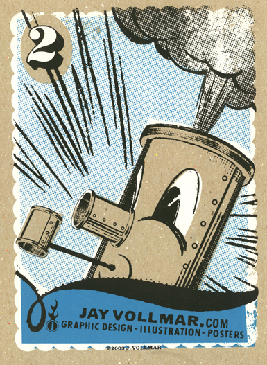
This beautiful, hand-silkscreened promo mailer by Jay Vollmar has a personal touch.
If your card makes it past the perils of the wastebasket and reaches the hands of your addressee – perhaps an Art Director at a record label or the CEO of a startup company - then you’ve done well. If he or she reads both sides and likes it enough to tack it onto the bulletin board for future reference, then you’re in great shape. And if you get a phone call the next time that Art Director has a freelance job, then you’re golden.
Your design work is not junk – it’s your passion - so your promo shouldn’t be junk mail. Make your promo memorable and personal. When it lands in the hands of Steven Q. Client, present Mr. Client with a design that is compelling and appropriate to his industry. Write him a note that is friendly and courteous while reminding him that you hope to hear from him the next time an appropriate freelance project arises. An even better way to make a great impression and stay out of the rubbish bin is to make an unusual or useful product instead of a postcard.
Print Your Design
If you’re very industrious (and you’ve got a good printer), you might print your postcard yourself. But for most designers, it makes the most sense to pay a professional printer to print a few hundred copies of your design.
Choose a print company that will provide accurate colors, high-quality printing, and accessible customer service. There are many of these available on the web; one fine example is Modern Postcard (author’s note: I am not affiliated, just a satisfied customer).
Don’t be wasteful. Check your printer’s environmental policy (a responsible printing service will make this available). Investigate their commitment to sustainability, recycling, and environmentally friendly products. Make your mailers count. Send to recipients who will be interested in your services.
Think Outside the Rectangle
Some designers eschew the pedestrian postcard in favor of a more adventurous option. Here are some creative promotional items that defy expectations.
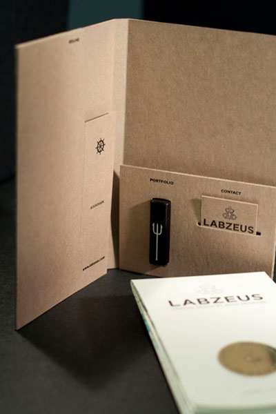
This lovingly crafted mail package from Labzeus/Brian Neumann includes his portfolio on a flash drive. According to Mr. Neumann’s website, “The project involved package design (custom folder with die cuts), letterpress & foil stamping (letterset & folder), giclée printing (fold-out poster, 2-sided), chemical etching (flash drives) and hand embossments (sticker seal and poster front). I also sourced mailer boxes, custom labels and had branded packing tape created to round out the piece.”
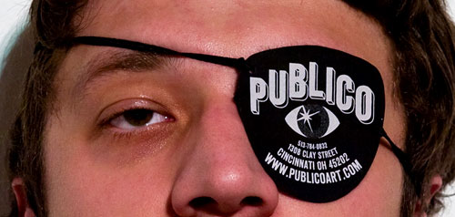
Promotional ‘business card’ eyepatch designed by Paul Coors for the now-defunct art gallery Publico
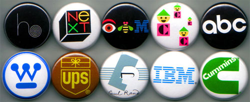
These small buttons are emblazoned the famous logos of design hero Paul Rand. Why not make small gifts or accessories featuring your own work?
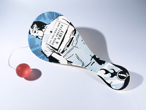
Promotional paddleball toy by Jay Vollmar
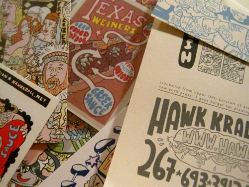
Philadelphia illustrator Hawk Krall sends out ‘mega-packs’ of colorful food-themed goodies. “I get the best response from these,” says Hawk. “I send out about 150-200 of these to my best/newest contacts, made up of 3 or 4 postcards, stickers, tearsheets, hot dog magnets, etc.”
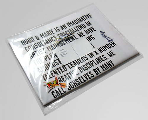
This newspaper-style promotional brochure from Hugo & Marie garnered the consultancy lots of attention both online and off.
A word of advice: if you design an unusual item, says designer Derek Sussner, “take a mockup to the design consultants at the USPS before you show up with 700 things to mail, especially if they are dimensional, fragile, or out of the ordinary. That early consult can save some time, energy - and often, postage costs.”
All About Mailing Lists
So now you’ve got a few hundred copies of your beautifully designed postcard/portfolio brochure/novelty treasure map. Where do you send them? You need a mailing list. A good mailing list is something that you can purchase or develop on your own.
Your mailing list should consist of both former clients and potential clients. You’re contacting former clients to say hello and to reinforce your presence in their minds. You’re contacting potential clients to introduce your work and convince them to visit your site, call you, and ultimately, hire you. With any luck, some of those potential clients will be transformed into enthusiastic former clients list by next year.
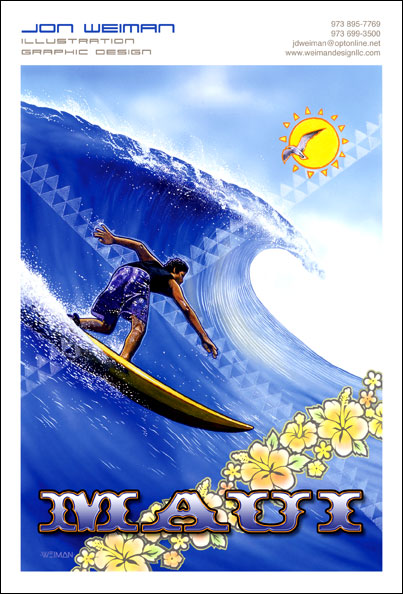
Postcard by Weiman Design LLC
How to Buy a Mailing List
Just like printing companies, a simple web search will turn up many companies that sell mailing lists. In fact, many printing companies are ‘one-stop shops’ that will not only print your mailers, but can also sell you a mailing list and even stamp, address, and send your items for you. If you choose this route, make sure the company you buy from is a reputable one. Get their representative on the phone and ask them what they can offer that’s suitable to your target audience. Make sure their lists were compiled recently and contain accurate information. If the list is over a year old, how many of those contacts have changed employers or positions? If one name is spelled wrong or one office incorrect, your mailer will end up at the bottom of the wastebasket – along with the money you spent developing and printing it.
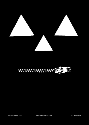
This postcard by Sam Kuo represents the theme of Halloween in New York City. Mr. Kuo has designed many clever mailers that acknowledge pop-culture phenomena and current events.
How to Build your Own Mailing List
For many designers, D.I.Y. (do it yourself) is an ethos to live by. Researching and compiling your own mailing list can be a highly effective and personal way to customize a list to the specific needs of your business. Sending to former clients and contacts is the easy part. But who else can you send to?
In order to build your own mailing list, you’ll need to identify a target audience. If you’re an editorial illustrator working for magazines, you might go to a bookstore and copy down the names and office addresses of art directors listed in the masthead of magazines you’d like to see your work in. If you’re a web designer, you might identify a target market (perhaps you specialize in promotional websites for filmmakers and videographers). Start Googling relevant companies and checking Contact pages for address listings. Don’t be afraid to get on the phone, introduce yourself, and politely inquire about an appropriate contact person who you might send to.
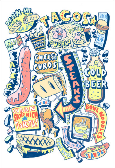
Postcard by Hawk Krall
High and Low
When selecting targets for your mailing list, choose a wide range of recipients. You should choose people and organizations similar to those you’ve worked with before. These potential clients are likely to be suitable to your size, price range, and services. You should also contact your ideal clients – look for your ‘dream job.’ If there are any companies you’ve always wanted to work with, now’s the time to do some research and get in touch. Be resourceful and be professional.
Snail Mail is Your Friend
Whatever you decide to send, calculate accurate postage for each item and buy correctly valued stamps. When in doubt, take your item to the post office and ask questions.
If you’re sending postcards, buy postcard stamps from the postal service. In the U.S., these stamps are cheaper than standard first class stamps and will save you a good deal of money on a bulk mailing.
Send your mail so that it will arrive on a Tuesday or Wednesday (this rule also applies to your email newsletter). Not only is mail volume lighter after Monday, but work volume is lighter, too. Your recipient is likely to have a smaller amount of mail competing with yours for his or her attention on these days. He or she is also more to have a few more moments of attention to devote to something besides the day’s pressing work tasks.
Examples from Sussner Designer Co.
Sussner Design Company (aka SDCo) is a design firm that’s been doing superb (and award-winning) work in Minneapolis, Minnesota for over ten years. Derek Sussner - the company’s “proud owner guy,” according to their website - was kind enough to answer some questions about SDCo’s inventive promotional materials for this article.
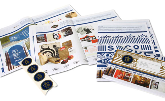
Sussner Design Company Promotional Brochure
“We printed about a 1,000,” Derek says of these newspaper-like brochures of the firm’s design work. “Of those, we mailed out 700. We use the rest as our portfolio when we meet with new clients, or to send to new people we come in contact with. Reflections printed them for us. We have a great, long-standing relationship with them. We create all of Reflections’ promotional materials - so we print our own self-promo materials for trade. These brochures/mailers have been pretty successful for us. And they are a great way to stay in front of people we haven’t talked to in awhile.”
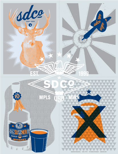
Sussner Design Co. Ten-Year Anniversary Poster
When Derek is asked whether he purchases his mailing lists or generates them in-house, he responds, “Both. The mailing list that works the best is the one we keep in-house. We add people we work with, have worked with in the past, people we’ve met and/or submitted proposals for, colleagues, industry partners, and a few networking friends. We also purchased a list (and we’ve renewed it several times). From what I can tell, we’ve never generated a face to face meeting from the purchased list.”
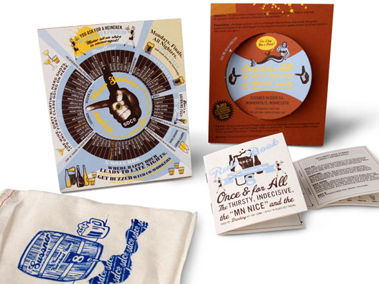
Sussner Design Company Happy Hour Spinner
The Sussner ‘happy hour spinner’ is a whimsical, functional, and extremely clever item that allows the user to put his or her happy hour destination in the hands of fate. The item was the follow-up to a Lunch Spinner, which Derek hopes to re-create soon. “We’re also looking to create a version the can be customized by the recipient - so they can be used by our out-of-town clients and friends.”
Derek’s says the company’s goal for promo mailers “is always that people keep them - and even better - display them on or around their desk. And the best scenario is that it causes them to write you an email or call you with a new project. I also like it when the leftover promos have a life span so you can continue to use them, hand them out, or send them with other capabilities presentations.”
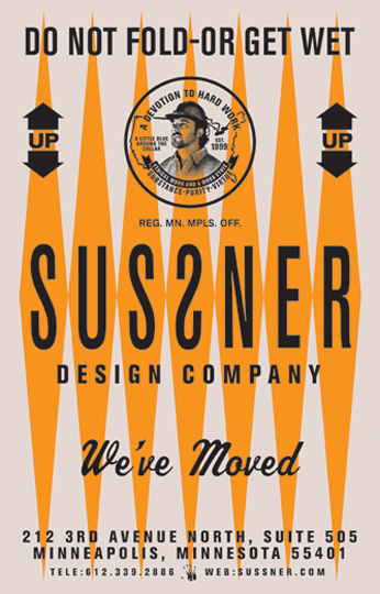
Moving announcements and event notifications are other common types of promotional mailers.
Derek’s advice on the most important attribute of a successful mailer is simple: “It has to grab someone’s attention. Hopefully, it slows the motion of the arm down - if someone notices it on their way to throwing it in the garbage.” The truth of the matter is that all printed promotional matter – no matter how clever – is ultimately disposable. That’s why promo items need to create a mental and emotional impact on the audience’s mind as quickly and deeply as possible.
In Conclusion
Exceptional design work is promotion in itself. Keep your clients happy and follow your own path as an artist and craftsperson. Word of mouth will keep clients and fans of your work coming back to hire you or check in on the evolution of your creative talent. In fact, a designer at one popular screenprinting and graphic design studio contacted for this article said, “You’ll be interested to discover that we actually do not have any promotional material! Our posters have worked as an effective promotional material for us for years. Don’t ask me how, but they do.” The truth is that this award-winning studio stays on top because its designs are exceptional and original each and every time. It has also been in business for many years - accruing clients, awards, and publication in popular design magazines all the while.
However, for designers that work at new or growing businesses – some of which launched during a daunting economic downturn – promotion is a valuable tool. It can also be a great way to express your personal creative energy between jobs for professional clients.
Besides, Thomas Edison once said “Everything comes to him who hustles while he waits,” and Jay-Z said “You can’t knock the hustle.”
So promote, promote, promote!


 Register Free Now
 SurveyJS: White-Label Survey Solution for Your JS App
 Celebrating 10 million developers
 Try ProtoPie AI free →


