Showcase of Academic and Higher Education Websites
College and university websites have a lot of roles to fill. They need to provide information for prospective students (both new and transfer), parents of students and prospective students, current students, and alumni. In many cases, they’re also the gateway to the school’s intranet and the public face for both academics and athletics. They often need to include reams of information in a way that makes everything easy to find. It’s a huge challenge.
And the truth is: most college and university websites are horribly designed. Either they look like they were designed fifteen years ago and then forgotten about, or they’re so overloaded with information that it’s almost impossible to find what you’re looking for.
You may also want to check out the following Smashing Magazine articles:
- Web Design Showcases From Various Industries
- Global Web Design Showcases
- Portfolio Web Design Showcases
But not every college or university website is horrible. There are some excellent sites out there, and below are some of them. If you know others, please share them in the comments to this post!
General Colleges & Universities
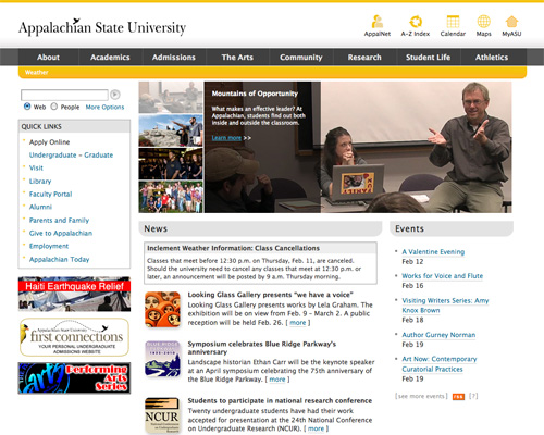
Appalachian State University Appalachian State University has a simple color scheme and makes great use of icons in their header.
Ball State University Ball State University uses a sophisticated color scheme and typography combined with plenty of negative space.
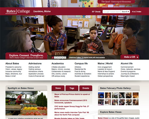
Bates College The bold header and grid-based layout work well on the Bates College site.
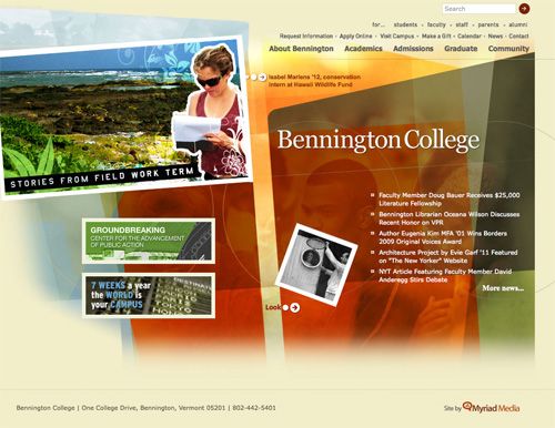
Bennington College Bennington College uses a unique layout and design.
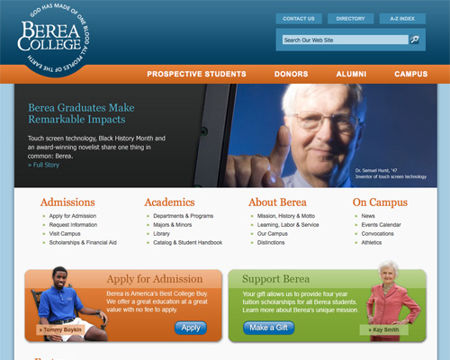
Berea College Berea College uses a clean layout, and the cutout in the navigation bar for the logo really sets it apart.
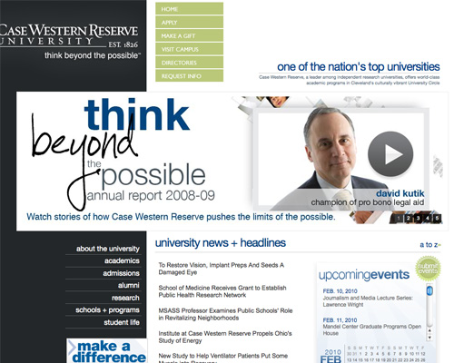
Case Western Reserve University Case Western Reserve University uses a unique layout and color options.
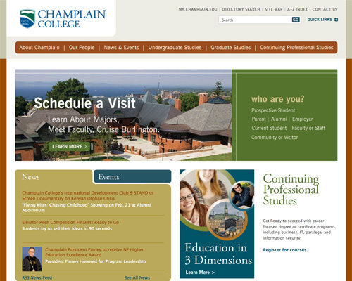
Champlain College Champlain College uses a sophisticated, muted color scheme and excellent typography.
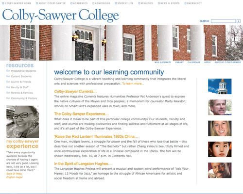
Colby-Sawyer College Colby-Sawyer College has a simple layout with plenty of negative space.
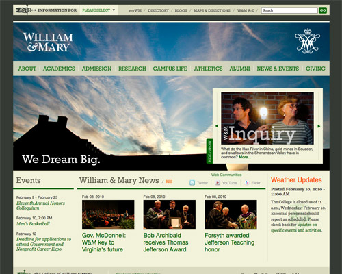
William & Mary The bold header image and excellent typography set the William & Mary site apart.
The College of Wooster The College of Wooster uses an interactive, animated header.
Denison University Denison’s website makes great use of negative space and a simple layout.
Dickinson College Dickinson College’s site has a great color scheme and a subtle background image.
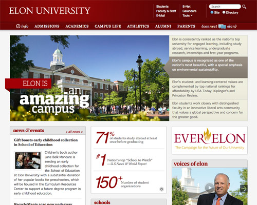
Elon University Elon University’s site includes a lot of details that make the site look really polished.
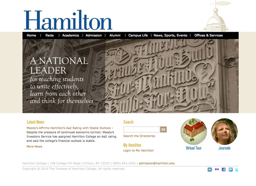
Hamilton College Hamilton uses a simple color scheme and straight-forward navigation.
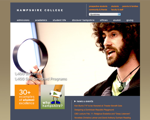
Hampshire College Hampshire College uses a unique, sophisticated color scheme and typography.
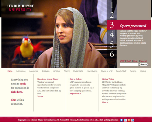
Lenoir-Rhyne University Lenoir-Rhyne University has a clean layout and bold header slideshow.
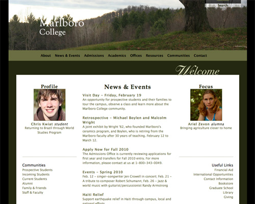
Marlboro College Marlboro College makes good use of a simple layout and color scheme.
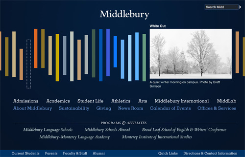
Middlebury College Middlebury College has a completely unique layout with excellent typography.
Minot State University Minot State University uses plenty of negative space and clean typography.
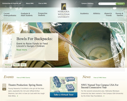
Nebraska Wesleyan University Nebraska Wesleyan has one of the best-looking college sites out there, with a fantastic background image and excellent typography.
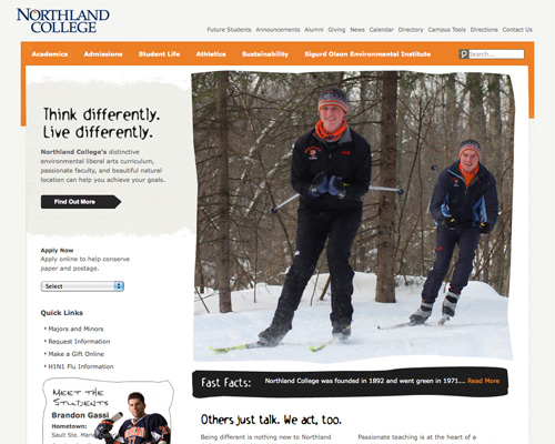
Northland College Northland College uses unique typography and grunge elements to stand out.
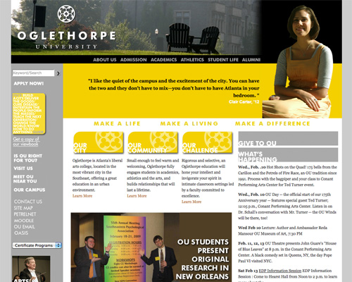
Oglethorpe University Oglethorpe University uses a modern color scheme and typography.
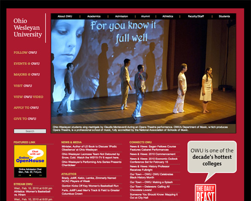
Ohio Wesleyan University Ohio Wesleyan uses a bold color scheme and graphics.
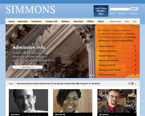
Simmons College Simmons College uses a clean, grid-based layout and sophisticated color scheme.
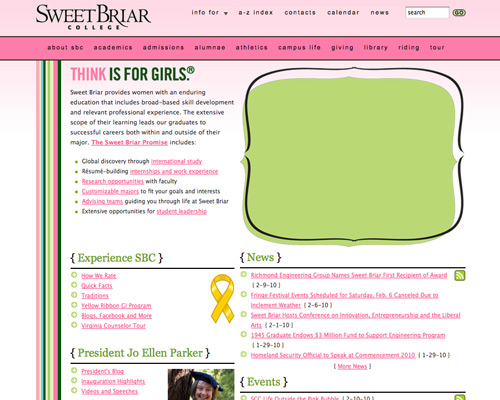
Sweet Briar College Sweet Briar College steps outside of the norm for a college website and uses a more relaxed, feminine design (appropriate for a women’s college).
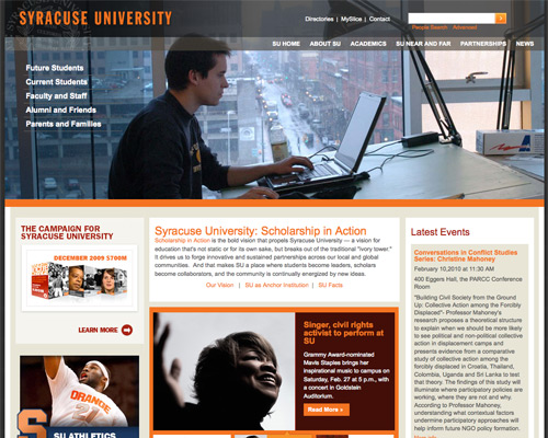
Syracuse University Syracuse University has a fantastic grid layout and modern color scheme.
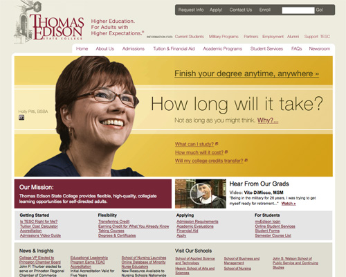
Thomas Edison State College Thomas Edison State College has a great illustration in their header and a sophisticated color scheme.
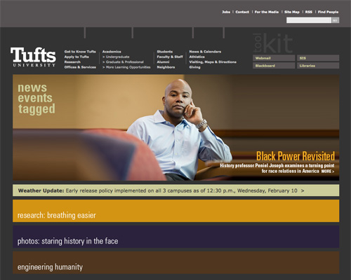
Tufts University Tufts has a unique layout and excellent typography.
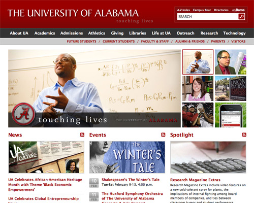
The University of Alabama The University of Alabama uses a grid layout and plenty of negative space.
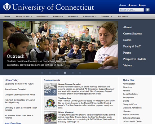
University of Connecticut The University of Connecticut’s site has a simple layout and navigation.
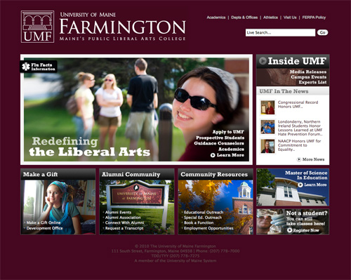
University of Maine Farmington The University of Maine Farmington’s website uses a basic grid layout and great typography.
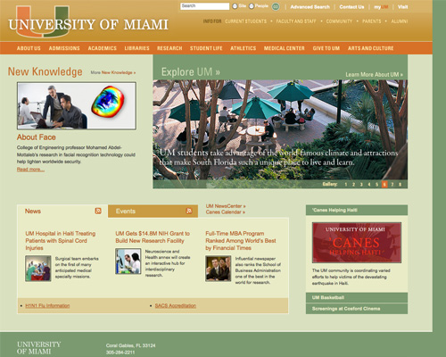
University of Miami The University of Miami uses a muted color scheme and simple, horizontal navigation.
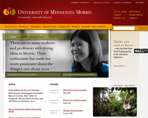
University of Minnesota Morris The University of Minnesota Morris’s site incorporates a number of small details that give the site its polished look.
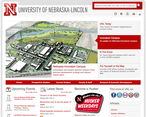
University of Nebraska-Lincoln A simple color scheme and clean, grid-based layout give the University of Nebraska-Lincoln’s website a polished and sophisticated look.
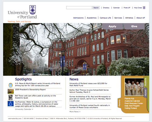
University of Portland The University of Portland uses a simple layout and color scheme with plenty of negative space.
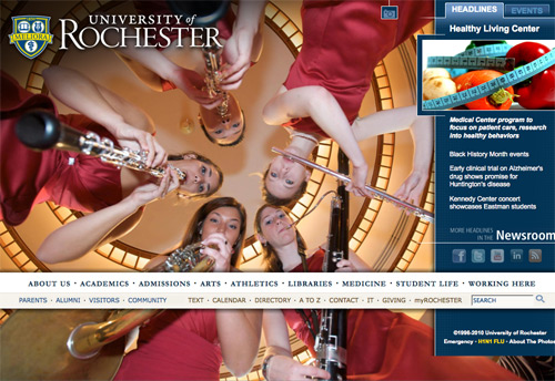
University of Rochester The large background image and non-standard navigation set the University of Rochester’s website apart.
University of the Sciences in Philadelphia The University of Sciences in Philadelphia uses a fantastic bright color scheme and clean typography.
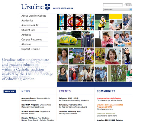
Ursuline College Ursuline College has a simple layout, good typography, and lots of negative space.
Vancouver Island University Vancouver Island University uses a grid layout and fantastic, monochromatic color scheme.
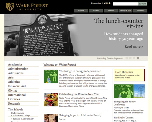
Wake Forest University Wake Forest University’s site has clean typography and a simple layout.
Wesleyan University Wesleyan University uses a grid layout and sophisticated color scheme.
Westmont Westmont utilizes a slideshow header and great color scheme.
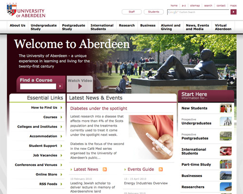
University of Aberdeen The University of Aberdeen has a fantastic grid layout.
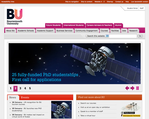
Bournemouth University Bournemouth University uses bright accent colors and tabbed navigation.
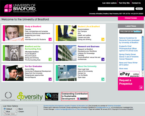
University of Bradford The University of Bradford uses bright accent colors and a grid layout to stand out.
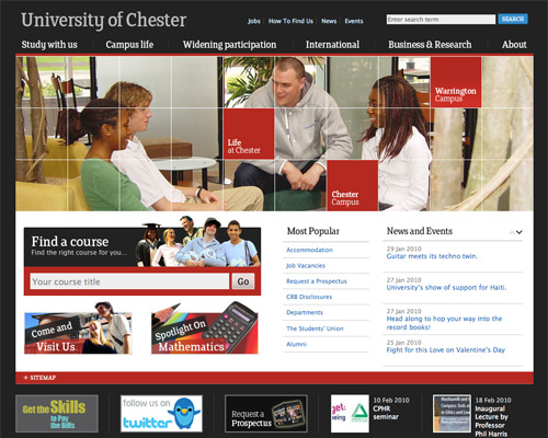
University of Chester The University of Chester uses an obvious grid layout, an animated header, and simple navigation.
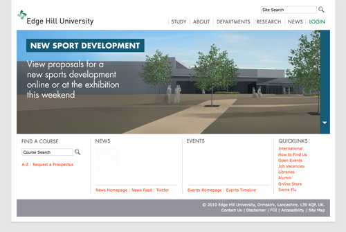
Edge Hill University Edge Hill University has a header slideshow, minimalist color palette, and lots of negative space.
University of Hull The University of Hull has a unique layout, simple navigation, and great accessibility features.
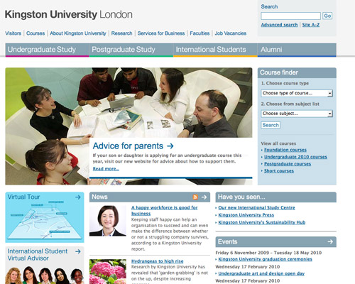
Kingston University London The Kingston University London’s website uses bright accent colors and simple navigation.
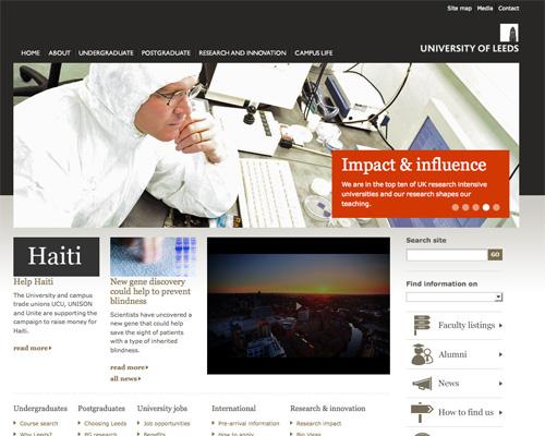
University of Leeds The University of Leeds has a simple layout, minimalist aesthetic, and good typography. They also make excellent use of icons to simplify navigation.
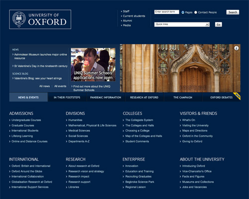
University of Oxford Oxford uses a simple color scheme and clean layout and makes good use of negative space.
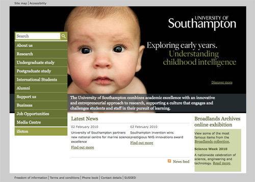
University of Southampton The University of Southampton has a bold header and simple color scheme.
Community Colleges
Salt Lake Community College Salt Lake Community College uses photorealistic and grunge elements, combined with a unique layout.
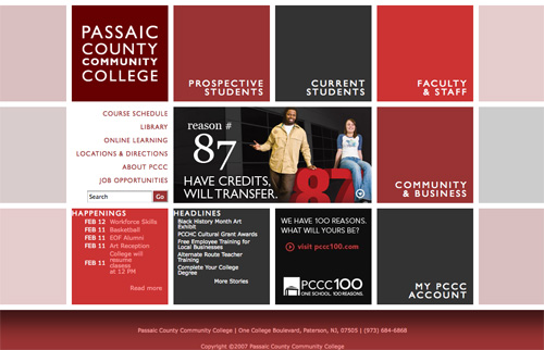
Passaic County Community College Passaic County Community college uses an obvious grid layout and a great color scheme.
Anoka-Ramsey Community College Anoka-Ramsey Community College has a unique color scheme and a good use of negative space.
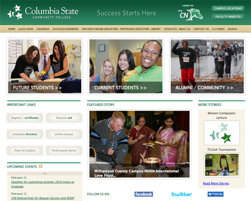
Columbia State Community College Columbia State Community College has a simple layout and color scheme with clean typography.
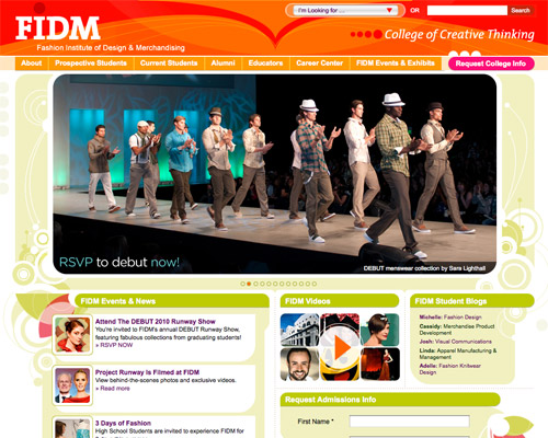
Fashion Institute of Design & Merchandising FIDM uses an excellent bright color scheme and a prominent slideshow.
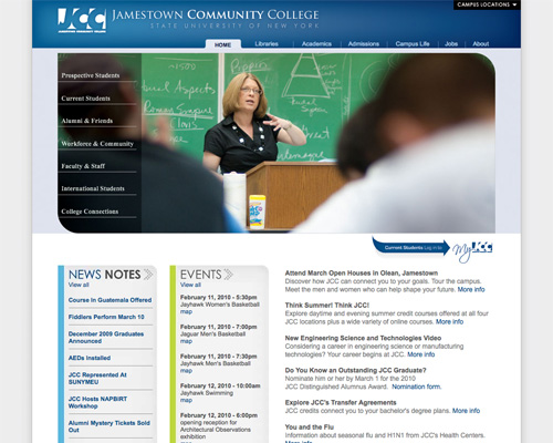
Jamestown Community College Jamestown Community College’s site has a simple layout and navigation.
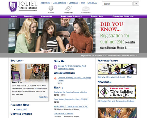
Joliet Junior College Joliet Junior College has a simple layout with a good use of icons.
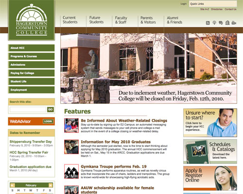
Hagerstown Community College Hagerstown Community College has a good color scheme, clean typography, and simple navigation.
Lone Star College System Lone Star College System makes good use of transparency.
Washtenaw Community College Washtenaw Community College has great hand-drawn elements, and a unique layout and color scheme.
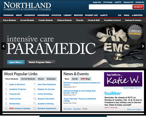
Northland Community & Technical College Northland Community & Technical College has a sophisticated layout and color scheme.
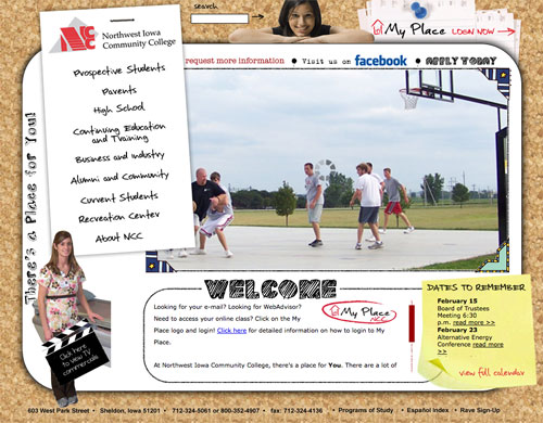
Northwest Iowa Community College The Northest Iowa Community College site uses a mix of collage, photorealistic, and hand-drawn elements.
Art and Design Colleges & Universities
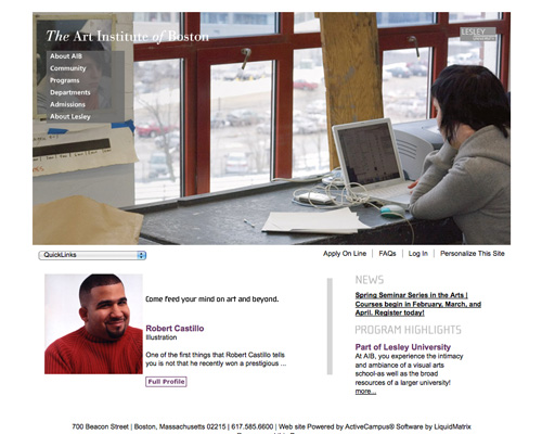
The Art Institute of Boston The Art Institute of Boston combines a simple layout with bold header graphics.
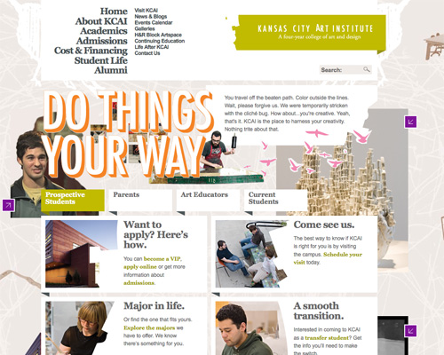
Kansas City Art Institute The Kansas City Art Institute uses bright colors, a collage-style background, and loose grid layout.
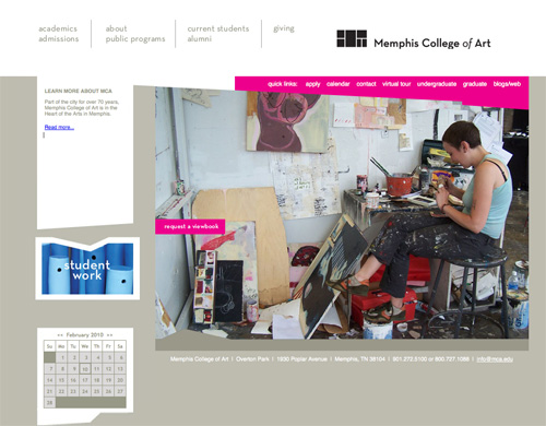
Memphis College of Art The Memphis College of Art site uses bright bright pink accents combined with a simple design and clean typography.
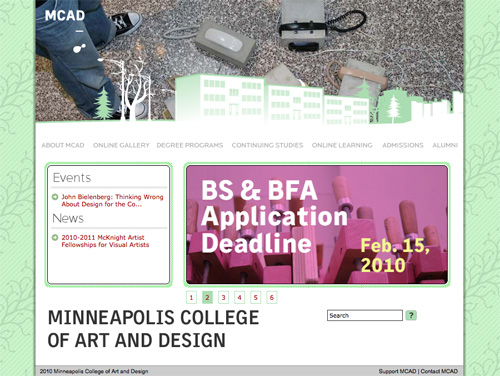
Minneapolis College of Art & Design The patterned background, animated header, and clean typography set the site of the Minneapolis College of Art and Design apart.
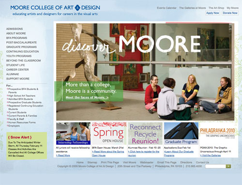
Moore College of Art & Design Bold graphics and a textured background makes the Moore College of Art & Design site stand out.
The Ontario College of Art & Design The Ontario College of Art & Design uses a grid layout and modern orange and white color scheme.
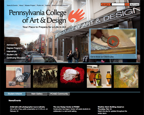
Pennsylvania College of Art & Design The Pennsylvania College of Art & Design uses a modern color scheme and bold header.
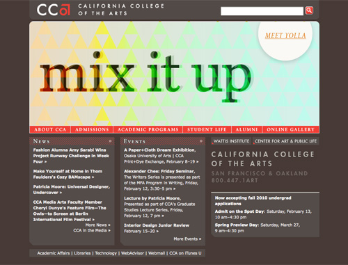
California College of the Arts The California College of Arts uses a unique color scheme and animated header.
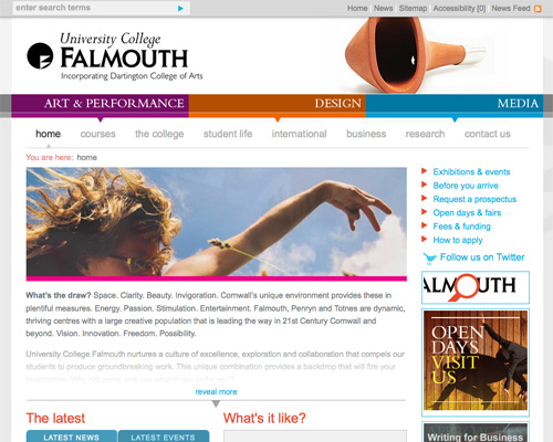
University College Falmouth University College Falmouth’s site has bright accent colors, lots of negative space, and simple layout and navigation.
Maryland Institute College of Art MICA uses a grid layout, muted color scheme, and excellent typography.
SCAD SCAD’s minimalist light-on-dark design sets it apart.
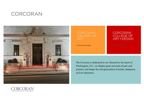
Corcoran College of Art & Design Corcoran’s mix of minimalist grid design and bold colors is fantastic.
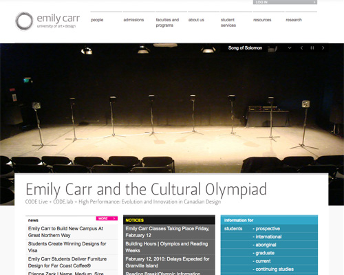
Emily Carr University of Art & Design Emily Carr University of Art & Design has a wonderful minimalist layout and clean typography mixed with bold accent colors.
Oregon College of Art & Craft Bold background, great typography, excellent navigation.
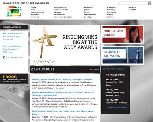
Ringling College of Art & Design The grid layout and bold background give the website of Ringling College of Art & Design a unique look.
Other Institutions, Colleges & Universities
Asian University for Women The Asian University for Women’s site has an excellent gold and maroon color scheme and plenty of negative space.
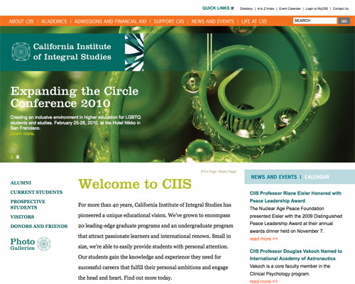
California Institute of Integral Studies The bold typography and great color scheme of the California Institute of Integral Studies sets it apart.
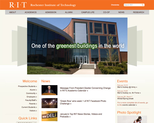
Rochester Institute of Technology The orange and cream color scheme, simple navigation and clean typography make the Rochester Institute of Technology’s site unique.
Conclusion
While the vast majority of college and university websites out there are in need of serious overhaul, there are some fine examples of sites if you look hard enough. If designing a site for a college or university, remember that simplicity and negative space are both important, regardless of the amount of information a site needs to contain.


 Register Free Now

 Celebrating 10 million developers
 SurveyJS: White-Label Survey Solution for Your JS App