Useful Design Tips For Your iPad App
Design For People
Apps will define the iPad, it’s true. But in developing your app idea, which comes first, the idea or the device? Good news: neither. It’s people! When brainstorming and researching ideas for your app, step back and consider the context in which the device will be used by real live people. How does the iPad fit into our lives? In what situations would we prefer this device to a laptop or iPod Touch?
Who Are Your People?
Ideally, your target audience includes you, but using this as a reason to decide that “I know what people like me want” could lead you to miss out on opportunities to enrich the product beyond your imagination. Surprises await when you consider the variety of people who might use your product. Your target audience may be different than what you think; or in defining your target audience, you may find that your product is missing important features.
For example, with our application (a drawing tool), our initial target audience included early-adopter techies. But after some analysis, we saw that the interface needed to be greatly simplified so that the children of the techies would also enjoy the app.
Tip: Define your target audience. Who are they? Where do they live, work and play? What challenges do they face? Give one of them a name, a job, a family, a car; then see how your perspective changes.
What Is Your People’s Story?
Defining a target audience is only half of the equation. Now you have to put your audience into action! What do they do in their daily life? How will their daily life intersect with your product? Get into their minds. Try this, and I guarantee it will lead you down some expected and unexpected paths.
You don’t need fancy software to do this. Below is an example of our use case sketches for our application. After writing out a few use cases, we learned that people lose interest in drawing games when they’re forced to create original artwork. Many people will say, “I can’t draw,” but they still have a desire to create beautiful things. Originally, we planned for our app to ship with patterns, similar to the classic Lite-Brite toy, but it didn’t occur to us that people would play with the app more if we provided pre-fab patterns and templates for them to color. Pretty important feedback!
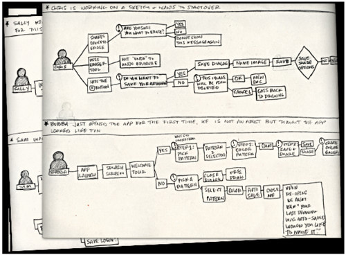
In developing the idea for an app, our use cases revealed that the replay value of such an app is low unless you provide patterns for the user to get started.
Tip: Think about the device in terms of lifestyle rather than features and technology. Will the iPad’s unique characteristics and environmental and sociological factors make your idea resonate with people?
- It’s lightweight = “I’ll carry it more places than I would a laptop.”
- It’s smaller than a laptop = “It’s discreet. Would I crack open my laptop to do some work in a waiting room? No. Would I switch on my iPad? Yes.”
- It has robust utilities and multimedia capabilities = “I can work and enjoy books, movies and games.”
- Its screen is larger than the iPhone’s = “I can consume more media with less eye strain. My kids will be entertained on a road trip.”
- It has Wi-Fi and 3G Internet connectivity = “I can be online on a plane, train or car.”
Designing for people is critical to weeding out weak (i.e. unprofitable, untargetable or unmarketable) ideas quickly and to developing a product that not only meets but anticipates the target audience’s needs.
Minimalism Works Best on iPad
With robust, portable, location-aware devices like the iPad, the temptation is to throw in everything and the kitchen sink. If you’re an iPhone developer, you’re probably excited about the additional screen real estate. Resist the temptation to fill the space! Keep it simple. Display only the content and controls that are relevant to the user at that moment. This requires you to use the following two things in your interface design.
Contextual Menus
Contextual menus are a great way to keep your UI out of the way. We wanted to keep sharing and community features out of the primary navigation. We used a contextual menu (“Share this thang!”) to present actionable items at the appropriate time.
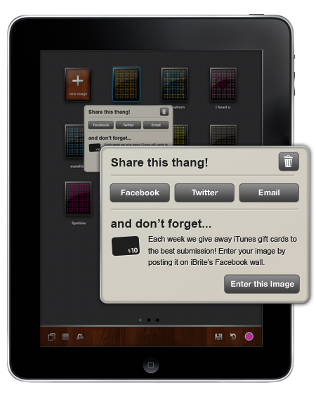
Example of a contextual sharing dialog, activated when you tap and hold on an image.
Modal Views (but Wisely)
With the increased real estate on the iPad, one can build in robust functionality that is impossible on an iPhone or iPod Touch screen. Modal views give you another way to organize your application; they give the user clear “modes” of operation; and they can be an elegant solution to UI clutter if executed wisely.
For example, “photos” on the iPad could operate similar to iPhoto on the desktop Mac. You have two “modes” of operation:
- View or edit an individual photo,
- Manage groups of photos.
In each scenario, packing the viewing, editing and managing functions into one view wouldn’t make sense. Think of how you could segment features in your app, while maintaining a smooth connection between the two modes.
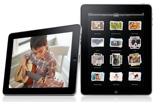
iPhoto has two modes of operation: viewing and editing a photo or managing photos.
Tip: What is the bare minimum your app could provide and still be useful to users?
iPad’s Two Orientation Are A Big Deal
Being able to switch views—landscape to portrait and back again—is not unique to the iPad, but it’s a bigger deal on it. This is where paper prototyping will save you from wasting loads of time in Photoshop.
Having to consider every element of your app in these two sometimes radically different layouts is like designing for two devices… except that you’re not designing for two devices. The trick is to keep the experience consistent in each view, allowing for a seamless user experience when switching views.
Below is a color palette we tested for our app. The palette looks great in landscape mode but absolutely hogs the screen in portrait mode. Oops.
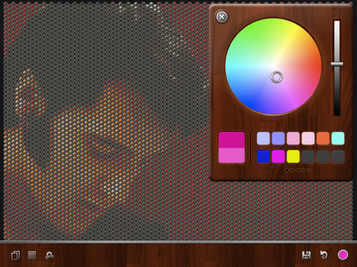
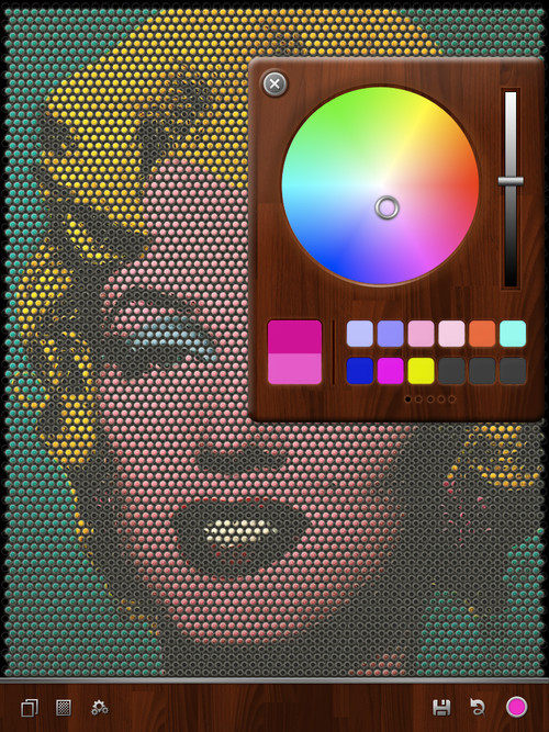
This palette looks okay in landscape mode but gobbles up the interface in portrait.
We reconfigured the color palette to have a smaller footprint in both landscape and portrait modes:
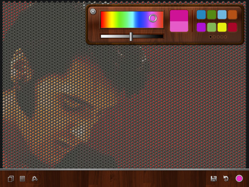
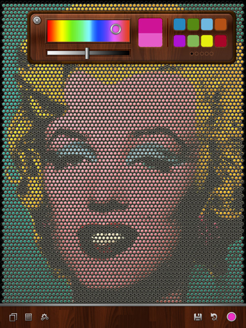
A streamlined color palette allows accessibility while staying out of the way in both landscape and portrait views.
Tip: Paper prototype all of your screens in portrait and landscape modes… a lot.
Use Touch And Real-World Metaphors
Touch changes how we interact with, edit and perceive on-screen elements. With the iPad’s larger screen, touch and gestures are turbo-charged. A quick run-down of unique UI elements on the iPad:
- Select and take action on multiple items at once by dragging them to another area of the screen.
- See both a list view and details of items in that list view (e.g. Mail).
- Edit elements in place rather than from a global menu bar.
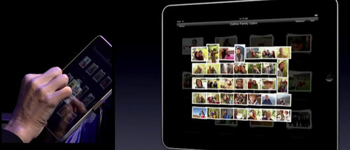
Spread your fingers over a stack of photos to spread them out for viewing, as you might in the real world.
Tip: Think of how you interact with things in the real world. Think of the on-screen elements as tangible things.
Design For Dynamic Content
The iPad’s portability and bigger screen size gives users unlimited possibilities for quickly creating and sharing robust dynamic content on the go. Hybrid apps (i.e. native apps that draw from Web pages or that load real-time Web content) are becoming more common as users demand connectivity to Web-based tools. Designing for dynamic content means working through the challenges and opportunities of dealing with an Internet connection (e.g. slow downloads or lost connection). Think of what visuals you would present to users when they’re stuck in East Bum with no connection to be found!
Tip: Plan for problematic situations in your design.
Get Started!
The first step to getting started is downloading the iPad SDK. For Web developers looking to get into iPad development with their current skills, products such as Appcelerator’s Titanium offer a good way to build native iPad, iPhone and Android apps in JavaScript.
Further Reading
- Ten Things To Think About When Designing Your iPad App
- Web Development For The iPhone And iPad: Getting Started
- How To Make A Physiology-Friendly Application For The iPad
- A Dad’s Plea To Developers Of iPad Apps For Children


 SurveyJS: White-Label Survey Solution for Your JS App
 Celebrating 10 million developers
 Register Free Now


