Designing For A Hierarchy Of Needs
Is this true? Or could a design that’s hard to use still succeed because it makes users more proficient or meets certain creative needs? Do you have to get all of the low-level needs exactly right before considering higher-level needs? To answer these questions, let’s start by looking at Maslow’s hierarchy.
Maslow’s Hierarchy Of Needs
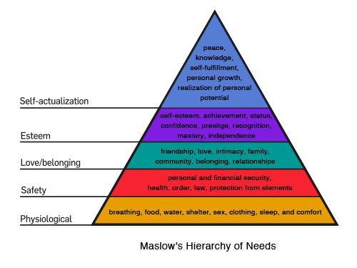
In his 1943 paper, “A Theory of Human Motivation,” American psychologist Abraham Maslow proposed the idea of a psychological hierarchy of needs in human beings.
- Physiological needs are the requirements for human survival. They include breathing, food, water, shelter, sex, clothing, sleep and comfort.
- Safety needs can be seen as a way to meet tomorrow’s physiological needs. They include personal and financial security, health, order, law and protection from elements.
- Love and belonging needs are about social interactions. We don’t want to go through life alone. Social needs include friendship, love, intimacy, family, community, belonging and relationships.
- Esteem needs include self-esteem as well as recognition from others. Esteem can come in the form of achievement, status, prestige, recognition, mastery, independence and responsibility.
- Self-actualization needs relate to becoming more than what we are, and they can come from peace, knowledge, self-fulfillment, realization of personal potential, personal growth and peak experiences.
According to Maslow, if you try to satisfy the needs of one level in the hierarchy without having first met the needs of the prior level, your place in the hierarchy will be unstable. You can’t be expected to work well on a team (level 3) if you’re awaiting medical test results to determine whether you have cancer (level 2).
Lower levels in the hierarchy serve as the foundation for higher levels. If your foundation shakes, then you get pulled back down to a lower level to stabilize your foundation before moving back up the hierarchy. If not, you’re led to thoughts and feelings of stress and anxiety.
Criticism of Maslow’s Hierarchy
Not everyone agrees with Maslow. Many challenge the hierarchy because it doesn’t account for selfless acts, bravery and charity. Nor does it account for the phenomenon of “starving artists,” who seek self-actualization even while their basic physiological needs are hardly being met.
Critics point to a lack of empirical evidence and the limited scope of observation before Maslow developed his theories. Maslow doesn’t account for the spiritual side of people and leaves out too many instances that don’t fit his theory. A good idea and start, perhaps, but still far from being accepted as is. Intuitively, it feels right, but Maslow’s hierarchy has limitations, as summarized below:
While Maslow’s hierarchy makes sense from an intuitive standpoint, there is little evidence to support its hierarchical aspect. In fact, there is evidence that contradicts the order of needs specified by the model. For example, some cultures appear to place social needs before any others. Maslow’s hierarchy also has difficulty explaining cases such as the “starving artist” in which a person neglects lower needs in pursuit of higher ones. Finally, there is little evidence to suggest that people are motivated to satisfy only one need level at a time, except in situations where there is a conflict between needs.
Chilean economist and environmentalist Manfred Arthur Max-Neef has put forth a different theory of fundamental human needs, one without a hierarchy beyond the fulfillment of basic human survival. Instead, the satisfaction of needs is inter-related and pursued simultaneously, with trade-offs in the process.
In this system, one could fulfill creative needs without having first to fulfill needs for protection and safety.
Design Hierarchy of Needs
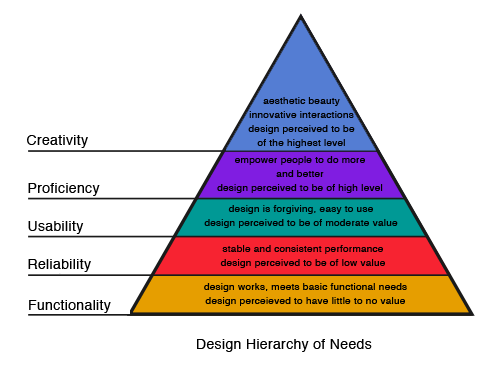
Maslow’s hierarchy can be translated to design, for which the hierarchy from low to high would be functionality, reliability, usability, proficiency and creativity.
Functionality
A design must be able to function before anything else. An MP3 player needs to be able to play, pause, rewind and fast-forward MP3 and other digital audio files in order to be considered an MP3 player. If it can’t perform these functions, then the design has failed.
Number of features is another story. Even though one MP3 player can pull in album cover art, others don’t necessarily have to. But if most MP3 players can do this, then yours will need to as well. What defines which features are required? The product itself? The designer? The market?
Designs that meet only basic functionality needs are considered to be of little to no value. A design is expected to meet basic functionality needs; doing so isn’t considered anything special.
Characteristics of a website that meets functionality needs might be pages that load in a reasonable amount of time, working links and pages that respond to basic browser buttons like “Back” and “Forward.”
Reliability
Once your design has met functional needs, it can move up to the next level in the design hierarchy: reliability. Your design should now offer stable and consistent performance. It not only works, but works again and again.
If your MP3 player sometimes plays and sometimes doesn’t, then it has failed to meet reliability needs. If it always plays but does it erratically (skipping here and there, slowing down and speeding up at times), then it has also failed to meet reliability needs.
Designs that meet only reliability needs are perceived to be of low value. Again, we expect the products that we buy to work and to work consistently.
A reliable website functions consistently. What worked yesterday should work today. When new pages and sections are added, they function just as well as existing pages and sections.
Usability
How easily can users accomplish basic tasks? Can the person with the MP3 player easily figure out how to turn it on and off? What about how to play, stop, pause and select a song? These are usability needs. Your design now works consistently. The question is, can people figure out how to use it?
In addition to being easy to use, is your design forgiving? Pressing the wrong button shouldn’t delete all of the songs on your MP3 player. Consequences for simple mistakes shouldn’t be dire. If a slip of the finger deletes all music, then the MP3 player has failed to be usable.
Usable designs are perceived to be of moderate value. We do have some basic expectations of usability, but we recognize that many things don’t quite work as we expect or would like. A usable design partly distinguishes your website from those on lower levels.
A usable website has a navigation system that is easy to understand and use, an organization that makes content easy to browse, readable text, and a layout in which orienting oneself is straightforward.
Proficiency
Does your design empower people to do more and to do better? Does the MP3 player allow you to build playlists and easily search through songs? Does it provide an easy mechanism for downloading songs from the Internet and transferring them to and from other devices?
These are proficiency needs. It is not imperative that your MP3 player makes recommendations of new songs based on your favorites, but it is desirable and would improve the design considerably.
Designs regarded as proficient are perceived to function at a high level. A design that allows people to do things not previously possible and to expand on basic functionality is considered to be great.
A proficient website might include advanced search options, the ability to combine data from different sources into more sophisticated levels of information and Web-based tools.
Creativity
Once all of the lower-level needs have been met, your design can move on to creative needs. With these met, your design can now interact with people in innovative ways. The design can explore and create things that expand on the product itself.
Perhaps your MP3 player teaches music theory by making recommendations based on the musical structure of the songs you listen to most, and it provides chord charts and notes that play visually in time with the audio. Your MP3 player might allow custom skins or allow you to combine parts of songs to create new music. Your MP3 player might be the most beautiful one on the market.
Designs that meet creative needs are perceived to be of the highest level. They generate a loyal fan base. If you’re confounded by Apple’s success, wonder no longer. It satisfies creative design needs.
A creative website might include AJAX effects, aesthetic appeal and interaction through voice commands.
Criticism of the Design Hierarchy
The same criticism applied to Maslow’s hierarchy could be applied to the design hierarchy. Does a design have to be reliable before it can be usable? Can’t you meet both at the same time? Could your design satisfy proficiency needs for advanced users while not being the most usable for beginners?
Do we really have to get everything right at one level before committing resources to higher levels? Will a market tolerate a product that fails for no reason 10% of the time if it does everything beyond expectations the other 90%?
Again, while the hierarchy intuitively makes sense, the needs and desires of the market will likely determine what is most critical to improve in the hierarchy.
Other Hierarchies of Needs
Maslow’s hierarchy has been applied to more than design. Many related disciplines use it to describe what they do and propose how to do it better.
Maslow Applied to Marketing
Maslow’s ideas are often applied to marketing. Whatever you are selling, the product is intended to fulfill a need somewhere in the hierarchy. To best market your product or service, identify where in the hierarchy it sits, and understand your target user’s motivation to meet those needs. A classic example is Michelin Tires. Rather than simply list the specs of its tires and boast how well they grip the road, Michelin commercials show tires that are protecting babies, with the tagline, “Because so much is riding on your tires.”
The commercial taps into our need for safety. It also tap into the next level in the hierarchy, our social needs—in this case, our love for our children. Specs are boring. A story about making sure that you and your family are safe satisfies deep psychological needs.
Maslow’s hierarchy also helps us determine which market to target and how best to reach that market. For example, you have a great idea to fill the niche demand for confidence-building. Fantastic.
But you’re targeting new business owners. This group is at level two in the hierarchy: security. They’re worried about their jobs and supporting their family. They don’t care yet about feeling confident.
You would need to find either a different story to tell in your marketing or a different group to target.
Maslow Applied to Writing Code
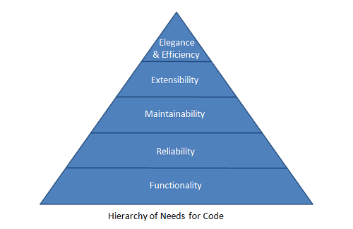
Patrick Dubrow has looked at Maslow’s hierarchy and the design hierarchy and has put forth a hierarchy of needs for writing code:
If you’ve ever written code, you can easily see how this hierarchy fits in with both Maslow’s and the design hierarchy. It too is intuitive and could be given the same criticisms as Maslow’s. Sure, poorly functioning code has to be fixed right away, but there’s no reason one couldn’t write elegant and efficient code from the very first line.
Resources
Here are a couple of additional hierarchies based on Maslow’s:
Examples
All of the websites below are well designed. Each has its own style and, for our purposes, addresses a different level in the design hierarchy. Most naturally meet lower-level needs, but some are more concerned with higher levels and neglect some lower-level details.
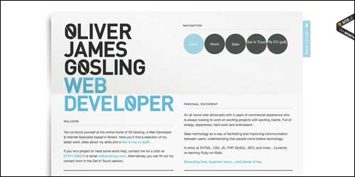
The websites of Oliver James Gosling and Y3K are both single-page portfolios. They both meet functionality and reliability needs. They are also aesthetically pleasing and start to meet creative needs. Oliver’s website has a “Back to top” link that moves down the page as you do; this nice touch in usability is absent on the Y3K website. Oliver also offers a PDF containing all the information of his website, perhaps adding a bit of proficiency to the design.
Cellar Thief Cellar Thief meets functionality requirements and is another aesthetically pleasing website. The aesthetics match the overall message about wines. But reliability and usability could both stand some improvement. The three main links at the bottom of the home page (“Choose a wine,” “Tell your friends,” “Feel good”) all lead unexpectedly to the “About” page. Also, the website sells only the three wines of the day, which is perfectly fine but not immediately obvious.
Elan Snowboards Elan Snowboards meets basic functionality and has an interesting aesthetic. A lot is going on, and it’s hard knowing where to look. Links aren’t always obvious, and as you click deeper into the website, it’s not always clear where you are. On the other hand, the website offers a forum, community blogs and video, all of which make the website more proficient for visitors. Overall, the website focuses more on higher-level needs at the cost of some lower levels. Given the audience of the website, this approach is probably justified.
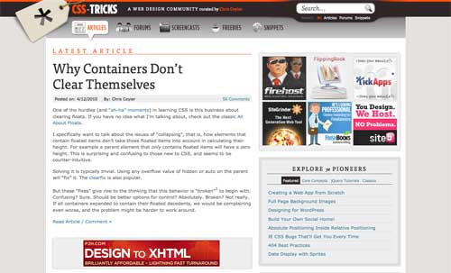
CSS-Tricks CSS Tricks is likely familiar to most of you. It meets needs of functionality, reliability and usability. Chris Coyier has sections for a forum, screencasts, freebies and code snippets, giving the website a layer of proficiency. Creatively, the website has a nice, albeit familiar, blog aesthetic, and it has appropriate touches of AJAX in the sidebar. Chris has also put a lot of work into small details that help to fulfill creative needs.
Ali Felski Ali Felski’s website is a combination portfolio and blog. It functions consistently, and finding your way around is easy. With the three lower-level needs met, the website adds creativity. One of the nice things about the design is that you could remove all of the aesthetic touches and still have a highly functional, reliable and usable design.
Antique Piano Shop The Antique Piano Shop meets all the lower-level design needs while offering a pleasing aesthetic. It meets proficiency needs by offering pages where you can identify your piano and sell it. Given the nature of the website, letting visitors hear what the pianos sound like might have helped to meet proficiency needs.
Fluid 960 Grid The Fluid 960 Grid System meets lower-level design needs well. It works, works consistently and is easy to use. While not the most beautiful page you’ll encounter, it has quite a few things to meet higher-level design needs. Most every part of the page is a working demo. You can view how each will work using either the jQuery or MooTools libraries, or you can turn JavaScript off completely to see how the demos function. You can also switch between 12- and 16-column fluid and fixed grids.
Summary
While Maslow’s hierarchy makes sense intuitively, critics point out the scant evidence to support it, particularly the assumption that lower levels must be satisfied before higher levels. The same could be said of the hierarchy of design needs, or even any hierarchy based on Maslow’s. They make sense on the surface but lack in empirical evidence.
These hierarchies are not absolutes that you must follow. As with all design, look at your success criteria to determine your design objectives. Your audience may well prefer an aesthetically beautiful website that has occasional hiccups to a boring website that is perfectly reliable.
There’s no reason why you couldn’t satisfy higher-level needs before completely satisfying all lower-level needs, as long as you understand that some low-level needs are absolutely essential. Naturally, if none of your pages load, then everything else is irrelevant. You will have to remedy that problem before worrying about progressive enhancement.
Look at the design hierarchy as a guide. Most of the time, meeting lower-level needs before attempting to satisfy higher-level needs makes sense. If your website isn’t usable, you will probably want to fix that before giving visitors more ways to be proficient.
Further Reading on SmashingMag:
- The Personality Layer
- This Interface Is A (Good) Joke!
- Fixing A Broken User Experience
- How Do You Deal With Overstressed, Irrational Clients?


 Try ProtoPie AI free →
 Celebrating 10 million developers
 SurveyJS: White-Label Survey Solution for Your JS App

