Showcase Of Web Design In The Netherlands
The Netherlands, also known as the “Low Countries,” is a small, crowded, muddy piece of land through which a few big important rivers fortunately run. In this country, you can find coffee shops, wooden shoes, tulips, windmills and a lot of water.
And everything is rather small! Well, at least most of the architecture is. How cute is that? But it’s also the land that brought the world many great painters, famous architects, and excellent graphic, fashion and interior designers. We all know Rembrandt, Van Gogh, Mondriaan, Rietveld, Koolhaas, Escher, Droog Design and Viktor & Rolf, don’t we?
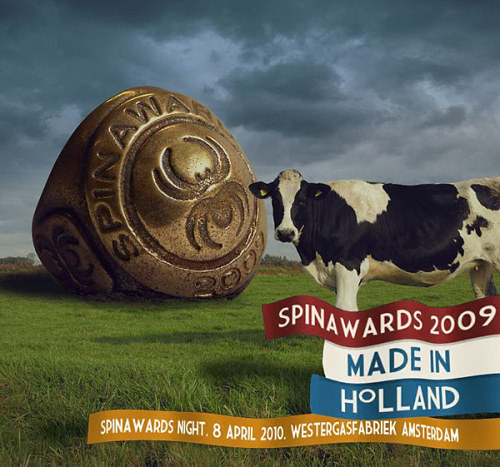
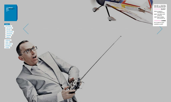
Dutch Web Design: Spin Awards
State Of Affairs
Can the Dutch be proud of its Web design community? Is it capable of producing great websites? Has the community earned a place in Web design land, or is Dutch Web design still in its infancy?
A Virtual Discussion About Dutch Web Design
I invited a diverse group of Dutch Web agencies and freelancers to discuss the state of Dutch web design.
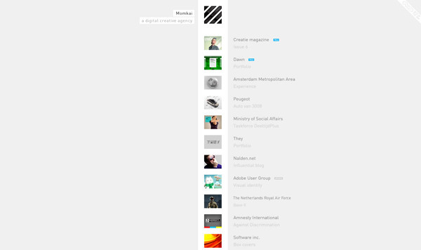
- Harald Dunnink, creative director at Momkai
- Wimer “Monokai” Hazenberg, art director at Booreiland
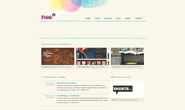
- Rogier Strobbe, Frish Design Studio
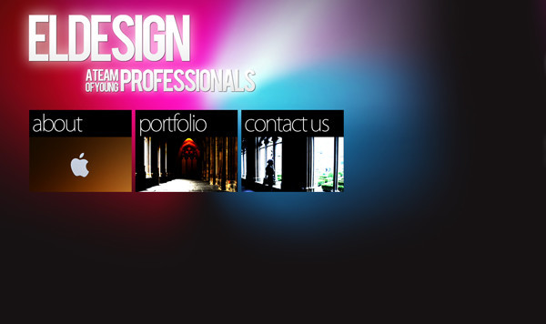
- Erik Leutscher, Eldesign
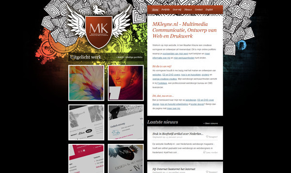
- Maarten Kleyne, creative designer
- Woud Hobbelink, Designphunk
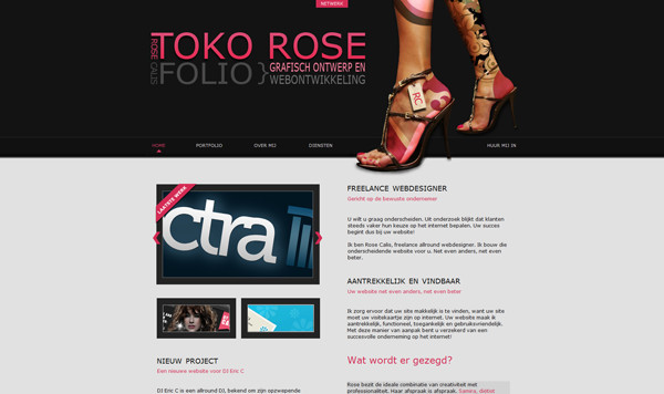
- Rose Calis, Toko Rose
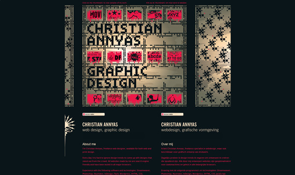
- Christian Annyas, freelance Web and graphic designer
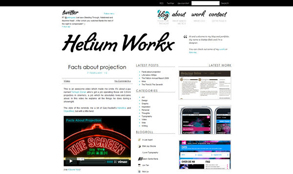
- Mattijs Bliek, Helium Workx
- Michel Branco Bio, Branco Creative Studio
- Ewout van Lambalgen, illustrator and Web designer
- Erik van Nieuwburg, Rumbling Skies
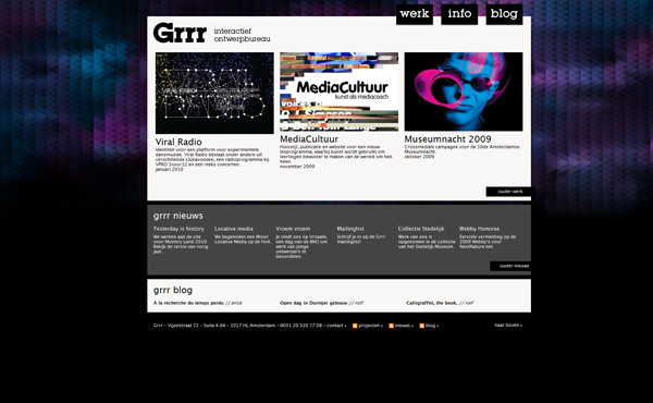
- Rolf Coppens, Grrr
- Jonno Riekwel, Jonnotie
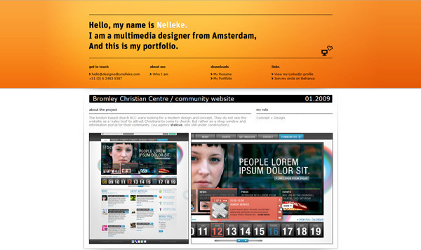
- Nelleke van der Maas, Designed By Nelleke
- Caspar Hardholt, MediaCT
- Marten de Jongh, graphic designer at e-sites
Can Certain Web Design Characteristics Be Called Typically Dutch?
Erik van Nieuwburg: “There is a very typical Dutch school of architecture, photography and graphic design. But in the field of Web design, I do not see a typical Dutch identity. Perhaps this has to do with the international nature of the Web.”
Maarten Kleyne: “I do not think you can pin this down as, ‘This is pure Dutch Web design so let’s hang it on our wall next to the wooden shoes, tulips, cheese and other things.’”
Harald Dunnink: “A certain clarity and simplicity characterizes Dutch design. For myself, I try to bring the traditional conception of creativity, aesthetics and clarity of Dutch design into the digital domain.” Christian Annyas has a similar opinion. Also, Woud Hobbelink agrees and feels that sometimes, Dutch Web designers seem reluctant to experiment. The products are usually somewhat stiff.
Rolf Coppens adds: “Simplicity and conceptual working are characteristics you often find in our Web design.” Caspar Hardholt has a similar opinion: “I think Dutch Web design is less complicated and very natural. As the Dutch saying goes, ‘Just act normal — that’s crazy enough.’ And I guess we don’t like stock photography. We make it more personal.”
Erik van Nieuwburg: “Dutch Flash projects are more about being functional than about having rich animations, at least when compared to many English-language projects.”
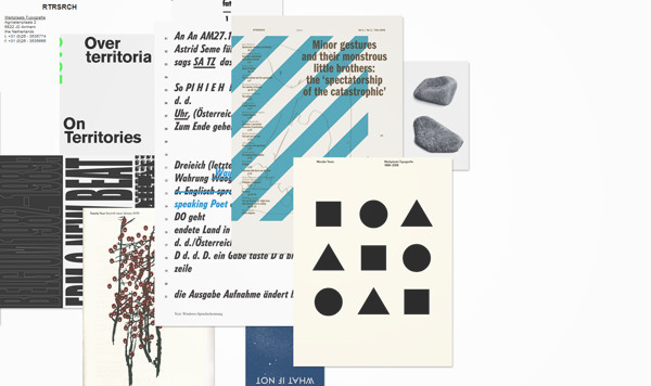
Rogier Strobbe: “If I may pick out one element that the Dutch have been known for, it is surely typography. We have some of the best typographers in the world. Think of Gerard Unger, Martin Majoor and Jos Buivenga. Of course, the Web has never been known for its rich typography, but let’s hope that @font-face and initiatives such as Typekit will change that and take typography to the next level in the coming years.”
Rose Calis adds: “The big Dutch Web design agencies still control both the market and the appearance of most designs on the Web. Freelancers spend a lot of time on the latest trends, as their designs often show. But I think the Netherlands is running a bit behind.”
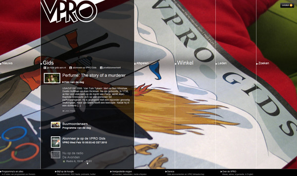
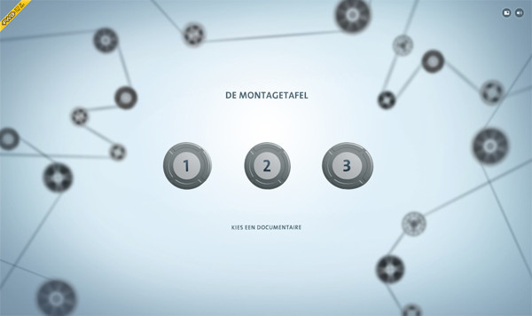
Dutch Web Design: VPRO
Christian Annyas nods approvingly: “It is hardly innovative. With the exception of a few.”
Marten de Jongh: “Best of all worlds!? The Netherlands is a multicultural society, and that’s what you see in its designs. Brazil is known for its illustrative qualities, the North Americans own the drop-shadow and use a lot of glass effects, and the French are more artistic. I think the Dutch have a little of everything.”
Michel Branco reflects: “Dutch designers characterize themselves as ‘unconventional’ and not mainstream. Perhaps an appropriate term for Dutch web design would be ‘unconventional Web design.’”
Is There A Dutch Web Community?
Wimer Hazenberg: “There is a Dutch design world, I think. Whether or not we can identify with it is another question — not with the establishment in any case, like Lost Boys.”
Mattijs Bliek: “Yes, there is one, but you have to search for it. My experience is that it is found mainly in the Amsterdam area, which certainly appears to be a creative hot spot in the Netherlands. I find that being around other designers who challenge and inspire you is really good.”
Erik Leutscher: “Web design is an Internet profession, which means that all you need to become a successful Web designer today can be found on the Web. I don’t think a ‘Dutch’ Web community exists.”
Nelleke van der Maas: “I’m not sure. I don’t meet up regularly with other Web designers, apart from the new year’s drinks organized by creative recruitment agencies like Aquent. But because I freelance for advertising agencies in Amsterdam, I often see the same people at events, conferences and the Spin Awards.”
Ewout van Lambalgen: “I’ve never noticed anything. I work as a freelancer, and I mainly follow international websites.”
Jonno Riekwel: “There isn’t a huge Web community in the Netherlands. Not that I know of anyway. I regret not having a community or organization that allows Web designers to come together more often, as Fronteers does for front-end developers.”
Harald Dunnink: “I prefer to be around people who love their profession, who are ambitious and creative. This could be a creative developer, illustrator, artist or designer, but also a baker.”
Erik van Nieuwburg: “The Flash community is a true ‘community,’ with much cohesion, because the group of people who make a living off Flash isn’t a very big one. I think it’s a great community, where you can often get immediate help with complex issues. At conferences, like Flash on the Beach and Flash in the Can, you can meet up with Flash celebs like Keith Peters and Mario Klingeman, drink a beer or two and jabber away with them!”
What Does A Web Designer Or Agency Need To Be Eye-Catching?
Jonno Riekwel: “Plenty of design companies are in the Netherlands, but you really stand out when you’re transparent and do good things. Like Mangrove, which organized an evening to watch Objectified. Agencies should do stuff like that more often.”
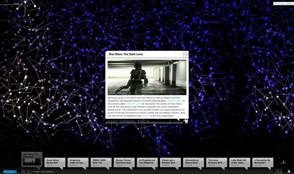
Erik van Nieuwburg: “If you are building a blog, for instance, you could see how WordPress does it, but you could also think about how the user would want it exactly. A great example is Nalden, where the established concept of a ‘blog’ was completely flushed down the drain.”
Wimer Hazenberg: “Do not accept the Web 2.0 style blindly. Go back to the basics, and from there you can create something that serves someone’s needs. We all know the basic styling tricks. It is more about finding a fitting solution to the issue at hand.” Ewout van Lambalgen agrees: “Don’t look too much to what other designers do, because it will only affect your own designs. (Un)consciously, you would always be copying from others, and then you wouldn’t stand out from the crowd.”
Caspar Hardholt: “You will be successful if you make your customers more successful.”
Matthijs Bliek: “To be completely honest, I do not like the term Web designer, because it limits you. Mike Kus puts it well in his article on 24 Ways: ‘A key factor in creating something original and fresh for the Web is to stop thinking in terms of Web design. Don’t design for the Web, just design.’ Do something crazy!”
Christian Annyas: “90% of all designers in the Netherlands are typical mediocre designers. The world of Web design primarily consists of rehashes of old recipes.”
Rose Calis, who has just started freelancing: “First, put everything you do on a list before you officially start as a freelancer. A beautiful and technically well-built website is not enough. A customer might give up on a poorly drafted briefing that is full of technical jargon. Be unique and refreshing, and above all keep investigating. You’re never too old to learn.”
Nelleke van der Maas: “A portfolio that not only looks beautiful but shows that the designer has thought about usability. Attention to detail makes me notice someone. Have they put effort into designing their own icons, for instance? Or have they used nice typography, unusual navigation or any new technologies?”
Woud Hobbelink: “Experimenting. Freaking out with your Photoshop/Illustrator document!” Erik Leutscher agrees: “Dare to violate the rules. You might screw up a project once, but learn from your mistakes and become a better designer.” And Harrald Dunnink puts it succinctly: “Talent, the will to work hard, a healthy kind of dissatisfaction and a computer.”
Maarten Kleyne: “Sometimes innovation can be found under the hood of a design and can be more innovative than the design itself.”
Matthijs Bliek has these words of wisdom: “Take up new technology such as HTML5 and CSS3.”
Conclusions
The Dutch are individualists. Despite having created a big pile of outdated websites, this small community is getting its creative act together. Web designers from the Low Countries generally love clear design, incline towards minimalism and prefer to work conceptually.
Given the rich graphic history of the Netherlands, there is still much honor to gain on the Web. Hopefully, @font-face will accelerate this development.
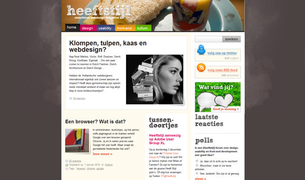
Heeftstijl.nl
There is no distinct Dutch Web community, considering the Dutch are individualists and internationally oriented. The industry is fragmented, unprotected and not well represented. The only Web design blog that tries to give the Dutch community a face and contribute to a sense of high-quality design for the country is Heeftstijl. Perhaps it is worthy of the term “Dutch Web design.”
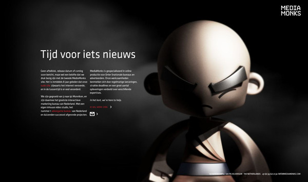
Certainly, inspiration can come from many different sources. Erwin Olaf is highly valued, as is poet Wim T. Schippers. Dutch designers refer to Bas Ording (Apple OS X), Momkai, Delta (Boris Tellegen), the late Kioken Inc., Jos Buivenga and Mediamonks as sources of inspiration.
And Now You Decide, With a Showcase
Adobe User Group
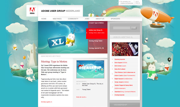
Iwit
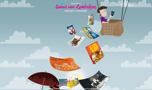
G-Star Next Raw Reporter
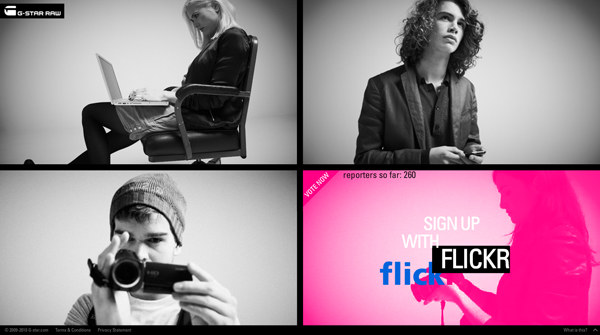
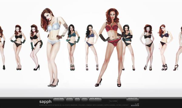
Sapph Lingerie
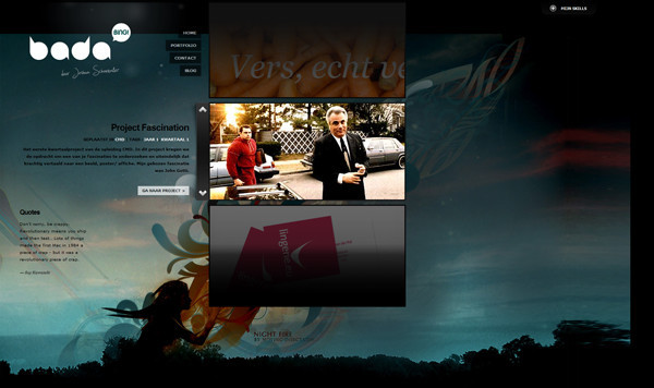
Badabingdesign
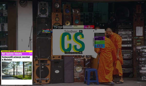
VenhoevenCS
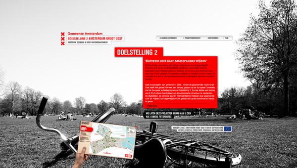
Doelstelling2
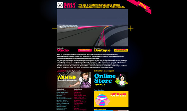
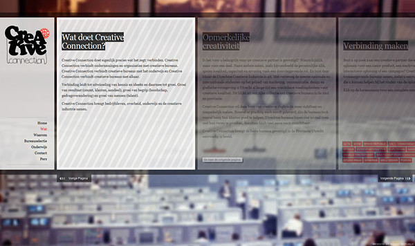
Dutch Design Agencies Showcase
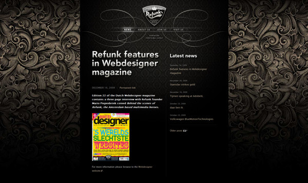
Refunk.com
Biqini
Designer Showcase
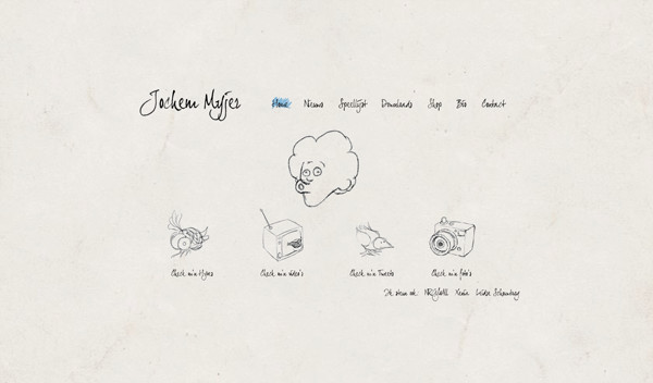
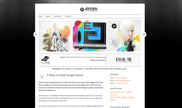
Jeroen van Eerden
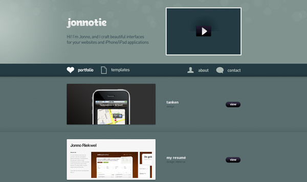
Jonnotie
Special thanks to Maarten Kleyne, Momkai, Frish, Eldesign, Designphunk, Toko Rose, Christian Annyas, Helium Workx, Branco Creative, Iwit, Booreiland, Rumbling Skies, Grrr, Nelleke, MediaCT, Marten de Jongh and Jonno Riekwel.
Related Posts
You may be interested in the following related posts:
- Showcase of Web Design in China
- Showcase of Web Design in Israel
- Showcase of Web Design in Russia
- Showcase of Web Design in Germany
- Showcase of Web Design in Mexico
- Showcase of Web Design in Ireland


 Try ProtoPie AI free →

 SurveyJS: White-Label Survey Solution for Your JS App
 Celebrating 10 million developers

