The Designer Who Delivers
Determining Factors In Number Of Mock-Ups To Deliver
As the owner of a small business, I have watched our company grow from a part-time, basement-dwelling, under-the-radar operation to a small business with an office, chairs, desks, and staplers (aren’t staplers an indication of legitimacy?). During this process of breaking out of our egg shell, we have birthed a company culture and a set of best practices, and we have gained valuable experience in the field of Web design and development. One of these nuggets of experience is acquiring the ability to save time and money by creating just the right amount of visual material to communicate clearly with both the client and website developer.
Further Reading on SmashingMag:
I won’t even bother asking whether you’ve ever been assigned to create a custom Web application with an intricate UI, only to see your client pretty well freak out and tell you that it’s completely the opposite of what they had in mind. And let’s be honest: they freaked out not because they’re Web infants who drool every time a Flash intro pops up, but because you failed to communicate the project and its functionality.

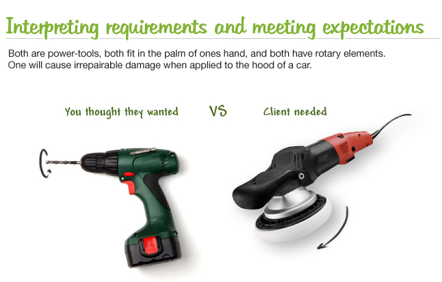
Don’t get me wrong. Your UI was probably slick. It ran fast, the scripts were minified, it had sprites for all button and UI elements. From a technical and design standpoint, it was as hot as the BMW Mini Cooper back in 2007. The only problem was that your client was looking for a pickup truck.
Our approach to Web design and number of mock-ups is usually based on the size of the project. For the purpose of this article, I’ll break projects into two categories: the brochure website (i.e. a content-oriented website about a company or individual) and the application website.
Brochure Website
For small websites, I recommend you sit down with the client and spend a good hour just learning about their business. Before this meeting, all you probably had to start with was an email from your cousin saying something like, “Listen, Mike over at Gadget Inc. wants a cool site that will be #1 on Google.” After your meeting, though, you will be amazed at the quantity of relevant information that your client shares with you. Don’t be afraid to ask questions: information that would normally be difficult to extract is but a question away when you’re sitting face to face. Your inquisitive attitude will also reassure the client because it indicates that you’re genuinely interested in solving his business problems.

Now that you have a wealth of information, you should be able to deduce what the client really wants (it might not be exactly what you originally thought). Make sure you understand well what websites they like and the reasons they like them, along with the colors, logo and other visual cues that might help you get started on the design. If your client has not yet committed to you and is waiting on a proposal, you may want to provide a single mock-up with your proposal. A mock-up is often a worthwhile investment on a larger project, because it creates an emotional attachment with the client and speeds up the bidding process.
This more or less sums it up for small websites: clear communication with the client helps you establish a good base to work from, and the number of mock-ups should be kept to a minimum if you’re good at listening. In case you get stuck on a minute detail that the client doesn’t like, you could always post your mock-up on ConceptFeedback.com or Smashing Magazine Forums and get some feedback from other designers. Most of the time, peer opinion will sway the client to your side if you know what you’re doing.
Application Website
Larger projects and Web applications are a completely different beast and should be dealt with accordingly. Your requirements for the project will arrive as a request for proposal (RFP), sealed in a gold-encrusted money-scented envelope and put together by a project lead. A committee of people will be responsible for the content, functionality and goals of the website, and their opinions will be slightly different. The job of the designer and/or team lead will be to interpret the client’s requirements and communicate them visually to the development team.
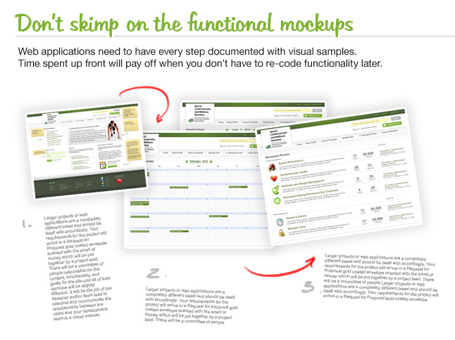
I have learned that written technical specifications are only as good as the people who read them. Your developers will understand them, but your client committee will interpret them in as many ways as there are people on the committee. Your responsibility, then, is to illustrate the project for both teams. All of the items mentioned above for the small website still apply, but you will also need to build an information architecture map, functional flow, interaction mock-ups and more. As you’re working through these visual elements, consider using some of the tools available on the Web to get feedback from a wider audience.

While mock-ups that encompass detailed functionality are a costly venture, they are simply the best thing you can do before writing a line of code, because an illustration will give your client the right expectations. As a Web development company, you would also be fortunate to have Web designers who understand mark-up, AJAX limitations, accessibility and readability implications and more. We have had some curious interactions with designers who made fantastic brochures but couldn’t mock up a single screen of a website UI.
This approach, while time-consuming at first, will save hundreds of development hours, because the application will behave and look the way the client expects. Your information hierarchy and functionality mock-ups will allow your developer to work completely independently from the designer, with minimal interruption and questions.
Recommended Tools
- Concept Feedback, for idea-sourcing and design feedback;
- Basecamp for project management;
- Photoshop and Illustrator, for creating mock-ups;
- Balsamiq for functionality mock-ups;
- Gridding;
- Using a Grid as Background;
- Freshbooks, for tracking time;
- Paper and pen, for initial mock-ups.
Red Flags
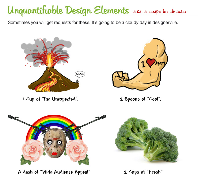
Even if you follow these guidelines and wield a creative stylus, you will have conversations or get emails that should set off alarms in your head. These communications usually start with, “This is not as hip as I wanted,” or “I was expecting something unexpected,” or “We really want it to look social.” These statements are problematic for a couple of reasons, the first being that you have a limited budget and time frame for the project and have already used up some of them. The second problem is that these statements are as ambiguous as Ricky Martin’s sexuality (not anymore, eh?).

Well, just as with the requirement-gathering phase, your focus here should be to drill to the heart of these statements and figure out what exactly is meant by each. The work you have already done can usually be salvaged, and the client might want nothing more than a different illustration, color combination or font stack. I suggest approaching this with changes that require little effort. Start with small tweaks, and then send the mock-ups. Continue with moderately complex changes, and then send the mock-ups. Rinse and repeat. What you will find through these small adjustments and your communications is that the negativity in their initial email was actually an exaggeration of a small issue.
Lessons Learned
The route you take in a successful project will depend on the size and composition of your team and your ability to communicate with the client. The more projects our team completes, the more strongly we believe in visual communication, which falls strictly on the designer’s shoulders. It is also safe to say that a Web designer is a mixed and intricate breed of professional: an individual who must understand business, be able to read customers, stay creative and fresh with visual solutions, and be technical enough to understand Web technology limitations and best practices.
Additional Articles
- 45 Incredibly Useful Web Design Checklists and Questionnaires
- Free Printable Sketching, Wireframing and Note-Taking PDF Templates
- 50 Free UI and Web Design Wireframing Kits, Resources and Source Files
- 40+ Helpful Resources On User Interface Design Patterns
- How Many Ideas Do You Show Your Client?
- How to Respond Effectively to Design Criticism


 Register Free Now


 SurveyJS: White-Label Survey Solution for Your JS App
 Celebrating 10 million developers

