Imagine A Pie Chart Stomping On An Infographic Forever
According to statlit.org, statistical literacy is the ability to read and interpret summary statistics in the everyday media: in graphs, tables, statements, surveys and studies. Statistical literacy is needed by data consumers.
You may also want to check out the following Smashing Magazine articles:
- The Do’s And Don’ts Of Infographic Design
- Data Visualization: Modern Approaches
- Fun With Physics In Data Visualization
- Designing Flexible, Maintainable Pie Charts With CSS And SVG
The importance of statistical literacy in the Internet age is clear, but the concept is not exclusive to designers. I’d like to focus on it because designers must consider it in a way that most people do not have to: statistical literacy is more than learning the laws of statistics; it is about representations that the human mind can understand and remember (source: Psychological Science in the Public Interest).
Can you notice what’s wrong with this infographics? You will find a detailed answer below, in the showcase of bad infographics.
As a designer, you get to choose those representations. Most of the time this is a positive aspect. Visual representations allow you to quickly summarize a data set or make connections that might be difficult to perceive otherwise. Unfortunately, designers too often forget that data exists for more than entertainment or aesthetics. If you design a visualization before correctly understanding the data on which it is based, you face the very real risk of summarizing incorrectly, producing faulty insights, or otherwise mangling the process of disseminating knowledge. If you do this to your audience, then you have violated an expectation of singular importance for any content creator: their expectation that you actually know what you’re talking about.
Anyone would be hard-pressed to find fault with the desire to make life prettier, but every color-coded geometric shape that you add to your awesome new “Lady Gaga vs. Eyjafjallajökull” infographic brings us all one step closer to something going horribly wrong. Most designers would probably not edit a politician’s party affiliation in a news article to make the text wrap in a way that is more pleasing to the eye. With data, though, careless designers all too readily sacrifice truth for the sake of aesthetics. Lovecraft’s eldritch horrors will rise only when the stars are right, but the preconditions for bad visual representations are already in place:
- Demand for graphs, charts, maps and infographics has increased.
- Increased data availability and more powerful tools have made it easier than ever to create them.
- But you probably don’t have a solid understanding of how to interpret or process data.
- Nor likely do your readers.
- And there’s a good chance that neither of you know that.
Do you hear that fateful, fearsome ticking? You’ve given your audience a time bomb of misinformation, just waiting to blow up in their faces. Perhaps they will forget your inadvertent falsehood before they harm someone with it, but perhaps they will be Patient Zero in an outbreak of viral inaccuracy. Curing that disease can be excruciatingly difficult, and even impossible: one of the more depressing findings in psychology is that trying to set the record straight can muddle it further. The lesson is clear: provide the right story the first time. But the staggering variety of awful visualizations online makes it equally clear that designers haven’t learned that lesson yet. Let’s see just how bad it can get.
Showcase Of Bad Infographics
Large view (Source: The Nation)
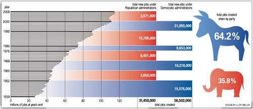
Yikes! Note how enormously misleading the red and blue bars are. There is absolutely no reason for their presence in this graph. Even if they were actually scaled to the number of total new jobs, a two-axis graph would still be difficult for most people to understand. The figure also doesn’t take into account a host of potentially confounding factors, including (but not limited to) population growth, women entering the workforce, shifts from part-time to full-time jobs, change in wages and GDP change.

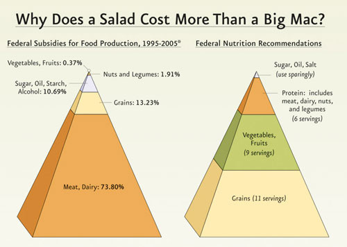
Large view (Source: Physicians Committee for Responsible Medicine in Good Medicine Magazine)
This graph circulated fairly widely for a while. The design of the food pyramid changed recently, in part because the visual characteristics of the old pyramid did not correspond well to the numerical recommendations. The new designer makes the same mistake but disdains “misleading” in favor of “mind-bogglingly dishonest.” The bottom tier of the left-hand pyramid takes up far more than 73.80% of the pyramid’s area, and the 3-D diagram enhances that distortion even further. Want a fun party game? Hide the numbers and ask your friends to guess what they are!
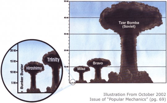
This classic suffers from the same problem as the food pyramid: the odd mushroom shape makes seeing the correct relationship impossible at a glance. The disparity between Bravo and Tzar Bomba is like a bad joke… and the punchline? In real life, doubling the destructive power of a nuclear blast doesn’t even come close to doubling the height of the resulting mushroom cloud.
Large view (Source: The Economist)
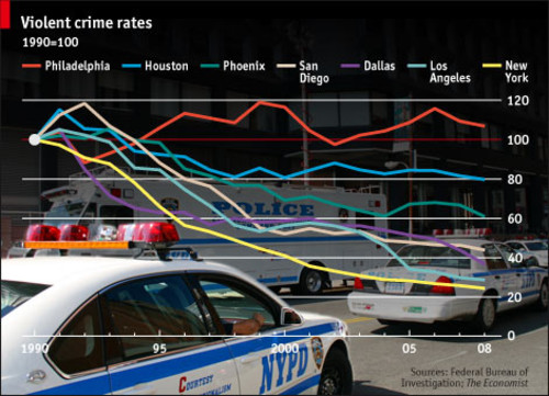
The flashy background and bright colors must have distracted this graph’s creator from the fact that it’s useless. Think the graph is describing crime rates? Think again. It actually describes the percentage change in violent crime rates. New York at 20% of its 1990 crime rate could still be more violent than Philadelphia at over 100% of its 1990 crime rate. If you want to know how dangerous these cities really are, you’ll have to look elsewhere.

Large view (Source: New Scientist)
There have been worse pie charts, but this one is bad in a subtle way. The point of a pie chart is presumably to facilitate a comparison of land use, but this pie chart makes that very difficult. Given the combination of the huge number of categories and the huge change in their values, this would have been better rendered as a table.
Large view (Source: Somethingawful Forums)
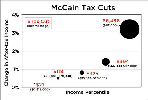
This graph is a painful experience all around. Income is described as “percentile” but is shown in ranges. The category labels are placed randomly around the data points, rather than at the bottom where they belong. The data points are tremendous circular blobs that are impossible to compare at a glance. And that’s with only five data points!
Large view (Source: Somethingawful Forums)
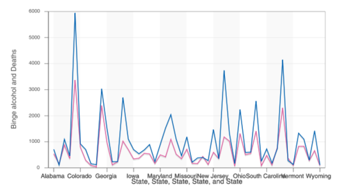
This is a line graph of binge drinking and suicide rates. Wait, scratch that: it’s an abomination, Alphabetically ordered lists of states belong in tables—maybe—and that’s only if you wouldn’t prefer to index them by some variable or another. Two-axis charts are as bad as any idea, especially when it’s not clear what the two variables actually are. But the worst part? It isn’t population adjusted. The states with the most deaths are the states with the most residents: California, Texas, New York and Florida. Knowing that someone made this and thought enough of it to post it on the Internet makes me want to drink.
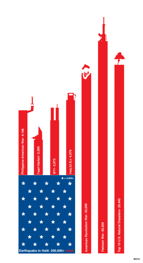
Large view (Source: in MOCH)
A certain measure of artistic expression is a great thing. This, on the other hand, is not. The bars have no proportion, even though there is no aesthetic reason why they couldn’t. What could have been a perfectly appealing mix of presentation and information has left any semblance of usefulness to die of neglect. Why not make the flag’s background represent Haiti’s casualties and then scale the war casualties to match? The world may never know.
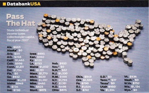
Large view (Source: Somethingawful Forums)
Trick question: what’s wrong with this map? Answer: there isn’t a map. The image may contain something that resembles a map, but it’s actually a map-shaped hole in effective data presentation. While the data in the table is presented more effectively, it’s too sparse to be of much use: how do those raw figures compare to tax rates, GDP, individual wealth or the many other factors that prevent easy comparison of states?
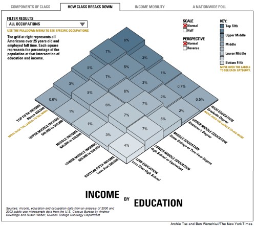
This isn’t so poor a choice of representation at first glance. But several subtle flaws could mislead the casual observer. To the lower right, we see three blocks labeled “7%” that have wildly different heights, presumably because of rounding in display. Dropping the decimal points is sometimes acceptable, but you can’t have it both ways: either those digits matter and should be shown, or they don’t matter and shouldn’t appear anywhere in the graph (in either the labels or bars).
The other major design failure here is the key, which misleadingly states that the darkest color is for someone in the “top fifth.” But which top fifth? We can see that you have to have a graduate degree and end up in the top fifth in income to be the darkest shade, but that would put someone in the 94th percentile (that is, the top twentieth). This is a case of an intuitive concept (darker means either wealthier or more educated) executed in a sub-standard way.
I leave it to the audience to decide whether it’s a mite useless, or even misleading, to only consider Americans with full-time employment.
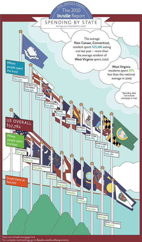
The first thought anyone should have when they see this is that it’s way too cluttered. The concern for the flags is merely aesthetic (as if anyone knows more than a handful of state flags), but the concern for the labels is about truthfulness. We’re presumably meant to look at the top of the flagpoles, but we can’t do that because there’s no axis for comparison, so we look to the labels for information. This means that we’re not going away with any more information than we might have from a table, but we might come away with less if we accidentally judge using the curve of the labels that we’re reading instead of the curve of the flagpole tops. Compare California to Washington to see what a difference that would make!
Thankfully, most people won’t skim long enough to notice the worst offender, which lurks at the bottom of the page. I knew something was about to go terribly wrong when I spied the notice stating that the graph “starts” at $20,000. Is the bottom of the page $20,000? Or is it the red line? Why is this counter-intuitive perspective even being used? I fear I may be kept waiting a long time for answers.
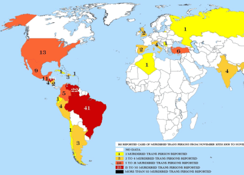
Large view, source
Maps are a common way to represent information, but they’re also a common way to misrepresent information. This map is a wonderful example of that very un-wonderful fact. You can see a large version of it at its source, but I can’t recommend it for the faint of heart: the original is grossly oversized, its aesthetics are just plain gross, and it’s served as a PDF with even more awful JPG artifacts.
This map purports to show the number of murdered transgendered people over a one-year period. But there’s a big problem: there is no data for the vast majority of the world (either by country or by population!). The data that is there is likely quite suspect, too (only one transgendered person was murdered in a country the size of Russia?). Tracking hate crimes is notoriously difficult for a variety of reasons, most of which apply especially to the transgendered community; but even compelling reasons for a lack of accurate data don’t actually make up for that lack.
This map’s worst failing, though, is that its doesn’t show hate crimes at all. I obviously don’t condone murder, but within a large enough group, murders are a fact of life. Half a million people are murdered around the world each year, and if even one in ten-thousand people is transgendered, we should expect to see hundreds of transgendered murder victims, for the same reason that we should expect to see tens of thousands of left-handed murder victims or hundreds of thousands of female murder victims.
Hate crimes against transgendered people are real; they can also deadly, which makes accurate information that much more critical. Perhaps presenting the information in this very sparse table in the context of a larger report would have been acceptable, but to use a poorly designed map with no disclaimers as a summary of findings is dishonest beyond belief.
Want Better Graphs? Get Virtuous Designers
If you’ve survived the array of horrors described above, take heart. Many design flaws can be remedied by learning patterns, principles or lenses that make avoiding disfunction easier. Even someone with no design background can read an article about why Comic Sans is never the right choice and resolve never to use it again. The curriculum is different, of course, but this is as true for data as it is for design.
Unfortunately, curing statistical illiteracy isn’t as easy as reading an article about it or even taking a statistics course. While a solid understanding of statistics is beneficial for a wide variety of purposes, countering statistical illiteracy requires the cultivation of an active interpretative technique that is separate from knowledge of pure mathematics.
Statistical literacy is only the bare minimum, though. The burden on designers is heavier because their uses of data often require them to go beyond interpretation and to perform some basic analysis, summarization or transformation of data. However, a formal education in research methods is probably too extreme. I believe that most mistakes of data could have been avoided had the designers focused on a limited skill set that is to a media producer what statistical literacy is to a media consumer. For now, let’s call this data mindfulness.
Mindfulness means exhibiting care, caution, exactness, prudence, regard and many other virtues. Data mindfulness is similar to someone imploring another to “be mindful” of something potentially dangerous. As a designer, you can be careful about the sources of data you choose and can be cautious of the claims you make based on that data. Your exactness is reflected in the effort you put into correctly transforming the original data. Your prudence relates to whether you are honest in your intent and methods. But regard comes closest to the concept of data mindfulness: to be mindful of your data—to avoid mistakes with it and prevent the harm that would result from such mistakes—you should regard it with respect.
Know Your Data: Mind, Body, And Soul
The mind-body-soul connection provides a convenient, memorable context in which to learn about data. With the mind already dealt with, where do the other two members of the trifecta fit in?
Our data’s “body” is its form and function. Like the human body, it consists of both overarching similarities and individual differences. Here we can draw an analogy with dislocation: just because your arm twists a certain way does not mean that it is supposed to; on the other hand, some people are indeed flexible enough to move in just that way. When we exceed the limitations of our body, we hear the body’s complaints loudly. But your data won’t let you know when you twist it out of shape (though you may hear some poor statistics professor screaming on its behalf). When we consider our data’s “body,” we’re considering the performance it can achieve and the stresses it can tolerate. That process often begins with these simple questions:
- How was it collected?
- What are its limitations?
- Which mathematical transformations are appropriate?
- Which methods of display are appropriate?
Our data’s “soul” is its context and broader meaning. One popular understanding of a soul is that it is some part of an individual that glorifies their uniqueness even while making them a part of a profound commonality. In a mystical context (whether you believe in it or not), we can easily understand this apparent contradiction. In a mundane context, many people would find the dissonance hard to swallow. This is unfortunate, because data must be understood in just this way: it is both an individual entity and a unit of a larger whole. Reconciling these is a notoriously tricky task, but some of the worst mistakes are avoided by collecting a few crucial bits of information:
- Who collected it?
- Why was it collected?
- What is its context in a broader subject?
- What is its context in the field of research that created it?
These eight questions should take under five minutes to run through, but they would prevent the vast majority of mistakes that designers make. Let’s assume for a moment, then, that you’re a responsible designer, and you try your best to come up with answers to these questions for the data you want to use. What if you can’t?
If your data’s “body” fails to stand up to scrutiny, then this is not necessarily a problem, depending on how serious is the task that you intend to put it to. Restricting yourself to a scientific level of evidence will earn you an A+ for effort, but it is not necessary for most design purposes. You will be limited in the claims you can make, but you can usually still make use of the data in some form without sacrificing honesty. Even scientists love preliminary data (or “napkin math,”) as long as they know that that’s what they’re looking at!
If your data’s “soul” is tainted, though, it could go to hell… in a figurative sense, of course: it would be banished somewhere where people wouldn’t draw the wrong conclusions from it. Getting some use out of potentially biased data is not impossible, but it’s not easy, and there are often other sources to draw upon anyway. If you smell smoke or, heaven forbid, a whiff of brimstone, don’t assume it’s because your infographic is so hot. Even people who do this for a day job get burned by misleading or downright falsified data more often than you might expect. For most any controversial issue, figuring out whose numbers to trust is difficult.
Learn It, Live It. You Can Love It Later.
I suspect that some designers are beyond their comfort zone by this point, so I’ll use a more familiar topic as an example of how to fit data mindfulness into your design. Many of you probably have experience with color theory or typography or have even taken courses on them. Or perhaps neither is your thing but you can still explain to someone why an image printed out looks different than on a monitor, or why Papyrus is a poor font choice. More importantly, you likely know where to find detailed information on particular topics in those fields when you need it.
Simply studying and practicing these fields to become proficient in them is possible, but few people can afford to master every skill they use in design. And yet most of us could afford a little more time to round out our skill sets. Just as with color theory and typography, even a novice understanding of the concepts involved in analyzing and representing data tunes a designer into the fact that it truly is a separate skill. This awareness allows you to stop yourself and say, “I don’t know how to do this yet.” Consciously recognizing that there is a “this” at all is an absolute prerequisite to being mindful.
Conclusion
Perhaps this all sounds a little extreme to you. But remember the stakes: while a poor font choice can ruin a meeting, a poor interpretation of statistics or data can kill you (or someone else, for that matter). Proper use of data is a viciously complicated topic, and I am no expert. But I feel confident enough to make this claim: if it would lead to the wrong conclusions, not presenting the data at all would be better.
Here is a simple rule for designers: your project isn’t ready to be released into the wild if you’ve spent more time choosing a font than choosing your data.


 See the full picture →
 Celebrating 10 million developers
 SurveyJS: White-Label Survey Solution for Your JS App


