Writing Systems And Calligraphy Of The World
The beauty of typography has no borders. While most of us work with the familiar Latin alphabet, international projects usually require quite extensive knowledge about less familiar writing systems from around the world. The aesthetics and structure of such designs can be strongly related to the shape and legibility of the letterforms, so learning about international writing systems will certainly help you create more attractive and engaging Web designs.
Pick any language you like: Arabic, Chinese, Japanese, maybe Nepali? Each is based on a different writing system, which makes it interesting to figure out how they work. Today, we’ll cover five categories of writing systems. This may sound tedious and academic, but it’s not. If you take the time to understand them, you’ll find that they all give us something special. We’ve tried to present at least one special feature of each language from which you can draw inspiration and apply to your own typography work. We’ll cover: East Asian writing systems, Arabic and Indic scripts (Brahmic).
You may also want to check out the following Smashing Magazine articles:
- Japanese, A Beautifully Complex Writing System
- Brush Lettering: It Only Gets Better After Practice
- Understanding The Difference Between Type And Lettering
- Taking A Closer Look At Arabic Calligraphy
We will cover Cyrillic, Hebrew and other writing systems in the second part of this post.
East Asian Writing Systems
Obviously, the Chinese uses Chinese characters (where they are known as hanzi). But Chinese characters are also used in various forms in Japanese (where they are known as kanji) and Korean (hanja). In this section, we will look at four East Asian writing systems: Chinese, Japanese, Korean and Vietnamese.
Chinese Characters
Chinese characters are symbols that do not comprise an alphabet. This writing system, in which each character generally represents either a complete one-syllable word or a single-syllable part of a word, is called logo-syllabic. This also means that each character has its own pronunciation, and there is no way to guess it. Add to this the fact that being literate in Chinese requires memorizing about 4,000 characters and you’ve got quite a language to learn. Fortunately for us, we don’t need to learn Chinese in order to appreciate the beauty of its writing.
Because many commonly used Chinese characters have 10 to 30 strokes, certain stroke orders have been recommended to ensure speed, accuracy and legibility in composition. So, when learning a character, one has to learn the order in which it is written, and the sequence has general rules, such as: top to bottom, left to right, horizontal before vertical, middle before sides, left-falling before right-falling, outside before inside, inside before enclosing strokes.
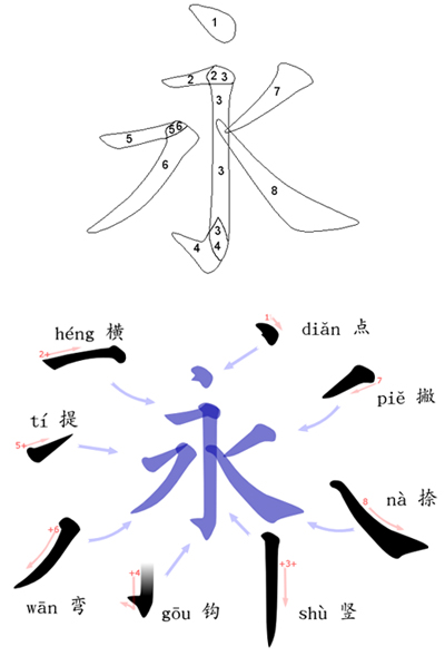
The Eight Principles of Yong
The strokes in Chinese characters fall into eight main categories: horizontal (一), vertical (丨), left-falling (丿), right-falling (丶), rising, dot (、), hook (亅) and turning (乛, 乚, 乙, etc.). The “Eight Principles of Yong” outlines how to write these strokes, which are common in Chinese characters and can all be found in the character for “yǒng” (永, which translates as “forever” or “permanence”). It was believed that practicing these principles frequently as a budding calligrapher would ensure beauty in one’s writing.
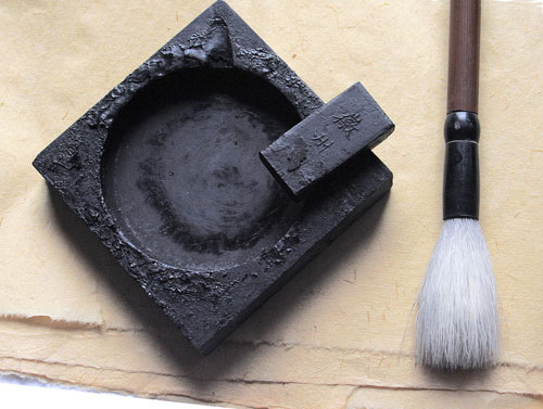
Four Treasures of the Study
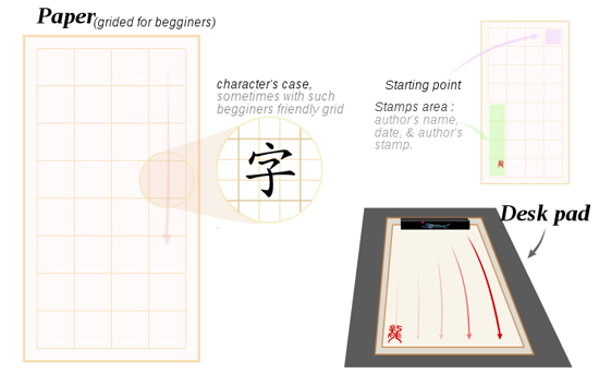
“Four treasures of the study” is an expression that refers to the brush, ink, paper and ink stone used in Chinese and other East Asian calligraphic traditions. The head of the brush can be made of the hair (or feather) of a variety of animals, including wolf, rabbit, deer, chicken, duck, goat, pig and tiger. The Chinese and Japanese also have a tradition of making a brush from the hair of a newborn, as a once-in-a-lifetime souvenir for the child.
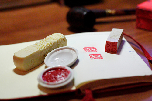
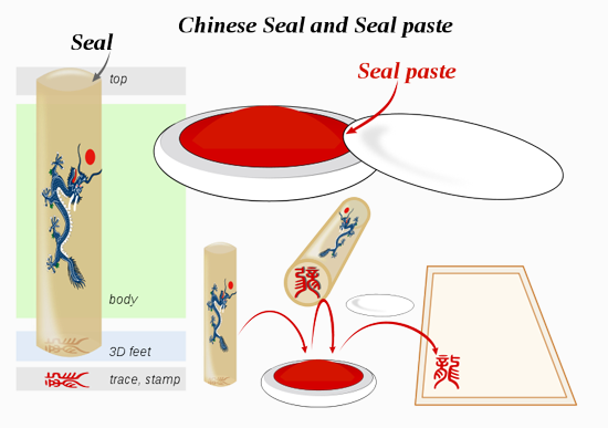
Seal and Seal Paste
The artist usually completes their work of calligraphy by adding their seal at the very end, in red ink. The seal serves as a signature and is usually done in an old style.
Horizontal and Vertical Writing
Many East Asian scripts (such as Chinese, Japanese and Korean) can be written horizontally or vertically, because they consist mainly of disconnected syllabic units, each conforming to an imaginary square frame. Traditionally, Chinese is written in vertical columns from top to bottom; the first column on the right side of the page, and the text starting on the left.
In modern times, using a Western layout of horizontal rows running from left to right and being read from top to bottom has become more popular. Signs are particularly challenging for written Chinese, because they can be written either left to right or right to left (the latter being more of a traditional layout, with each “column” being one character high), as well as top to bottom.
Different Styles
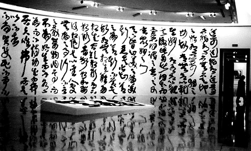
In Chinese calligraphy, Chinese characters can be written in five major styles. These styles are intrinsic to the history of Chinese script.
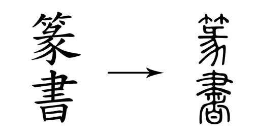
Seal script is the oldest style and continues to be widely practiced, although most people today cannot read it. It is considered an ancient script, generally not used outside of calligraphy or carved seals, hence the name.
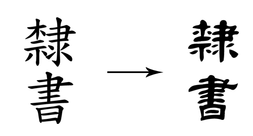
In clerical script, characters are generally “flat” in appearance. They are wider than the seal script and the modern standard script, both of which tend to be taller than wider. Some versions of clerical are square, and others are wider. Compared to seal script, forms are strikingly rectilinear; but some curvature and influence from seal script remains.
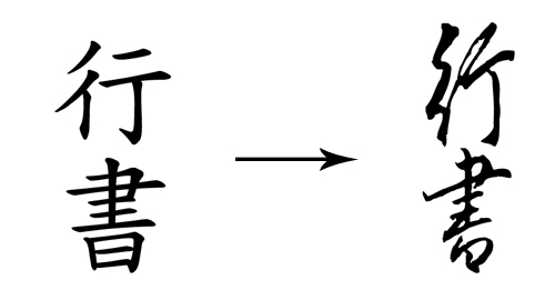
The semi-cursive script approximates normal handwriting, in which strokes and (more rarely) characters are allowed to run into one another. In writing in the semi-cursive script, the brush leaves the paper less often than with the regular script. Characters appear less angular and rounder. The characters are also bolder.
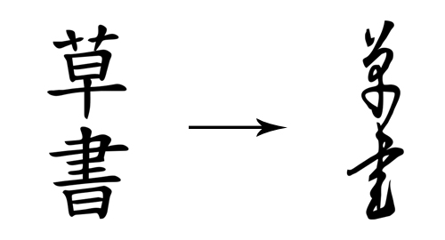
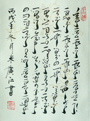
The cursive script is a fully cursive script, with drastic simplifications and ligatures, requiring specialized knowledge to be read. Entire characters may be written without lifting the brush from the paper at all, and characters frequently flow into one another. Strokes are modified or eliminated completely to facilitate smooth writing and create a beautiful abstract appearance. Characters are highly rounded and soft in appearance, with a noticeable lack of angular lines.
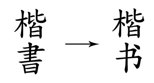
The regular script is one of the last major calligraphic styles to develop from a neatly written early-period semi-cursive form of clerical script. As the name suggests, this script is “regular,” with each stroke written slowly and carefully, the brush being lifted from the paper and all strokes distinct from each other.
Japanese
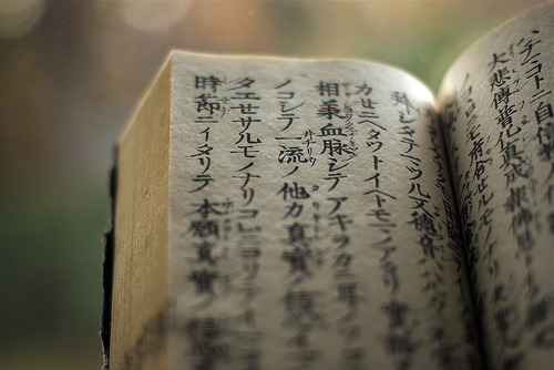
A rather different writing system is Japanese, which is syllabic, meaning that each symbol represents (or approximates) a syllable, combining to form words. No full-fledged script for written Japanese existed until the development of Man’yōgana (万葉仮名), an ancient writing system that employs Chinese characters to represent the Japanese language. The Japanese appropriated Kanji (derived from their Chinese readings) for their phonetic value rather than semantic value.
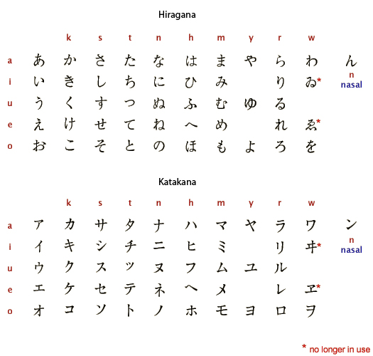
The modern kana systems, Hiragana and Katakana, are simplifications and systemizations of Man’yōgana. Thus, the modern Japanese writing system uses three main scripts: Kanji, which is used for nouns and stems of adjectives and verbs; Hiragana, which is used for native Japanese words and written in the highly cursive flowing sōsho style; and Katakana, which is used for foreign borrowings and was developed by Buddhist monks as a shorthand. In Japan, cursive script has traditionally been considered suitable for women and was called women’s script (女手 or onnade), while clerical style has been considered suitable for men and was called men’s script (男手 or otokode).
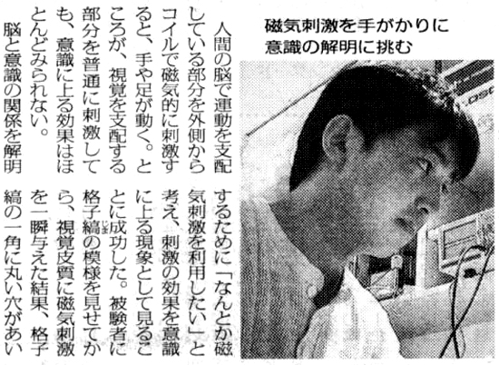
The three scripts are often mixed single sentences.
As we can see, the modern kana systems are simplifications of Man’yōgana. It is interesting to see how they have been simplified.
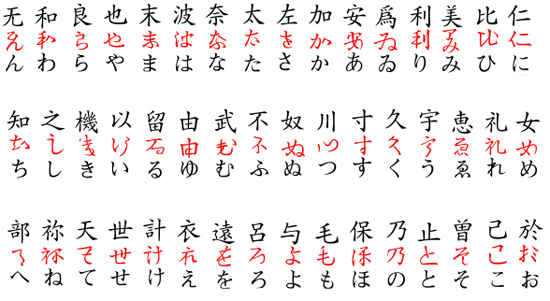
Development of hiragana from man’yōgana.
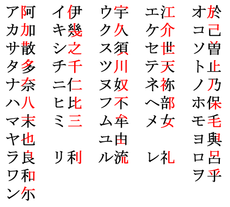
Katakana, with man’yōgana equivalents. (The segments of man’yōgana adapted into katakana are highlighted.)
Korean Squares
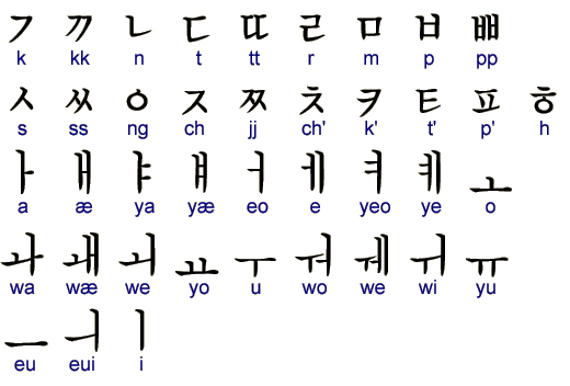
Korean is itself a very different writing system. It uses Hangul, a “featural” writing system. The shapes of the letters are not arbitrary but encode phonological features of the phonemes they represent.
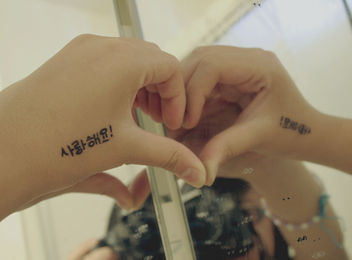
Hangul has existed since the middle of the 15th century (approximately 1440). But tradition prevailed, and scholars continued to use Classical Chinese as the literary language, and it was not until 1945 that Hangul became popular in Korea.
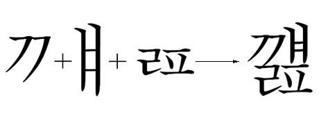
Jamo (자모; 字母), or natsori (낱소리), are the units that make up the Hangul alphabet. “Ja” means letter or character, and “mo” means mother, suggesting that the jamo are the building blocks of the script. When writing out words, signs are grouped by syllables into squares. The layout of signs inside the square depends greatly on the syllable structure as well as which vowels are used.
|
|
|
|
|
| ||||||||||||
|
|
| ||||||||||||||||
We won’t get into the detailed rules, but here is an example for inspiration:
Vietnamese Rotation
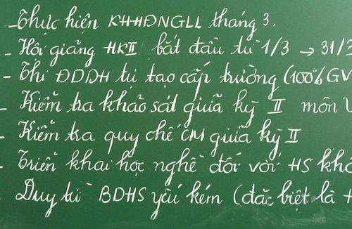
The Vietnamese writing system in use today (called Chữ Quốc Ngữ) is adapted from the Latin alphabet, with some digraphs (i.e. pairs of characters used to write individual phonemes) and nine additional diacritics (accent marks) for tones and certain letters. Over the course of several centuries—from 1527, when Portuguese Christian missionaries began using the Latin alphabet to transcribe the Vietnamese language, to the early 20th century, when the French colonial administration made the Latin-based alphabet official—the Chinese character-based writing systems for Vietnamese gradually became limited to a small number of scholars and specialists.
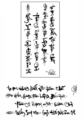
However, the Chinese philosophy still exerts a strong influence. The stylized work above is by painter Tran Dat, who introduced a harmony between the shapes of Chinese and Vietnamese characters. If you rotate the first image 90 degrees counter-clockwise, you can make out the Vietnamese words. It is meant to be displayed vertically so that it appears as ancient Chinese text at first.
Arabic
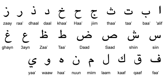
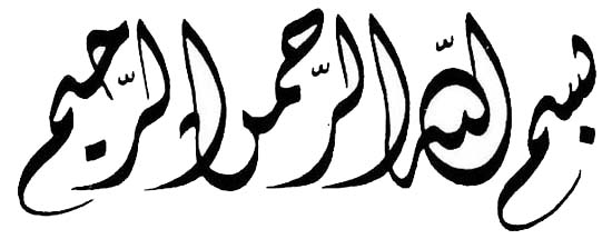
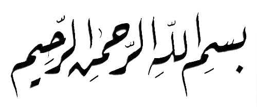
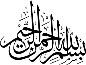
Here we’ll explore the beauty of Arabic, which has many styles and techniques. The Arabic alphabet was developed from the Nabataean script (which was itself derived from the Aramaic script) and contains a total of 28 letter. These 28 letters come from 18 basics shapes, to which one, two or three dots are added, above or below the letter. Arabic uses a writing system that we haven’t seen yet: an abjad, which is basically an alphabet that doesn’t have any vowels—the reader must supply them.
Contextual Shaping
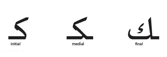
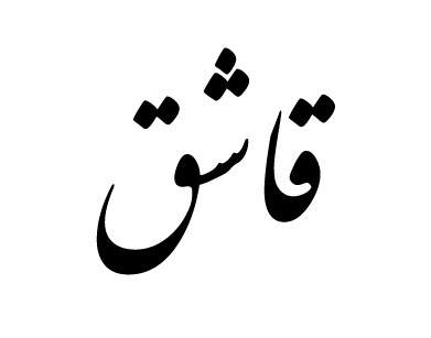
The shape of these letters changes depending on their position in the word (isolated, initial, medial or final). Here, for example, is the letter kaaf:
Diacritics
The Arabic script is an impure abjad, though. Short consonants and long vowels are represented by letters, but short vowels and long consonants are not generally indicated in writing. The script includes numerous diacritics, which serve to point out consonants in modern Arabic. These are nice and worth taking a look at.
Alif as a Unit of Proportion
Geometric principles and rules of proportion play an essential role in Arabic calligraphy. They govern the first letter of the alphabet, the alif, which is basically a straight vertical stroke.
- The height of the alif varies from 3 to 12 dots, depending on the calligrapher and style of script.
- The width of the alif (the dot) is a square impression formed by pressing the tip of the reed pen to paper. Its appearance depends on how the pen was cut and the pressure exerted by the fingers.
- The imaginary circle, which uses alif as its diameter, is a circle within which all Arabic letters could fit.
Different Styles
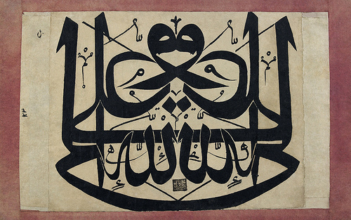
Arabic script has many different styles—over 100 in fact. But there are six primary styles, which can generally be distinguished as being either geometric (basically Kufic and its variations) and cursive (Naskh, Ruq’ah, Thuluth, etc.).
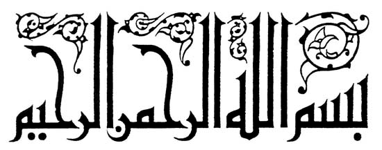
Kufi (or Kufic) is noted for its proportional measurements, angularity and squareness.
Tuluth means “one third,” referring to the proportion of the pen relative to an earlier style called Tumaar. It is notable for its cursive letters and use as an ornamental script.
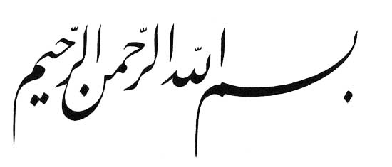
Nasakh, meaning “copy,” is one of the earliest scripts with a comprehensive system of proportion. It is notable for its clarity for reading and writing and was used to copy the Qur’an.
Ta’liq means “hanging,” in reference to the shape of the letters. It is a cursive script developed by the Persians in the early part of the 9th century AD. It is also called Farsi (or Persian).
Diwani was developed by the Ottomans from the Ta’liq style. This style became a favorite script in the Ottoman chancellery, and its name is derived from the word “Diwan,” which means “royal court.” Diwani is distinguished by the complexity of lines within letters and the close juxtaposition of letters within words.
Riq’a is a style that evolved from Nasakh and Thuluth. It is notable for the simplicity and small movements that are required to write in it, thanks to its short horizontal stems, which is why it is the most common script for everyday use. It is considered a step up from the Nasakh script, which children are taught first. In later grades, students are introduced to Riq’a.
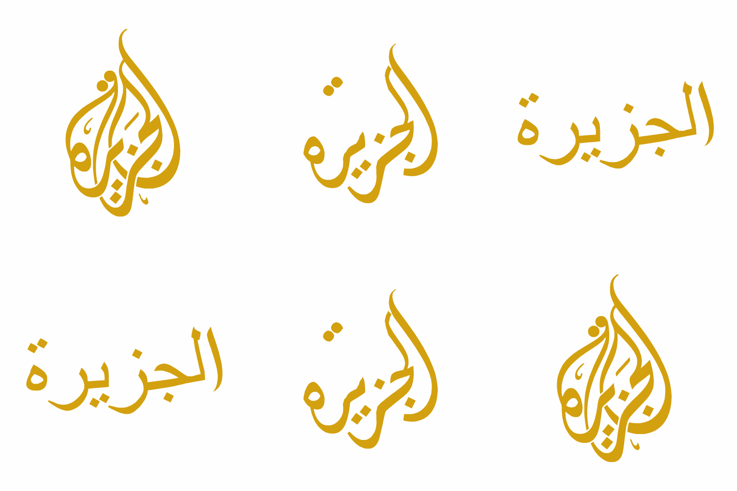
Teardrop-Shaped Composition
Here is an animation showing the composition of the Al Jazeera logo:
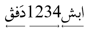
Bi-Directionnality
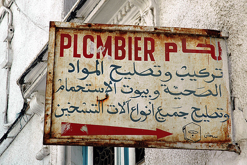
When left-to-right text is mixed with right-to-left in the same paragraph, each text should be written in its own direction, known as “bi-directional text.”
Material Used
In case you want to try, you’ll want to know what material to use. There is a lot of typical tools, such as brush pens, scissors, a knife to cut the pens and an ink pot. But the traditional instrument of the Arabic calligrapher is the qalam, a pen made of dried reed or bamboo. “The traditional way to hold the pen,” wrote Safadi in 1987, “is with middle finger, forefinger and thumb well spaced out along the [pen’s] shaft. Only the lightest possible pressure is applied.”
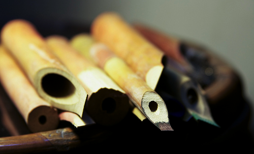
As for the ink, you have many options: black and brown (often used because their intensity and consistency can be varied greatly) as well as yellow, red, blue, white, silver and gold. The important thing is that the greater strokes of the composition be very dynamic in their effect.
A Few Techniques
The development of Arabic calligraphy led to several decorative styles that were intended to accommodate special needs or tastes and to please or impress others. Here are a few outstanding techniques and scripts.
Gulzar is defined by Safadi (1979) in Islamic calligraphy as the technique of filling the area within the outlines of relatively large letters with various ornamental devices, including floral designs, geometric patterns, hunting scenes, portraits, small script and other motifs. Gulzar is often used in composite calligraphy, where it is also surrounded by decorative units and calligraphic panels.
Maraya or muthanna is the technique of mirror writing, where the composition on the left reflects the composition on the right.
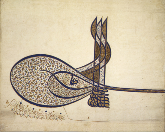
Tughra is a unique calligraphic device that is used as a royal seal. The nishanghi or tughrakesh is the only scribe trained to write tughra. The emblems became quite ornate and were particularly favored by Ottoman officialdom.
In zoomorphic calligraphy, the words are manipulated into the shape of a human figure, bird, animal or object.
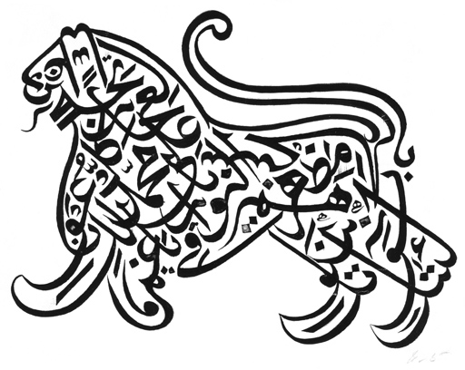
Sini
Sini is a Chinese Islamic calligraphic form for the Arabic script. It can refer to any type of Chinese Islamic calligraphy but is commonly used to refer to one with thick tapered effects, much like Chinese calligraphy. It is used extensively in eastern China, one of whose famous Sini calligraphers is Hajji Noor Deen.
Perso-Arabic Script: Nasta’liq Script
The predominant style in Persian calligraphy has traditionally been the Nasta’liq script. Although it is sometimes used to write Arabic-language text (where it is known as Ta’li, with Farsi used mainly for titles and headings), it has always been more popular in Persian, Turkic, and South Asian spheres. It is extensively practiced as a form of art in Iran, Pakistan and Afghanistan. Nasta’liq means “suspended,” which is a good way to describe the way each letter in a word is suspended from the previous one (i.e. lower, rather than on the same level).
The Perso-Arabic script is exclusively cursive. That is, the majority of letters in a word connect to each other. This feature is also included on computers. Unconnected letters are not widely accepted. In Perso-Arabic, as in Arabic, words are written from right to left, while numbers are written from left to right. To represent non-Arabic sounds, new letters were created by adding dots, lines and other shapes to existing letters.
Indic Scripts (Brahmic)
The Indic or Brahmic scripts are the most extensive family of writing systems that we haven’t looked at yet: abugidas. An abugidas is a segmental writing system which is based on consonants and in which vowel notation is obligatory but secondary. This contrasts with an alphabet proper (in which vowels have a status equal to that of consonants) and with an abjad (in which vowel marking is absent or optional).
Indic scripts are used throughout South Asia, Southeast Asia and parts of Central and East Asia (e.g. Hindi, Sanskrit, Konkani, Marathi, Nepali, Sindhi and Sherpa). They are so widespread that they vary a lot, but Devanagari is the most important one.
Devanagari Ligatures and Matra
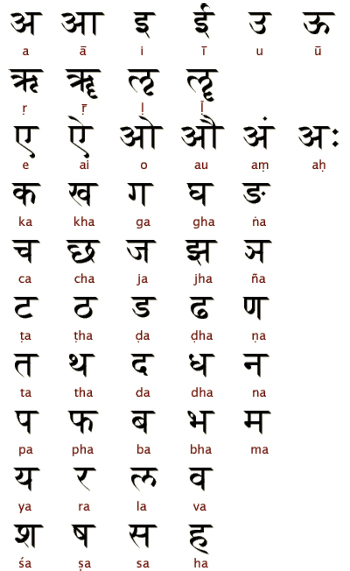
Hindi and Nepali are both written in the Devanāgarī (देवनागरी) alphabet. Devanagari is a compound word with two roots: deva, meaning “deity,” and nagari, meaning “city.” Together, they imply a script that is both religious and urban or sophisticated.
To represent sounds that are foreign to Indic phonology, additional letters have been coined by choosing an existing Devanagari letter that represents a similar sound and adding a dot (called a nukta) beneath it. It is written from left to right, lacks distinct letter cases and is recognizable by a distinctive horizontal line running along the tops of the letters and linking them together.
In addition, a few other diacritics are used at the end of words, such as the dots illustrated below and the diagonal line, called virama, drawn under the last letter of a word if it is a consonant.
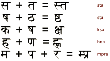
One interesting aspect of Brahmic and in particular of Devanagari here is the horizontal line used for successive consonants that lack a vowel between them. They may physically join together as a “conjunct,” or ligature, a process called samyoga (meaning “yoked together” in Sanskrit). Sometimes, the individual letters can still be discerned, while at other times the conjunction creates new shapes.
Here is a close-up of a nice ligature, the ddhrya ligature:
A letter in Devanagari has the default vowel of /a/. To indicate the same consonant followed by another vowel, additional strokes are added to the consonant letter. These strokes are called matras, or dependant forms of the vowel.
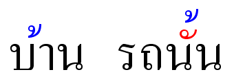
Thai Stacking Diactritics
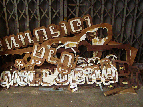
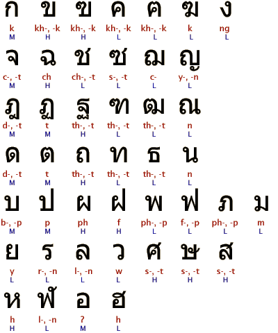
The writing system of Thai is based on Pali, Sanskrit and Indian concepts, and many Mon and Khmer words have entered the language.
To represent a vowel other than the inherent one, extra strokes or marks are added around the basic letter. Thai has its own system of diacritics derived from Indian numerals, which denote different tones. Interestingly, like many non-Roman scripts, it has stacking diacritics.
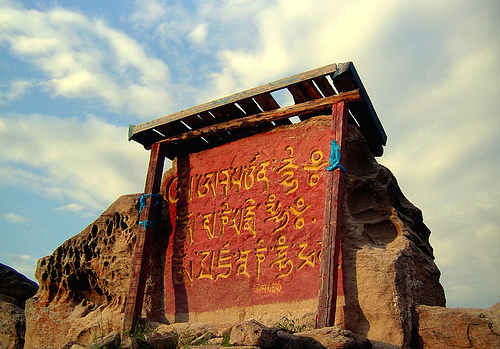
Tibetan Mantras
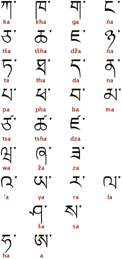
The form of Tibetan letters is based on an Indic alphabet of the mid-7th century. The orthography has not altered since the most important orthographic standardization, which took place during the early 9th century. The spoken language continues to change. As a result, in all modern Tibetan dialects, there is a great divergence of reading from the spelling.
The Tibetan script has 30 consonants, otherwise known as radicals. Syllables are separated by a tseg ་, and because many Tibetan words are monosyllabic, this mark often functions almost as a space.
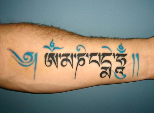
As in other parts of East Asia, nobles, high lamas and persons of high rank were expected to have strong abilities in calligraphy. But the Tibetan script was done using a reed pen instead of a brush. As for a mantra, it is a sound, syllable, word or group of words that is considered capable of “creating transformation.”
The use of mantras is widespread throughout spiritual movements that are based on or off-shoots of practices from earlier Eastern traditions and religions. The mantras used in Tibetan Buddhist practice are in Sanskrit, to preserve the original mantras. Visualizations and other practices are usually done in the Tibetan language.
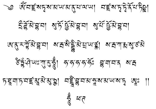
Vajrasattva mantra in Tibetan.
Summary
So what should you take away from this article? We have seen that Arabic and Chinese calligraphy have many different scripts variations. From geometric to cursive to regular script, there is no such thing as one calligraphic style for a language.
Sometimes there is even no such thing as one script per language. This is why Japanese is interesting: it is written in three different scripts that mix nicely. The construction of the Korean language is also fascinating: characters are grouped into squares that create syllables. Writing systems are ultimately diverse in construction, which makes them so interesting.
Many languages also have various components that can be used in our typography. Arabic and Thai, among many others, have a large system of diacritics. Arabic has a decorative aspect. Ligatures are directly related to our Latin alphabet but can be quite elaborated in such scripts as Devanagari.
You could do a lot to spice up your own designs. Did you catch the red Chinese seal, which contrasts with the usual black ink. Have you thought of rotating your fonts to give them a whole new look, as Vietnamese calligraphers do? What about the Arabic teardrop-shaped writing? If you missed all of this, you have no choice but to scroll back up and take a closer look.
Bonus: How to Integrate These Languages on a Website?
Working with foreign languages in international design projects can get a bit tricky. Obviously, studying the specifics of the language that you are supposed to work with will help you better anticipate user’s needs and avoid embarassing problems or misunderstandings. Tilt.its.psu.edu presents general guidelines for integration of various international languages in websites.
Licensing
This page is based on the copyrighted Wikipedia articles (”Hindi”,”Chinese Script Styles”, “Four Treasures of the Study”, “Hangul”); it is used under the Creative Commons Attribution-ShareAlike 3.0 Unported License (CC-BY-SA). You may redistribute it, verbatim or modified, providing that you comply with the terms of the CC-BY-SA.


 Celebrating 10 million developers
 Try ProtoPie AI free →
 SurveyJS: White-Label Survey Solution for Your JS App
 Register Free Now
