Design Better And Faster With Rapid Prototyping
The old adage, “a picture speaks a thousand words” captures what user interface prototyping is all about: using visuals to describe thousands of words’ worth of design and development specifications that detail how a system should behave and look. In an iterative approach to user interface design, rapid prototyping is the process of quickly mocking up the future state of a system, be it a website or application, and validating it with a broader team of users, stakeholders, developers and designers.
Doing this rapidly and iteratively generates feedback early and often in the process, improving the final design and reducing the need for changes during development.
Further Reading on SmashingMag:
- Optimizing Your Design For Rapid Prototype Testing
- Choosing The Right Prototyping Tool
- Content Prototyping In Responsive Web Design
- Resurrecting User Interface Prototypes (Without Creating Zombies)
Prototypes range from rough paper sketches to interactive simulations that look and function like the final product. The keys to successful rapid prototyping are revising quickly based on feedback and using the appropriate prototyping approach. Rapid prototyping helps teams experiment with multiple approaches and ideas, it facilitates discussion through visuals instead of words, it ensures that everyone shares a common understanding, and it reduces risk and avoids missed requirements, leading to a better design faster.
The Rapid Prototyping Process
Rapid prototyping involves multiple iterations of a three-step process:
- Prototype Convert the users’ description of the solution into mock-ups, factoring in user experience standards and best practices.
- Review Share the prototype with users and evaluate whether it meets their needs and expectations.
- Refine Based on feedback, identify areas that need to be refined or further defined and clarified.
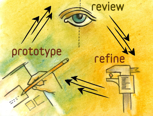
The prototype usually starts small, with a few key areas mocked up, and grows in breadth and depth over multiple iterations as required areas are built out, until the prototype is finalized and handed off for development of the final product. The rapidness of the process is most evident in the iterations, which range from real-time changes to iteration cycles of a few days, depending on the scope of the prototype.
Scoping A Prototype
The word prototype often conjures images of a coded, fully functioning version of an application or interface. Rapid prototypes are not intended to evolve into fully functional solutions, but are meant to help users visualize and craft the user experience of the final product. With that in mind, when scoping a prototype, decide on a few key issues before beginning any prototyping work.
What Needs to Be Prototyped?
Good candidates for prototyping include complex interactions, new functionality and changes in workflow, technology or design. For example, prototyping search results is useful when you want to depart significantly from the standard search experience; say, to introduce faceted search or the ability to preview a document without leaving the search results.
How Much Should Be Prototyped?
A good rule of thumb is to focus on the 20% of the functionality that will be used 80% of the time; i.e. key functionality that will be used most often. Remember, the point of rapid prototyping is to showcase how something will work or, in later stages, what the design will look like, without prototyping the entire product.
Find the Story
After identifying the areas to be prototyped, weave them together into one or more scenarios: identify the coherent paths through the user experience that the prototype simulates. For a website that sells shoes, one scenario could be “Boring Joe” buying the exact same Nike running shoes that he bought six months ago, while another scenario could be “Exploring Sam” browsing through size 10s to find a pair of Oxfords and pair of loafers that interest him.
Plan Your Iterations
The entire prototype is usually not built in a single iteration but rather piece by piece. A good approach is to start prototyping broadly and widely and then dive deep into selected areas of the solution. For a website, this would mean building out the home page and landing pages for the main sections in the first iteration (sometimes referred to as a horizontal prototype) and then reviewing and revising that framework. Subsequent iterations could drill down into one or more sections of the website (a vertical prototype); for a media download website, this could be the steps a user would take to find a video and to download it, or how they would manage the media in their online library.
Choose the Appropriate Fidelity
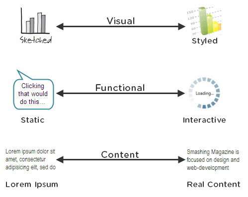
Fidelity refers to how closely a prototype resembles the final solution. There are multiple dimensions of fidelity, and prototypes can lie anywhere on the spectrum for each of these dimensions. Depending on the stage of the design process and the goals of the prototype, select the appropriate fidelity for each of the following:
- Visual fidelity (sketched ↔ styled) Look and feel are the most noticeable dimension of a prototype’s fidelity and, if not properly selected, can sidetrack prototype reviews. Go hi-fi too soon and users will focus on visual design, which is not appropriate in early stages. From a visual standpoint, prototypes do not have to be pixel perfect but should be proportional; for example, if the left navigation area has to occupy one-fifth of a 1024-pixel screen, it does not need to be exactly 204 pixels wide, as long as it is proportionally depicted in the prototype. As prototyping progresses through the design cycle, increase visual fidelity as needed by introducing elements of style, color, branding and graphics.
- Functional fidelity (static ↔ interactive) Does the prototype reveal how the solution will work (static) or does it appear to be fully functional and respond to user input (interactive)? This dimension is less of a distraction to users, but adding interactivity in subsequent iterations increases functional fidelity and allows the prototype to be used for usability testing and training and communications.
- Content fidelity (lorem ipsum ↔ real content) Another dimension that often distracts users is the content that is displayed in the prototype. Squiggly lines and dummy text like lorem ipsum are useful to avoid in early stages of prototyping. But as the prototype is refined, evaluate the need to replace dummy text with real content to get a feel for how it affects the overall design.
The Prototyping Spectrum
Low Fidelity
The quickest way to start prototyping is also the easiest: putting pen(cil) to paper. Sketching on paper is a low-fidelity approach that anyone can do; no special tools or experience required. Most often used during the early stages of a design cycle, sketching is a quick way to create rough mock-ups of design approaches and concepts and to get feedback from users. Paper prototyping is ideal during brainstorming and conceptualization and can be done alone in a cubicle with a sketchbook or in a group with a flip chart (or whiteboard) and markers.
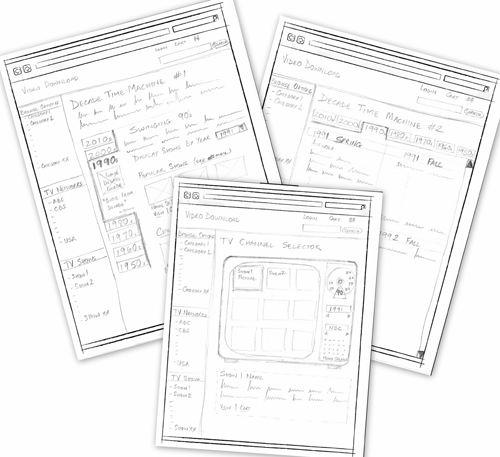
Lying at the low-fidelity end of the prototyping spectrum, paper prototypes are static and usually have low visual and content fidelity. This forces users to focus on how they will use the system instead of what it will look like, and it makes designers more open to changes based on user feedback.
Low-fidelity prototyping lends itself to rapid prototyping. It has no learning curve but lets you make changes easily and quickly.
Medium Fidelity
As we start using computer-based tools such as Visio and Omnigraffle to prototype, the fidelity increases on most fronts, yielding medium-fidelity prototypes. Wireframes, task flows and scenarios that are created with these tools take more time and effort but look more formal and refined. While visual elements of branding, colors and style can be introduced, prototypers often stay away from them, focusing instead on demonstrating the behavior of the application. Interactivity can be simulated by linking pages or screens, but functional fidelity here is medium at best. These prototypes are best suited to determining whether user needs are met and whether the user experience is optimal.
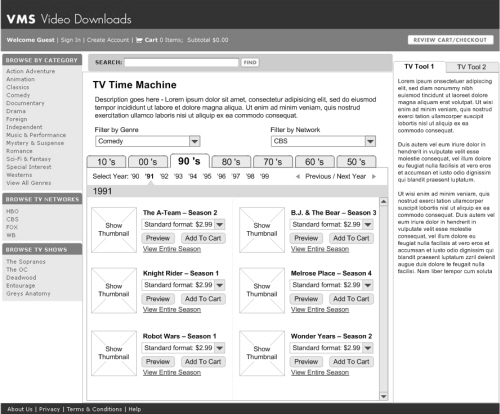
There are two reasons why one might intentionally make a medium-fidelity prototype not look like a medium-fidelity prototype:
- The first is that, by using Balsamiq or sketchy Visio stencils to make the prototype look low fidelity, you force users to view it as a draft or work in progress, rather than a polished and finished product.
- The second is that, by giving the prototype a high visual fidelity (for instance, in a comprehensive layout done in Photoshop), you get the user to focus on the visual design and look and feel, including color, fonts, layout, logo and images.
The speed of medium-fidelity prototyping is achieved with templates, stencils and reusable widgets and elements. It gets faster as you become more proficient with your tools of choice.
High Fidelity
High-fidelity prototypes are the most realistic and are often mistaken for the final product, but they are usually time-intensive. A few years ago, the only way to create high-fidelity prototypes was to actually code using a programming language, which often required the designer and developer to work together. These days, however, application-simulation tools allow non-technical users to drag and drop UI widgets to create high-fidelity prototypes that simulate the functionality of the final product, even for business logic and database interactions. Axure and iRise are some examples of application-simulation tools that can be used to create high-fidelity prototypes.
These prototypes are appropriate when high visual and functional fidelity is required; for example, when introducing a new technology (say, when moving from a mainframe application—yes, they still exist!—to a Web-based solution. Most of these prototypes cannot be converted to usable code, but they serve as an excellent reference for developers. These are also useful for conducting usability testing and training users.
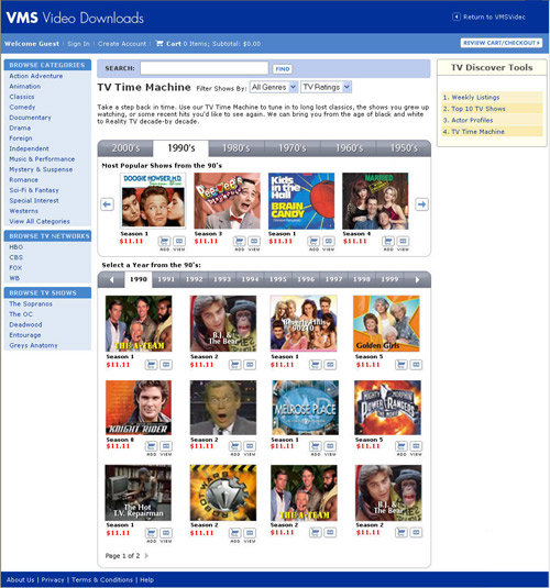
High-fidelity prototyping is relatively rapid, considering the level of interactivity and fidelity involved, and it can be accelerated by using drag-and-drop simulation tools. In addition, some of these tools facilitate the gathering of user feedback and documenting of requirements, further speeding up the design process. Even though you do not need to learn a new programming language, these tools do have a learning curve.
Selecting a Fidelity Level
In choosing the prototype fidelity, there is no one correct approach. Most designs of new products are best started with sketches, then moving to either medium- or high-fidelity prototypes, depending on the complexity of the system and the requirements of the dimensions of fidelity.
In working with one particular client in the pharmaceutical industry, we went from whiteboards to interactive prototypes that had high functional and content fidelity but low visual fidelity. They cared less about the look and feel than about adhering to corporate guidelines.
For another client, this one in retail, our interactive prototype had to have high visual and functional fidelity. The content fidelity did not matter because they would be reusing content and were already familiar with it. To them, the look and feel and interactive experience mattered more because this was their first implementation of SharePoint, and they wanted to make the portal look “non-SharePointy”!
Selecting Tools
Depending on your approach, you have a wide variety of tools to choose from. Dan Harrelson has compiled a list of popular prototyping tools on the Adaptive Path blog.
Each tool has its own feature set and strengths. Based on your needs and the requirements of the projects you work on, evaluate which tool would be most appropriate. Here are some questions to consider when evaluating tools:
- How easy is it to learn and use the tool?
- Is it flexible to support prototypes for Web, packaged and custom software applications, as well as desktop and mobile applications?
- Is there a repository of reusable stencils, templates or widgets available?
- How easy is it to share the prototype with others for review? Can their feedback be captured using the tool?
- How easy is it to make changes on the fly or to incorporate feedback?
- Does it have any collaboration features, such as allowing multiple people to work on it at the same time?
- What are the licensing terms and costs?
Dos And Don’ts
As you get started, here are a few points about effective rapid prototyping to keep in mind:
Do…
- Work collaboratively with users, business and IT stakeholders while rapid prototyping. Apart from giving valuable feedback, they also gain a sense of ownership of the final product.
- Avoid “prototype creep” by setting expectations for the process, including ones affecting the purpose, fidelity, scope and duration. Remind everyone, including yourself, that rapid prototyping is a means to an end, not an end in itself.
- When creating interactive high-fidelity prototypes and simulations, build in realistic delays (for instance, for screen refreshing or moving through steps of a transaction), so that users do not expect instant response times from the final product.
- Reuse, reuse, reuse. For computer-based prototyping, this means saving reusable templates, stencils, patterns and widgets for future projects.
- Most importantly, begin every prototype review session with the disclaimer that this is just a prototype, a mock-up, not the actual solution. This reminds users that this is a work in progress, it encourages feedback, and in the case of high-fidelity prototypes, it prevents users from mistaking it for a working solution.
Don’t…
- Don’t prototype features or functionality that cannot be implemented—often an issue with software package implementations. When in doubt, confirm with developers before starting.
- Don’t take every change or request that comes out of a prototype review as a new requirement. Rapid prototyping helps capture missed requirements, but these new requirements should be evaluated carefully. Some may be implemented, while others are pushed to a future release.
- Don’t begin prototype review sessions without clear guidelines for feedback. Be very specific about the type of feedback you are looking for. (Are the steps logically arranged? Is the navigation clear and intuitive?) If not, be prepared for, “I don’t like the blue in the header,” or “Can’t we use this font instead?” or “Can you make this bigger, bolder, in red and flashing?”
- Don’t be a perfectionist. In most cases, rapid prototyping does not have to be 100% perfect, just good enough to give everyone a common understanding.
- Don’t prototype everything. Most of the time, you shouldn’t have to.
Further Resources
- If you need a nudge to start sketching, try Dan Roam’s book The Back of the Napkin.
- Learn more about paper prototyping in Carolyn Snyder’s book Paper Prototyping: The Fast and Easy Way to Design and Refine User Interfaces.
- Sketchboarding, a technique for exploring and refining concepts.
- Need low-fidelity content? Generate Lorem Ipsum text for your prototype.
- Want to make your paper sketch look high fidelity? Try these Web, iPad and iPhone stencils.
- Sketching and Prototyping Tools for iPhone Apps
- Simple sketching and prototyping in Firefox with the Pencil add-on.
- Free Printable Sketching, Wireframing and Note-Taking PDF Templates
- 50 Free UI and Web Design Wireframing Kits, Resources and Source Files


 SurveyJS: White-Label Survey Solution for Your JS App
 Celebrating 10 million developers
 Register Free Now

