The Process Behind Good Illustration (Part 2)
In Part I we skimmed the surface on a few points regarding when an image becomes an illustration. But, of course, this knowledge isn’t very useful if we don’t know how to apply it to our work when the pencil hits the paper! Or, stylus hits the tablet, whatever it is you do.
Good Process and Good Design
It’s easy to think there’s no way you can make anything look good because you don’t know how to use Adobe Illustrator, or can’t draw people worth beans, etc. And if that’s your concern, don’t worry one bit — skill-related knowledge is nothing that can’t be built up with practice and time. Those that have natural gifts will get there faster, but the doors are closed to no one. There are, however, staples to illustration that have nothing to do with how good you are at drawing or using Photoshop — they transcend into the realm of good process and good design, and I’ve believed that studying illustration is much more about this than about the former.
In this second part of the article, I’d like to share some of these practices that have been invaluable to me as an illustration student, and ones I think I will carry with me for a long time to come.
Be sure to check out the following articles:
- Inspiring Illustrator Artworks By Artists Around The World
- 40 Excellent Adobe Illustrator Tutorials
- Drawing A Cartoon In Illustrator
This part deals a lot more with actual practice, technique, etc. — so, not everyone will think and work this way best. My goal here is not to provide an exhaustive and definitive list, but just to share a few tips that I felt have really pushed my own learning leaps and bounds. Part III (next week) will pick up with the second half of this list, but please feel free to share your responses so far in the comments!
Part II: So how do we do it?
Draw actively.
If it’s not distracting, add it. If it’s not necessary, remove it.
…And this is why it can take a very long time! In the end the goal is to get your illustration down to a point when as much as possible of what’s in it (people, their actions, props, setting, shapes, whatever it may be) is actively catering to your purpose — and as much of what’s not is removed. Heck, you might not need more than a line-drawing or stick figures.
Some assorted points in my head on this:
- More generally, just answer the “why” question at every step — why you chose those colors and those sharp edges here, why this character’s head is so big, why is the focus on the red circle — what is it doing to communicate the idea, and is there a clearer way to do it? And if you ever catch yourself rationalizing something with “it just looks cool” — take a step back. Illustration can definitely look cool, but everything cool in it has got to be for a reason.
- In general, always think “pare down” and “less is more” — chances are you have way more stuff in your picture than is really necessary!
- On the flip side, a good illustration can be as fully-rendered as a detailed painting — but that would mean that you didn’t just add it because you felt like it. For instance, if that was the only way to get a necessary mood across, or if the illustration specifically relied on referencing Renaissance-era fine art, for example.
- If you arrived at a decision (style, colors, etc.) “by accident” that doesn’t necessarily mean it’s inappropriate or unjustified. In fact, experimenting is
oftenthe only way to determine if something works or not! - Think about specific visual metaphors that get your point across most clearly — for example, how do you illustrate a feeling of happiness? A character looking euphoric, light colors, anything cute and personified (alas), a big grin, radiating beams, whatever it may be — and that might be all you need./p> Note: If you’re having a hard time with this, there is a great article by illustrator Jillian Tamaki on this subject that has helped me tremendously. I couldn’t have said what she wrote better.
- Pay a great deal of attention to hierarchy, or the order of importance. There are several hierarchies to consider — hierarchy of color, value, scale, etc. — they all work together to comprise one overall visual hierarchy. As an illustrator, your job to define exactly what your viewer sees first, where and how their eye is guided around the picture, and what narrative, if any, unfolds from it (this is crucial to getting a message across). Be thinking about how changing the color and size of elements affects this balance and how to use it to your advantage. You’ll find a lot of it is common sense — for instance, bigger things are seen first, as are more vibrant colors. A greyscale illustration with one bright red object will draw very particular attention to that object. A picture where the front-and-center is dominated by a figure will place a lot of importance on that figure, no matter its color. Moving that figure off to the side would already shift the balance a great deal. So on and so forth. :) There’s no rule to figuring out the best composition; again, and again, the general recipe is Try it and See.
- Be careful where you add details — details are closely related to where the viewer should be getting more visual information out of (which could really affect your hierarchy and, in turn, your illustration’s effectiveness). Inaccurate details could be distracting as well, so using informed visual references where needed is very key (more on this later).
- Think “more obvious” — you don’t have to beat the viewer over the head with what you’re trying to say, but the more blunt you are, the faster you’ll get the point across. And sometimes that will mean exaggeration and altering reality. For example, it’s much easier to convey the fact that something is shiny or glowing by drawing little cartoon lightbulb rays coming out of it, than it is to render the whole thing in realistic lighting and set that object in a realistic glow. (This is one of those things that could do a lot to dictate what visual style you execute your illustration in.)
Use color with discretion.
…Are you sure your illustration needs color? It might not, for instance, if your line work gets the work done. Don’t forget that a nice clean sketch or a non-colored line work drawing can be a finished illustration!

Illustration © Chi-Wen Lee. Used with permission.
If you add color, it should be because you need it (you very often will).
You might need color, for instance, if your line work alone does not separate shapes as strong>clearly by itself (for instance if all your line-weights are very similar and it’s difficult to see what is where), and if color will help set apart foreground and background, focus attention on something, set a necessary mood, etc.
On the left are two versions of Chi-Wen Lee’s illustration (you can view her entire process on this project on her blog here). The cut-out by itself does not read as clearly because of the complexity of the lines, all of which have similar weights (thickness). In other words, it’s very hard to see where the dragon is! But, upon adding color, however, the image is much clearer, and there’s a sense of hierarchy and even space that was not there before.
If you must color…
…Then remember you’ll probably need far fewer colors than you think. Look at your favorite illustrations, and I bet you you can identify 3-4 hues tops (if not just 1-2) that it uses for all its parts. And it’s true! You don’t need the whole rainbow.
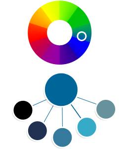
Get yourself a color wheel and pick a palette of 2-3 compatible colors and stick to them (and perhaps different shades of them, but no more hues). The fewer your choices, the more strict and grounded your decisions will have to be as to which part of the picture needs what color, which means you must make good design decisions in picking them. (And any time you make good design decisions, you score major brownie points!)
Hold up. What does “compatible” mean, and how do I pick these compatible colors?
“Compatible” colors merely means they work together harmoniously. Harmonious doesn’t necessarily mean “tranquil” or “happy” — it just means having some sort of relationship amongst all of them that permeates them.
The goal isn’t to starve you of color choices, or force you to make unrealistic ones. Just like an outfit becomes harder and harder to put together the more colors and patterns you introduce, it becomes harder and harder to make a drawing’s colors look good together the more of them there are. Which is why a limited and considered color palette is very important, lest color become a distraction because of its incongruence.
Any two colors could work together, two colors can be bridged with a third color that would work well with them, and any one color will resolve well with shades of itself.Knowing this, how can we come up with a limited but flexible color palette without using the whole rainbow?
First, let’s look at some ways to select up to 3 hues from our color wheel. (This is the method that I’ve been taught and that I use myself, but I’m sure there’s more than one way to wrap one’s brain around this.)
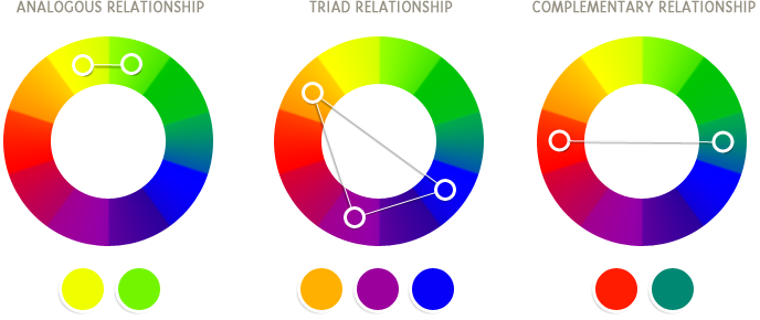
Now, you can generate other compatible colors that stick within your palette by pulling those colors apart a little bit. To do so, adjust their value (light and dark) and saturation (also known as chroma — how vibrant the color is). You can adjust the hue a bit as well for some nice analogous shades.
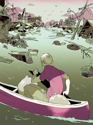
Illustration © Tomer Hanuka. Used with permission.
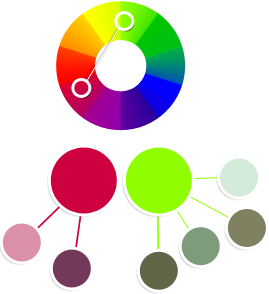
…Though, don’t forget how flexible even one hue can be! (If one is all you need, then one is all you need.) In the illustration below, the blue color is pulled apart to generate many gray-ish, green-ish, purple-ish, brighter, lighter, and darker blues that serve all the needs of the illustration, but still work together as a small family.
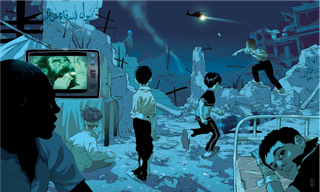
Illustration © Tomer Hanuka. Used with permission.
Note: Illustrator Tomer Hanuka was kind enough to give me permission to use his works in this article… I selected his illustrations as my guinea pigs here because I distinctly remember once thinking that colors needed to be photography-realistic to tell a realistic story. Tomer, of course, proved me wrong, and I wanted to pass that on! :) )
When coloring a drawing, it can be difficult to know where to start, when all you have is your black and white sketch staring at you. What I sometimes do before I even start experimenting with color palettes is just zoom out and block in my entire drawing in black-and-white first (or in one hue), focusing on getting the balance and composition of the relative values right. Once those are there (if you are working digitally), it’s much easier to dive into some color studies.
If you want to keep reading, Douglas Dowd has a great blog post on this topic that really expands on this. (My summary herein hardly does it justice.)
For when you’re in a hurry or just feel like browsing, Adobe has a nifty tool called Kuler that will generate lovely compatible palettes for you.
Use with great discretion.
Go out into the world.
Why can’t I just search online for inspiration? The Internet is much bigger than anywhere I can walk or drive!
I know, right?? My professors are sticklers for requiring us to obtain ideas and inspiration from everywhere but the Internet, which used to perplex me. And I actually didn’t internalize the answer until my professor (and illustrator) John Hendrix laid it out.
And here’s the deal. The Internet indeed makes visual stimulus very easy to find these days. There are thousands of blogs dedicated to aggregating inspirational material from website designs to comics, and Google is available right there for your searching pleasure. But it’s not “searching” for ideas you want to be doing. You want to be happening upon them, be surprised by them, have absolutely no influence on their having found you. Anything with you more in control means they’re coming from your head one way or another.
Discovering brand new ideas online is nigh impossible for exactly this reason, since things you find on the Internet are inherently based on your somehow searching for them. You’re going to need to type some keywords into the search box, or consciously go to a blog that has material of a known type — yes, even StumbleUpon is limiting. Using the Internet, thus, means you need to have some idea in your head to search for — and how can you search for things that you don’t know you’re looking for?
So. Keep your sketchbook (or even your camera phone) with you and just observe, actively. Take photographs, makes doodles, notes, visit corners of the bookstore or the library you always avoid, browse magazines from the 1930s. You’re surrounded by visual inspiration every day, most of which you usually dismiss — but all of it is out there waiting for you, it is not already in your head, and you will not find it unless you open your eyes and let it find you.
Experiment. And then experiment more.
Don’t ever throw away what you’ve done — but take a few minutes to mock up some thumbnails of alternative solutions to whatever it is you’re doing, be it picking a composition, color-choosing, alternative visual metaphors, etc. Don’t be timid, and don’t be afraid to “ruin” it (as long as you keep backups). Good design loves rough play; get as big a range of possibilities as possible! So flip that thing horizontally, mess up all the colors to something completely unexpected, change the point of view, upturn the composition to a different angle, add more objects in, remove them, crop the format to a completely different shape, and go nuts. Even if you think the idea won’t fly. Just try it and see. If you can get a range of 20-50 crazy ideas, you’ll hit on 2-3 really, really, really good ones you would have never come up with otherwise.
Here are some examples of concrete tips to try that have helped me a lot:
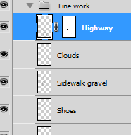
- If you’re working digitally, such as in Photoshop, separate your work into layers as much as possible, so you can move things around and reposition them easier. I’ll often have 10-20 layers devoted to just line work (even if it’s all one color and all part of the same “outline”) — just so I can easily nudge and move and rotate several pieces into good compositional places before I decide on anything.
- Backtrack in your process and try to find points at which there were alternative directions you could have taken, instead of the one that led you to where you are now. And try them.
- Possibly the tip I hold closest to my heart: Zoom out and be rough before you zoom in and be painstaking. If you reverse this, the sky will fall on your head! Block in colors roughly first to get the overall balance right, do rough thumbnails of compositions without spending too much love on any one of them, et cetera. If it looks good and balanced zoomed out, you can be confident that when you zoom in to work small it’ll all still sing.
- Be inspired. Go out into the world, take two! (If you are keeping a folder of inspirational material, that would be great to dive into too.) Try looking at illustrations, designs, and other visual material that have nothing to do with what you’re working on — they would offer up the biggest surprises in terms of directions you didn’t consider that might work with your drawing, too.
- Is it an abstract composition? One super-easy trick to reconsider the composition is just to rotate the format. (Or spend some time re-arranging the elements on the page — which should the viewer be drawn to first, and how does rearranging them change the hierarchy?)
- …or perhaps you’re drawing a person, or people. Do they really need to be visible head to toe, or be right in the center? Things tend to get more interesting if you change the scale of the subject relative to the size of the format, experiment with the foregound/middle-ground/background, or play with the edge relationships.


So, why “waste time” on so much experimenting? What if you’ve got a great idea right away and you’re certain you love it?
…it very well may be good, but it may not be the best. And, the only way to evaluate if it’s “the best” or not to compare it to something else — and if you make lots of variations of your idea, the more successful will very clearly shine against the less successful ones.


Especially if one’s illustration experience is still in the works, trusting your brain to always be right the first time isn’t the best idea, which is something I learned the hard way! My last three studio projects were the results of margin sketches I scribbled on loose-leaf paper off-hand, that my professor pointed to and said, “That. Do that. Throw away this… *point to sketch I spent 6 hours on*… and do that.”
Note: I found that it’s actually important that you do this step even if you’re happy with what you have, almost more so. Something that you really like could be the very pinnacle of your internal idiosyncrasies and thought patterns! So, by all means save what you did, but take even just a few minutes to entertain the idea that you had to completely rethink everything you just made. You just might find that your half-hearted experiment just… works!
This list has a bit more to it, so stick around for Part III as well next week, in which we will wrap up this outline. Hope some of these are helpful so far!


 Register Free Now

 Celebrating 10 million developers
 SurveyJS: White-Label Survey Solution for Your JS App

