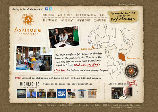
Showcase of Sweet Chocolate Websites
As one would expect, chocolate website often use an appetizing brown dominant color. If you take time to look at the panel of colors associated with it, you will find out that there is a lot of combination working really well. Apart from this component, each site is unique and features an original identity, depending on product presentation and given information.
Further Reading on SmashingMag:
Feel free to explore the designs featured below. Some of them are nice examples for Flash used for product presentation. Some designs are very classy while others are more artistically designed. But they all have in common this fascinating sweetness everyone loves.
Similarities In Chocolate Website Designs
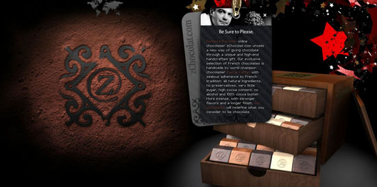
We found out that there are three common techniques that seem to crop up over and over again on various chocolate-related websites. A vast majority of the sites use a horizontal top-navigation, brilliant product and ingredient images as well as a dark brown color scheme which is often combined with vivid, strong colors.
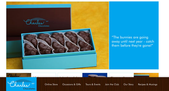 CharlesChocolates: the bright blue color scheme here is fun and fresh, but the thick footer navigation is what really makes the CharlesChocolates’ site stand out.
The navigation patterns are mostly common and convenient, however we’ve noticed quite a few uncommon navigation menus as well. The interesting part is that we’ve seen only a couple of typical boring stock templates. Apparently, most chocolate and confectionery website owners do care about their branding and their unique presentation on the Web. In fact, many sites try to be playful, creating an engaging, interactive and memorable user experience. That’s not something you will see in every industry, e.g. certainly not among medical websites.
Horizontal Top Navigation
Because chocolate websites vividly highlight product and ingredient images and therefore fill a large part of the layout with visuals, the choice of horizontal top navigation seems quite appropriate. The number of navigation options varies from five to nine links per navigation menu (excluding sub-navigation links). The most common navigation links lead to pages describing the manufacturor of the chocolate, shops where the chocolate is available and “gifts” pages where users can order business gifts, wedding gifts etc. Sometimes the navigation also contains a link to the recipes page.
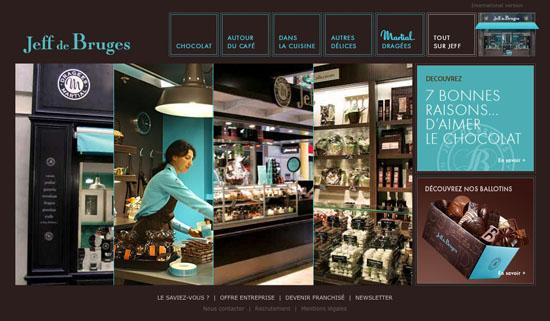
Jeff de Bruges Offsetting each navigation element with it’s own double border makes each link stand out and adds visual interest to the header.
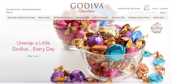
Godiva Chocolatier Placing the navigation directly under the header works well on the Godiva Chocolatier site.
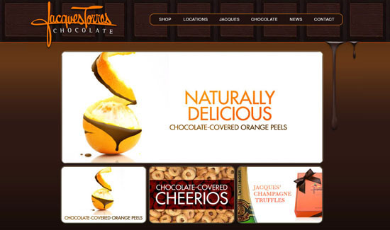
Jacques Torres Chocolate Having the top navigation highlighted by a thin orange border makes it more visible to new visitors.
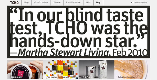
TCHO: Buy Dark Chocolate and Gifts The top navigation here is simple and a bit on the minimalist side. Placing it above the bold header text makes it stand out a bit more.
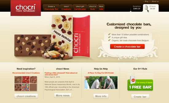
Chocri customized chocolate bars Classic tabbed navigation works well with multi-colored text and a subtle gradient.
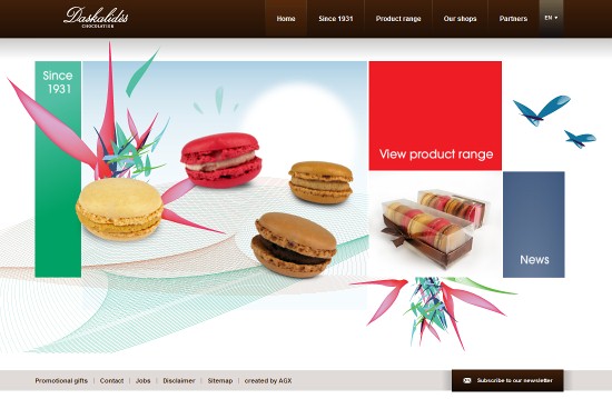
Daskalides Simple horizontal navigation is combined with a playful Flash-based navigation in the middle of the page.
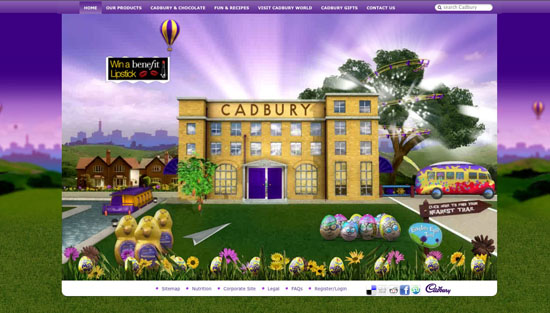
Cadbury: Cadbury Chocolate A simple, traditional top navigation bar is user-friendly and almost always looks good.
Product and Ingredient Images
The quality of product photography on chocolate websites is remarkable. Images are often large and dominant and are given a lot of both horizontal and vertical space. In fact, chocolate, especially gourmet chocolate, is often very visually interesting. The ingredients that go into it can also be very aesthetically pleasing. So it only makes sense that a lot of designers are opting to include mouth-watering images of the chocolate being sold on a given site.
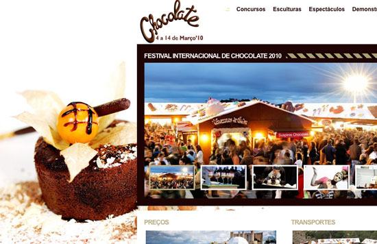
Festival Internacional de Chocolate de Obidos This site of a chocolate festival uses a striking background image as well as a nice chocolate photos on its main page.
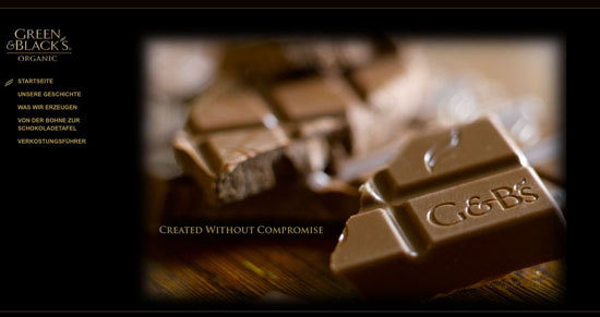
Green & Blacks Organic Chocolate The broken chocolate bar used here gives a casual look to the site, while the embossed logo helps reinforce the brand.
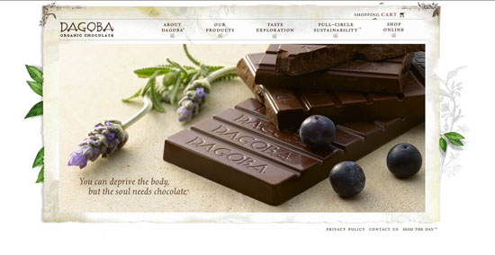
Dagoba Organic Chocolate The combination of chocolate with blueberries and lavender reinforces the organic nature of Dagoba’s chocolate bars.
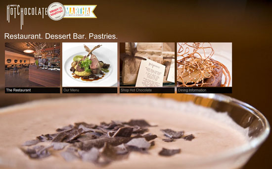
Mindy’s Hot Chocolate An almost-macro image of chocolate shavings in a chocolate martini, combined with other images of their offerings sets apart the Mindy’s Hot Chocolate website.
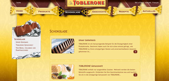
Toblerone Toberlone opts for limited product images, but including just a couple of well-placed images can have a positive impact.
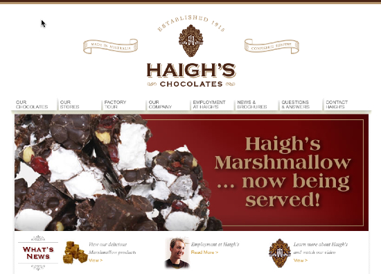
Haigh’s Chocolates A large, close-up image of the product adds a ton of interest here without overwhelming the otherwise simple and minimalist design.
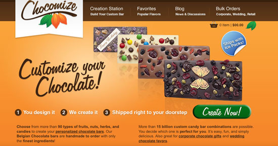
Chocomize Showing the variety of possible chocolate bar customizations can go a long way toward enticing visitors to create (and order) their own customized chocolate bars.
Brown Color Scheme
Obviously, dark brown color scheme dominates on chocolate websites. However, very often the scheme is complemented with vibrant, dynamic colors such as bright green or red. In general, most sites do stick to the dark scheme, often with tiled or photographic backgrounds which are closely related to the main theme.
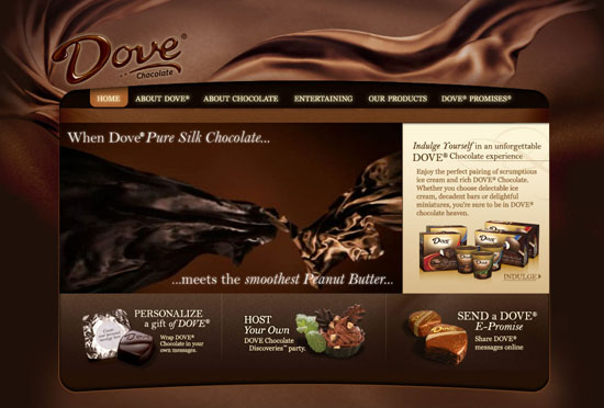
Dove Chocolate The Dove Chocolate site has an almost exclusively brown website design, with varying shades used to offset different parts of the site.
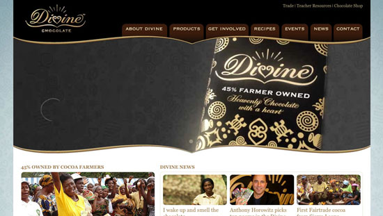
Divine Chocolate The Divine Chocolate site uses brown in limited quantities, but it’s still prominent in the design.
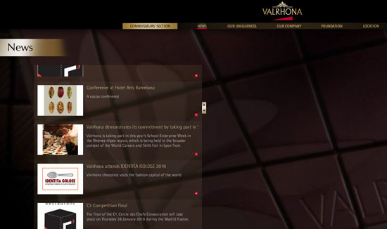
Valrhona Dark brown used throughout the design of Valrhona’s site makes one think of dark, high-end chocolate.
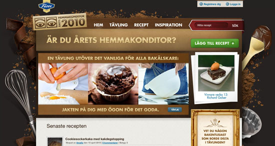
Hemmankonditor Varying shades of brown, from the very dark brown (almost black) of the background to the lighter browns of the navigation and header are all evocative of the many varieties of chocolate out there, and what can be made with them.
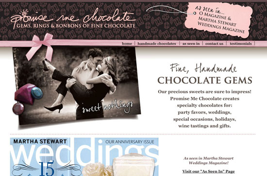
Promise Me Chocolate… The combination of dark brown and pink works really well together, especially on a site specifically targeting brides-to-be.
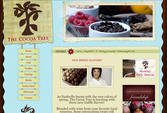
The Cocoa Tree Using brown as an accent color sets apart The Cocoa Tree’s site. It feels fresh and light, something that’s often hard to accomplish while still bringing to mind chocolate.
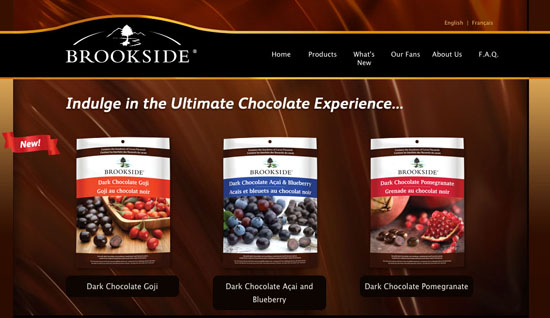
Brookside Foods The Brookside Foods site brings together various shades of brown with black and gold to create a high-end looking site.
Unique Designs
Some chocolate websites fight for user’s attention with striking design elements and unconventional navigation schemes. Some of them are presented below. In these cases, (for site owners) the engaging and memorable user experience seems to play a very important role.
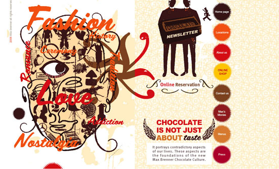
Max Brenner The Max Brenner website is set apart for a few reasons. The right-hand vertical navigation is one reason. But also the retro, grungy design with the animated eye (you’ll have to visit the actual site to see it).
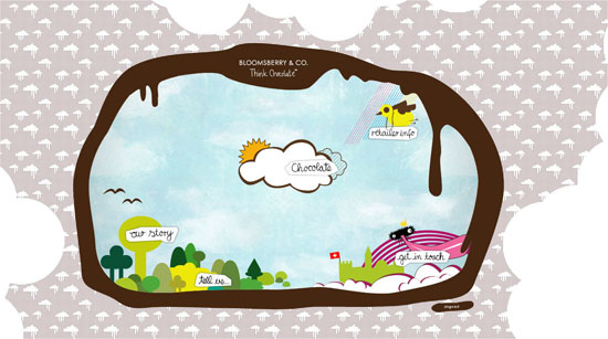
Bloomsberry The animation used on the Bloomsberry site is interesting and very well-done. The navigation is also atypical, with links easily identifiable but scattered throughout the main part of the home page.
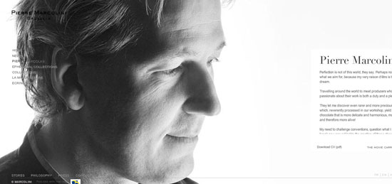
Pierre Marcolini The Pierre Marcolini site is very minimalist, with not a trace of brown showing up in the main part of the design.
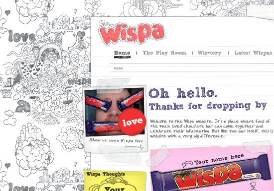
Wispa Another site that uses no brown in the main design, but instead opts for colors reminiscent of the product’s packaging rather than its contents. The hand-drawn elements also make it stand out.
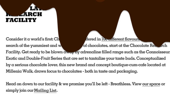
Chocolate Research Facility The animated chocolate dripping onto the screen is a bit gimmicky, but also adds a lot of interest to what would otherwise be a very simple site.
More Chocolate Website Examples
Chocolatfrey
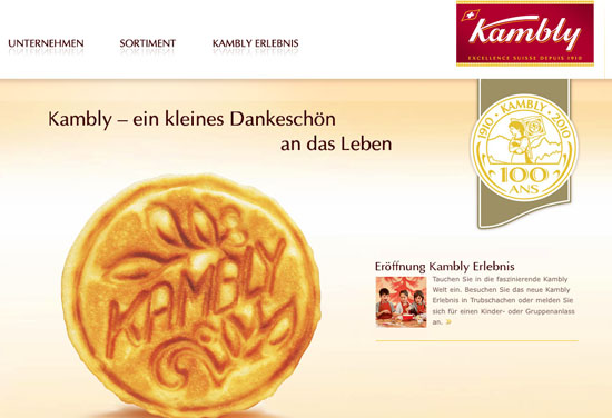
Kambly SA
Related Posts
You may be interested in the following related showcases:
- Showcase Of Beautiful Vertical Navigation Designs
- Beautiful eCommerce Websites
- The Unusable and Superficial World of Beer and Alcohol Websites
- What If Oscars Were Given To Movie Websites?
- Principles Of Minimalist Web Design, With Examples
(jb) (cs) (mm) (cc) (vf)


 Register Free Now
 Celebrating 10 million developers
 Try ProtoPie AI free →