Fashion Websites: Trends, Showcase, Interviews
Fashion is a cultural phenomenon. It’s so often transient, but at the same time one of the most polished mirrors of our time. Unlike other art forms and creative media, fashion is a mode of self-expression for all players involved: the designer makes clothes to express their personality, and the consumer wears them for the same purpose. Fashion also accommodates a number of other creative professions, such as photography, make-up and hair-dressing and Web design.
In this post, we’ll look at websites from the fashion industry. We spoke with two developers whose websites differed in style and implementation to find out the considerations involved in designing a website for a fashion brand. Further below, you’ll find a collection of smart websites done by clothing designers, photographers, make-up artists and other players.
Further Reading on SmashingMag:
- Showcase of Beautiful Fashion Websites
- Showcase of Beautiful (or Creative) E-Commerce Websites
- Finding Inspiration in Uncommon Sources: 12 Places to Look
With its look at trends and features in this niche, this post may come in handy for those of you working on a related project or who are simply curious to know how Web design is approached in this industry. Although we won’t discuss the clothing itself, fashionistas may find some use in it, too.
Some Trends On Modern Fashion Websites
Looking through the websites discussed in this post, we caught a few commonalities.
Full-Screen Photography
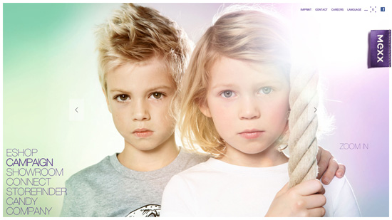
Photography is a powerful tool and is integral to fashion websites. Grasping how photography can impress the viewer and set the mood, many fashion brands use big high-quality pictures to dominate their websites.
Mexx Like many other fashion websites, Mexx relies heavily on Flash and full-screen images. The design has no special features or gimmick; its uniqueness is in the content itself.
Story-Telling
The fashion industry works hard to create mental associations and set expectations on the part of its audience. The market is saturated, and companies look for new ways to grab the attention of customers. One way a brand does this is by going beyond merely presenting its clothes and instead bringing its merchandise together into a storyline and associating its product line with a certain lifestyle.
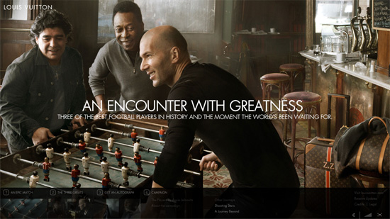
Louis Vitton Journeys Louis Vuitton Journeys is a unique Web campaign sponsored by the famous fashion brand. It features exclusive stories about influential modern personalities. The latest journey, Encounter With Greatness, features quite a smashing get-together of three football legends: Pele, Diego Maradona and Zinedine Zidane. Unique content and interactivity through Facebook integration make the website an exciting destination.
E-Commerce Integration
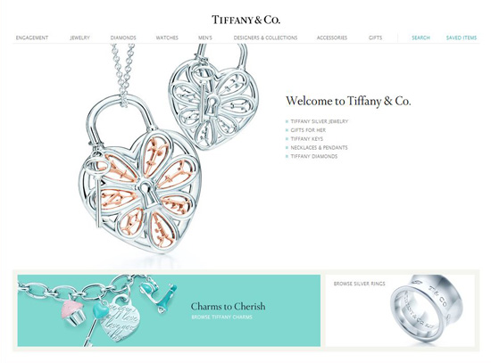
Modern Web technology enables us to showcase and sell products at once, and equally well. Today, most fashion brands no longer divide their online presence between their product line and e-commerce, preferring to combine the two under one domain or using their online store as their official website.
Tiffany Tiffany’s official website has a distinctly e-commerce design.
Big Names Are Inconspicuous
That the icons of fashion are so old-fashioned with their website designs is rather ironic. A quick look across fashion websites reveals that the more famous a brand, the more poorly designed its website. It seems these traditionally big names prefer conventional marketing channels and minimize their Web presence because of it.
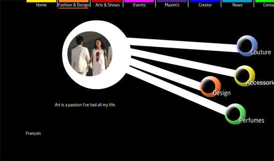
Pierre Cardin This website is definitely worth a visit, at least to see what a good design is not. Or perhaps that’s what they call avant-garde?
Interactivity and Social Media
Another trend is the increasing use of interactive features and social-network integration. Designers are taking advantage of the latest tools and techniques to allow visitors to “touch” their products and deliver exciting experiences. Live-action previews of apparel, webcam functionality, connecting and sharing via Facebook, even 3-D viewing mode: with all of these entertaining baits, becoming an online shopaholic is easier than ever.
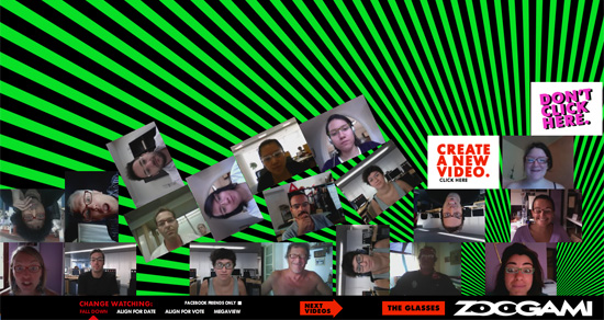
Zoogami Eyewear Zoogami presents its latest eyewear collection in a fun, amusing way. You need a Facebook account and webcam to experience it.
Different Web-Building Technologies
Although Flash still leads as the tool of choice for fashion websites, more websites based on HTML and JavaScript are appearing in this niche.
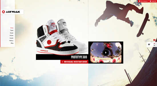
Airwalk The website for footwear brand Airwalk shows JavaScript at its best. It delivers a dynamic and interactive experience with its variety of transitions and hover effects. The branding website is seamlessly integrated with the online store, and the company style is perfectly supported by the images and typography. Legwork Studio is behind the work.
Showcase Of Beautiful Fashion Websites
Below are some more examples of fashion websites. The websites were selected not because the brands are famous, but rather because they were attractive, their approach was creative and their interface uncluttered (though not every website necessarily exhibited all three characteristics).
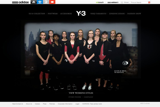
Adidas Y-3 The website for this Y-3 spring and summer 2010 collection is hosted on Adidas’ corporate domain. The website features an innovative and sophisticated presentation of the products, implemented with the “live photos” effect. Designed by Sid Lee.
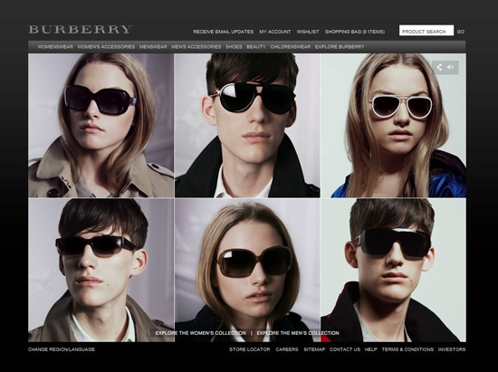
Burberry Every item in Burberry’s apparel and accessories collections is presented in a unique way on the company’s website. Here, you can see the “live photo” effect, similar to the one implemented on Adidas’ website; Burberry does a twist on it, though, by adding 3-D rendering. The design agency, KOKOKAKA, aimed for interactivity and hit the target, wouldn’t you agree? The website also includes an HTML-based e-commerce platform, so it’s a good example of how HTML and Flash can be effectively combined.
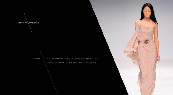
Amanda Wakeley A simple yet elegant website that serves as both an online store and a branding home for Amanda Wakeley. Design by Pod1.
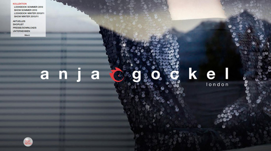
Anja Gockel The website of German fashion designer Anja Gockel has a clean and contemporary look. This is achieved mostly through high-quality photography, an uncluttered layout and clean typography. A special treat for fans: three desktop wallpapers available for free downloading, something rarely seen on fashion websites. Website design made by Macologne.
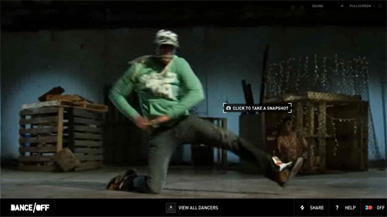
Jay Jays Dance/Off Dance/Off is an online catalogue for the new line by youth fashion brand Jay Jays. Its highlight is the interactive video available for viewing in 3-D. Visitors can enjoy a dynamic dance show and then just click to freeze the action and explore the outfits. Creative agency Visual Jazz did a great job of creating the fun and engaging product presentation.
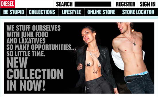
Diesel This website looks quite normal for a company that has developed a habit lately of inviting everyone to “be stupid.” Perhaps taking up a good half of the main with a large cloud of images and adding some Italian content here and there might seem strange, but given its habit, Diesel can probably get away with being a bit… well, cuckoo in its design.
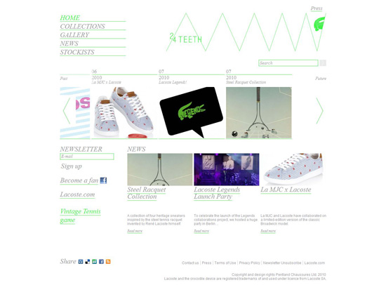
24 Teeth by Lacoste This minimal and light design splendidly matches the style of the 24 Teeth footwear line by Lacoste.
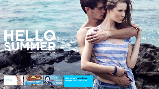
Reserved The website of Polish clothing brand Reserved has an atmospheric Flash-based design. The full-screen slideshow on the main page works great at inviting visitors to check out the latest collection. “Live photos” are used here, too, officially making this a trend. Some content is available only in Polish, even after you switch the language selector to English, similar to the Diesel website. Another trend? Hopefully not.
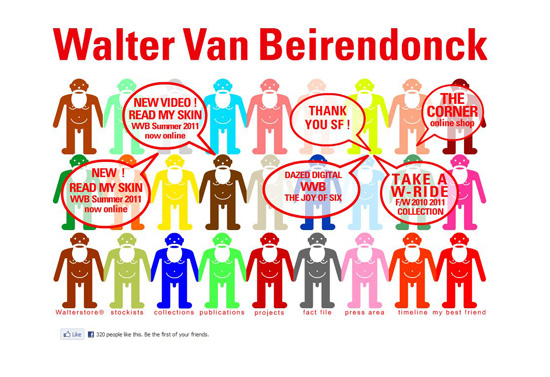
Walter Van Beirendonck Now here’s a Belgian approach to fashion websites. The design relies heavily on boxed tables and red. The timeline section has some bugs; still, the website is worth checking out, if only for the illustrations. Designed by Emmy Mees.
Werkstette Werkestette’s website is based on content. The simple and intuitive navigation enhances the impact of the large photos. The website was created by Pelle Martin and Felix Nielsen.
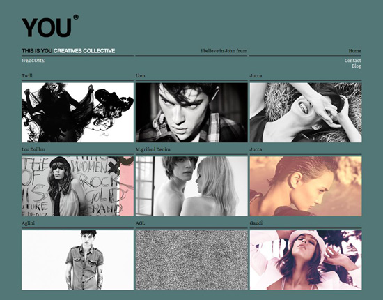
You Simplicity and an intelligent use of colors make the website of Italian creative studio You a beauty.
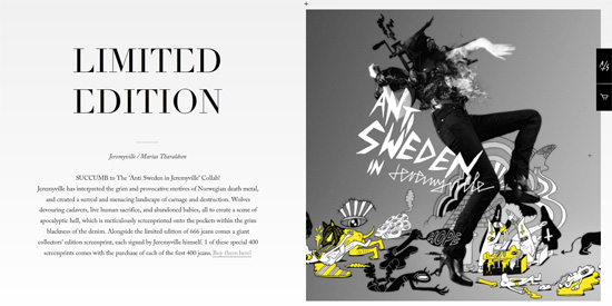
Anti Sweden Anti Sweden is the tribute of Norwegian design collective Anti to black metal, jeans and Norwegian identity. Remarkable graphic design and typography earned the Anti Sweden website a spot in this showcase.
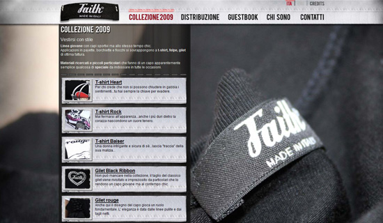
Faith The Faith clothing line is the brainchild of the Italian fashion designer Federica Sasella. Large photographs and cloth textures give the Faith website a pleasant look and feel. Designed by Effective Studio.
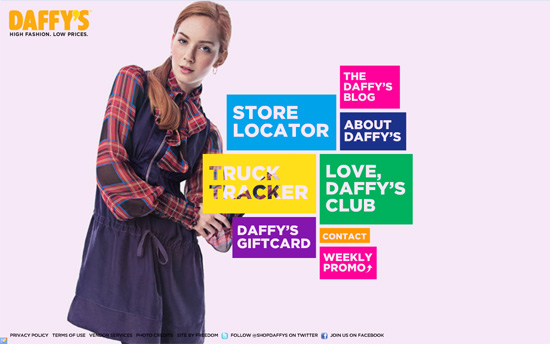
Daffy’s Daffy operates a network of low-price clothing stores geared to varied consumers. Bright colors, big eye-catching pictures, transitions and easy navigation make for a comfortable experience of browsing for bargains.
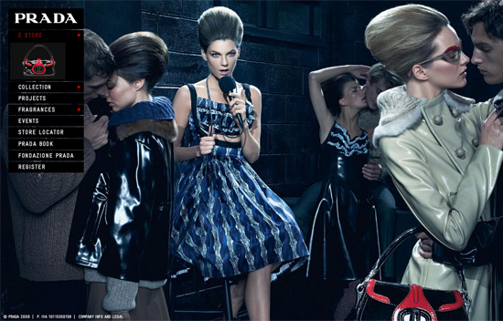
Prada This website focuses on imagery; the latest Prada collection is presented as an original mix of photos and illustrations. One nice feature is that most pages open in their own pop-up windows that can be moved around the screen, allowing visitors to compare products.
Josh Goot On the website of Australian fashion designer Josh Goot, visitors can play with the fuzzy surreal background, which creates a nice visual effect as the mouse moves around the screen. The interactive full-screen mode for images lets you examine the outfits in details. Tick off the checkboxes for aesthetics and functionality.
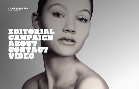
Lasse Pedersen This website is for hair and make-up artist Lasse Pedersen. The big pictures and typography are best viewed at full screen. Developed by Pelle Martin and Felix Nielsen.
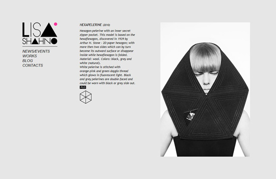
Lisa Shahno Moscow-based designer Lisa Shahno puts herself on the fashion map with these geometry-inspired designs. Her website accords with the style, too: the sparseness of the design complements the photographs and geometric logo well. Website designed by Kostya Sasquatch.
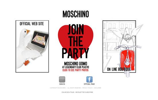
Moschino On the splash page of Moschino’s website, you can choose between the main website, the official online store or the page for the current campaign. At first sight, the three sub-sites aren’t very visually consistent. But it doesn’t feel like a serious problem, maybe because the funny goose mascot creates a link between the sections. Made by Netway Italia.
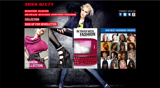
Miss Sixty The design for Miss Sixty’s website is bold and provocative, in no small part because of the abundance of red on the black background. The online store is slightly calmer.
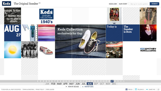
Keds “The Original Sneaker” celebrates its over 90-year history. The website is a treat for the typophile.
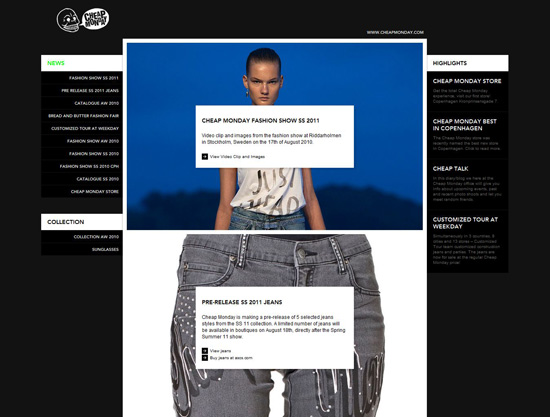
Cheap Monday This well-known producer of street-style jeans, Cheap Monday, has an interesting history. You can learn all about it on the company’s website, which has a simple “bloggy” design that matches the underground values of the brand.
Under The Hood: Interviews With Two Developers
To get a better idea of what characterizes the process of designing a fashion website, I spoke with people at two design agencies that have relevant portfolios. One of them is the Swedish digital agency Nute, which developed a website for the fashion and art project Uniforms for the Dedicated. The other team is the Indian agency BC Web Wise, which designed a website for apparel creator Allen Solly.
I thank both teams for taking the time to do interviews for this article.
Uniforms for the Dedicated
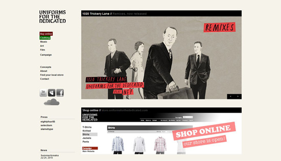
Uniforms for the Dedicated (UftD) shows an innovative approach to fashion branding by combining men’s fashion, music, art and film. All of these and an online store are skillfully presented on UftD’s website, which was designed and developed by Nute Digital Agency. Like the fashion brand itself, the website is diverse and successfully combines HTML, Flash, JavaScript and an e-commerce platform into an enjoyable browsing experience.
Daniel Ruuth, creative Web developer at Nute, was kind enough to share details of the creation process for UftD’s website.
Question: What is involved in designing a website for a fashion brand?
Daniel: I think designing a website for a fashion brand is like designing a website for any other lifestyle product. The main thing is to display the products—the clothes in this case—well and in a context in which the viewer gets an overall feel for the product. A piece of clothing is so much more than a textile and a color: it’s a mood, a statement and an expression of the person wearing it.
We have a great connection with our client, and because of this we know how important the context, the feeling and the underlying story of each garment are. This is what we need to communicate to visitors. They need to be able to see themselves in the clothes. Besides this, of course, users want to be able to “get” the material, so close-ups and/or photographs that help you understand the motion of the garment are important.
Question: What goals did the client set for you?
Daniel: The website was combined with an art installation. The goal was to launch the website to keep the rings on the water moving. Along with that, we had the goal to increase website traffic by 40%, which we did.
Question: Could you give us a brief overview of the stages of creating the website?
Daniel: We had a start-up meeting with the clients to discuss this year’s campaign. At the meeting, we gathered key concepts and any ideas they had. After that, we start working on a presentation of our suggested approach; this is where we showed them the initial hand-drawn sketches (which were poorly detailed on purpose to keep the client from locking in on the details).
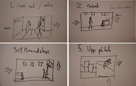
Some sketches from the original hand-drawn story board.
Daniel: That idea and those sketches got tossed around for a while before we got to the next point: the mock-up. Here, we did a simple mock-up (watch this concept test movie for the UftD website). Once that was completed, we did the final sketches, got them approved and then went about starting the actual production.
Question: What tools did you use? Particularly, what were your reasons for not using pure Flash, which seems to be the most popular platform for fashion websites?
Daniel: We put the idea first. The technique is not what’s important. If the idea must be realized with Flash, we’ll use Flash. If it can be solved with plain HTML, we’ll use HTML. If we need to work with Web cameras and streaming services, well, then we’ll use that. We try not to think of “how” right from the start, but rather of “what.” We have a great team here at Nute, so whatever idea we come up with, we usually have someone who can make it happen.
The tools we used in this production were AfterEffects, Photoshop, Flash and Coda. The online store implementation was built on the Magento e-commerce software.
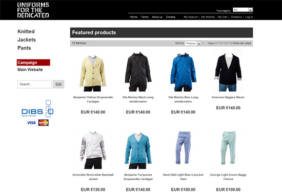
The UftD online store is clean and elegant, creating a comfortable shopping experience.
The biggest part of the production was creating the movie/environment (see a screen dump of our AfterEffects project; quite a few layers).
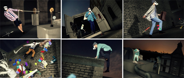
Some of the frames from the movie for UftD’s latest campaign, 1020 Trickery Lane.
Question: What do you think makes this website a win?
Daniel: We strive to tell the user a story. Whether it’s a huge CMS-based company website or a campaign website like the one for UftD, there’s always a story to tell. In this case, it’s easier to see what I mean by “story,” because the website could actually be interpreted as a film, going from point A to point B. Our first concept was like a script for a movie.
What makes this website a win? Well, perhaps it’s a win because we are able to entertain users while they view all of these awesome garments by UftD in an exciting environment. But more importantly, I think this website is a win because it’s right where the audience is. This would not be a good website for a Donna Karen collection, but it’s a great website for a brand like UftD.
Question: What feedback have you gotten from the client and users about the website?
Daniel: The client is more than happy, and the online buzz for the website speaks for itself.
Allen Solly
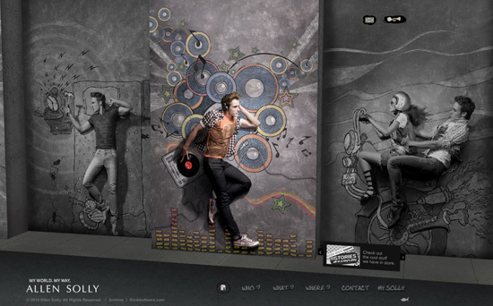
Allen Solly is an apparel brand from India that offers mostly semi-formal and casual wear for men and women. The brand’s official website is based on Flash; eye-catching illustrations and an interactive 3-D environment convey well the spirit of the 2010 collection and engage the target audience. Unlike most fashion brand websites, Allen Solly’s has a contemporary and uncluttered design.
To learn more about the process of creating a website for Allen Solly, I got in touch with the agency responsible for the design, BC Web Wise. The founder, Chhaya Balachandran Aiyer, and the studio’s leading designer, Naim Shaikh, kindly agreed to answer my questions.
Question: What is involved in designing a website for a fashion brand?
Chhaya: Imagery is critical. The design has to showcase the fashion statement. It has been commonly implemented in print and on TV before. The idea is to extend this fashion statement to the Web, taking advantage of its interactive capabilities. I think we did it with the use of Papervision3D and bringing alive a 3-D rendition of the print campaign.
Question: What goals did the client set for you?
Chhaya: The message of Allen Solly’s latest release was as follows: “We’re bringing modern art to modern fashion, doing summer style like nobody else. Our new range of youthful work and casual wear lets you live life 3-D in a 2-D world.” Our goal was to create a Web presence that reflected this idea in the best way.
Naim: In short, the client’s brief sounded like this: “This is our new collection. Do your best with this.” We then got full freedom to do our creative work.
Question: What tools did you use? Particularly, why did you choose Flash, which seems to be the most popular platform for fashion websites?
Naim: Flash and Photoshop were used to make this website. Usability is very important to us. I feel that many fashion websites are too cluttered, with weak usability, and we tried to avoid this. For Allen Solly, along with the main Flash version, an alternative HTML website is available, which helps with search engine optimization and gives choice to visitors who don’t have Flash enabled.
The creative artwork done by Ogilvy for Allen Solly’s print campaign was very cool, with a 3-D effect and illustration style. We adapted it for online.
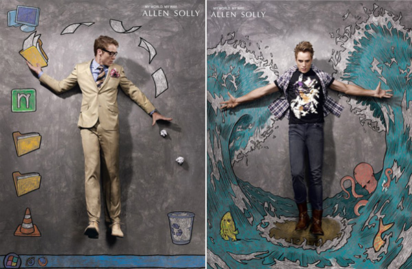
The illustrations on the Allen Solly website were initially designed for the print campaign of the same name, designed by Ogilvy & Mather Bangalore.
Question: What, in your opinion, makes this website a win? What feedback have you gotten from clients and the audience?
Chhaya: An intuitive front end and sleek execution. Honestly, everyone has simply loved it.
Naim: It was a very big project for us. It is very big for me on a personal level, too. The website has received the most positive response and has been featured in various design communities.


 Celebrating 10 million developers
 Register Free Now
 SurveyJS: White-Label Survey Solution for Your JS App