Showcase Of Appetizing Restaurant Websites
Because customers are increasingly using mobile browsers to make decisions on the spot, restaurant websites are doing a better job of communicating core information quickly. Similarly, full Flash websites with no mobile alternatives are seeing some decline. Especially interesting is how these businesses are improving their online menus by replacing PDF-only downloads with Web-optimized alternatives that are more readable and easier to navigate.
Showcase Of Restaurant Designs
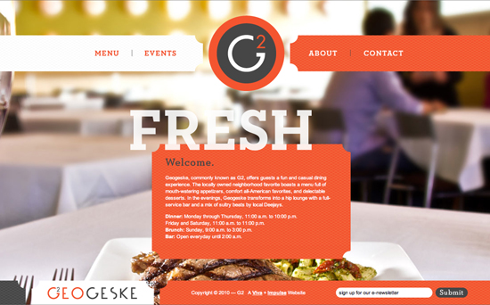
Geogeske
This design has printerly qualities, with its eye-catching oranges and whites and oversized headings. Everything works together to establish a relaxed yet smart urban atmosphere. The JavaScript effects (sectional fades and spring-loaded logo introduction) are used sparingly and effectively. Simple navigation and short copy make scanning easy while putting the focus on the strong menu-worthy photography. However, the site could certainly use a larger font size.
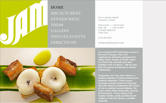
Jam Restaurant
Upscale modernist and classical elements are used consistently on this website and in the menu and restaurant interior. The vibrant typographic header looks stunning while enhancing usability by prominently displaying a phone number and hours. Another nice touch is how the body scrolls beneath the stationary translucent header.
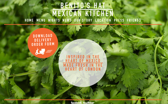
Benito’s Hat
Named after a celebrated Mexican president, this restaurant communicates authenticity and freshness with a green cilantro backdrop and clear devotion to its culinary roots. At times, the backdrops on the interior pages eat the foreground text; a little contrast and spacing would help in spots. Overall, an offbeat feel that works.
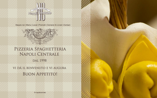
Pizzeria Napolicentrale
This website uses horizontal navigation to guide the user through photos of mood-setting rustic Italian elements. The beige picnic pattern adds just enough visual interest without competing with the copy. But in some sections, the taller content makes horizontal scrolling a bit floaty.
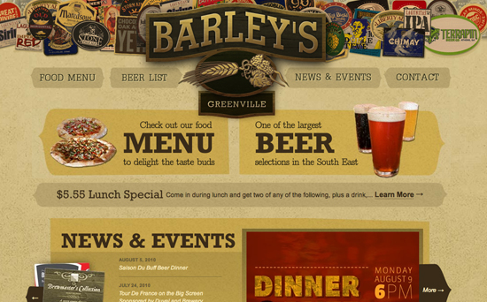
Barley’s
A cozy design rich in grainy colors and sturdy serifs. Small touches—like the roll-overs, and lighting effects such as in the logo hover state—give a handcrafted feel. Do not miss the nice, readable menu and beer list that feature stylishly simple beer ratings.
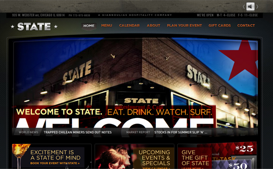
State
With nocturnal tones and pictures of people having a good time, the State uses a hip design to say that it’s a cool sociable night spot. Perhaps intentionally, there seems to be little focus on food; for example, the menu section feels skimped (disjointed navigation and flimsy type for the buttons). More photos of the restaurant and food might enhance the personality of this website. Also, the home page seems a tad cluttered. In general, a little more depth in the sub-pages would round out what is a good-looking piece.
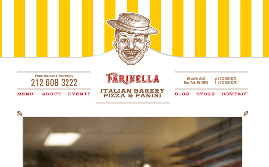
Farinella Bakery
Fun and disarmingly honest, Farinella Bakery takes the cake in blending personality and usability. The bold header and fun footer become bookends for the spot-on copy and photos. Notice the slight head bob when you click on the navigation and the magnification when you roll over menu items; a tasty browsing experience. What makes this a winner is that the integrity and consistency of the design can be found in the smallest elements.
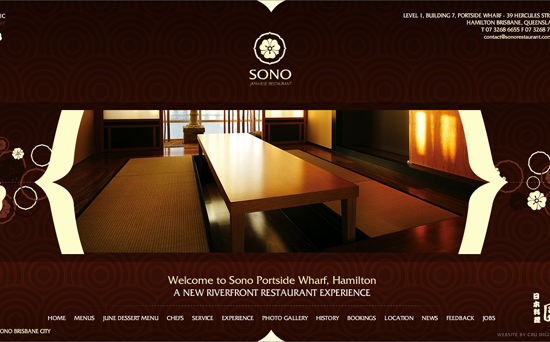
Sono
Authentic Japanese design elements and atmospheric audio effects work well to create mystique on this Flash website. A few usability concerns pop out: for example, the flaky JavaScript for the “Back” button and the small text that is in a cramped box with a small scroll bar.
The Little Cake Parlour
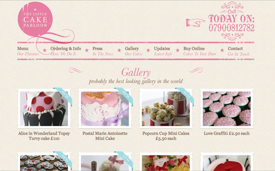
This more conventional website shines with gorgeous photography that almost seems edible. The design has a strong focus on typography, with various elements embedded in the elegant pink multi-column layout. Some design elements probably shouldn’t be images and would work better as simple plain text, though. Also, because all visual elements have a similar pink tone, they may be a bit difficult to recognize at first glance — for instance, the pink PayPal-button in the footer of the site.
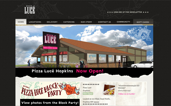
Pizza Luce
With playful tattoo-like scribbles and quirky photography, Pizza Luce makes clear its immutable place in Minneapolis’ food culture. Check out the oddly captivating home page illustration. For all of these strengths, the community section feels slapped together and in need of a bit of refinement.
La Vista
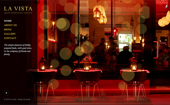
The clever use of the Flash overlay here adds intimacy and life to the crisp photography. The menu is noteworthy: simple to browse and very clean.
Georgian Wine Society
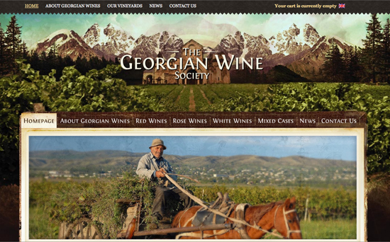
The backdrop feels like a matte painting that draws us into the headspace. With that, we are receptive to the interesting narrative about Georgia’s role in wine-making. The e-commerce system is well integrated; a more generous margin between elements would augment the shopping experience.
Catered by Kate
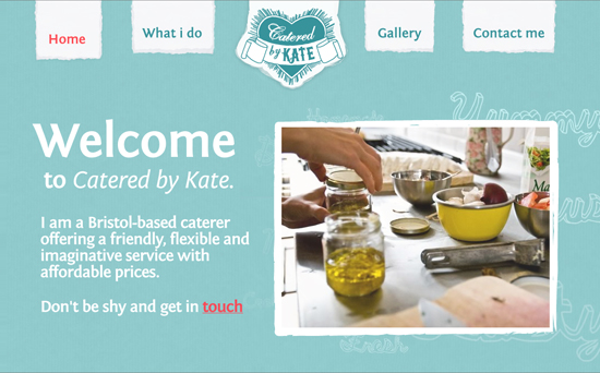
This website’s “About” page is one of the top in this showcase. It opens with Kate smiling warmly, giving the page a welcoming human touch. Next, it summarizes (in only two sentences) three very compelling reasons why you would use Kate for your catered event. Just one distracting but easy-to-fix minus: a call-out to an empty Flickr page that is supposed to hold more images.
Can Jubany
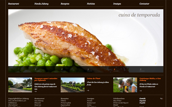
This clean layout on deep chocolate brown feels elegant even while containing a surprisingly large amount of content. The home page sets the right tone with the large yet quick-loading video that tells a story. Two more unique touches are the simple sliding navigation and the tantalizing, well-written recipe section.
Caravan
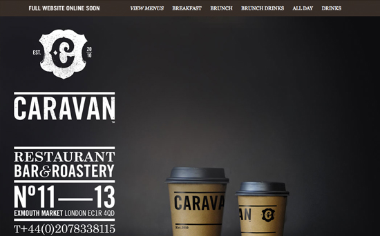
This simple and savvy composition uses negative space to focus on the coffee while adding depth with subtle textures. If the placeholder is this solid, then our expectations are high for the full website!
Chipotle
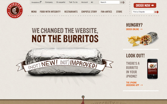
Humor, earthy tones and engaging (and notably non-Flash) animations make for an experience that is engaging and relaxed yet expertly crafted. Consistent with its corporate message of “Food with integrity,” Chipotle focuses much of the website on its brand rather than the burritos. Be sure to tug the rope in the footer for some hidden and delightful interactivity.
Le 28 Thiers
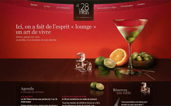
Here are tangerine and rose hues mingled with crisp photographic elements and textures. The simple wooden table distinguishes the layout and grounds the content visually. Subtle gradients in the typography, quality photography and the curved navigation inject elegance and dimension.
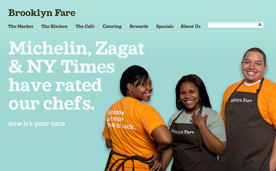
Brooklyn Fare
This playful design achieves a unique charm through imagery that consists of real employees, bookish serifs and a stylish seafoam background. Especially nice is the consistent layout, with its cheerful copy and gritty photography, which avoids appearing repetitive.
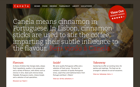
Canela
Canela (Portuguese for “cinnamon”) employs a conventional layout, energetic reds and generous imagery to give a sense of flavor and sophistication. The three-column PDF-only menu makes browsing on a mobile device more challenging.
Last Click
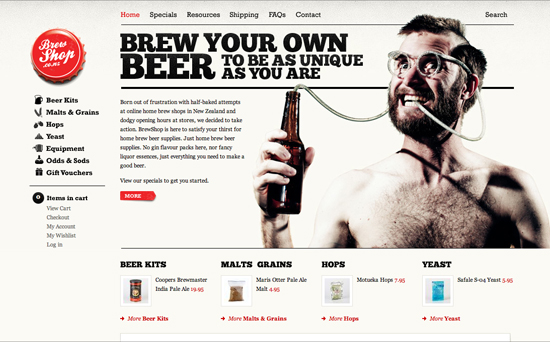
Brew Shop
The Brew Shop is not really a restaurant website, but it is still worth mentioning. The site establishes personality at first sight with a hilarious photo and beery good humor. It backs the funny with substance, such as a very usable e-commerce system, effective copy and scannable icon-enhanced navigation. Especially nice are the swaths of red as call-outs and the subtly scrambled type.
Related Posts
You may be interested in the following related posts:


 Try ProtoPie AI free →
 Celebrating 10 million developers


 SurveyJS: White-Label Survey Solution for Your JS App