Showcase of Interesting Navigation Designs
Three points to consider in any navigation scheme are consistency, user expectations and contextual clues.
If page is long and provides different levels of navigation, will users be able to find their way through the site and use proper navigation quickly? Forcing visitors to use certain keystrokes to navigate, rather than what they’re used to, might be novel, but is that effective if you have to explain instructions prominently on your home page? Here are some examples for your reading pleasure.
Further Reading on SmashingMag:
- Showcase of Creative Navigation Menus: Good and Bad Examples
- Web Design Navigation Menus – Articles And A Beautiful Showcase
- Showcase Of Beautiful Vertical Navigation Designs
- Breadcrumbs In Web Design: Examples And Best Practices
Made by Water
A JavaScript-Powered Vertical Fun
The large bold headings and modern color palette on Made by Water feel fresh and fun. The grid layout is nice and clear, while the background texture is subtle but interesting. The icons at the top are visually appealing, and the animation makes them fun to click. It’s not immediately apparent what they are for, though. Some text would help to clarify that they are for navigation.
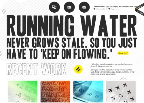
Vertical navigation buttons with icons.
The other problem with the navigation is the yellow “up” arrow that is displayed in the footer of the page. One would expect it to bring you back to the top of the page, but it leaves you more in the middle. The circle of stripes that follows you down as you scroll doesn’t match the background pattern, but we can’t tell if it’s part of the navigation. At any rate, we clicked it to no effect.
Finally, while the text at the top is fun and exciting, finding the “Who am I” section is a bit hard. It’s not immediately clear what the website is about.
Made in Haus
Horizontal Slideshow as Navigation
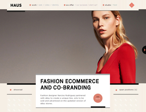
The large page keeps Made in Haus from feeling unoriginal, and the smooth motion is a bit different from many of the sliders we’ve seen. Bumping the accompanying text up into the body of each slide is a good way to keep it above the fold and visible as the user flips through the slides. The sliders on the sub-pages are also effective, being an easy way to skim through a fair amount of content. Also, nice hover-effects under the slideshow look attractive and give an insight into the work of the agency.
One drawback is that the triangle on the far right of the upper navigation menu is a bit confusing. It appears to link to the home page, as a logo would, but we’re not quite sure why. Also, the arrow on the right side of the slideshow may be a bit too tiny, making it a bit difficult for users to navigate the slideshow. We’ve seen a similar navigation earlier, on Weightshift which is a nice example of an alternative implementation of this technique.
Foundation Six
Animated Text Scrolls Down With the User
Foundation Six features a few big bold screenshots at the center of the page, giving us the impression that they were interactive in some way. The first thing that we did was try to click on the screenshots, but nothing happened (except for the central one which links to the description of the project featured in the center of the page), which was a little frustrating.
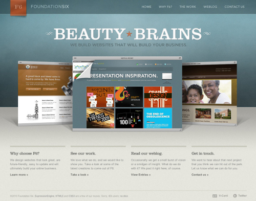
Text moves instead of images.
The headings are large and very clear, and the type is handled nicely throughout. The color palette is very soft and clean, and it nicely matches the atmosphere of the site. The call-to-actions buttons are large and easy to find, read and click. The subtle hover effects in the upper navigation enhance the user experience, making it smooth. Additionally, the contact form tracks well and is nicely laid out, while the map is a nice touch. The company scores bonus points for linking to Bring Down IE6.
On the projects page, the way the explanatory text slides down instead of the images is original. But being so unexpected, it could be a little disorienting, which may or may not be a good thing: is explanatory text really the best place to make a statement with moving parts?
Word Refuge
Textual Content in a Horizontal Slider
Word Refuge features an old-fashioned bookish vibe. Because it is a copywriting service, this seems appropriate. The contact form is prominent, easy to find and easy to use. The logo is also nicely done, and the color palette is rich and regal.
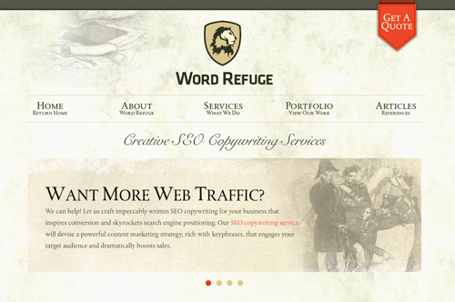
Various arguments for the company are organized into slides.
One small point is that the tag lines in the main navigation are effective under some of the menu items but not under others. Some of them feel redundant, as if they’re there only to balance things out. As a rule, if text doesn’t add any explanation, it shouldn’t be there. That said, the text throughout the website is nicely kerned, and while the page is wordy, the text is easy to skim through and read.
Relogik
Animated Horizontal Slideshow Navigation
Relogik is another example of minimalism done well. The logo is understated and sophisticated. Most design elements are semi-transparent and appear on hover. The close-up images are bold and make the content the focal point of the page. The code is clean and well-structured and uses a solid grid layout with pulls to keep everything squared up.
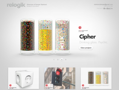
Sliding horizontal navigation.
The classic numeric navigation makes it easy to navigate the slideshow. One weakness is that the contact information has a very low contrast against the background. A darker color would help to highlight it. The project detail pages do a good job of showing rather than telling and of displaying each piece in a real-world context.
Drexler
Horizontal Navigation… If the User Follows Instructions
The horizontal navigation on Drexler works both with the arrow keys and mouse clicks. On the first glance, it’s not clear how to navigate the site: you need to either read the hint in the upper area of the site (“User your arrows”) or experiment with the design to figure it out. To browse blog posts, users need to click on the illustration of the post or use keyboard arrows. The design itself is visually appealing, but the navigation scheme isn’t straightforward.
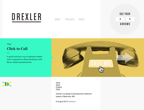
“Use your arrows” to navigate.
The retro color palette and big bold fonts make the website colorful and energetic, but they also might be a little overpowering. The “t” for Twitter in the upper right is an interesting break from the usual little bird, but the downside of breaking with convention is that you might lose clarity. We didn’t know what the icon was for until we clicked it, and we probably wouldn’t have clicked it if we were merely visiting the website as a normal user. The contact button is amazing indeed, as it claims. The multi-column contact form is an interesting take on the email form. It seems effective, and it tracks very well. This is a design that needs to be explored to be understood — but maybe it was the intention of the designer in the first place?
The logo is simple and clean, but again, it adds a note of confusion. The yellow underline on mouse-over feels unbalanced, because the rest of the logo isn’t highlighted. One other thing to note is that the page changes color to match the project being displayed. This is an unusual take on the portfolio. Usually, projects are displayed uniformly, sometimes to the point of being indistinguishable. This approach makes the projects stand out, in a good way.
Komrade
Vertical Navigation With a Twist
This page allows users to forge their own path through the website. Komrade features original illustrations, a fresh color palette and an original “Choose Your Own Adventure”-style navigation scheme. The navigation has the following cracks in it, though:
- The light blue text looks like it’s hyperlinked. One of the first things a user sees upon loading the page is the blue “Who’s Komrade” heading. The first thing we did was click it, but nothing happened. This started the user experience off on the wrong foot. With this unusual scrolling navigation, distinguishing the clickable from the unclickable is extremely important.
- The numbered navigation for Komrade’s past work does not stand out enough. The red circles look like yet more flowers, which caused us to pass over them several times before figuring out that they were the navigation. This goes back to the clickable/unclickable issue. Well-placed labels would go a long way here.
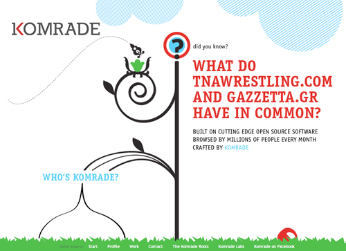
“Choose Your Own Adventure”-style navigation.
All For Design
Scrolling Navigation and “Shelf”-Navigation
All For Design feels light and airy, with its crisp woodcut headings and subtle effects such as the Twitter icon that flies on hover. The design os single projects pages is especially nice, making clear exactly what was involved in each project. The section “some inspiration” nicely puts books, useful websites and articles on a “shelf” and has subtle shadow- and hover-effects. The only problem is that the title-attribute is displayed on hover together with the screenshot which makes it a bit difficult to focus on one of them.
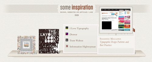
“Shelf”-navigation.
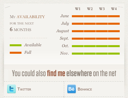
Calendar next to the contact form.
The calendar next to the contact form is also a great idea: it sets expectations and makes it easy for potential clients to plot a timeline. While the font is scannable, it still feels a bit too wordy overall, although the shadow effects, subtle borders and custom icons keep the eye flowing down the page.
Digital Labs
Horizontal or Vertical Navigation?
With the prominent screenshots on this website, one would think the page would have horizontal navigation; in fact, the page is static. Digital Labs uses a wide layout, with a nice textured background. The dark colors make it feel spacious without being too spacey. One issue, though, is that the orange ribbon on the right looks like it should be clickable, but it isn’t. The text-based social media widget, which responds to mouse-over, is an interesting touch. The web design scene is full of social media icons, so a text-based widget stands out.
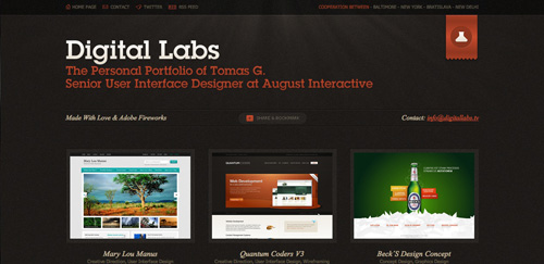
The static screenshots above look like a slideshow.
The other issue is that the “Are you ready to get started?” link at the bottom is a mailto: link, rather than a link to a contact form. This is acceptable, but a drop-down form in that space would really kick things up a notch.
Calobee Doodles
Classic Thumbnail and Lightbox Combination
Calobee Doodles, an illustration-based portfolio website, has fun details, such as the objects and people falling from the sky. The cloud menu items could be clearer, though. At first, we were not sure what “Custom” stands for (it stands for custom design and illustration work). However, the menu benefits from descriptive tooltips and appear on hover. Still, a different wording, for instance “Work”, would have been clearer.
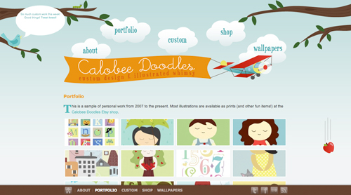
The website uses the classic thumbnail and lightbox navigation.
A thumbnail gallery is a common way to display work, but in this case illustration thumbnails are a bit too small, and they are linked to images. A lightbox may work better in this context. The bottom-up-navigation may be useful for some readers, and the footer is truly remarkable. Also, it would be nice to remove dotted lines appearing on click in the navigation menu. A simple outline: none; for links with proper styles for :focus and :active states would suffice.
Build
Classic Top-Level Navigation
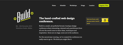
While the overall layout of Build is clean and modern, the content could stand to be more easily scannable, for two reasons for this. A look at that code suggests that the margins and padding are a bit arbitrary. The padding for the main body conforms to a design pattern, but the major content elements do not. Maybe it would be a good idea to use multiples of a set base number for the margins, padding and borders, so that there is a consistent ratio throughout.
Secondly, the contrast of the text in the content sections has some problems. The contrast between strong white and strong grey background is very striking, and maybe a bit too strong. The second part of the page looks a bit busy and a bit difficult to scan, probably because the colors of the headings and descriptions are very similar. Maybe if the headings were kept as a serif, the content blocks could be distinguished a bit by making the text lighter and using a sans-serif font. Some textual variation or typographic work might add visual interest as well. Subtle hover effects for links are attractive and fun to click on: nice touch!
We liked the listserv sign-up widget in the footer of the page. A sample email in the relevant field, along with more space on the line, could be a helpful, though. Also, an explanation of what exactly users are meant to type here would be great — for instance, a sample e-mail in the input field. Also, the mouse pointer should change after you click on the submit-button, but in this case it doesn’t. We fumbled a bit at first until we looked at the code.
Mail Chimp
Graphics-Heavy Vertical Page With No Navigation Other Than Browser Scroll Bar
Mailchimp’s promo page is a visually appealing website with a lot of interesting vintage graphics. Some real strengths of this website are the many interesting textures and patterns. The color scheme is modern and appealing. There are, however, a few usability problems. First, there is actually no navigation. We’re as big a fan of shedding unnecessary conventions as the next guy, but if we were an existing customer visiting this website, we would have no idea what to do. The “Sign in” link is obscured at the bottom of the page, with few visual cues to reward the user’s patience as they scroll down. Even a few small links at the top would add some structure and provide some cues for navigation, which would make the whole website make more sense.
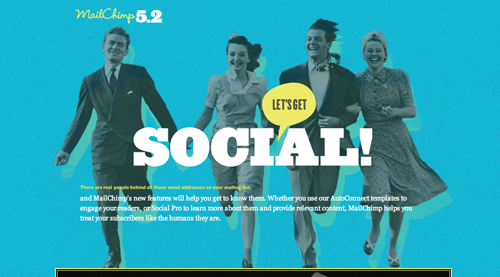
Graphics-heavy vertical website.
Secondly, the edgy graphics, while fun and visually interesting, don’t give much sense of what the main point of the page actually is (if you are visiting the site for the first time). The primary message is only delivered in the paragraph towards the middle, and even it is a bit hard to read, with the small white text over the shades of gray. The paragraph would be more effective if it were bigger and had more contrast. The promotional videos are really great and remarkable, though.
Pline Studios
Minimalism in Vertical JavaScript-Based Navigation
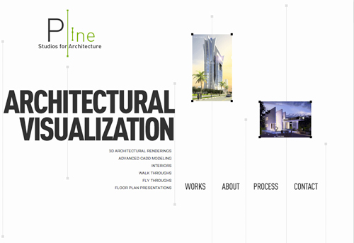
Pline studios is an architecture firm, so it makes sense for it to have a spacious vertical layout with graphic touches that are reminiscent of CADD drawings. The big headings are clean and visually appealing and do a great job of leading the eye around. In an unconventional navigation scheme, making it clear where to click is critical, and this website makes it extremely clear. The navigation is repeated in each section, so the user is never stranded and left to scroll.
One problem, though, is the project descriptions; so much focus is on the images and animations that there’s actually very little explanation about the projects themselves.
Transformology
Persistent Toolbar-Navigation
Transformology shows another way to handle navigation on a vertical page. When the user scrolls the page, the navigation menu at the top of the site changes accordingly. The elaborate headings in the text blocks are visually appealing, but almost to the disadvantage of the content that should be showcased. The headings make the content easy to see but more difficult to read. The website has a clean, solid grid layout, but it may not always do an effective job of displaying the content, which sometimes feels overpowering.
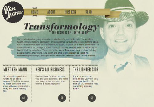
Static navigation follows wherever you go.
Burton
Sliding Captions and Tabbed Boxes in a Vertical Layout
The first thing we noticed about Burton is the nice visual details, such as the animated eyes on the “Search and Destroy” search box, and the animated GIF on the mouse-over logo. The jigsaw layout is clean, bold and easy to scan. The mouse-over labels are a good way to display details without overwhelming users with text, and the mini-tabbed layouts inside the content blocks keep things clean and minimal. All of the content is available without being visible all at once.
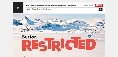
The scrolling vertical navigation is aided by the jigsaw sections with sliding captions.
A problem with the navigation, though, is the up and down arrows on the side of site’s pages. We expected that they would allow us to move up and down the page; instead, they pop out a text-based navigation menu. Not knowing what sections of the page correspond to the labels (for instance, when you visit the page for the first time), this isn’t very useful. Still, overall very nice, original and memorable design.
New Adventures in Web Design
Fun Shapes That Feel Like Navigation
At the first sight, the interactive shapes in the middle of the New Adventures page feel a bit like navigation, in that they change as you move through the website, providing cues that the page has changed. New Adventures is an example of a clean and solidly structured design. The rainbow of dynamically transforming shapes is fun and original. Adding more color could make the design a bit stronger; the brown palette is calm and professional, but it probably could have been be more interesting with some accent colors.

The shapes move all over the place!
The typography overall is effective, and the line heights and margins make the information very clear and concise. An interesting touch of the design would be to highlight the speaker’s photo when a user hovers over his or her name in the list of speakers. Also, when trying to return to the front page, we clicked on the text logo in the left upper corner (“New Adventures in Web Design”), but it isn’t clickable which is a bit confusing. We had to use the small “Home”-link in the upper left corner instead.
Christopher Kaufman
Wide Horizontal Slider With a Difference
On Christopher Kaufman’s page, the sub-content panels slide up as the slider moves left to right. The layout is clean and organized, the background is colorful and unique, and the slideshow adds plenty of eye candy. The logo is minimal but detailed, and the top-level navigation is clear and effective. One drawback is that the background image is a pretty big file; as it loads, it creates a flashing effect that can be disorienting. One could argue that the height of the slideshow is optimized for larger screens; but scrolling through the slideshow content, some users can see that the content below has changed, yet have to scroll down to read all of it. This isn’t necessarily a big issue, but the slideshow panels could be a bit shorter.
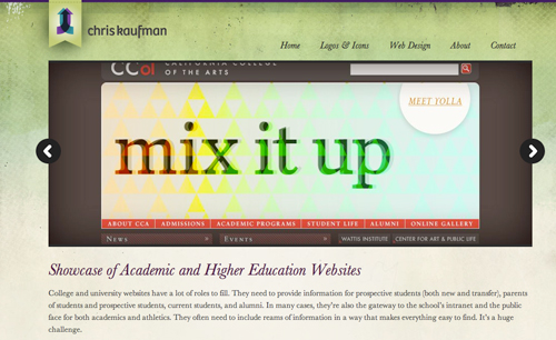
The wide horizontal navigation forces users with small screens to scroll.
Chapolito
Another Example of Tabbed Navigation
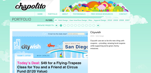
Chapolito is really a unique website. The footer animation catches the eye right away, and the abstract shapes in the top-level navigation are original, as is the way the logo is integrated in the navigation, which keeps the brand as a focal point. We do have a suggestion for the sub-navigation in the portfolio section, though. The circles-as-progress indicator probably works best for slideshows of about five pieces of content or fewer. With such an extensive showcase, the user might get lost and not be able to find a particular project again. If numbers were in the circles, that would help.
Flywheel Design
Sliders and Graphic Tiles That Flip on Mouse-Over
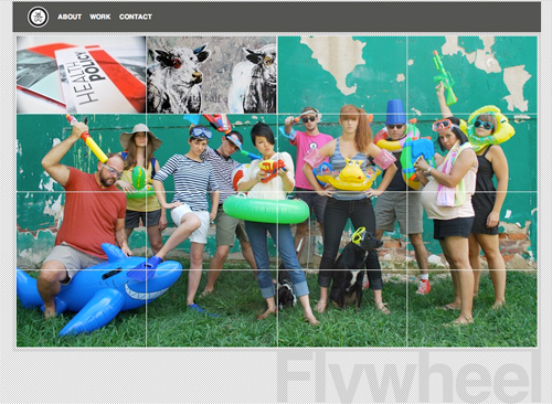
Flywheel Design gives a good overview of its work right on the home page. The hover-over navigation is fun and gives users an incentive to mouse around and explore. The background is simple without being boring, making this a good example of minimal design. One problem for us was the slider navigation on project sub-pages: almost too minimal, because it took us a while to figure out it was there. Making it a little bigger or adding a splash of color might help.
Wishbone Design
Flash-Based Animated Navigation
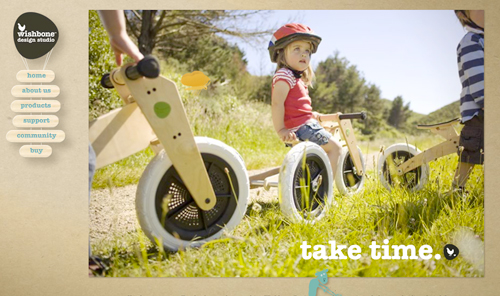
Wishbone Design is created for kids and parents, so it makes sense for it to be fun and full of Flash animations. The navigation is entertaining but a little hard to use. Having the sub-elements open on hover seems to be the root of the problem; changing it to a click might give users a greater sense of control. Hover navigation should be as speedy as possible. The main slideshow is eye-catching, but you really have to dig to figure out that this is actually a company manufacturing bicycles (among other things). An explanatory blurb or even some slides would help new visitors. Another problem: if you’re going to have audio, please give users a way to turn it off! Overall, the site is truly remarkable, with attention to details. Nice work, this is what Flash is supposed to be used for!
Basmatitree
Flash-Based Animation That Could Be Navigation
We can’t lie: on first arriving on 60 mq missione casa, we were really hoping that the spoons were the navigation. We were sad to find out they aren’t. That said, this is a pretty fun layout for a food blog. The typography could benefit from some more variation, though. Also, the posts would be easier to scan if some texture or color variation were added to the columns.
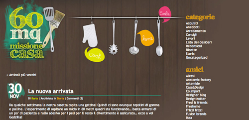
Flash-animated spoons are fun!
Minus Five
An Entirely Horizontal Sliding Website
Horizontal navigation can be problematic. In this case, though, Minus Five is larger than life and colorful. The hover-over “Forth” and “Back” controls are large and easy to see, making it abundantly clear where you can click and what you are supposed to do, and avoiding one of the common drawbacks of unconventional navigation.
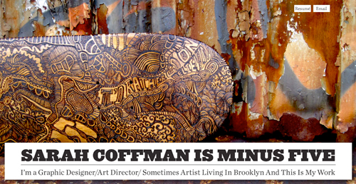
Entirely horizontal navigation.
For a portfolio, one thing that could confuse users is that the featured websites are not linked to anything. Using images embedded in a Mac frame to convey that they are websites is a good idea, but they make it a little hard to see the details in the designs. Another questionable design choice is positioning the portfolio pieces to the right of the background image. This makes it feel as though the background is the focus, instead of the portfolio pieces themselves. Also, the page is difficult to browse if you don’t have a proper wide screen display, because you see only small chunks of the site at once.
Retinart
Completely Text-Based Navigation
Retinart is a lovely example of a typography-focused website. The nice, even gutters and margins are relaxing on the eyes. One thing that’s a little unexpected is that the “Feedback” tab on the left side doesn’t pop out from the side (as most users would expect), but rather opens a modal window.
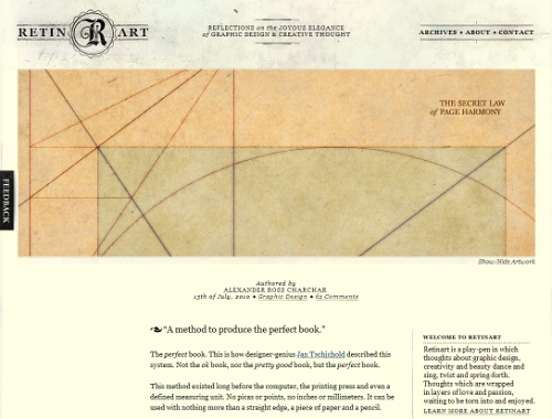
The beautiful typography goes well with imaginative language.
Notice the careful attention to language. In conjunction with beautiful type, a designer can really take it to the next level by using beautiful language to emphasize the quailty of the site.
Collision Labs
Classic Tabbed Navigation
Collision Labs is energetic. We immediately wanted to take this design firm’s advice and fasten our seat belts! The large header block is exciting without being overpowering. The portfolio sub-pages are clear and do a good job of both telling and showing what the projects were about. The typography, though, is a little uniform. One thing that confused us was the Twitter icon in the footer navigation: the bird flips upside down on hover. We couldn’t really see the reason for this, so it felt vaguely unsettling. Overall, though, an effective website, and a good example of judicious and not excessive icon usage.
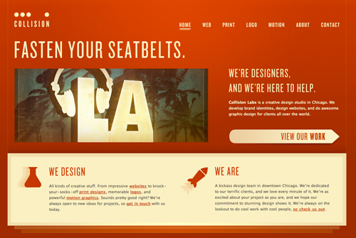
Bold color and traditional navigation.
Summary
While the overall layout of Build is clean and modern, the content could stand to be more easily scannable, for two reasons for this. A look at that code suggests that the margins and padding are a bit arbitrary. The padding for the main body conforms to a design pattern, but the major content elements do not. Maybe it would be a good idea to use multiples of a set base number for the margins, padding and borders, so that there is a consistent ratio throughout.
Secondly, the contrast of the text in the content sections has some problems. The contrast between strong white and strong grey background is very striking, and maybe a bit too strong. The second part of the page looks a bit busy and a bit difficult to scan, probably because the colors of the headings and descriptions are very similar. Maybe if the headings were kept as a serif, the content blocks could be distinguished a bit by making the text lighter and using a sans-serif font. Some textual variation or typographic work might add visual interest as well. Subtle hover effects for links are attractive and fun to click on: nice touch!
We liked the listserv sign-up widget in the footer of the page. A sample email in the relevant field, along with more space on the line, could be a helpful, though. Also, an explanation of what exactly users are meant to type here would be great — for instance, a sample e-mail in the input field. Also, the mouse pointer should change after you click on the submit-button, but in this case it doesn’t. We fumbled a bit at first until we looked at the code.
Mail Chimp
Graphics-Heavy Vertical Page With No Navigation Other Than Browser Scroll Bar
Mailchimp’s promo page is a visually appealing website with a lot of interesting vintage graphics. Some real strengths of this website are the many interesting textures and patterns. The color scheme is modern and appealing. There are, however, a few usability problems. First, there is actually no navigation. We’re as big a fan of shedding unnecessary conventions as the next guy, but if we were an existing customer visiting this website, we would have no idea what to do. The “Sign in” link is obscured at the bottom of the page, with few visual cues to reward the user’s patience as they scroll down. Even a few small links at the top would add some structure and provide some cues for navigation, which would make the whole website make more sense.

Graphics-heavy vertical website.
Secondly, the edgy graphics, while fun and visually interesting, don’t give much sense of what the main point of the page actually is (if you are visiting the site for the first time). The primary message is only delivered in the paragraph towards the middle, and even it is a bit hard to read, with the small white text over the shades of gray. The paragraph would be more effective if it were bigger and had more contrast. The promotional videos are really great and remarkable, though.
Pline Studios
Minimalism in Vertical JavaScript-Based Navigation
Pline studios is an architecture firm, so it makes sense for it to have a spacious vertical layout with graphic touches that are reminiscent of CADD drawings. The big headings are clean and visually appealing and do a great job of leading the eye around. In an unconventional navigation scheme, making it clear where to click is critical, and this website makes it extremely clear. The navigation is repeated in each section, so the user is never stranded and left to scroll.
One problem, though, is the project descriptions; so much focus is on the images and animations that there’s actually very little explanation about the projects themselves.
Transformology
Persistent Toolbar-Navigation
Transformology shows another way to handle navigation on a vertical page. When the user scrolls the page, the navigation menu at the top of the site changes accordingly. The elaborate headings in the text blocks are visually appealing, but almost to the disadvantage of the content that should be showcased. The headings make the content easy to see but more difficult to read. The website has a clean, solid grid layout, but it may not always do an effective job of displaying the content, which sometimes feels overpowering.

Static navigation follows wherever you go.
Burton
Sliding Captions and Tabbed Boxes in a Vertical Layout
The first thing we noticed about Burton is the nice visual details, such as the animated eyes on the “Search and Destroy” search box, and the animated GIF on the mouse-over logo. The jigsaw layout is clean, bold and easy to scan. The mouse-over labels are a good way to display details without overwhelming users with text, and the mini-tabbed layouts inside the content blocks keep things clean and minimal. All of the content is available without being visible all at once.

The scrolling vertical navigation is aided by the jigsaw sections with sliding captions.
A problem with the navigation, though, is the up and down arrows on the side of site’s pages. We expected that they would allow us to move up and down the page; instead, they pop out a text-based navigation menu. Not knowing what sections of the page correspond to the labels (for instance, when you visit the page for the first time), this isn’t very useful. Still, overall very nice, original and memorable design.
New Adventures in Web Design
Fun Shapes That Feel Like Navigation
At the first sight, the interactive shapes in the middle of the New Adventures page feel a bit like navigation, in that they change as you move through the website, providing cues that the page has changed. New Adventures is an example of a clean and solidly structured design. The rainbow of dynamically transforming shapes is fun and original. Adding more color could make the design a bit stronger; the brown palette is calm and professional, but it probably could have been be more interesting with some accent colors.

The shapes move all over the place!
The typography overall is effective, and the line heights and margins make the information very clear and concise. An interesting touch of the design would be to highlight the speaker’s photo when a user hovers over his or her name in the list of speakers. Also, when trying to return to the front page, we clicked on the text logo in the left upper corner (“New Adventures in Web Design”), but it isn’t clickable which is a bit confusing. We had to use the small “Home”-link in the upper left corner instead.
Christopher Kaufman
Wide Horizontal Slider With a Difference
On Christopher Kaufman’s page, the sub-content panels slide up as the slider moves left to right. The layout is clean and organized, the background is colorful and unique, and the slideshow adds plenty of eye candy. The logo is minimal but detailed, and the top-level navigation is clear and effective. One drawback is that the background image is a pretty big file; as it loads, it creates a flashing effect that can be disorienting. One could argue that the height of the slideshow is optimized for larger screens; but scrolling through the slideshow content, some users can see that the content below has changed, yet have to scroll down to read all of it. This isn’t necessarily a big issue, but the slideshow panels could be a bit shorter.

The wide horizontal navigation forces users with small screens to scroll.
Chapolito
Another Example of Tabbed Navigation
Chapolito is really a unique website. The footer animation catches the eye right away, and the abstract shapes in the top-level navigation are original, as is the way the logo is integrated in the navigation, which keeps the brand as a focal point. We do have a suggestion for the sub-navigation in the portfolio section, though. The circles-as-progress indicator probably works best for slideshows of about five pieces of content or fewer. With such an extensive showcase, the user might get lost and not be able to find a particular project again. If numbers were in the circles, that would help.
Flywheel Design
Sliders and Graphic Tiles That Flip on Mouse-Over
Flywheel Design gives a good overview of its work right on the home page. The hover-over navigation is fun and gives users an incentive to mouse around and explore. The background is simple without being boring, making this a good example of minimal design. One problem for us was the slider navigation on project sub-pages: almost too minimal, because it took us a while to figure out it was there. Making it a little bigger or adding a splash of color might help.
Wishbone Design
Flash-Based Animated Navigation
Wishbone Design is created for kids and parents, so it makes sense for it to be fun and full of Flash animations. The navigation is entertaining but a little hard to use. Having the sub-elements open on hover seems to be the root of the problem; changing it to a click might give users a greater sense of control. Hover navigation should be as speedy as possible. The main slideshow is eye-catching, but you really have to dig to figure out that this is actually a company manufacturing bicycles (among other things). An explanatory blurb or even some slides would help new visitors. Another problem: if you’re going to have audio, please give users a way to turn it off! Overall, the site is truly remarkable, with attention to details. Nice work, this is what Flash is supposed to be used for!
Basmatitree
Flash-Based Animation That Could Be Navigation
We can’t lie: on first arriving on 60 mq missione casa, we were really hoping that the spoons were the navigation. We were sad to find out they aren’t. That said, this is a pretty fun layout for a food blog. The typography could benefit from some more variation, though. Also, the posts would be easier to scan if some texture or color variation were added to the columns.

Flash-animated spoons are fun!
Minus Five
An Entirely Horizontal Sliding Website
Horizontal navigation can be problematic. In this case, though, Minus Five is larger than life and colorful. The hover-over “Forth” and “Back” controls are large and easy to see, making it abundantly clear where you can click and what you are supposed to do, and avoiding one of the common drawbacks of unconventional navigation.

Entirely horizontal navigation.
For a portfolio, one thing that could confuse users is that the featured websites are not linked to anything. Using images embedded in a Mac frame to convey that they are websites is a good idea, but they make it a little hard to see the details in the designs. Another questionable design choice is positioning the portfolio pieces to the right of the background image. This makes it feel as though the background is the focus, instead of the portfolio pieces themselves. Also, the page is difficult to browse if you don’t have a proper wide screen display, because you see only small chunks of the site at once.
Retinart
Completely Text-Based Navigation
Retinart is a lovely example of a typography-focused website. The nice, even gutters and margins are relaxing on the eyes. One thing that’s a little unexpected is that the “Feedback” tab on the left side doesn’t pop out from the side (as most users would expect), but rather opens a modal window.

The beautiful typography goes well with imaginative language.
Notice the careful attention to language. In conjunction with beautiful type, a designer can really take it to the next level by using beautiful language to emphasize the quailty of the site.
Collision Labs
Classic Tabbed Navigation
Collision Labs is energetic. We immediately wanted to take this design firm’s advice and fasten our seat belts! The large header block is exciting without being overpowering. The portfolio sub-pages are clear and do a good job of both telling and showing what the projects were about. The typography, though, is a little uniform. One thing that confused us was the Twitter icon in the footer navigation: the bird flips upside down on hover. We couldn’t really see the reason for this, so it felt vaguely unsettling. Overall, though, an effective website, and a good example of judicious and not excessive icon usage.

Bold color and traditional navigation.
Summary
In sum, navigation is as much about communicating instructions for finding content as it is about being fun and interesting. There are some points to take away. For instance, if something is clickable, make sure it looks clickable. If it’s not clickable, make sure to communicate that, too. Also, be fun without being confusing. And show, don’t tell. If you have to tell users what to do, then the navigation has failed. After all, the crucial attribute of any truly exceptional website is both aesthetics and the usability of its navigation.
Related Posts
- Showcase of Modern Navigation Design Trends
- Showcase of Beautiful Vertical Navigation Designs
- The Case Against Vertical Navigation
- Navigation: Menus, Trends and Examples
- Showcase of Well-Designed Tabbed Navigation
Would you like to see more similar showcases on SM?
Let us know what you think in the comments to this post! And please like this article below if you find it useful and would love to see more similar posts on Smashing Magazine in the future. Thanks.


 Try ProtoPie AI free →


 Register Free Now
 Celebrating 10 million developers
