The Case For Open-Source Design: Can Design By Committee Work?
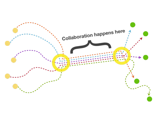
In celebrating the merits of free software and the excitement over this radical networked production method, an important truth is left unspoken. Networked collaboration shines in the low levels of network protocols, server software and memory allocation, but user interface has consistently been a point of failure. How come the networked collaboration that transformed code production and encyclopedia-writing fails to translate to graphic and interface design?
Further Reading on SmashingMag:
- Why Design-By-Committee Should Die
- An Organizational Structure That Supports Your Digital Presence
- Why You Should Include Your Developer In The Design Process
The following is an investigation into the difficulties of extending the open-source collaboration model from coding to its next logical step: interface design. While we’ll dive deep into the practical difference between these two professional fields, the article might also serve as a note of caution to think before rushing to declare the rise of “open-source architecture,” “open-source university,” “open-source democracy” and so on.
The Challenges
Scratching an Itch
By going open-source, coders are fulfilling a need to change software, to make it their own. They might have different motivations, but if you’re already modifying something for yourself, answering the “Why share?” question is really easy with “Why not?” By the time the code executes correctly, the immediate users of the software—that is, the coders themselves—are already familiar with the software and can operate it even without a delicately crafted user interface.
Therefore, the motivation to take an extra step and invest in a usable interface that would extend the user base beyond the original geek-pool is not obvious. The interface already works for me, so what itch am I scratching by working hard to make it usable for others who can’t help me code it?
For the designers themselves, what is their incentive to make the design process more collaborative? Will others make my design better? Will they be able to communicate my ideas better than I can?
Beyond that, open-source interface design suffers from a chicken-and-egg problem: most designers don’t use open-source tools, and so it doesn’t occur to them that they could make the software better. As a result, open-source software suffers from an inferior interface that makes designers shy away from it and stick to their proprietary tools. The cycle repeats…
Granularity
Both software and wikis are made of granular building blocks, namely characters. This makes every typo an invitation to collaborate. My first Wikipedia edit was a typo correction, my second was adding a reference link, my third was writing a whole paragraph, and that led me to more substantial contributions, like adding a whole new article and so on.
Each granular step gets you closer to the next granular step. This ladder of participation makes each successive step easier. It also allows you to compare changes easily, giving you transparency, accountability, moderation and an open license to try and possibly fail, knowing you can always revert to the previous version.
You don’t get that with design, because the changes are not granular and are not as easily traceable. The first step is steep, and a ladder is nowhere to be found.
Encoding/Decoding
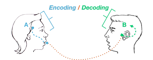
In his 1980 article “Encoding/Decoding,” cultural theorist Stuart Hall defines communication in terms of code. To describe it briefly, let’s imagine a spoken conversation between Alice and Bob. Alice encodes her framework of knowledge into the communicable medium of speech. Assuming Bob can hear the sounds and understand the spoken language, he then decodes the sounds into a framework of knowledge.
Both encoding and decoding are creative processes. Ideas are transformed into messages that are then transformed into ideas again. The code that Alice uses for encoding is different than the one Bob uses for decoding. Alice could never telepathically upload ideas into Bob’s brain. (We can all agree that that is a good thing.)
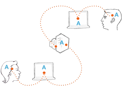
Let’s entertain Hall’s ideas of encoding and decoding in software. Alice is an open-source hacker, and Bob is collaborating with her as a designer. Alice is writing software code; she knows when it executes and when it doesn’t because the program communicates that through error messages. When she is happy with the result, she uploads the code to an online repository.
Bob then downloads the code to his computer, and because it has executed on Alice’s computer, it also executes on his. When Alice and Bob collaborate through a programming language, they are literally using the same code for encoding and decoding.
Alice always chooses one of her three favorite programming languages. Being a designer, to communicate a message visually Bob starts by defining a visual language—graphics, color, layout, animation, interaction… If Alice or any other developer had to reinvent a new programming language on every single project we would not be speaking about FLOSS now.
Bob needs to define a graphic language, a standard for the collaboration. Doing that is already a major part, possibly the most important part of the creative work. Whoever works with Bob will need to accept and follow these standards, relinquish control and conform to Bob’s predefined graphic language. These artificial constraints are harder to learn and conform to than the constraints of a programming language. While constraints and standards in technology are the mother of creativity, in design they can often feel artificial and oppressive.
Beyond that, within a collaboration, when Bob tries to argue for the merits of his design, unlike in the case of Alice’s code he cannot prove that it executes flawlessly, or that it is faster or more resource efficient. The metrics are not as clear.
It is important to remember, in collaboration on code Alice and Bob have a third collaborator, one that cannot be reasoned with - the computer. This collaborator will simply not execute anything that doesn’t fit its way of work. On the other hand, as long as it is syntactically correct and satisfies the inflexible collaborator even “ugly code” executes and muddles through. And so, the different voices expressed in code are flattened into a single coherent executed application.
For better or worse, we lack this inflexible collaborator in design. It doesn’t care about our communicative message and it doesn’t level the playing field for communicative collaboration. And so, the different voices in design simply spell inconsistent multiplicity that dilutes the communicative message.
One might turn to Wikipedia as a testament to successful non-code-based collaboration, but Wikipedia enforces very strict and rational guidelines. There is no room for poetry or subjectivity within its pages.
Is It Simply Impossible?
Not necessarily. If we step out of the technical construct of the open-source methodology, we can identify quite a few networked collaborations that are transforming and often improving on the design process.
Viewing free culture and the free sharing of media as evidence of collaboration is tempting, but the availability of work to be remixed and re-appropriated does not necessarily imply collaboration. Sharing is essential to collaboration but is not enough.
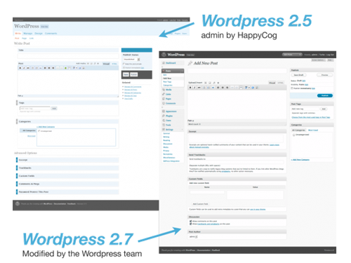
WordPress, the leading free blogging software, is an interesting example. Looking to redesign the WordPress administration interface, Automattic, the company leading the WordPress community, hired HappyCog, a prominent Web design firm. And in March 2008, WordPress 2.5 launched with a much improved interface. Through a traditional design process, HappyCog developed a strong direction for the admin interface. Eight months later, Automattic released another major revision to the design that relied on HappyCog’s initial foundation but that extended it far beyond.
One of the interesting methodologies that Automattic used to get the WordPress community involved in the design process was a call for icon designers to provide a new icon set for the interface. Within two weeks, the six leading icon sets were up for voting by the community.
But rather than just casting a blanket “Like” or “Dislike” vote, community members were invited to provide a detailed assessment of consistency, metaphor coherence and so on. Some icon designers in the running even acknowledged the superiority of other contributions and voted against their own sets. The icon set that was ultimately chosen, though, was a collaborative effort, because some of the icons changed based on inspiration from the other sets.
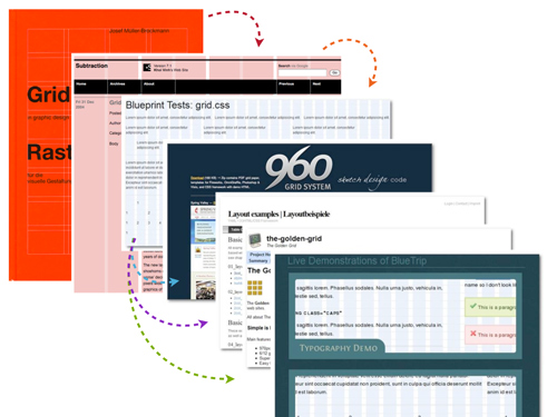
Another example is the evolution of grid systems for Web design. Half a century after the rise of Swiss-style graphic design, some design bloggers suggested that some of its principles might apply to Web design. Those suggestions evolved into best practices, and from there into Blueprint CSS, an actual style sheet framework. The framework became popular and inspired other frameworks, such as 960.gs.
Similar processes happen in interaction design. One example is the pop-up window evolving into the elegant lightbox or modal window modules, and then changing and being modified again and again in open-source code libraries.
Other design-oriented experiments in free software, such as the ShiftSpace platform, challenge the Web interface power structure. ShiftSpace allows users to interact with a website on their own terms by renegotiating the interface and proposing different interactions on top of the page. Projects like ShiftSpace aim to expand the limited participatory paradigm of the Web beyond user-generated content to include user-generated interfaces.
Make It Happen!
There are ways to make open-source design work without falling into the traps often characterized as “design by committee.” We are already seeing designers scratching their own itch and contributing creative work to the commons.
Lecturing designers (or users) and demanding that they use bad tools for ideological reasons is counter-productive. Designers often use free tools (or use proprietary tools in unauthorized ways) only because they are free as in free beer. So, to win over new users, free software should be pitched on the full range of its merits rather than on ethics alone. While the ethics of “free as in free speech” are convincing to those who can “speak” code, the openness of the source to those who lack the skill to modify the code is a weaker selling point.
Free software tools have won on their broad merits many times, and not only on low-level system and network fronts. Wikis and blogging software (which are interaction and communication tools) that have been invented by the free software community have maintained a lead over proprietary competitors. Networking and collaboration are the bread and butter of free software, and the community should leverage these advantages.
Just as Wikipedia extends the free-software collaboration model by leveraging the granularity of characters, so can design. When possible, using code for design collaboration is preferable. Beyond that, collaborators should adopt distributed version control systems for both code and image files. Rather than trying to compete with proprietary software by creating open clones, the Free Software community can leverage its experience as an advantage and focus on new collaborative paradigms for version control and collaboration.
Finally, There are ways for us to better analyze the encoding and decoding of the communicated message. We can formalize processes of collaborative encoding. We can start by conducting networked design research using existing research tools; in this way, we might come up with design decisions collaboratively. We can define modular and extensible languages that embody design decisions but still allow for flexibility and special cases (like Cascading Style Sheets). We should also learn how to document our design decisions so that they serve other collaborators. Designers have been doing this for many years in more traditional and hierarchical design contexts when they have compiled documents such as branding books or design guides.
For the decoding part, we should realize that many design patterns are rational or standardized and can leverage common ground without compromising the creative output. For example, underlined text on the Web almost always implies a hyperlink. We could choose to indicate a link otherwise, but if we try to use this underline styling, say, for emphasis, we can expect users will try to click on it.
User experience research, technical aspects of design, best practices in typography, icon use, interaction paradigm—these are all aspects of design that can be researched and assessed according to measurable parameters. Thorough research of these can provide a basis for consensus for shared expectations of how a message will be interpreted. A lot of this work is already taking place on design blogs, which have published a lot of research on the subject over the past few years.
Finally, the substantial parts of design that still cannot be easily quantified or assessed on shared rational ground should be managed through trust and leadership. A resilient community of practice must be able to develop design leadership whose work and guidance is respected and appreciated even without the convenient meter of coding meritocracy.
Scaling Subjectivity
It comes down to the deep paradox at the heart of design (whether for interface, architecture, product, etc.). We are trying to create a subjective experience that scales—a single personal scenario that can be multiplied repeatedly to fit a wide array of changing needs by a vast majority of users. The thing is, subjectivity cannot be scaled—that’s what makes it subjective—therefore, the attempts to create a one-size-fits-all solution are bound to fail, along with the attempts to customize the solution to each individual user in each individual use case.
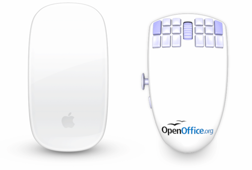
Chris Messina gives a great example for this paradox by comparing Apple’s Magic Mouse to the OpenOffice mouse. While Apple’s solution is a slick, clean one-button device, the OOMouse has “18 programmable mouse buttons with double-click functionality; analog Xbox 360-style joystick with optional 4-, 8- and 16-key command modes; 63 on-mouse application profiles with hardware, software and autoswitching capability…” and more. While the Magic Mouse embodies Apple’s commitment to design leadership at the price of user choice, the OOMouse embodies the free software community’s preference for openness and customization over unified leadership.
Successful open-source projects have always benefited from a mix of the two approaches, a combination of openness and leadership. Finding a similarly nuanced approach in other fields is required if we ever hope to extend the open-source model beyond code. We cannot sprinkle the pixie dust of open source on everything and expect wonders. The same goes for design. Hopefully, though, we can make some progress by demystifying the process and by collaborating wisely when it makes sense and coming up with new ways when it doesn’t.
“Can Design By Committee Work?” by Collaborative Futures is licensed under the Creative Commons Attribution-ShareAlike 3.0 Unported License. Based on a work at www.booki.cc. This essay is also featured in the Collaborative Futures book, written collaboratively, published for free and released under the CC-BY-SA license.


 Register Free Now
 Celebrating 10 million developers
 SurveyJS: White-Label Survey Solution for Your JS App