When A Thousand Words Is Worth A Picture
Good design speaks for itself, right? Unfortunately, that is rarely the case. Most of us don’t have the privilege of designing for ourselves; we design for clients, clients who have their own taste and ideas, clients who ultimately need to be persuaded on why we’ve made certain decisions. Good design doesn’t speak for itself; it needs an advocate.
This article examines both why design requires justification and how you can go about providing it in a way that is clear and understandable. While we’ll focus on visual design, the principles described here are applicable to any creative process or endeavor. Indeed, we learned most of these lessons while presenting Web interfaces and prototypes to clients, which took place after the visual designs had been agreed on.
Beyond The Talk
There is a saying oft quoted by professionals:
"Those who can, do; those who can't, teach."
— George Bernard Shaw, Man and Superman
I disagree with the premise of this statement, but I do sympathize with its tone. It is borne of the frustration that comes from the separation between the practice of a discipline and its theory.
Web design is to some degree immune from this criticism, being an extremely practical discipline by nature, and also a very new one. But we don’t have to look far to find university professors teaching students how to design layouts using tables!
At the other end of the spectrum, we have the salespeople. These people may not be great at precise explanation, but they can certainly put forward a compelling argument. Ever sat in on a sales pitch and barely recognized the product being promoted? By the time the salesperson was through talking, you were convinced that the CMS could take you to the moon. I once heard this described as “truth massage.”
 The WaSP InterACT (featured) and Opera Web standards curriculum were created to address the problem of institutions getting out of step with the Web industry.
While the full-time teacher (and even full-time salesperson) certainly have a place in the industry, explaining our designs is too important a task to leave to professional “talkers.”
We need to reconnect the practice of design with the theory of design. To do this, we need to learn the words and arguments for making a strong case for our designs.
The Importance Of Communicating A Message
"Marketing without design is lifeless, and design without marketing is mute."
— Von R. Glitschka
Despite what many designers think, “marketing” is not a dirty word. We can learn much from the advertising and marketing industries about the importance of communication. Some advertising is as subtle as a sledgehammer, practically screaming at the user “Buy now!”; nevertheless, a great deal of thought went into how each message would be perceived and what would convince buyers most effectively.
When it comes to Web design, communication tends to be a much subtler affair: a delicate balance between satisfying users needs and delivering on business objectives. Here, design can play a key role by simplifying processes and persuading users.
Consider the registration form. Usually, business objectives demand as much information from the user as possible, so that the company can streamline and direct its marketing efforts. However, users are reluctant to supply information about themselves and are put off by long forms.
In this instance, trends dictate that the user experience wins out; registration forms now commonly consist simply of an email address and password. But business objectives are not entirely dismissed either: the reduction in effort to sign up translates into more registered users for the website, and people are generally becoming more willing to submit their email address. Plus, a short form fits neatly onto most pages, grabbing the attention of users when they are most receptive — for example, after having just read an interesting article.
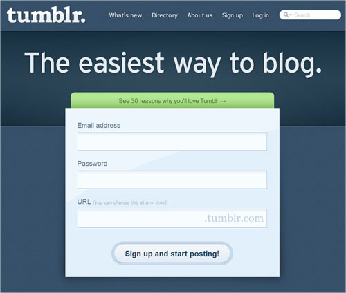
 The micro-blogging platform Tumblr epitomizes the simple sign-up form.
Design Doesn’t Just Happen
Design is itself a process of deduction. It involves a number of decisions, both conscious and unconscious. During this process, the designer dismisses some ideas as unworkable and pursues others in order to arrive at a solution.
But this process is completely opaque to the client. The client likely views the design not as the outcome of an in-depth process, but as a response to the brief, merely a visual representation of the constraints and considerations set before the designer. As the designer, part of your job is to educate the client and reveal the design process to them.
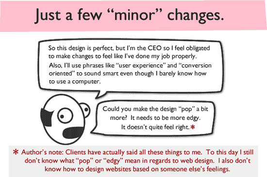
If you fail to do this, you risk reliving the scenario parodied The Oatmeal’s post on “How a Web Design Went Straight to Hell.” In short, what happens is that client (rightfully) wants some input into the process, so they make suggestions or improvements. But they don’t fully understand the reasons behind your design choices, and so their “minor tweaks” take the website further and further away from its purpose. The design suffers, the designer gets exasperated, the client feels unappreciated and the relationship breaks down. Sound familiar?
 The Oatmeal comic describes how poor communication leads to Web design hell.
As designers and Web professionals, we needn’t be afraid of criticism. Good design stands up to criticism, because it is more than a matter of taste. View criticism as an opportunity to explain the reasons behind your decisions, to invite the client into the design world so that they feel like a part of the process.
If you treat criticism this way, then both you and the client will benefit. The client begins to articulate “problems” with the design in language that you can respond to. Instead of just saying, “Make it green,” they might now say, “The red feels too dominant, and we want to push the environmental benefits of our product, so I feel a more natural color is needed. Perhaps green?” Similarly, you will be less precious about your designs, understanding that they will be open to change unless the arguments behind your design decisions are convincing.
Learning The Vocabulary
If we are to explain our designs to clients, then we need to know the language. Translating a visual medium into words is not straightforward. Designers suffer from being so well versed in the language of design that they struggle to articulate it to others. To them, it just “looks right.”
The second difficulty faced by designers is assumed knowledge. They forget that much of their understanding of design comes from past experience, and they can become impatient with clients who are resistant to their suggestions.
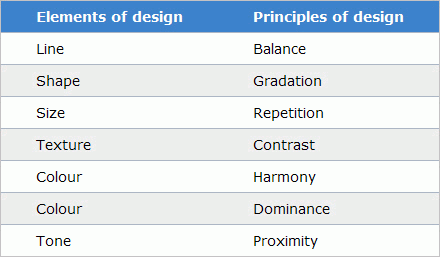
In these situations, going back to the basics — i.e. the elements and principles of design — can be helpful. These basics are the “fundamental ideas about the practice of good visual design that are assumed to be the basis of all intentional visual design strategies” (from Wikipedia). A few are listed below:
 The elements and principles of design.
You might wish to familiarize yourself with these elements and principles, although you very likely use them liberally in your designs already. For example, white space is really an expression of balance, because it affords each element enough space to have the right amount of focus. Similarly, we draw on proximity when designing forms to make clear the relationship between labels and inputs.
Understanding the principles and elements of design can also help in the design process. When assessing your options, you are able to fall back on more than “It just looks right.”
Making A Convincing Argument
Ultimately, if we are going to persuade clients of the value of our designs, then we need to make convincing arguments. Clients are people, and people have biases; so, the best way to convince them is to frame your argument in the right context.
Clients usually have various pressures put on them, and have to deal with various expectations of the website. Understanding these expectations from the outset will help you at each stage of the process, including the design stage. Some expectations will be formalized as objectives, which should be documented and serve as the basis of the design brief; other expectations might be politically motivated and therefore more difficult to identify.
While I don’t advocate playing the political game, spending some time understanding your client’s motivations will pay dividends as the project proceeds.
Broadly speaking, motivations fall into five categories:
- Usability and accessibility,
- Return on investment (ROI),
- Return on engagement (ROE),
- Deadline-driven,
- Financial.
Depending on the dominant factors in a project, the client will be sympathetic to certain solutions and hostile to others. Let’s look at one factor in detail.
Usability and Accessibility
These tend to be a strong motivator with government, not-for-profit and service-oriented clients, usually stemming from a combination of legislative pressures and a desire to be inclusive to all audience segments. Of course, usability and accessibility should be core considerations in all projects, but they are rarely client-driven.
In such a case, Flash and other highly interactive technologies could be dismissed out of hand for not being accessible. This will also have a bearing on decisions related to color, font and clarity, which in turn will have a huge impact on the overall look and feel of the design.
Understanding this from the outset will help you present the design in the right framework and thus make the design appeal more to the client.
Presenting Your Case
Always present a design to the client in person (or by remote conferencing when that is not possible). Never just send it as an attachment to an email, otherwise you will:
- Look incredibly unprofessional,
- Have no control over the environment (or mindset) in which your design is viewed.
Once you have set aside a time to present your design, how should you proceed? The first thing to do is set clear expectations for the meeting.
Whether you like it or not, the way you present a design sends a message. For example, if you show up at a kick-off meeting with professionally printed boards of design ideas, you will be sending two conflicting messages, because no matter how much you talk about “sketching out” ideas and “exploring” concepts, your boards will be communicating something completely different. The danger here is that the client gets hung up on what they see, which can derail the project in later stages.
As a designer, you have many tools in your arsenal: wireframes, mood boards, sketches, scamps, flat designs, HTML templates and even the backs of napkins. Pick the method that conveys the right amount of professionalism, while offering enough flexibility.
And remember, whatever expectations you have for the meeting, make sure to communicate (and agree on) them before a single design is made.
Dan M. Brown’s book Communicating Design focuses on those deliverables (wireframes, concept models, site maps) that serve as the primary communication tools between designers and clients.
The second thing I find really helpful, closely related to setting expectations, is giving the client a task. Believe it or not, clients actually want to help. But like a wayward child in the kitchen, this help can sometimes be more damaging than constructive.
The best way to do this is to bring the client on board with your own goals. Talk them through the design brief and how you have answered it, or reiterate your overall concept to them. Invite the client to look at the design from this standpoint and to use it to shape their comments. They should consider themselves the website’s quality control officer, pointing out where you might have veered from your own principles. If you do this, then you are far more likely to hear the sort of helpful criticism we spoke of earlier.
To Recap
- Remember, your design doesn’t speak for itself. If it is to stand up to scrutiny, then it needs an advocate.
- In explaining your design, resist the temptation to use meaningless catchphrases. Instead, use plain, easily understood language.
- If possible, include your client in the design process. Walk them through the process you took to arrive at your decisions.
- Don’t be afraid of criticism, because good design is more than a matter of taste.
- Don’t be precious with your design. Be prepared to change elements that you cannot make a good argument for.
- Translating a visual medium into words can be difficult. But the principles and elements of design will help you articulate this visual language.
- To make your argument convincing, frame it in the right context. Understand the pain points, and justify your design in these terms.
- Always present your design in person, and ensure that any expectations are communicated (and agreed on) before a single decision is made.
- Finally, be proud of your work. When you’ve finished speaking, give it plenty of space to say a few words of its own!
Further Reading
- Ten Laws to Design By “As designers, we have to be aware of the function of our work and design, as much as we care about the aesthetics and visuals…” This post presents 10 design laws worth considering.
- Is John the Client Dense or Are You Failing Him? An interesting post by Paul Boag that challenges us to empathize with our clients to build better relationships… and produce better websites.
- It’s Not Just What You Present, But How You Present It An article by Ross Johnson that takes a closer look at effective methods of presenting a design.
- How to Persuade Your Users, Boss or Client Paul Boag on the art of persuasion.
- Communicating Design A book by Dan Brown that describes the tools that designers use in the course of creating a website. One chapter focuses on screen designs and the way they should be presented.


 SurveyJS: White-Label Survey Solution for Your JS App

 Celebrating 10 million developers
 Register Free Now


