Billboard Web Design: How To Win Your Audience’s Attention
Generally, the eye-catching ads are mostly the ones with witty taglines that are easy and fun to remember. As much as the colors of the images and fonts being used are important to make it easy on the eyes, the idea actually has to be unique and simple enough to be separated from other commercials.
Further Reading on SmashingMag:
- Global Web Design Showcases
- Web Design Showcases From Various Industries
- Showcase of Beautiful (or Creative) E-Commerce Websites
The same principle applies to any website. Though a user won’t necessarily be passing by your site at 65 mph, there is a certain bounce rate — visitors who leave your site shortly after entering it. For many websites, these rates are much too high. This poses a very similar challenge to those who design billboards. You have a very short amount of time to capture your audience’s attention and to keep it for long. With that in mind, here are some principles for developing billboard-style Web designs.
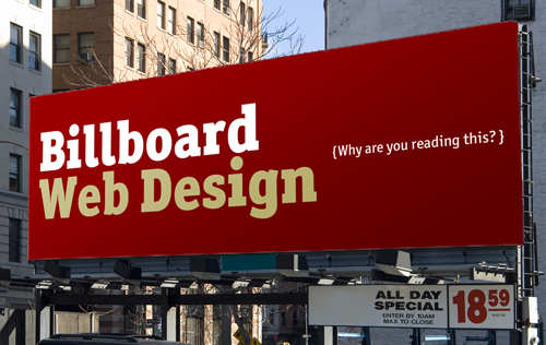
Photo credit: Randy Harris
Creative And Unique
An important piece to the billboard website puzzle is creative and unique design. This can be intertwined within the other principles, and when done effectively, can be the sole reason for viewers to dig deeper into your site.
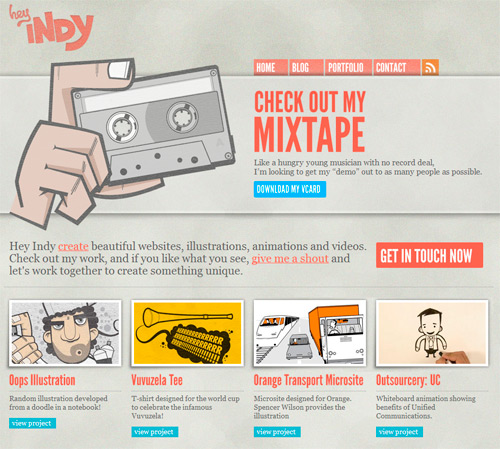
Hey Indy Creative and fun, heyindy.com breaks the mold of an ordinary, plain and boring website. Complete with customized illustrations, drawings and playful typography, each page engages users, making them feel comfortable on the site. Notice how well the illustration on the top fits with the tagline of the site. Hey Indy creates websites, illustrations and animations and uses the “mixtape” metaphor to attract client’s attention. The site is not obtrusive, but inviting instead. A very personal, attractive design.
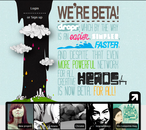
Dropr This online service uses a nice typographic poster with playful typography on the front page to explain what it does. The design is attractive and inviting, although a plain simple text message could have worked just as well to deliver the message to the visitors. The interesting part are the animated clouds on the left side with colorful water drops. Very nice use of metaphor contained in the title of the service. An original and unique design.
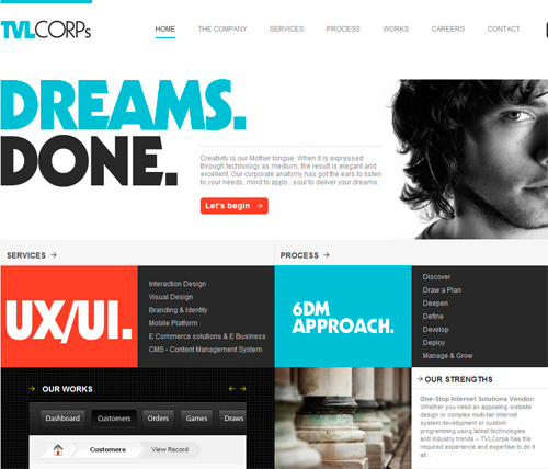
TVLCORPs Interested yet? Though the tagline shown on the web design below does not really say what this company does, the layout is creative and compelling; the strong, vivid contrast is more than enough to turn some heads. Notice how “UX/UI” stands out on the site, focusing the visitor’s attention on the ‘services’ section of the page.
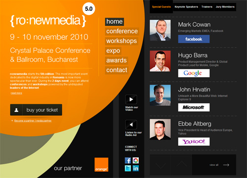
{ ro:newmedia } Sometimes it’s a good idea to risk an unusual design approach — be it exaggerated typography, striking color combinations or unusual design layouts. The latter is the case in point for ro:newmedia’s website. The layout is very unusual and original, and therefore memorable. Colorful large spinning circles look like an overlay of the site layout and appear vividly against the dark background. A downside: the font size of the text on the page could be a bit larger.
Pixelmator Much different than the standard, pasted screenshot, Pixelmator works the sleek, elegant interface of their application directly into the design of their page.
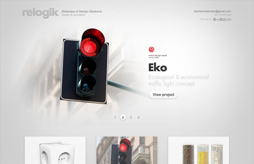
Relogik What makes this particular site effective is its ability to draw the eye to the name of the product or service they are showcasing. In this case, it works well to give the company name an afterthought as well as making the product more prominent.
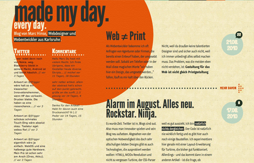
Made My Day One more test to run is to assume how much impact a particular site has on a reader, if they were to take a quick glance and look away. Ask yourself: If you were to carry out your day from that point, what were you to still remember about that particular site? The large orange circle elegantly integrated into this composition does an excellent job of leaving a style for returning visitors to remember.
Compelling Headlines
A good design only goes as far as the content it contains. For this reason, it’s vital to go beyond average with your copy text. If you’ve seen a billboard advertisement or two, you may remember the tag lines featured on them. Short and to the point, they’re meant to get you to remember a certain brand.
Many large corporations don’t even use ad copy, but rely solely on their logo and identity to remain effective. One has even gone as far as making their billboard a working sundial in this respect. Though we should all aspire to having a brand of our own this influential, it’s recommended that you stick to clear and powerful copy text along with your design to help capture your readers. Here are some examples of compelling headlines:
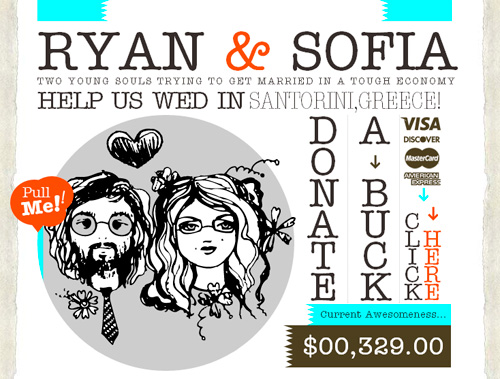
Ryan & Sofia Ryan and Sofia combine hand-drawn design elements with a compelling headline, all supported by a very informal, emotional language and choice of layout. The message is strong and clear, and therefore very appealing.
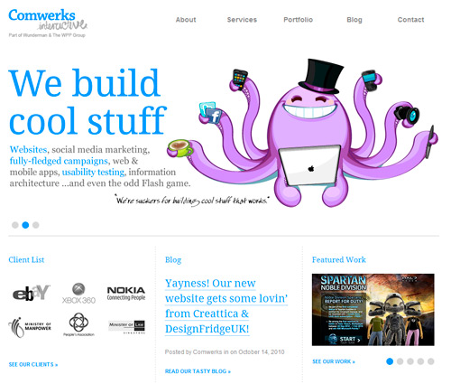
Comwerks Interactive This design agency uses a clear and simple language to communicate the purpose of the website. Cute illustrations make a website look less formal and much more engaging. The purpose is clear and the client list immediately proves that the design agency indeed builds cool stuff. A downside: the text on the images in the slideshow would benefit from not being embedded in the images.
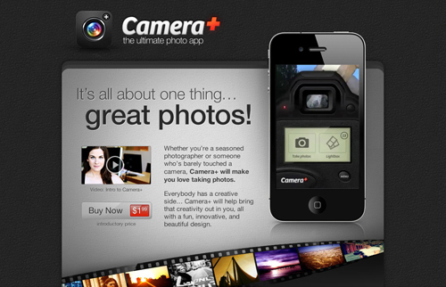
Camera+ Clear, contrasting colors only add to the effectiveness of the headline given on this website. In a clear and elegant manner, a reader is quickly able to glance at this website and know its purpose.
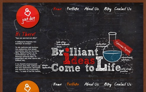
Just Dot Sticking to the billboard clarity, Just Dot provides a clever design and tagline to attract readers. Along with a creative chalkboard theme, this site features neat and clean navigation to help guide readers through the site.
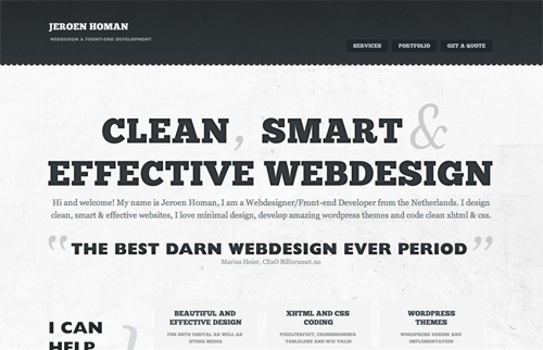
Jeroen Homan In clear and impacting typography, this site screams out its purpose distinctly. In today’s fast-lane crowd of web-surfers, such clear and impacting titles are a must-have for a captivating and inviting website. This of course, is the case as long as the amount of content allows for this.
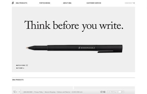
DBA Products An important part of capturing your reader’s attention is in engaging in a conversation. When one reads, “Think before you write” a first reaction is to wonder about what is actually meant by that phrase. Firstly, attention is captured. Secondly, a reader eye is lead to the bottom left corner where they can view a video to learn more.
Clever And Poignant
Not every billboard is meant to be humorous, however, almost all strive in some way to get a point across in a not-so-ordinary fashion. Consider the last few advertisements you’ve seen. If they were selling toothpaste, did the ad simply state “Buy this Toothpaste” or was there something creative and direct to get you to remember that particular brand?
In Web design, the same principle can be applied. With the hundreds, if not thousands, of websites we’re exposed to overall, trends can be seen which are all too often followed. But because the Web is ever changing, simply following trends can lead to a site becoming outdated the moment it’s published.
How can this be avoided? Once again, we can look back at billboard advertisements. What makes many of them effective is their ability to deliver something creative, or other than what the average person was expecting to see.
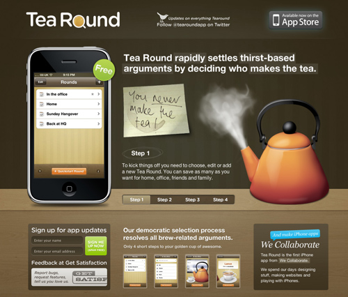
Tea Round Complete with high-quality images, Tea Round’s website captures attention, while incorporating a creative tagline.
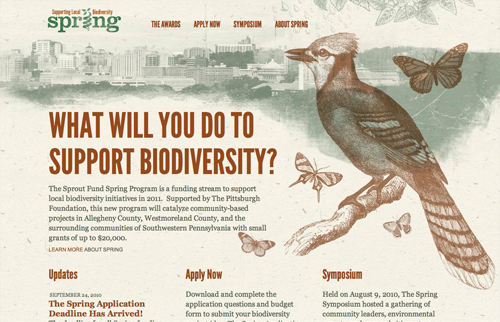
Spring: Supporting Biodiversity This particular tagline is effective because it engages you with a question. Notice how the question is not “Do you support biodiversity?” but rather “What will you do to support biodiversity?” which places the reader in a position to feel as though they need to take action!
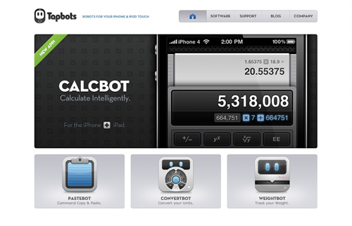
Tapbots Another element to creating memorable billboard-style web designs, is the product or service itself. Short and snappy names are just as, if not more important, than the tagline. “Calcbot” is much easier to say and much more memorable than something like “Calculator Application for iPhone.”
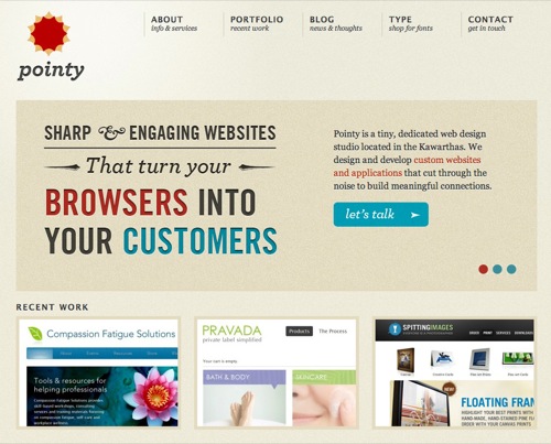
Pointy Featuring a vibrant color scheme and typestyle, Pointy successfully merges creative typography with a compelling and challenging headline. Along with the headline is a clear next action for the reader to take: “Let’s talk”.
Powerfully Branded
Though it’s already been touched a bit thus far, branding is another important piece to powerful Web design which deserves further attention. As with the toothpaste example, a billboard’s purpose may in the end be to generate sales, but just as important is the building of the brand the company is advertising. After all, you can get dozens of different brands of toothpaste, just as there are a multitude of of websites out there, so how is one among the crowd to be remembered? Building a brand through a Web design is the very mark or entity visitors remember you by.
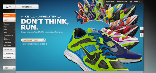
Nike® Showing the importance of subtle repetition, Nike® combines a creative display of their shoes, while giving viewers multiple views of their logo.
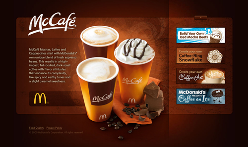
McCafé® With every cup featuring the McDonald’s® and McCafé® logo, a viewer can be grabbed by the quality of the product, while remembering the brand correlating to it.
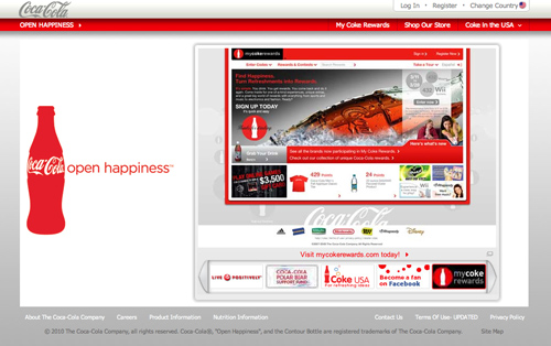
Coca-Cola® The Coca-Cola® website is a billboard in action. Complete with the clean logo and bottle, with the clear and simple tagline, the brand is very easy to remember.
What Does a Brand Have to do with a Website Anyway?
Even if the website you’re developing doesn’t have the sole purpose of making money, a brand is still very important. Brands are essential for goading visitors to come back time and time again. Consider some of the recent advertisements you’ve seen. If there is a company you know and love, would you say you’re much more apt to spend time looking at that advertisement, as oppose to the dozens of others you’ve never seen before, or the ones that don’t interest you? The same applies for websites.
Eye-Catching, Yet Tactful
There are countless sites on the web that will undoubtedly catch your attention, but only for the worse. Poor, outdated design, or a heap of flashing animated gifs will only increase your bounce-rate. Appealing sites achieve a balance between capturing reader’s attention and providing an adequate amount of useful information. Something to keep in mind: the design is a key piece of your website, but if it distracts away from the aimed content, it no longer serves its purpose!
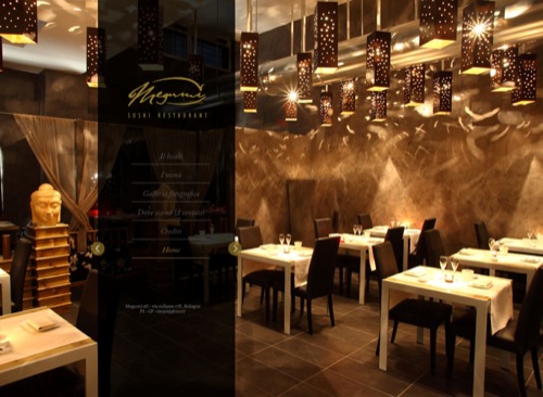
Megumi With jaw-dropping elegance and simplicity, this web design effectively brands their name, gives a brief tour, all while keeping the design clean and clear.
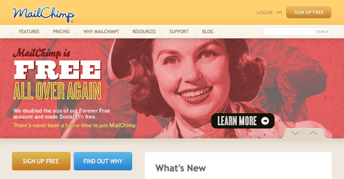
MailChimp MailChimp’s website design is bold and clean, and it sticks to a consistent color scheme. Bright, complimenting colors are used while making the main content readable.
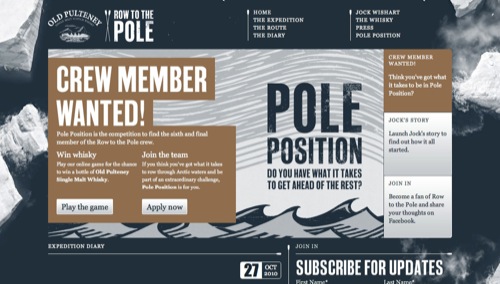
Row to the Pole Still retaining a subdued and clean typestyle and color scheme, this site is still able to feature a commanding headline. Communication, clarity, and balanced design are all utilized exceptionally on this layout.
Clean, Simple And Straight To The Point
Of course, one of the options is also as simple as simplicity. Not to say we cannot be creative in our delivery, but a saturation of text and images, especially on a home page, can motivate our viewers to click that back button! Here we’ll take a look at some good billboard-style websites that have captured the essence of simplicity to attract readers:
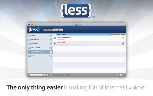
Less Less has a clean and well-designed interface. Complete with a clever tagline, this application shows you a screenshot of exactly what they’re offering to you. It doesn’t get much clearer than this.
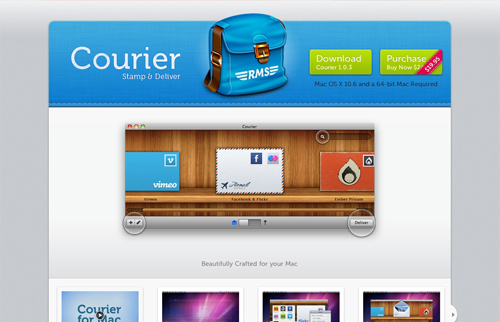
Courier Mac App Complete with a well crafted icon, Courier clearly depicts their application with cool, soft colors, yet elegantly displaying the showcased application. The catchy subtitle also assists with remembering the name. Something to take note of as well is the fact that the “download” and “purchase” buttons are clearly displayed at the top of the page.
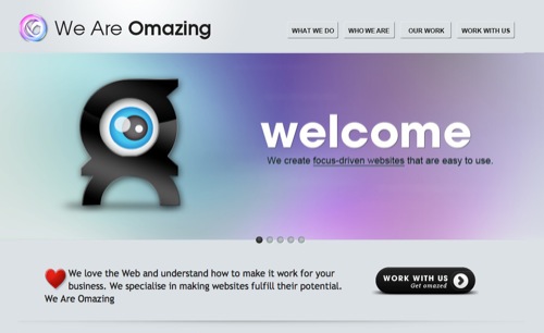
We Are Omazing With a simplistic approach, this site integrates the imagery and style into the tagline. Branding is in effect as a memorable name is complimented with readable design.
Clarity And Contrast
Pivotal to any design, good contrast is a must. While subtle typefaces and graphics have their place in design, strong contrast is important to quickly direct a reader’s attention or get them to remember something particular. If viewers have to hunt around for what you do or what you offer - more than likely they will not stick around for long. Make it easy for your readers to know what you’re about from the very beginning.
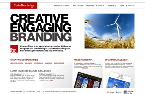
Charles Elena Don’t be afraid to go big with your text. This site sports an effectively large Sans-Serif font to grab the attention of its readers and to get them to remember what they do. The design isn’t necessarily strong and vivid, but the message is communicated very clearly.
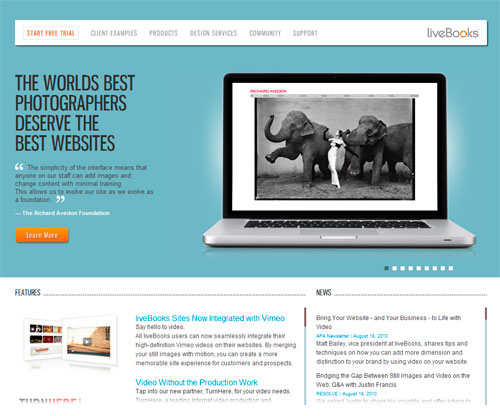
Live Books There are many different features listed on Live Book’s website, but one thing that’s executed exceptionally well is its clarity. There’s no mystery here, you know exactly what they offer.
Conclusion
In an age where advertisements saturate our market, it becomes all the more visible of the need for creative and effective design. As we’ve explored here, good design goes beyond making things look nice, or following trends, but rather effectively capturing the audience of those whom we wish to view the site. In the end, what action viewers do, or do not take, can come down to the finest details of the decisions made by the Web developer.
Feel free to share your opinions or experiences in the comment section below!
Bonus Billboard Template Download
In addition to the concepts explored here, you can download your free billboard website/image template for displaying your billboard-style design. Place any 440px wide image into the code provided, or modify it yourself for a great way to display your images. See some samples below:
Download the Template for Free
- Download the PSD template (20 Mb, .zip)
- Download HTML with CSS (+ a Web ready version of the billboard image)
(ik) (vf)


 Try ProtoPie AI free →
 SurveyJS: White-Label Survey Solution for Your JS App
 Register Free Now