Designing Memorable Websites: Showcase of Creative Designs
One of the main goals of having a website, whether it be a portfolio website or a business website, is to declare your presence on the Web. There are thousands upon thousands of websites out there; it’s pretty well established that you are competing for your audience’s interest and attention. To this end, it’s important to make those few seconds count when making a first impression.
There are many things happening in web design today. One of the interesting developments is the emergence of responsive web design, in which fluid grids, flexible images, and CSS media queries are used to create more adaptive layouts and hence more elegant user experiences. These designs can adapt to the browser’s viewport, completely changing the layout or the overall design of the page altogether, to fit the available space.
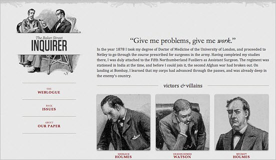
In responsive web design, as described in Ethan Marcotte’s article, fluid grids, flexible images, and CSS media queries are used to create more adaptive layouts and hence more elegant user experiences.
We also see a rising popularity of soft :hover and :active/:focus-effects, where buttons, navigation items and links feel more responsive and engaging as well. The transitions are smooth, and often subtly or vividly animated. Another important development is of course the rich web typography, made possible with the emergence of font embedding services. We have much more freedom for our typographic decisions which is an opportunity to create more diverse, unique and therefore memorable designs.
How To Design A Memorable Website?
- Make use of original and unique graphics. Having a large, punchy or slightly quirky graphic on your portfolio can help separate you from the competition.
- Feel free to experiment with non-traditional color combinations. Experiment with various contrasts to create tension, but put readability always first. Invite the users to feel engaged, but keep the page usable.
- Use original, compelling language to clearly emphasize your differences. Unfortunately, your visitors are likely to read only a small percentage of the text on your website. You can pack the most punch in that percentage by using confident opening statements, catchphrases or interesting summaries to pique the interest of your audience.
- Keep things organized. This might go without saying, but if visitors can’t navigate through your website or figure out who you are from the start, chances are they won’t stay around to see your amazing portfolio.
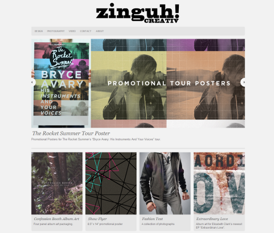
Green accents in the navigation, and in the favicon, are a unique touch, but could be improved for better readabilityThe green highlights for text are a bit harsh on the eye, a slightly darker green would probably work better. A minimalist arrangement of the images is a nice touch. ## United Pixelworkers ### Pixelly Images: A Visual Pun! United Pixelworkers features a subtly pixellated, textured background as well as foreground images with blocky edges, creating a play on their name which is fun, cute and smart. The texture is so rich, and the information architecture so clean, that this website feels far more content-rich than it actually is.
United Pixelworks uses a static, left-aligned navigation bar The left-aligned sliding navigation bar is an example of static navigation done right. It's there, but it doesn’t get in the way of the content and isn’t too obnoxious or obvious. The select color palette and letterpress-style links at the bottom are a nice final touch. ## Outback Creative Studio ### Large Original Illustrations Outback Creative Studio features innovative, large navigation buttons on the right side which is a fresh, colorful and inviting approach. The colors, the graphics and the blocky feel of the layout work together to create a bold and unique statement.
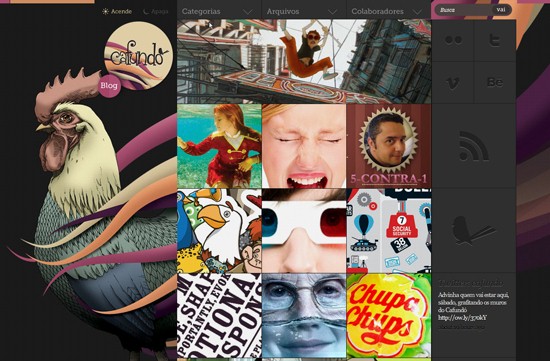
Outback Creative Studio has "night" and "day" themes, emphasized with a rooster graphic The "night" and "day" button allows the user to switch between themes, a creative and unique presentation reinforced by the central rooster graphic. The graded orange and purple color scheme is rich and unusual, and lends the design a unique look and feel. ## Mike Kus ### Right-aligned, Interactive Logo Mike Kus has an eye-catching interactive logo with a motto that displays on mouse-over. DEAD stands for "Dreaming Everyday About Design," which stands out and is easy to remember. DEAD is featured in the favicon too, adding more places for users to see and absorb the tagline.
Interactive logo The light background again leaves the emphasis on the work, which is strong enough to stand on its own. Punches of color and the use of images lead the eye down the page very well; notice how well each project's description and related images are grouped, making the page flow very smoothly. ## Wez Maynard ### Right-aligned Graphic Mayhem Wez Maynard uses offbeat graphics, creative layout and original content phrasing to make his website memorable. The design is completely right-aligned, which is quite unusual to see and feels truly novel. The ribbon sidebar on the left is interesting and unique, and the vintage graphics and blue, textured footer are fun and visually interesting. The quirky messaging is a great example of how to use language to create an impression. This is a nice example of an original, unique and interesting design.
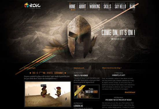 Texture, color and type work together seamlessly
The artwork used here is all the more unusual because it's in a much more traditional style, usually reserved for print media. Epic Agency uses plenty of graphics, and does so in a very original way, making for a very visually striking user experience.
## Ryan O'Rourke Presents
### Elegant, Dark, Responsive Layout
Rourkery.com features a vivid, majestic, theatrical theme which juxtaposes well with playful typography and colorful graphics. Using a distinct theme can be a good way to ensure that content, graphics and messaging work together in a focused way. The website's centered logo and navbar are both unusually and elegantly done, aligned in the center and using a subtle navy pattern.
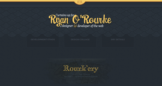
Theatre theme keeps content and graphics focused Potential downsides to note are the leading of the text, as well as the visibility of the home page link, which is the logo in the center of the header. Notice how well orange is used as the main color across various design elements. The layout and images resolutions also nicely respond to changes in the browser window size, responsive design at its best. ## Christina Ung Illustration ### Bold, Unique Use of Typography Christina Ung Illustration is all about the typography. The liberal use of bold and lighter font-weights, along with the mix of lowercase, uppercase, and mixed serif and sans-serif fonts, all work together to make the type as visually interesting as the use of graphics would be.
Bold typography logo The clear, dark logo anchors the eye on the left-aligned navigation, which leaves plenty of room for the portfolio content occupying the main part of the page, to be the main focus. Large screenshots allow the content to be seen very easily without clicking through the actual blog posts. The pink highlights feel fun and fresh, but not overpowering. ## Josh Sullivan ### "Droll" is Memorable JoshSullivan.me is a good example of how even a one-page website can pack a punch. The large header graphic is very unique and memorable, with its old-fashioned "nature book" feel. The background is an interesting mix of textures, colors, geometric shapes and historical-feeling images. While nothing is really clickable, this is just a calling card so nothing really needs to be; the social networking and email address links serve as the page's call to action.
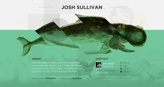
Interesting stew of background images The color palette may look a little offbeat, in keeping with the graphics, but this all helps make the website as memorable as it is visually appealing. One small suggestion would be to make the links on the page a bit more prominent so that users don't end up wandering. A stronger contrast between the text color and the background color would help. The main graphic is so central that it might be a bit overpowering for some, but this really does depend on who the audience is. ## Jake Przespo ### Fun Graphics and Clean Organization The portfolio of Jake Przespo features another very creative central graphic. The "fun factor" goes a long way toward making a website memorable, and this is one that adds fun, very effectively. As users navigate through the website, the graphic flips around. The words in the red banner stand out, with subtle hover effects and woodcut detail.
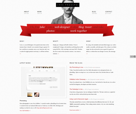
Whimsical central image flips around as users navigate through The minimal colors and splash of red keep the page a clean, minimal background for the front-and-center images. The readability of the content would certainly benefit from an increased font size, though. ## Cooper Graphic Design ### Large, Bold Header Graphic The colors really draw the user into Cooper Graphic Design. The shades of brown, with texture and punches of turquoise, feel very bright and upbeat. The layout is clean and systematic, while the main, large center graphic contrasts with the more subtle background graphics in an interesting, attention-grabbing way. The top-level navigation is also very clear, making this an effective and visually appealing portfolio website. Also notice an interesting background image that lends the page more visual appeal. And don't forget to resize the browser window, too.
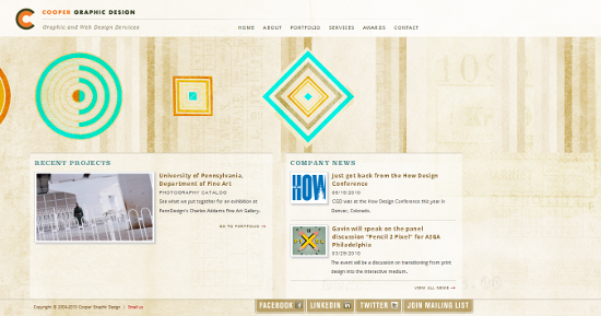 Bold header graphic contrasts with subtler background
One small usability problem, however, might be the tabbed navigation at the bottom of the page. The use of tabs often signifies internal navigation, rather than external. In this case, these tabs seem to link out to external pages, which might confuse users a bit.
## Brandon J. Schmidt Design & Photo
### Watercolor Graphics
The watercolor graphics on Brandon J. Schmidt Design & Photo are very prominent and visually appealing, especially on the front page. The black, white and yellow color scheme feels minimal and modern, an interesting juxtaposition with the old-world feel of the watercolor.
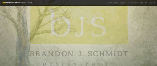
Soft watercolor graphics The logo graphic on the home page is faded into the background on the website's second-level pages, keeping the website logo as the focus and leaving a lasting impression on users. ## Water's Edge Media ### Minimal Design With Floral Illustrations The simple, solid navigation structure and design of Water's Edge Media stands out even without the illustrations, but the illustrations help make it more memorable. The logo, in particular, is very fresh and modern.
Fresh, modern color palette and pretty floral illustrations The slide show of recent work is neat, but it could use some polish, especially the slider buttons. The left alignment adds a modern feel. Overall, however, a little more variance in font type and size would make the design just a bit more interesting. ## Jordan Gray Creative ### Minimal Design With Left-aligned Navigation Jordan Gray Creative features seamless left-aligned navigation below a clean, minimal typography logo. This design is super-minimal, relying on the work in the slide show for content and appeal. Subtle details like the favicon and CSS spacing keep the design from seeming too simple.
## Eight Hour Day Design & Illustration ### Bold and Colorful Using the portfolio as the graphic element, Eight Hour Day Design & Illustration integrates a lot of color through relying only on the work. The select color palette of the page itself is crisp and bright. The type is clean and vivid. Although it's simple, the hint of subtle patterning and shadowing at edge borders and between navigation menus effectively keeps things from looking flat.
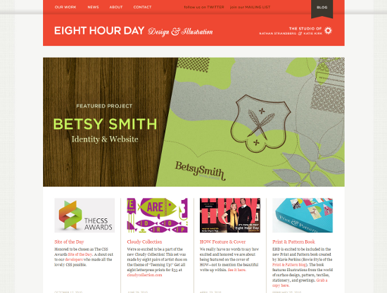
Colorful elements are drawn directly from the Eight Hour Day portfolio
## It's Not My Type ### A Typography Blog About Typography It's Not My Type makes good use of the richness of Web typography—with strong slab serif typography widely used across the various design elements, including the Web form, date and comment areas.
Fonts change as users navigate through the website The scrolling content panel works pretty well here; the colors and subtle textures are clean, and add visual appeal. ## McKinney ### Simple But Elegant McKinney features a minimal design with accent graphics that are not textures, but geometric shapes like lines, circlesand triangles. The red, gray and black palette is striking yet subtle.
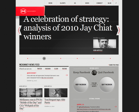
Elegant touches through geometric accents One thing that would be fun, is if the slide show controls were draggable. More hover effects would also give the page a more dynamic feel, making it more interactive and responsive (some elements do, however, respond when clicked on). The consistency of the layout and color choices of the website's internal pages, also deserves a mention. ## Shaping the Page ### Playful Origami Animations Shaping the Page uses a soothing, light and airy color palette as a backdrop for fun, whimsical, animated origami illustrations, which are a visual pun on its name.
Elephants, butterflies and more! The lightly textured blue background and the wispy social networking graphics at the bottom of the page are downright charming. The portfolio page is nicely organized and right-aligned, which seems to work well with the playful, moving illustration on the left to visually balance the content. ## Broken Pencils ### Pencil Sketch Illustrations Broken Pencils, Inc. has a prominent and visually striking logo. Although the navigation is split into bottom and top sections, it doesn't look redundant since the top is more understated and the bottom uses different colors. The slow color transitions on hover effects on the "Services" page are a nice surprise as well. All of the graphics are simple and modern. The most striking part of the design, however, is the pencil sketch illustrations, in keeping with the "pencil" theme.
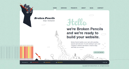 Pencil sketch illustrations echo the website theme and company branding
## Who is Leon
### Fun With Interaction!
The background animation of Who is Leon might be the first thing the user notices. The static background and scrolling content, combined with the slightly blurred photography, work together to create a sense of motion and excitement. Users might feel invited to click around, and many elements on the page are, in fact, interactive.
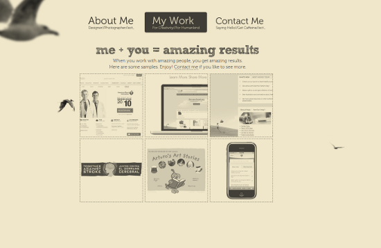
Hover, click and move! The grayed out portfolio screenshots turn to color on hover. Against plain flat background this really makes the screenshots pop, and along with the prominent buttons, invites visitors to take action. The website also involves the use of several fonts, which add to the overall striking effect of the design. ## David Paul Seymour ### A Monster! The portfolio of David Paul Seymour is a very fun, colorful, illustration-based website. The illustrations take up most of the page, making them the main focus as well as a design statement. The cloud illustrations for the navigation are fun and makes users want to click around. In contrast to the previous website, none of these illustrations are interactive. This feels a little bit like a missed opportunity, as some hover effects or small animations would really go a long way toward adding to the playful feel of this website.
Color and whimsy make this page stand out One other thing that stood out was the lack of a favicon. The addition of a favicon (most especially on such a graphically rich website) is a really quick and easy way to enhance brand recognition, and to add a more polished, complete feel. ## Creativepayne ### Bold, Unique Graphics Creativepayne is a bit tongue-in-cheek, graphically speaking. The old-world art mixes with a variety of other styles; there is a lot going on in this design. The color palette is a subdued mix of browns and tans.
Bold, unique graphics and mix of styles The call to action, "ESTIMATES get yours TODAY," does get a bit lost in the top right corner; overall, if some of the other design elements had slightly bolder fonts, they might balance out the main, large graphic a little more. ## Chicago Interhoods ### Interactive Map Chicago Interhoods is an example of a great marriage of design and information. The orange, cream and blue color palette is striking and fun. With a prominent, central logo and clearly organized top-level navigation, this design is a clean and effective backdrop for the interactive map. The map itself is a nice visual way to browse for information.
Beautifully interactive design aids browsing for information
## AdPacks.com Classy Sites & Classy Ads ### Vintage Graphics and Type AdPacks Classy Sites & Classy Ads features a fun, vintage feel in the graphics, fonts and textures. The visual interest created by this mix, invites and engages users to interact the website elements.
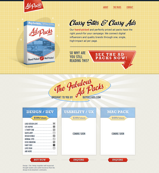 Fun, vintage graphics and type
The visual representation of the products makes it easy for potential buyers to see and understand what the products are, while the calls to action are clearly laid out in the buttons for each section, making this a complete, well-laid out product landing page.
## Min Tran's Journal
### Beautiful Typography and Unusual Textures
Min Tran's Journal features a ribbon navigation that is sophisticated and tidy. The soft colors work together nicely; the playful typography looks informal and engaging, and also works nicely with the graphics and overall feel. The two-column layout features columns of equal width, conveying a clean, well-organized and fresh impression that is unique at the same time.
## Solid Pink Studios ### Big, Bold, Diagonal Solid Pink Studios takes the pink theme its name suggests, but takes it in a completely unexpected direction; the grumpy rock monster looks like he means business.
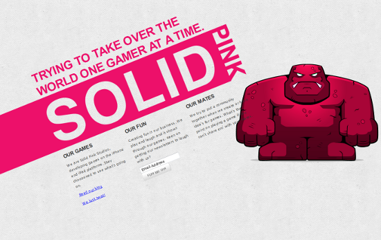
The solid pink rock monster is a fun, memorable element The diagonally-aligned text works best at a fixed width, and could present some display difficulties to users with a small screen; on smaller screen resolutions, the blog link is cut off to the point of nearly being hidden. Overall, the diagonal text alignment is is a fun and memorable way to present content and is very in keeping with the rest of the design. One final note: this is nit-picky, but it does feel a bit odd that the favicon for Solid Pink is green, not pink. ## Summary When creating a memorable website, make sure to pay special attention to the treatment of your design elements. Risk something unusual and creative. A clean, well-structured backdrop for fanciful graphics, creative animations and bold typography can all make the design stand out even more. The more personal and creative you appear, the better your chances of being remembered and selected for your next project. ### Related Posts
- 50 Beautiful And Creative Portfolio Designs
- 40 Creative Design Layouts: Getting Out Of The Box
- Best Practices For Effective Design Of “About me”-Pages
- The Current State of Web Design: Trends 2010


 Try ProtoPie AI free →
 Celebrating 10 million developers
 Register Free Now
 SurveyJS: White-Label Survey Solution for Your JS App


